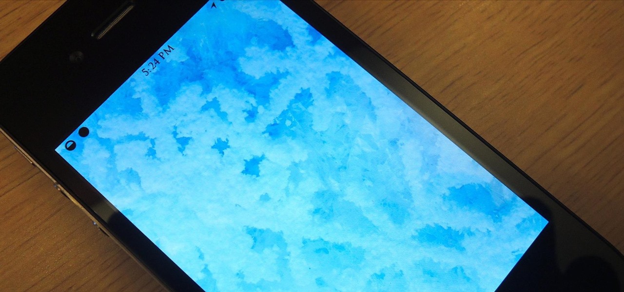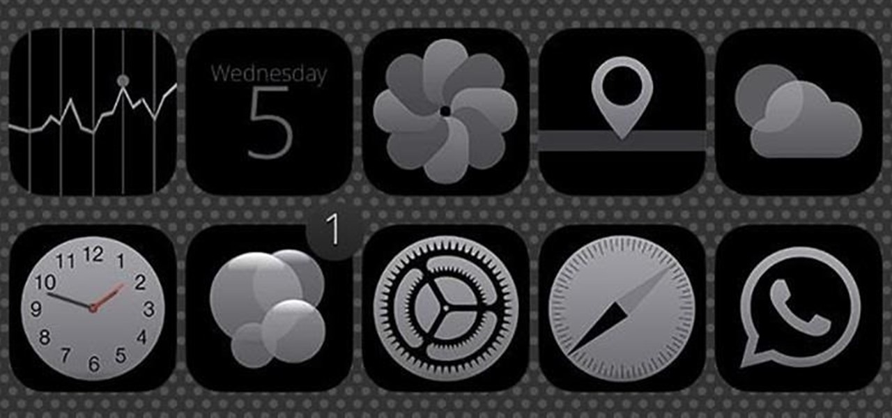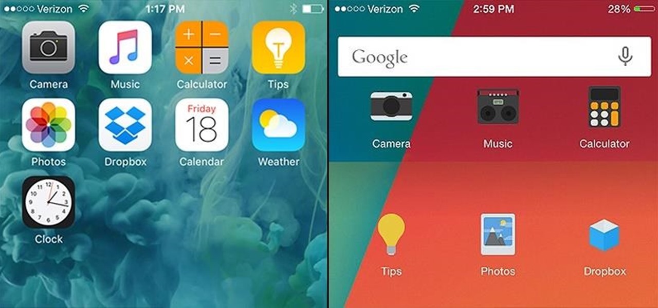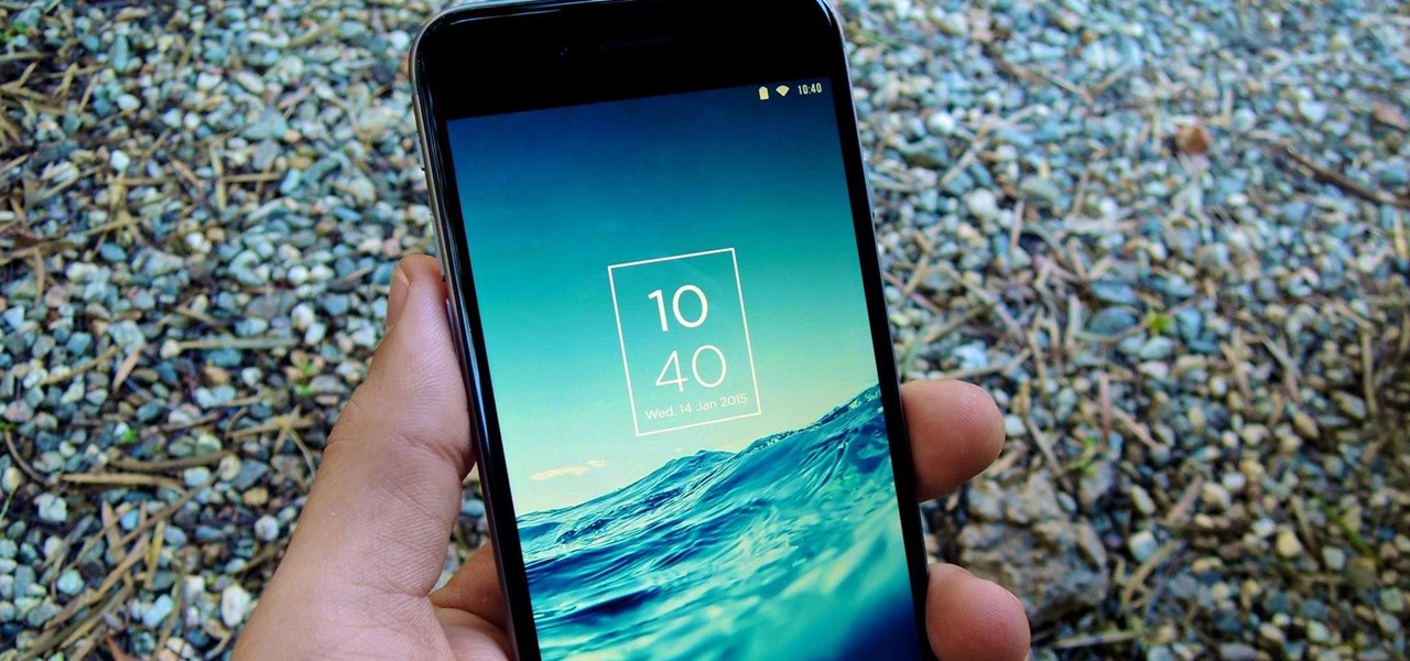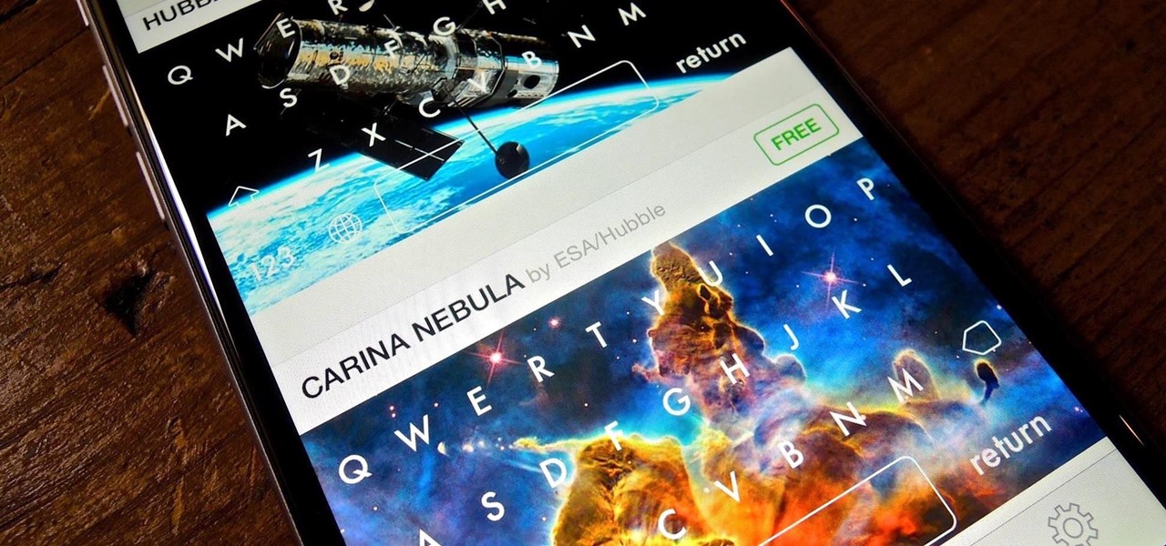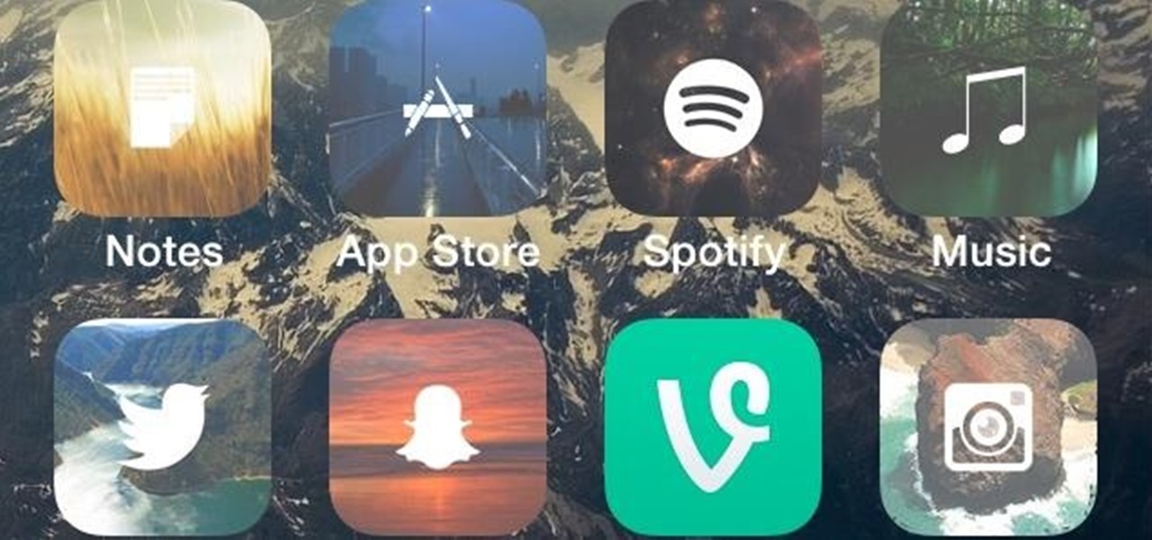
Winterboard for iOS 7 allowed us to use some pretty great-looking themes. Circulus and Space BlueBerry are both great, but a little too "fun" for me. If you want something serious, yet appealing to the eye, then M'flat is for you.

One of the biggest reasons we jailbreak our iPads and iPhones is to add and change themes. Apple locks down a lot of how we can personalize our devices, and while the stock look is easy on the eyes, sooner or later we may realize how boring it can be. Now, it doesn't have to be.
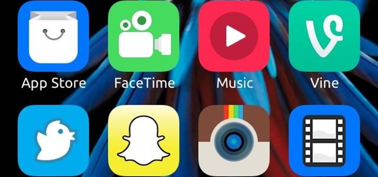
Depending on who you ask, the icons on your iPhone have either improved or taken a serious dive since the iOS 7 update. They're flatter and cleaner, which I really appreciated, but the neon colors are a little too bright, and the grays are a little too dull.
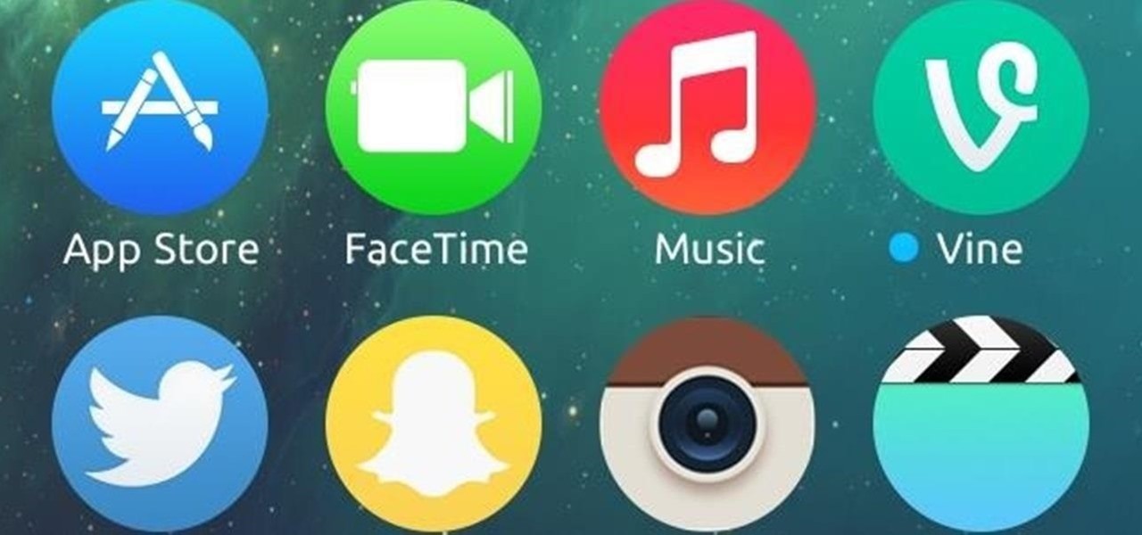
Rounded rectangle icons are so 2007. Sure iOS 7 tweaked them a bit, but with the clean new approach to design that software is taking today, they're starting to look dated. Today I'm going to show you how to go full circle with your iPhone's icons, and the results are actually pretty awesome.

The iPhone 5S may be the most popular Apple phone to date, but I'm still rocking my iPhone 4. No disrespect to the 5S, but I'm not upgrading until I can unlock with a retina scan or get Siri to sound like Scarlett Johansson.
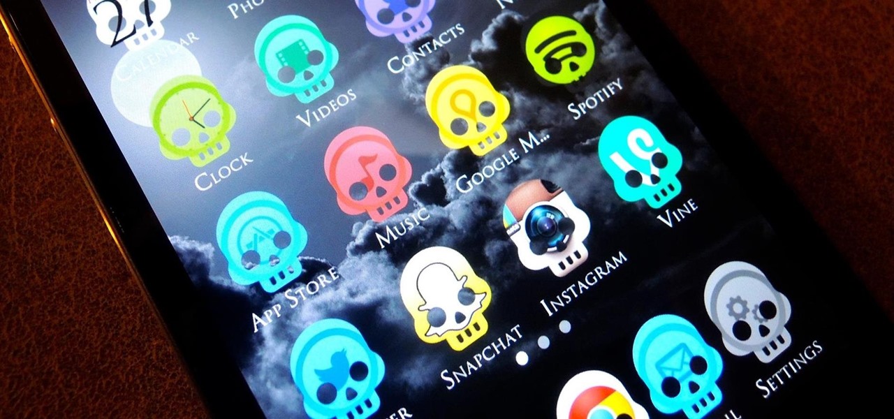
More and more, our phones are becoming an expression of us. Whether it's the device we choose, the case it dons, or the ringer it bellows, we like to personalize. Unfortunately, there's not much you can do beyond cases and ringers on your iPhone, unless you jailbreak.

Apple is set to release its latest operating system for iPad, iPhone, and iPod touch this fall, and if you haven't noticed yet from our iOS 7 softModder guides, it's going to be pretty slick.

The competition between iOS and Android is fierce. Each operating system offers unique and powerful features, so it can be hard to choose which one you want. However, for iPhone users, a little tweaking and some themes can give your iPhone some of the key features and aesthetics of an Android.

For over 37 years, Apple has been using the same "bitten" apple as their company logo. Sure, it's looked slightly different over the last couple of decades, from rainbow stripes to monochromatic colors, but its shape has change very little.

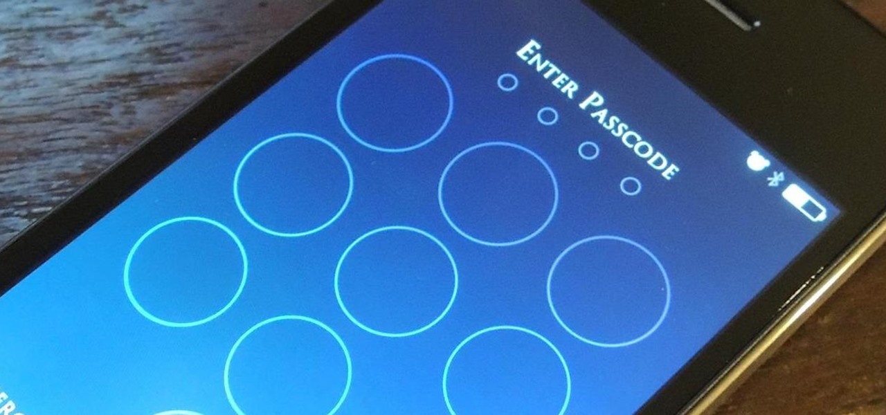
Are you tired of your snoopy coworkers and friends lingering over your shoulder as you type in your security passcode? Unless you have the newer iPhone 5S with Touch ID that scans your fingerprint, you've only got a couple of security options—either a 4-digit numeric passcode or a cumbersome password.

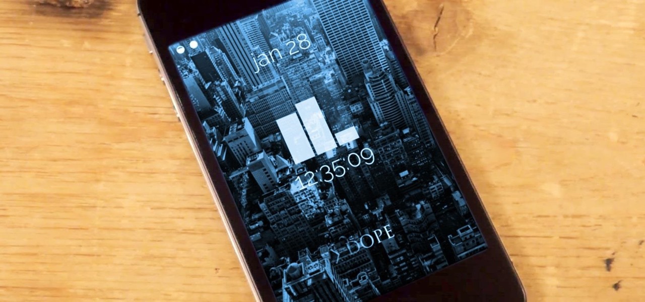
The iOS 7 lock screen was made to be just that, a lock screen, so it's pretty limited in terms of functionality. We're able to add wallpapers and easily access the Control Center or Notification Center (unless we disable that access through our settings), but other than that, it's pretty bland.

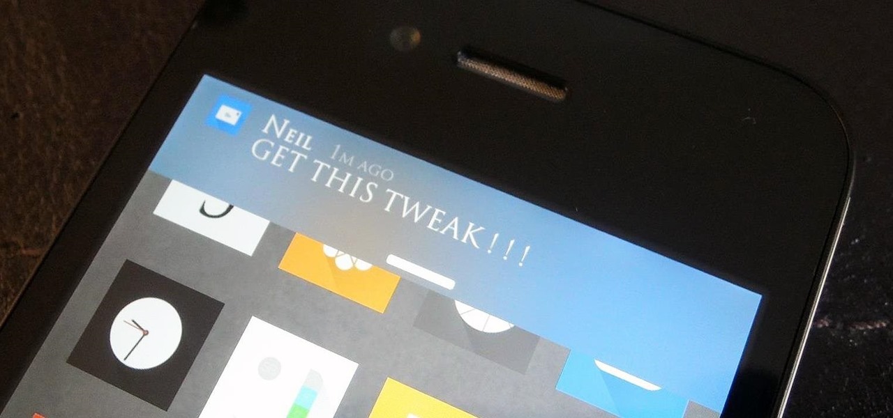
A banner alert for notifications is like the Robin to our iPhone's Batman—they're taken for granted and don't really get the recognition they deserve. Yes, they can be disruptive at times, but just like Robin, they can be necessary for getting things done.

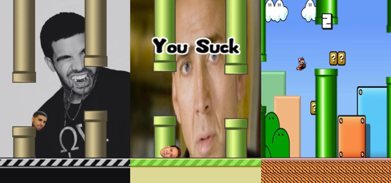
Flappy Bird is immensely popular, we already know that, but it's even more so now that the developer removed it from Google Play and the iOS App Store. Android users can still get the game fairly easy, but it's nearly impossible to install a safe version on the iPhone now, so you'll have to resort to one of the many Flappy Bird clones out there.

Once you jailbreak, there are hundreds of options available for you to fully customize your boring stock iPhone into something more efficient and fun. We've already shown you a bunch, like how to beautify app icons and change battery icons, but now it's time for a badge alert makeover.

One of the most rewarding things about jailbreaking is theming. Unlike Android, iOS doesn't allow you to make small changes to certain aspects like the icons or the lock screen, so jailbreaking facilitates the ability to make some of these desired changes happen.

Third-party keyboard support, introduced earlier this year by Apple with iOS 8, was initially pretty awesome. I loved playing around with all of the different options available in the iOS App Store, including SwiftKey, TouchPal, GIF Keyboard, and Swype.

Good battery life is one of the most important things any phone or tablet should have, but iOS 7 isn't always that great at handling power consumption. That leads to tunnel vision on the status bar's battery meter. After all, you don't want to be stranded in the middle of nowhere with no juice left to make a call.

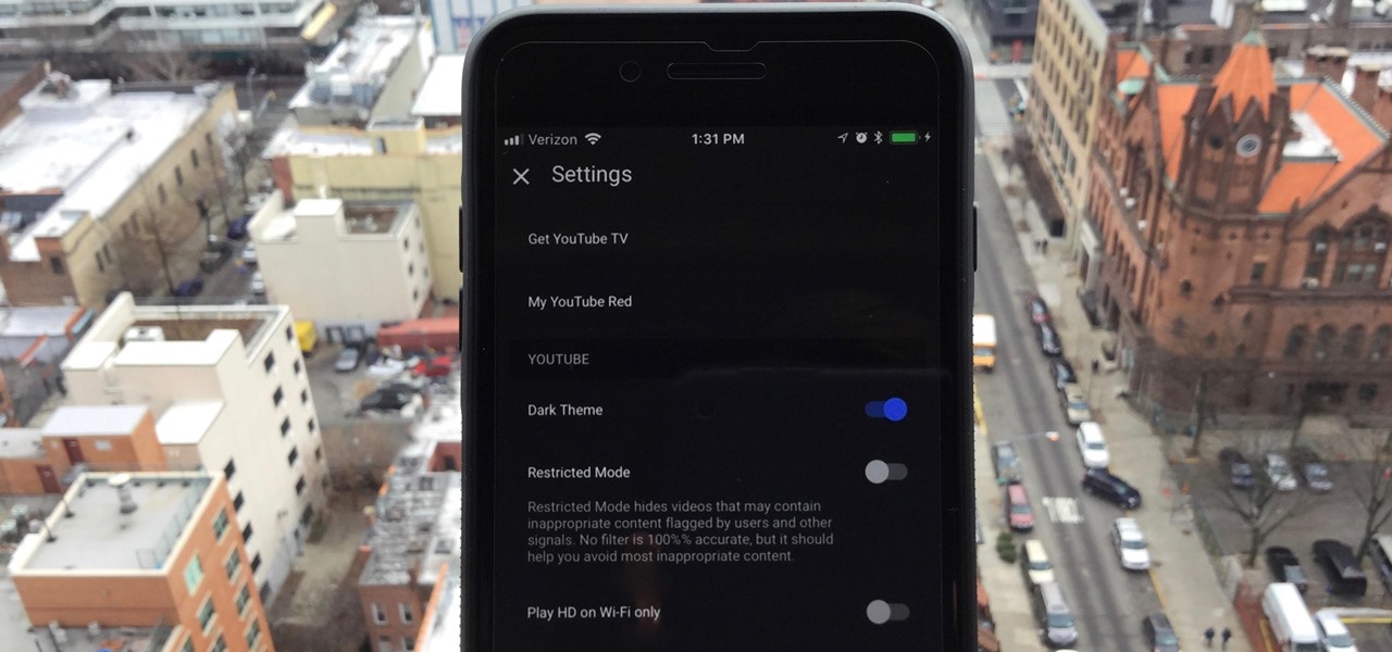
One of the downsides to iOS is the lack of a true dark mode. While Apple has offered a workaround, third-party developers have taken it upon themselves to implement dark themes in their apps. While big names like Twitter and Reddit have led the charge for some time, it appears YouTube is the next app to join the party.

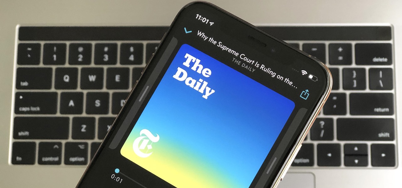
We all listen to podcasts differently — on the way to work, at the gym, when drifting off to sleep. If you're in the latter group and rely on Overcast to help you with your nightly routine, you're probably sick of its blinding light theme keeping you up. That's why the app features a dark mode, to keep things easy on the eyes while picking out or playing an episode.

New releases of iOS are always pretty exciting. I remember the anticipation buildup of iOS 7 before it was announced at WWDC 2013, as it was expected to be a complete game changer compared to previous versions—and it was.

Third-party keyboards have been available for iPhone ever since iOS 8, but which ones are worth checking out? There have been many options over the years, and if you want keyboard features like swipe-typing and themes, you're going to have to put Apple's stock QuickType keyboard on the backburner and try out these top hits.

By far, one of the biggest advantages to having a jailbroken iPhone is being able to apply custom themes to Apple's user interface and truly set your device apart from the rest of the crowd. And if you want to change your iPhone's app icons from rounded squares to circles for an entirely unique look, there's nothing stopping you.

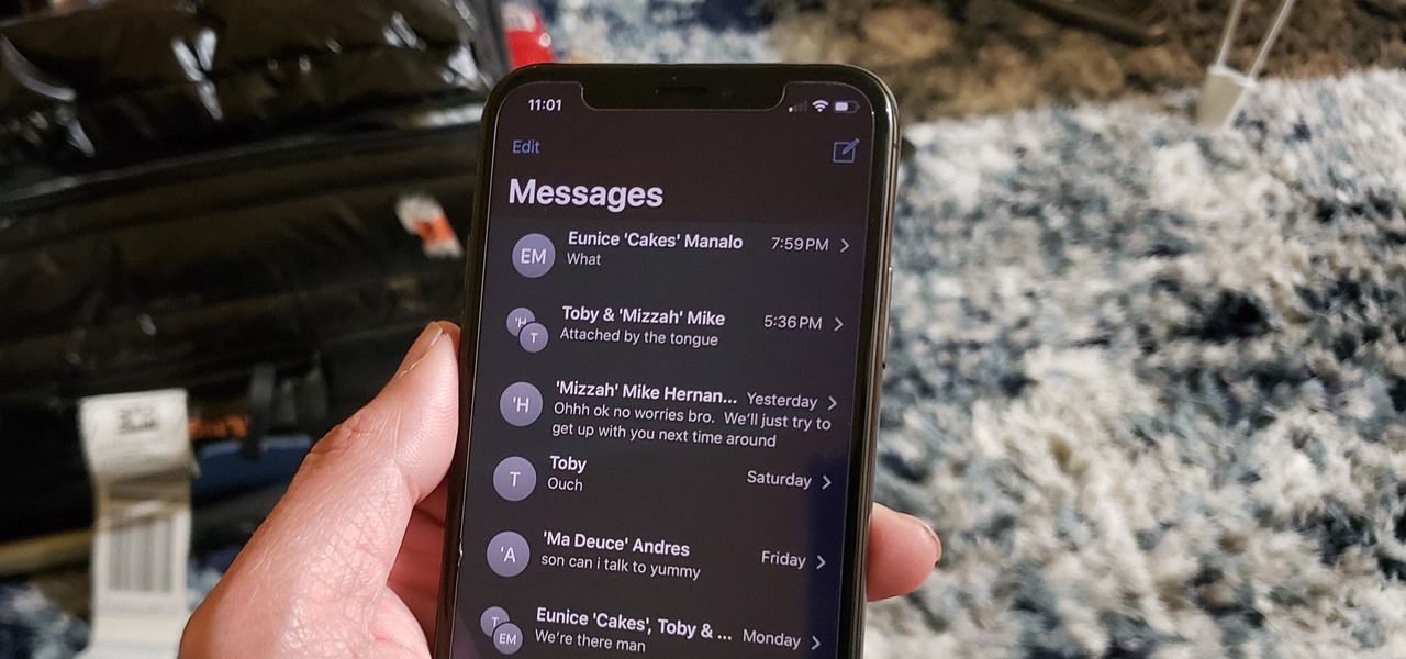
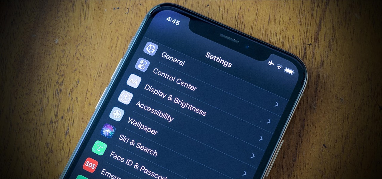
A universal dark theme has long been one of the most sought-after features we've been urging Apple to introduce for iOS. While this wish went unfulfilled with iOS 12, there's renewed hope that it'll finally touch down with iOS 13's arrival. The jailbreak community, however, has had this functionality available for quite some time, and you can too if you're running the right iOS version.

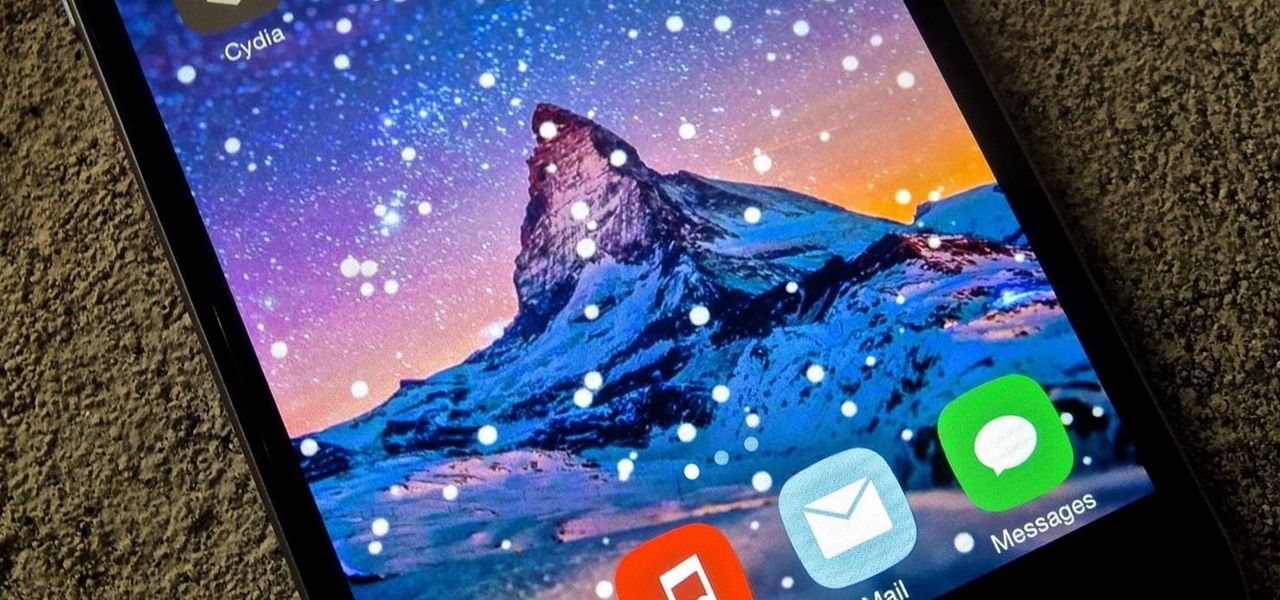
Just in time for the holiday festivities, iOS developer Tristan Kennedy has created a snowy HTML widget for your jailbroken iPhone's home screen called SnowScreen. Simply apply the widget and you'll have a falling snow animation layered over whatever wallpaper you already have. Without further adieu, let's show you how to apply this tweak.

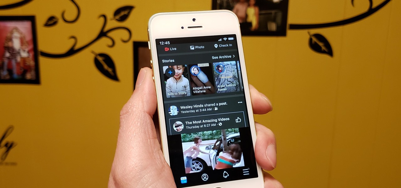
Dark mode support has steadily made its way to mainstream acceptance, with big-name apps like YouTube, Reddit, and Twitter adopting the feature to satisfy user demands. In this regard, Facebook is lagging, yet to offer the sought-after feature for easier viewing in low-light conditions. If your iPhone is jailbroken, however, you don't have to suffer like everyone else.

For those of you who have been taking full advantage of the jailbreak for iOS 8 that's available, you can understand and appreciate what this really offers iPhone users—sovereignty.

Believe it or not, there are a variety of ways to customize app icons in iOS. While iOS 12 made gave us an unofficial built-in way to do it, and iOS 13 improved it, and iOS 14 made it the best it could possibly be, there's still another option if you don't like using the Shortcuts app.

With iOS 13, Apple introduced system-wide dark mode for the first time on the iPhone, and there are several ways to activate it. You could use the brightness slider to change the theme, have Siri do it for you, or adjust it straight from the Settings app. But there's one way that's faster than all others so that you can switch from light to dark in no time.

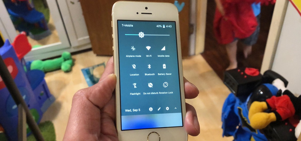
In iOS, the Control Center is an easy way to toggle settings such as Wi-Fi, Do Not Disturb, and Low Power Mode. Its Android counterpart is called "Quick Settings," which provides much of the same functionality with a few bonuses. If you're curious about how this toggle menu works or miss having it before you made the switch from Android, you can test it out on your iPhone right now.

Some elements of iOS's design, like its minimal color palette, are what make Apple products unique, helping to produce a clean, sleek user experience. But after you jailbreak, that all goes out the window. Once you've tried things like theming your status bar, changing your icons, or applying a new lock screen, you'll never see your iOS device in the same way again.

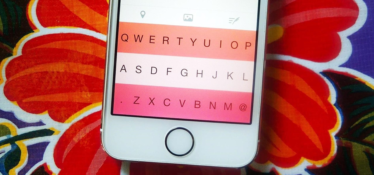
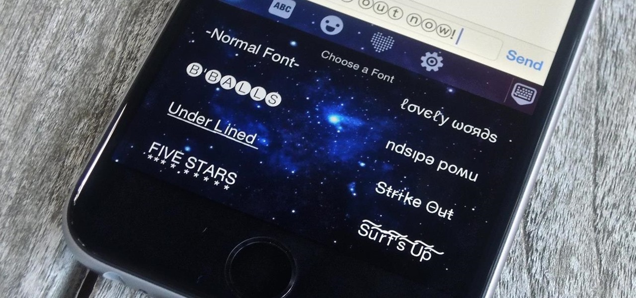
Allowing the use of third-party keyboards on iOS 8 was a great move on Apple's part, providing iPhone users with choices when it came to an often-used and important aspect of their operating system. Unfortunately, as cool as all these keyboards are, they all use the same boring, stock font.

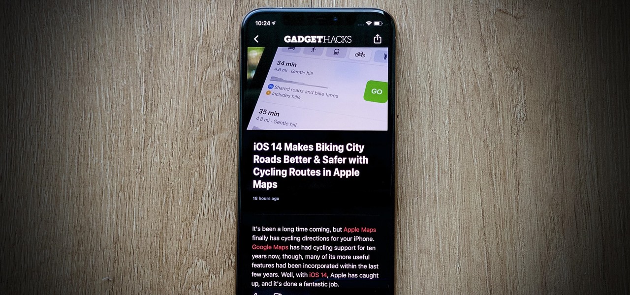
It's almost impossible to use Apple News at night without having to mess with the white point and zoom filters. That might sound a bit dramatic, but it's really not when you consider that iOS 13 has a perfectly good Dark Mode that should work for News. So why are we stuck reading most news stories in Light Mode? We're not, but you have to put a little work into it going dark in News.

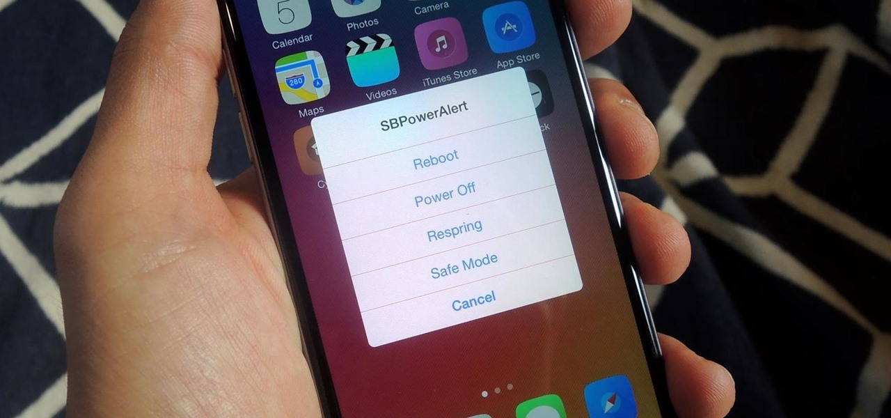
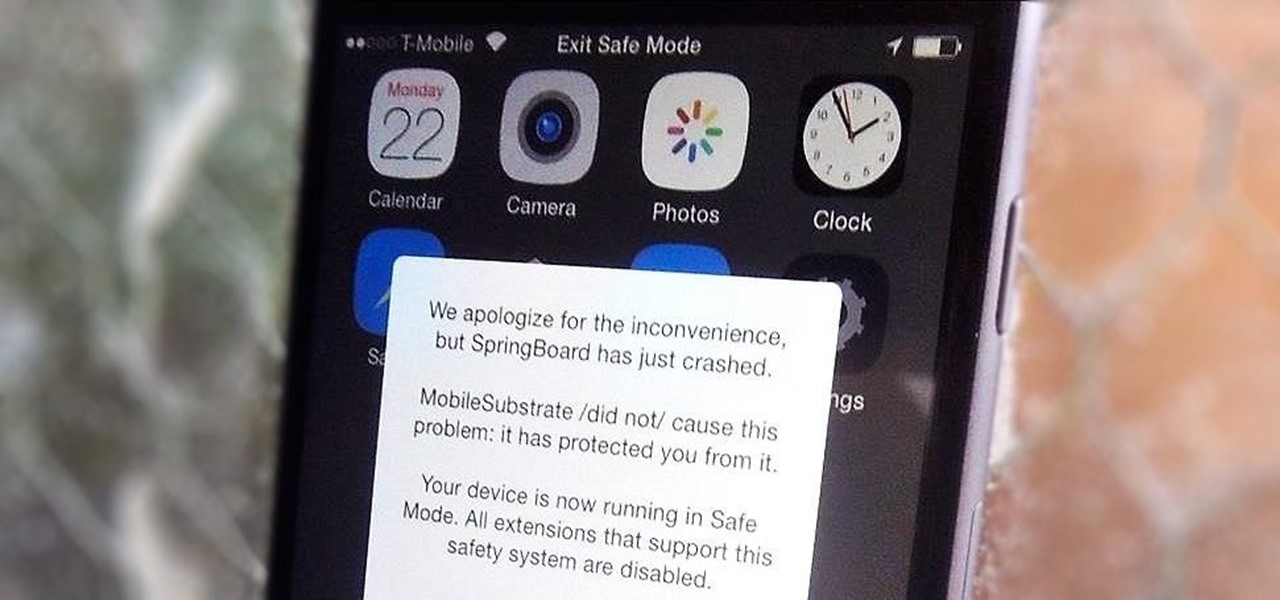
Installing tweaks or themes onto your jailbroken iOS device is a pretty fun and exciting experience, but if you do it for long enough, you're bound to come across a bug that will cause your operating system to crash.

Not all websites are created equal, and that's why Safari doesn't apply Dark Mode to each webpage you visit during your iPhone's system-wide dark appearance. But in Safari's latest update, Apple gives its web browser more power to automatically apply Dark Mode to specific website content without having to use extensions like Noir.

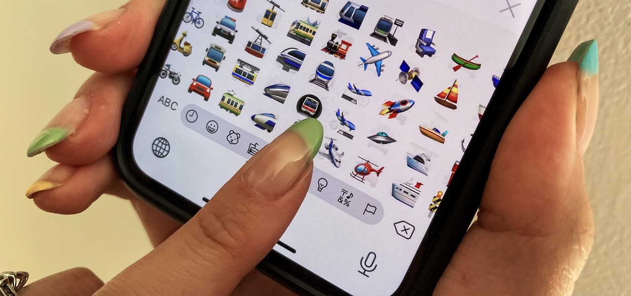
When words aren't enough, emojis are there to help. Your iPhone has almost two thousand of them for you to communicate in a more lively manner or to express indifference, excitement, joy, and other emotional states. However, the more emojis that come out, the more difficult it is to find the one you want — unless you know your way around your keyboard.

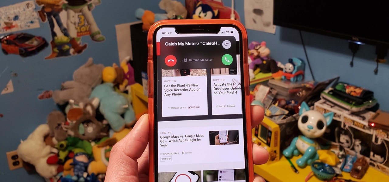
Incoming phone calls and FaceTimes, whether you want to answer them or not, will take over your entire iPhone's screen — no matter what you're in the middle of doing on the device at the moment. You could be browsing the web, playing a game, or chatting on social media. It doesn't matter, you'll get interrupted. But you don't have to put up with it anymore.

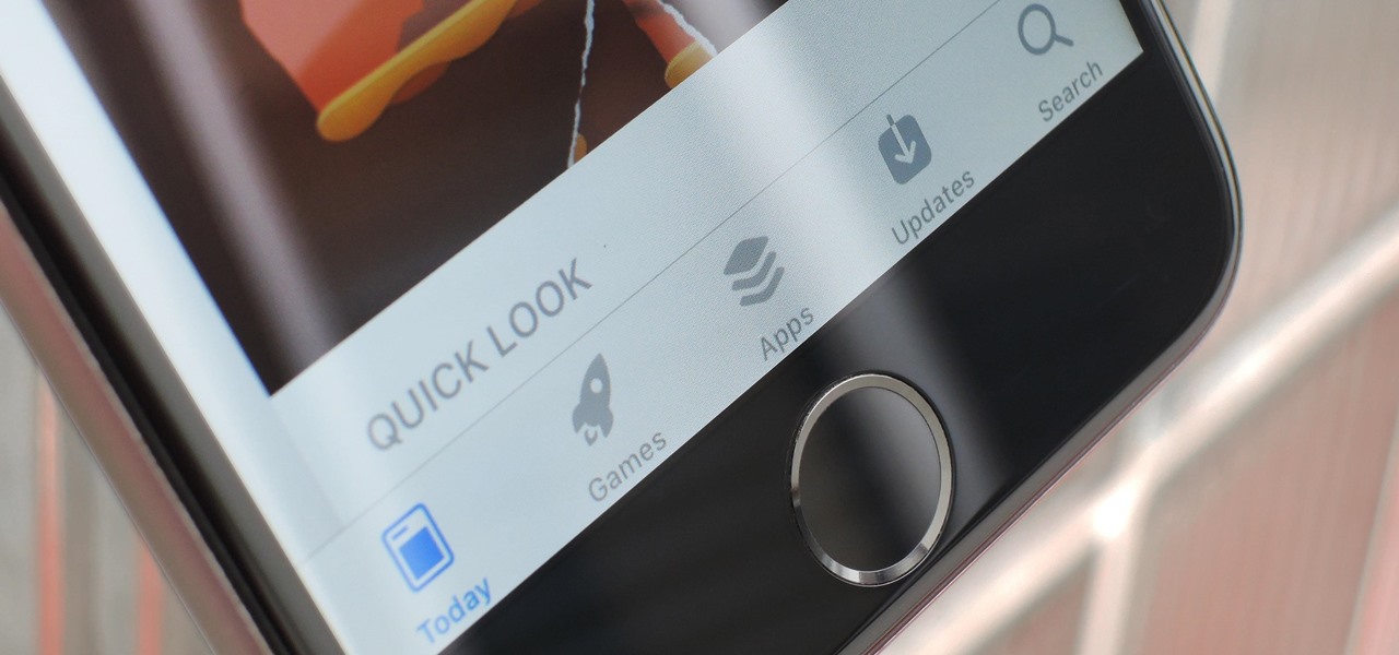
Since its debut 9 years ago, the iOS App Store has always had roughly the same functionality: Featured apps, categories, top charts, a search function, and a place to update your apps. But starting with iOS 11, that's all changing — drastically.

There's no denying that native Dark Mode in iOS 13 is awesome. Stock apps that were blindingly white for over a decade can now be comfortably used in the middle of the night. You might find, however, that some of your third-party apps aren't taking the hint. Why won't YouTube switch to dark mode when iOS as a whole does? We put together a troubleshooting checklist to get your apps cooperating.

These days, using Reddit on your iPhone is just as good, if not better, than Redditing on a desktop browser. While there's an official Reddit app for iOS, there are plenty of third-party clients that have similar features as well as custom perks to enhance the experience. But figuring out which Reddit client is best for your daily use can be a lot of work — work that we can make easier on you.

February may be the shortest month of the year, but for iOS softModders, there were plenty of apps and tweaks to fill up those days. Whether patching major security holes or just a tweak to make speed dialing more efficient, there was a plethora of great mods for our jailbroken iOS 7 devices. These are our favorites from the month.


