Apple's iOS 13 has been available for beta testing since June, and the stable release pushed out to everyone on Thursday, Sept. 19. To help you make the most out of iOS 13 for iPhone, we've rounded up everything you'll want to know, whether a colossal feature, small settings change, interface update, or hidden improvement.
If you're not ready to install iOS 13 because you're worried about stability issues that usually plague first releases, you can at least see what's in store for you when you finally do update. And since we focus primarily on the iPhone side of things, the features below are all found in iOS 13. However, most if not all of the features will also work in iPadOS 13 for iPad models.
Additionally, we've seen two more updates since iOS 13 — iOS 13.1, released Tuesday, Sept. 24; and iOS 13.2, released Oct. 28. These updates combined add over 40 new features, some of which were expected to show up in 13.0, so make sure to check out those features in our other roundup.
Skip to a particular section: System-Wide & General Settings | Files App | Siri | Control Center | Mail | Messages | Photos & Camera | Music | Apple Maps | Reminders | Notes | Safari | Security | Home | Voice Control | Accessibility | Performance | Other
System-Wide & General Settings
There are a lot of new features and changes that affect how you use your iPhone as a whole, from system-wide visual differences to how you share things.
1. There's Dark Mode for Native & Third-Party Apps
After years of waiting, Apple finally delivered with its dark mode implementation. Way better than Smart Invert, the new Dark Mode applies system-wide and works in every Apple app. Developers can also hook into Apple's API to bring the dark mode to their apps with minimal work.




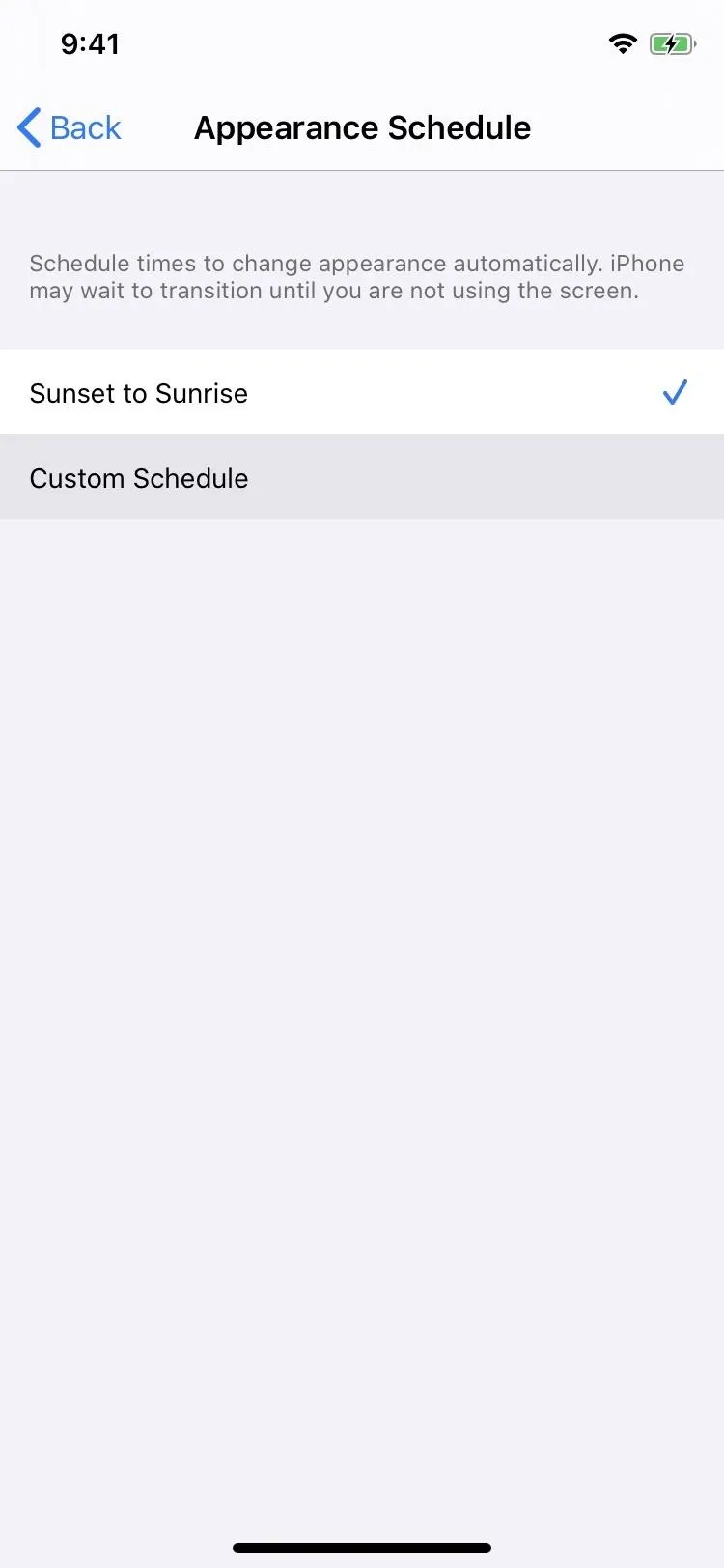
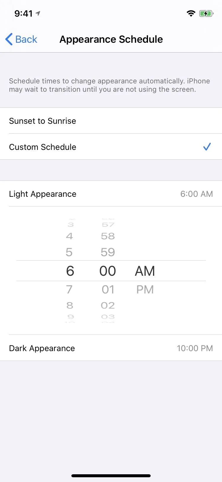
2. You Can Schedule Dark Mode to Turn On/Off Automatically
What's even better than having a Dark Mode you can change quickly from the Control Center? Scheduling the appearance to fit your light-to-dark schedule. That way, you don't need to think about whether or not you should have dark mode enabled — it's ready to go when you are.
- More Info: How to Put Dark Mode on a Schedule in iOS 13


3. There Are 4 New Wallpapers Optimized for Dark Mode
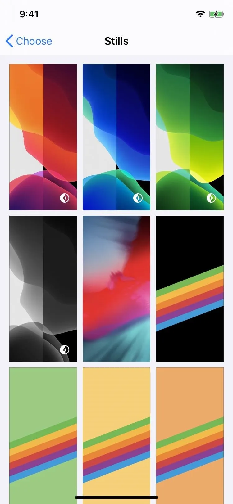
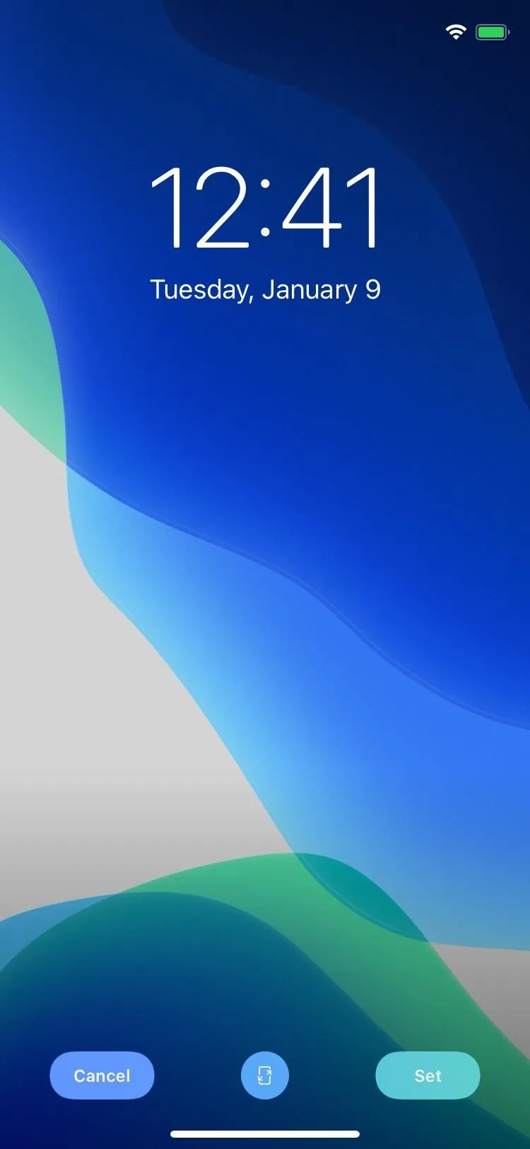
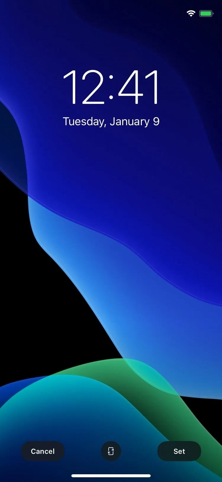
Apple's iOS 13 comes with four default still wallpapers that adjust their appearance based on the system theme. So it's almost like having eight new wallpapers.


4. You Can Dim Your Own Wallpapers During Dark Mode
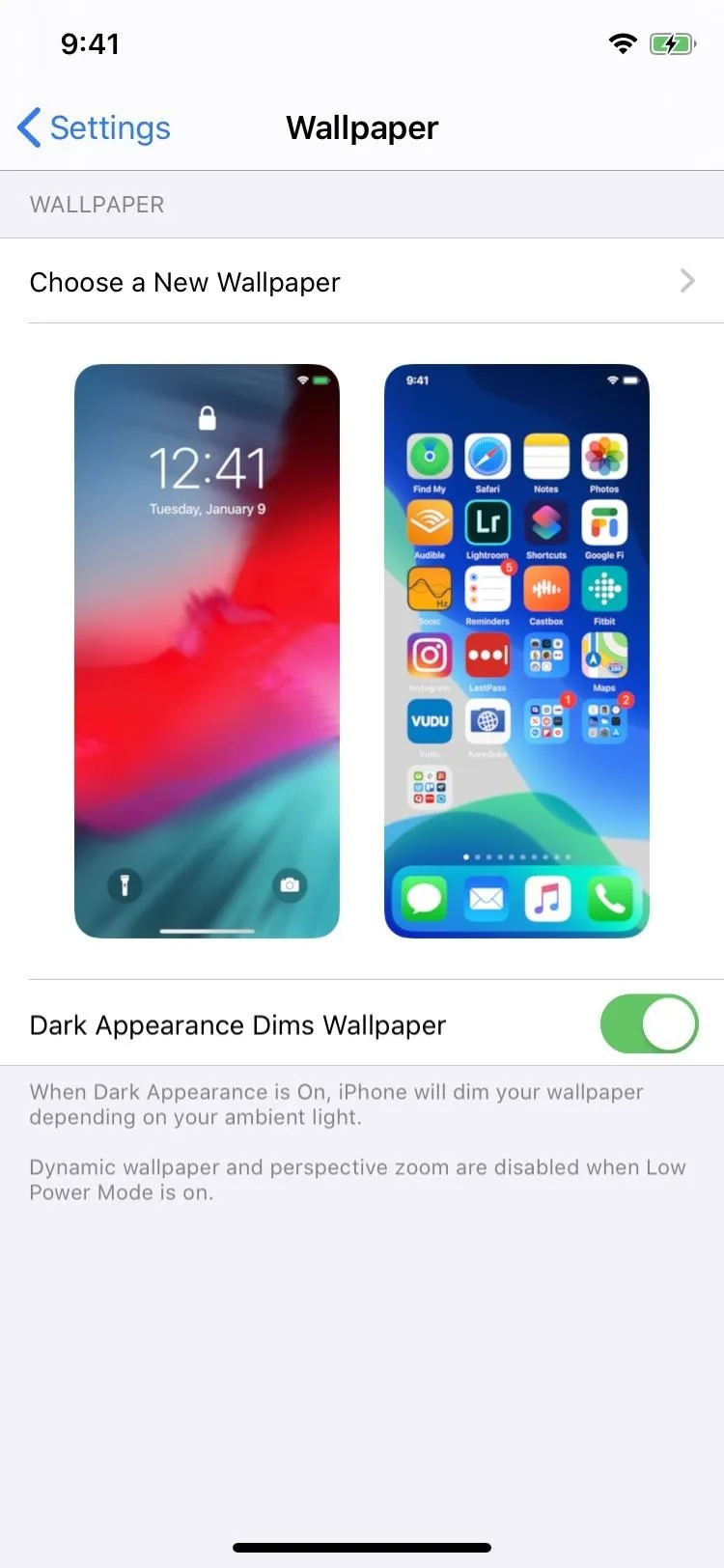
There's an option when choosing wallpapers to dim them during Dark Mode. Just toggle on "Dark Appearance Dims Wallpaper" and when you turn on Dark Mode, your custom wallpaper will dim depending on the ambient light around you. It's a neat effect that really rounds out Dark Mode on iOS.




5. You Can Connect Your Xbox Wireless Controller
If you're like me, touchscreen controls will just lose you the game. But not anymore. If you have a wireless Xbox One controller that supports Bluetooth, you can connect it to your iPhone and play games that support external controllers. Finally!
6. And a PlayStation 4 Controller
If the Xbox controller support wasn't enough, PlayStation gamers can also connect their wireless DualShock 4 controller to the iPhone to play games more easily. Feel free to argue about which controller is better in the comments (just keep it civil).
7. The Volume Overlay Is Finally Less Distracting
The distracting volume overlay had always been a problem in iOS 12 and under, showing up right in the middle of the screen in most cases. Now, Apple finally changes things up, with a smaller volume overlay indicator on the side or at the top. It appears thick at first to so you can see the speaker icon, then minimizes to a thin line.

The volume HUD in iOS 12 (left) and iOS 13 (right).


The volume HUD in iOS 12 (left) and iOS 13 (right).

8. The Silent Mode Overlay Is Also Less Distracting
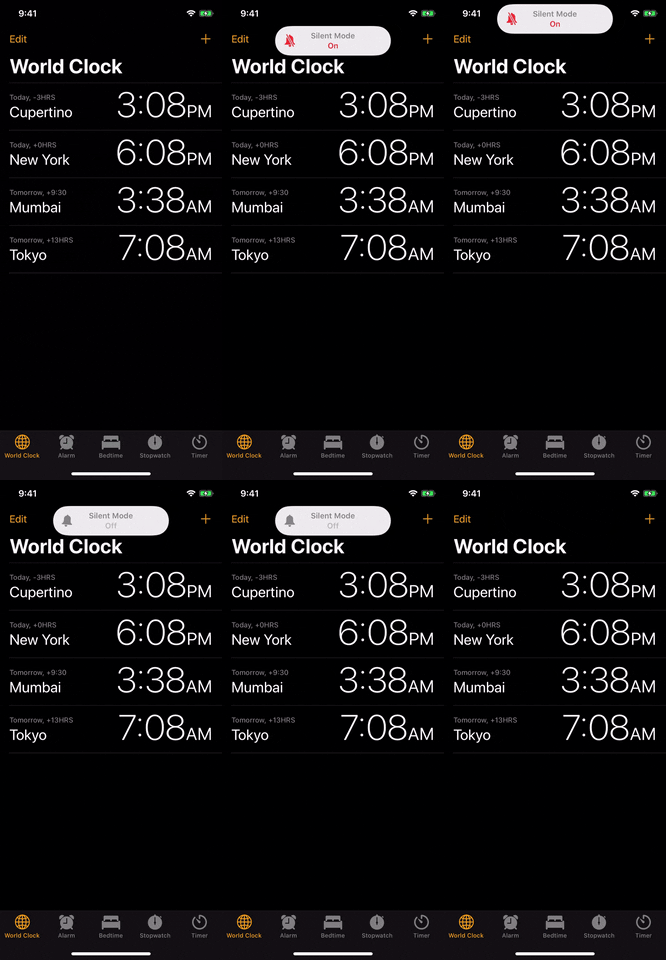
The Silent Mode overlay, which looked like the old volume overlay, is replaced by a pill-shaped banner notification when you use the Silent Mode switch on the side of the iPhone. It's a huge improvement, and matches the modern iOS aesthetic much better than the old interface.

The silent/ring switch in iOS 12 (left) and iOS 13 (right).

The silent/ring switch in iOS 12 (left) and iOS 13 (right).

9. There's Finally Slide Typing in the Keyboard
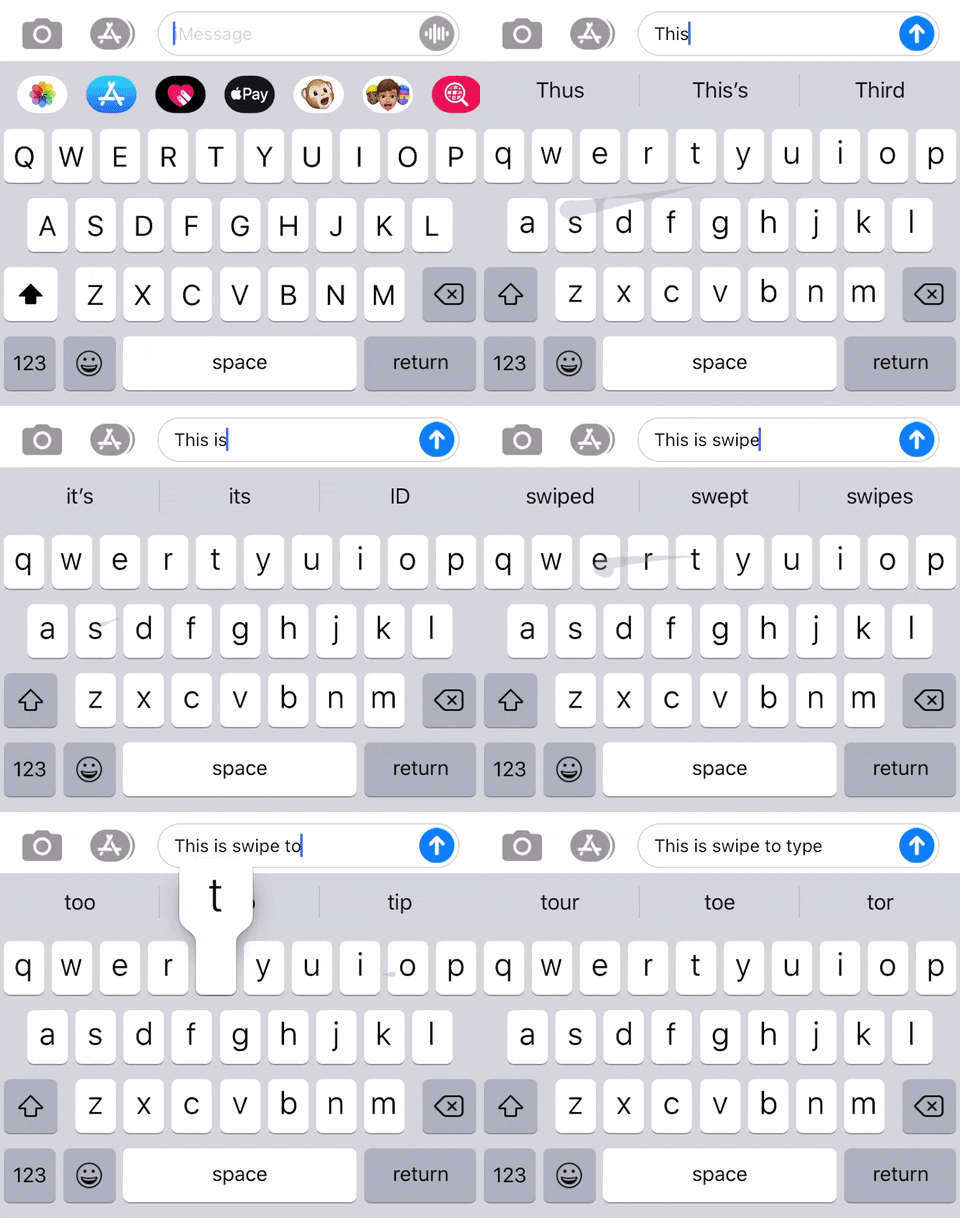
Joining the likes of Gboard, SwiftKey, and other swipe-typing keyboards, Apple's default QuickType keyboard now has a "Slide to Type" glide option called QuickPath. It's enabled right away, and you can even disable it if you want, but why would you want to?
10. There Are New Gestures for Editable Content
Apple added some much-needed gestures in iOS 13 for text editing, and they work no matter what keyboard you use. Swipe left with three fingers to undo (sure beats shaking your iPhone like a crazy person). Swipe right with three fingers to redo. Spread three fingers to paste. Pinch three fingers to copy. Pinch three fingers twice to cut. Tap with three fingers to open a menu that lets you do all of that.
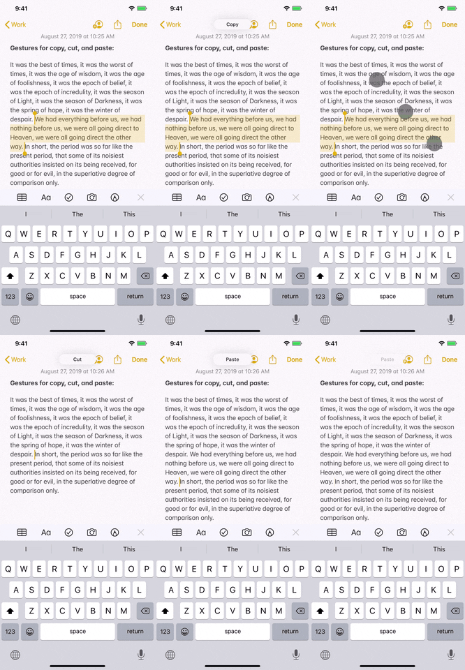
New copy, cut, and paste gestures (left); Undo, redo, menu (right).
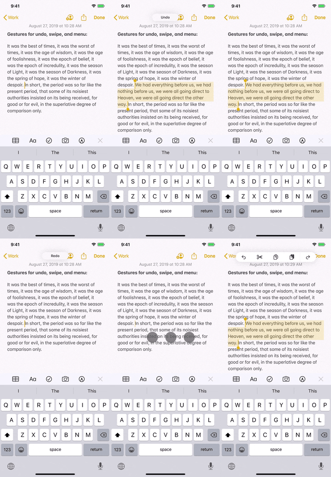

New copy, cut, and paste gestures (left); Undo, redo, menu (right).

11. The Cursor Is Easier to Move When Editing Text
Before, whenever you needed to move the cursor, you could tap-and-hold to bring up the magnified view, then drag to where appropriate. The magnifier was kicked to the curb in iOS 13, so now you just grab the cursor and move it without much thought. Some have found the change a bit annoying, since your finger basically blocks the cursor.
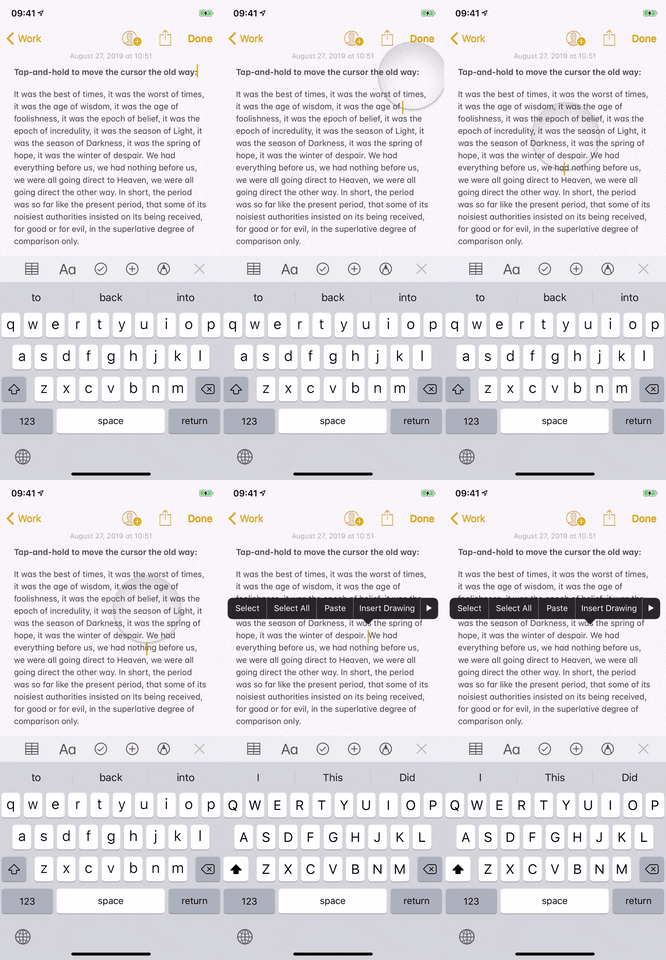
Moving the cursor in iOS 12 (left) and iOS 13 (right).
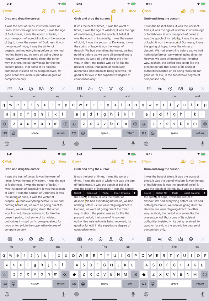

Moving the cursor in iOS 12 (left) and iOS 13 (right).

12. It's Easier to Place the Cursor in the Middle of a Word
In iOS 12 and under, you could tap the center of a word for the rest of your life and you'd never get it to go anywhere but at the beginning or end of the word. In iOS 13, that still applies, but if you long-press instead you can place the cursor in the middle wherever necessary. Once you get the hang of it, it's a great way to fine-tune your iOS writing.
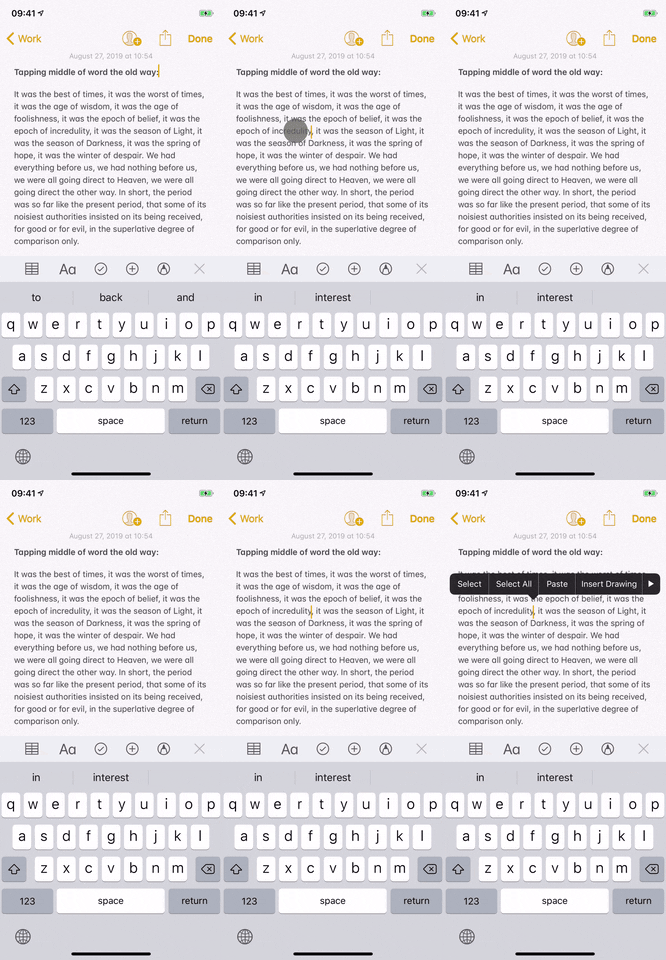
Trying to tap in the middle of a word on iOS 12 (left) and iOS 13 (right).
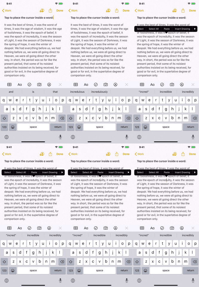

Trying to tap in the middle of a word on iOS 12 (left) and iOS 13 (right).

13. You Can Now Double & Triple-Tap to Highlight Text
You could always double-tap a word to select it when editing text, but now you can double-tap to highlight the sentence and triple-tap to highlight a whole paragraph.
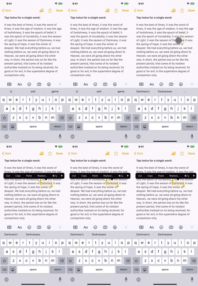
From left to right: Tapping twice, three times, and four times in iOS 13.
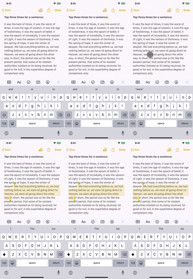
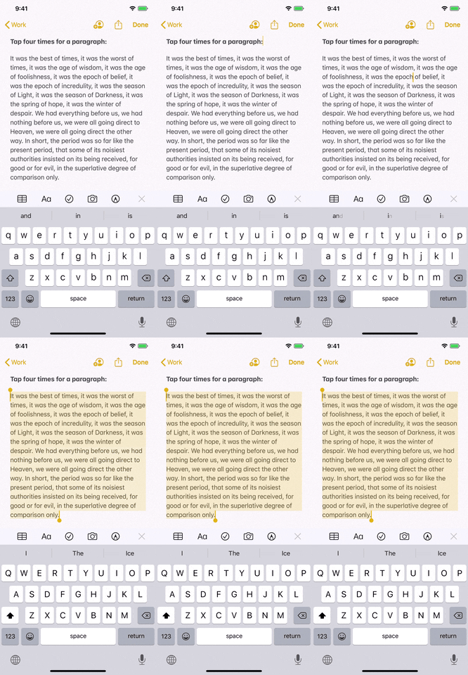

From left to right: Tapping twice, three times, and four times in iOS 13.


14. The Indent Tools for Editing Text Are Slightly Better
The previous "Indent Right" and "Indent Left" options in the contextual edit menu are now labeled as "Indentation." Tap that, and you get options to "Increase" and "Decrease" the indent.
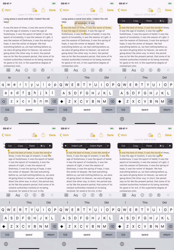
Slide to select and indenting on iOS 12 (left) and iOS 13 (right).
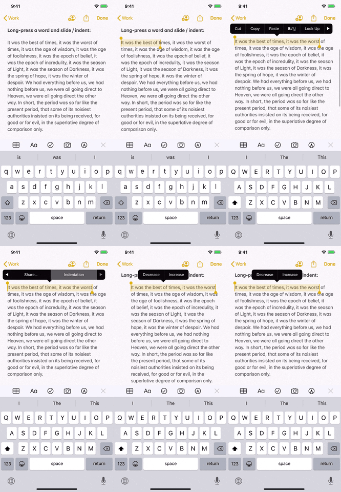

Slide to select and indenting on iOS 12 (left) and iOS 13 (right).

15. You Can Quickly Scroll Through Pages
You can long-press the scroll bar in any app that it appears in, such as Notes, Safari, and Settings, then move up or down to fast-scroll a page. This feature is a great addition to be sure, until you start grabbing the scroll bar by accident.

Scrolling in iOS 12 (left) vs. iOS 13 (right).


Scrolling in iOS 12 (left) vs. iOS 13 (right).

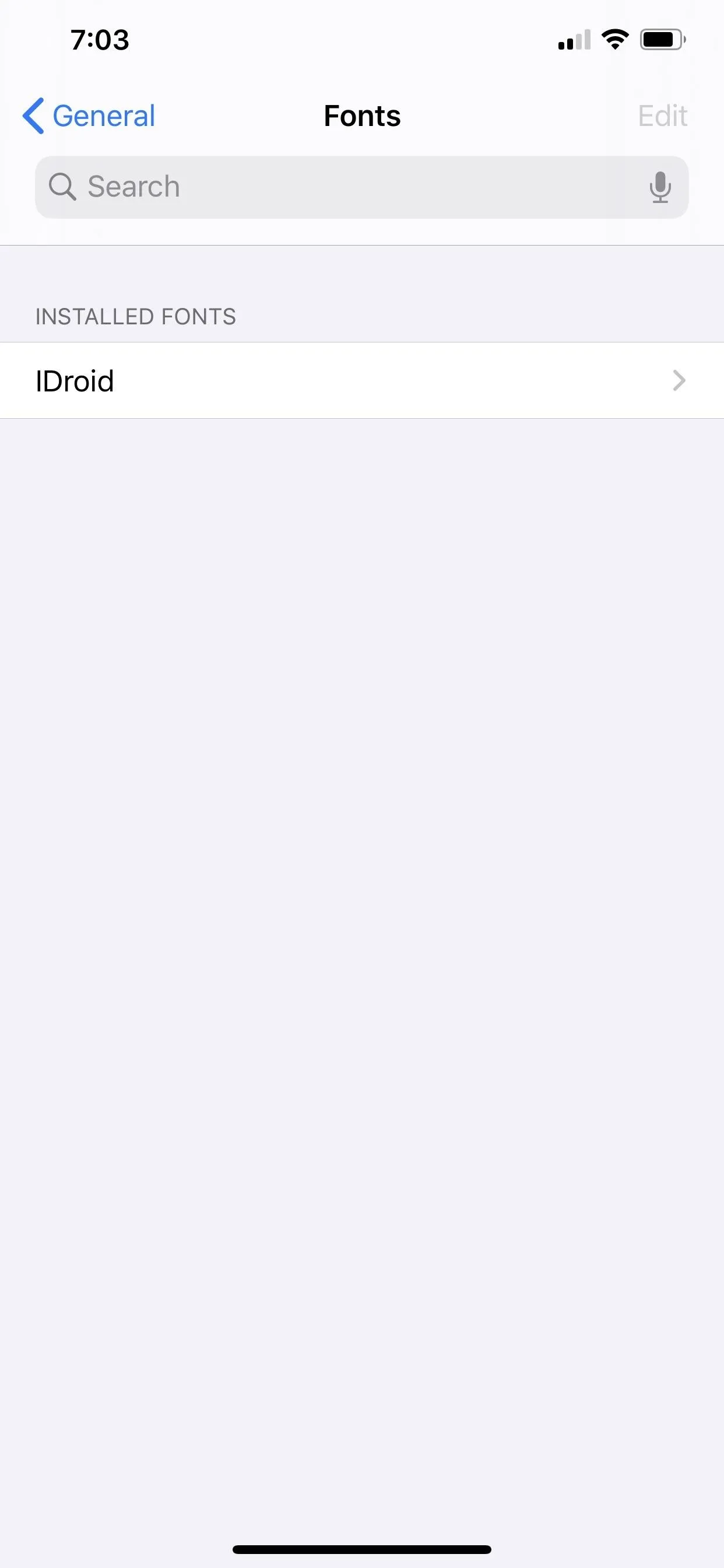
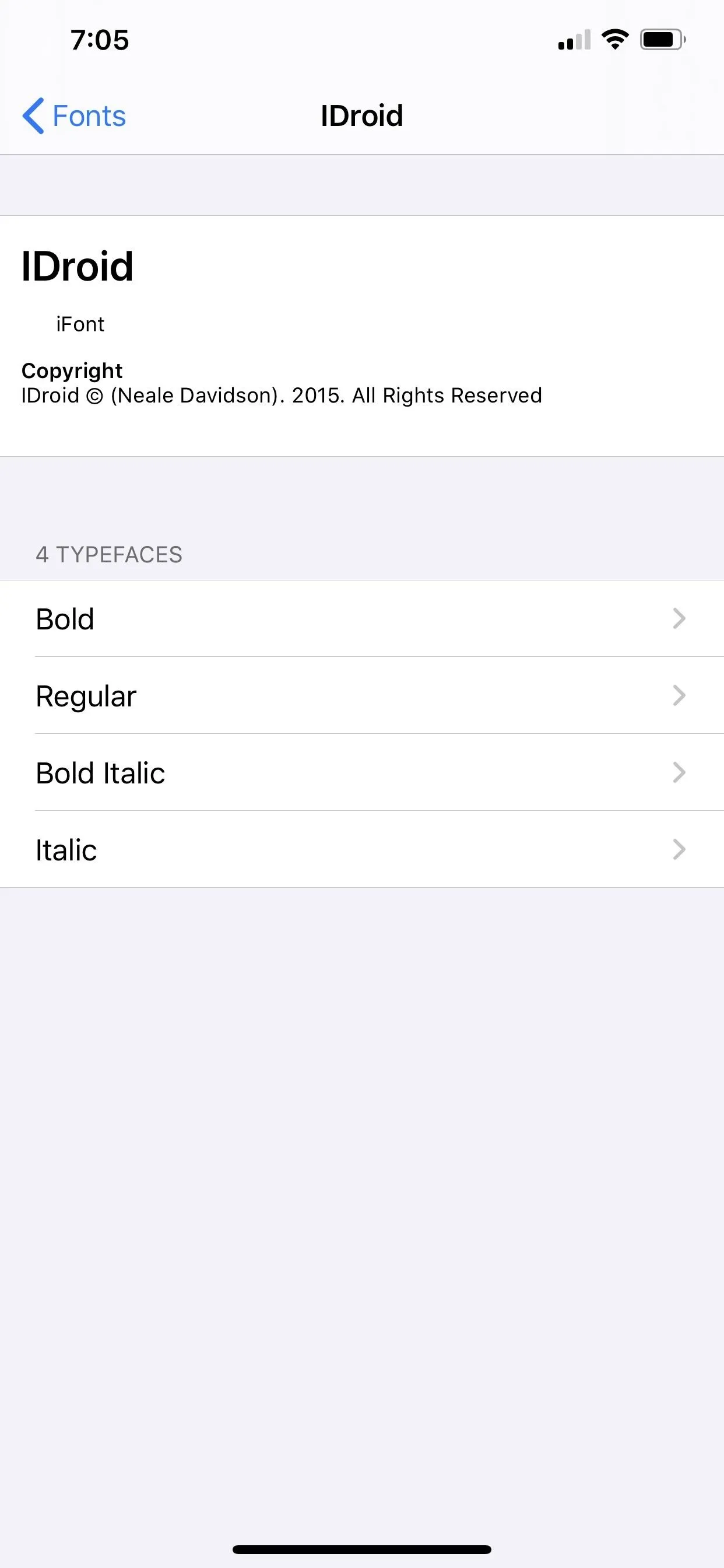
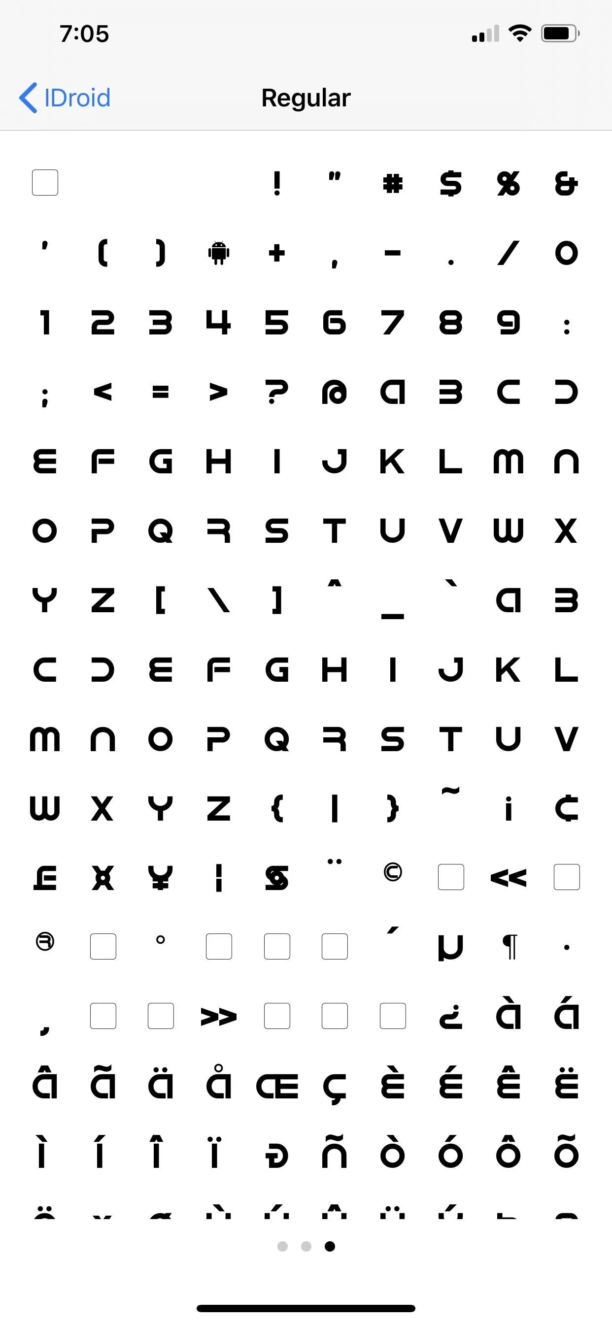
16. There's a Fonts Manager for Downloaded Fonts
You could install custom fonts before on iOS, and either TTF, OTF, or TTC files would work, but there was no way to manager them. Now, there's a "Fonts" manager that corrals them all.
If you install fonts via the old way, they are separate configuration profiles (not always safe), and you can only view them in the Fonts manager. However, third-party font apps that support iOS 13's new Fonts manager can install fonts directly to the system without any profiles involved. Those can be directly managed in the Fonts manager. Needless to say, all installed fonts are only available in apps and can't be used to change the system font.


17. There Are Settings for Auto-Joining Hotspots
There's an option in the Wi-Fi settings to "Auto-Join Hotspot" which can be set to ask, never, or automatic. These are for personal hotspots, like using another phone's cellular data.

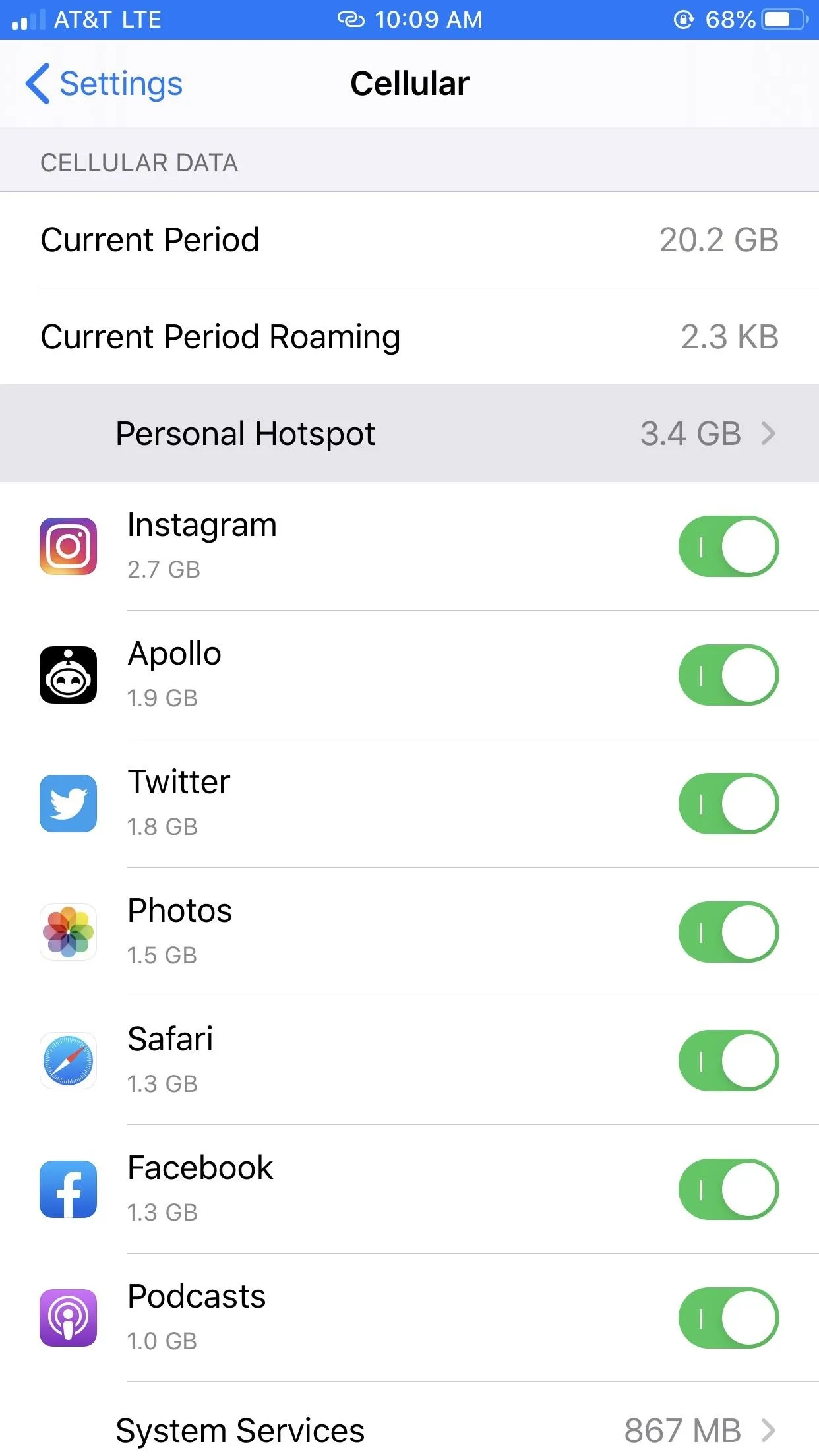
18. You Can View How Much Data Devices Suck Up from Your Hotspot
You can view the data in the "Cellular" settings. Each device that connected to your iPhone's hotspot will show up with how much data each used next to it.


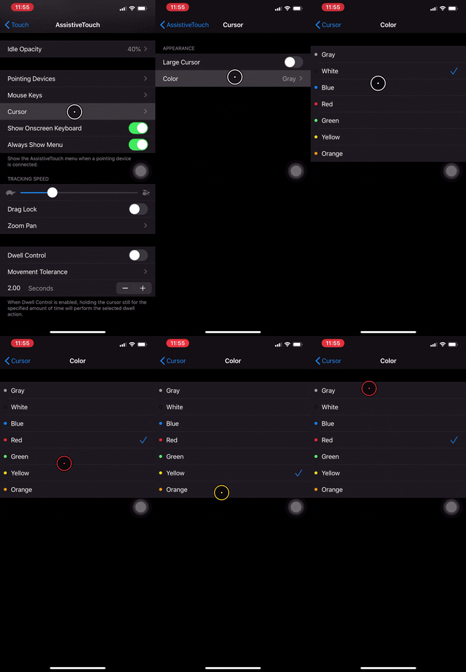
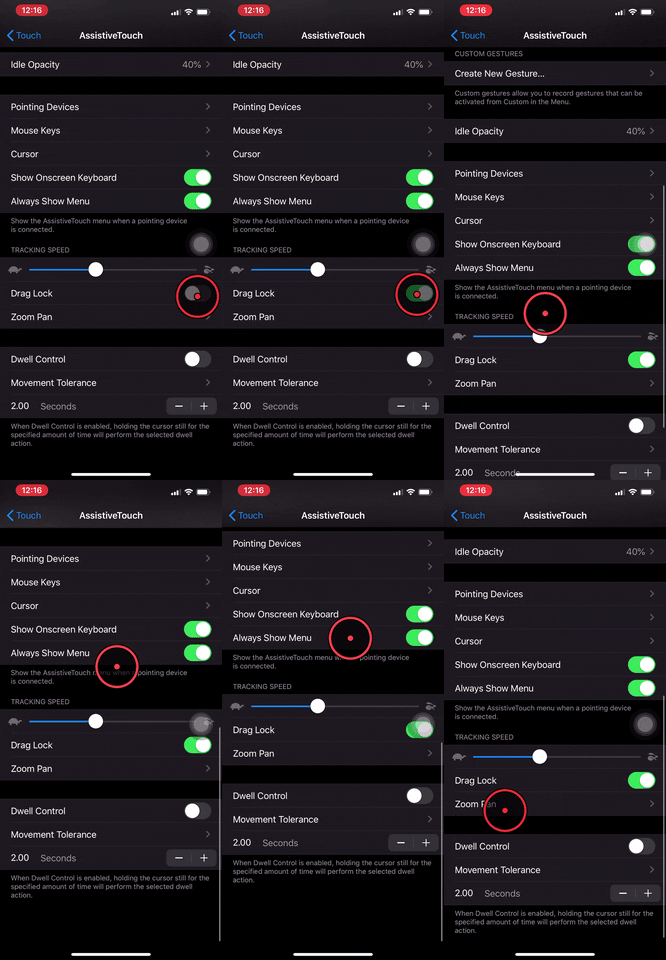
19. Bluetooth Computer Mice Work Now
You can use virtually any computer mouse, whether wireless or wired, to control pretty much everything on your iPhone. Great for people who have trouble swiping and tapping, but also fun for everyone else. Plus, there's an impressive level of customization here, like setting cursor appearance or tracking speed.


20. Your Battery Will Last Longer Overall
There's a setting that helps make your battery last longer overall. You'll notice it in action when your iPhone won't charge past 80% when plugged in or on a wireless charging hub. Your iPhone analyzes your usage to determine when the best time to complete charging is, saving on unnecessary charging to 100%.
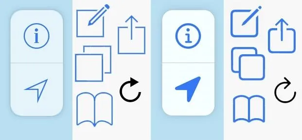
21. Glyphs Look Better for Menu Icons
There's a simpler, rounded glyph design for menu icons across iOS 13. Overall, they're cleaner and stand out more. The "round" design matches Apple's 2019 aesthetic better as well.
22. Haptic Touch & 3D Touch Are Similar
A lot of the things you could do with 3D Touch you can now do with Haptic Touch, such as view quick actions on the home screen. You can even "peek" in most places no matter which iPhone you have, though, the ones with 3D Touch seem to work faster. An overall, "pop" seems to be gone entirely, replaced by a static preview you tap again to view.
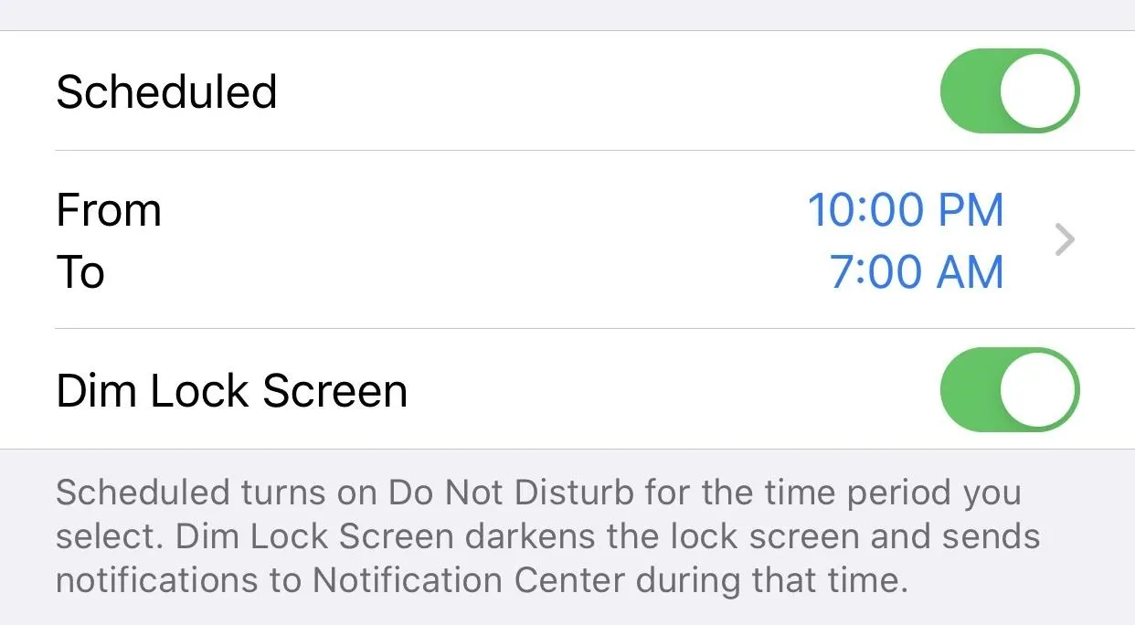
23. Bedtime Has Been Changed to Dim Lock Screen in DND Settings
The use of "Bedtime" for Do Not Disturb schedules was confusing in iOS 12 since it could be mistaken for the Bedtime feature in the Clock app. The latter lets you set an alarm, while the former just dimmed your lock screen and sent notifications straight to Notification Center. Now, Apple cleared it up by calling DND's scheduled option "Dim Lock Screen."
24. Modals Look Better in Some Places
Sheet and full-screen modals in Apple apps look like the Wallet ones from iOS 12.2, where the options in square white boxes appear in rounded white boxes with more padding overall (but it's still not everywhere).
25. You Can Disable the Wallet on the Lock Screen
There's a new toggle in the Face ID & Passcode and Touch ID & Passcode settings to disable Wallet on the lock screen. This option should appeal to anyone who wants an extra layer of security to their mobile payments, or those who activate Wallet accidentally far too often.
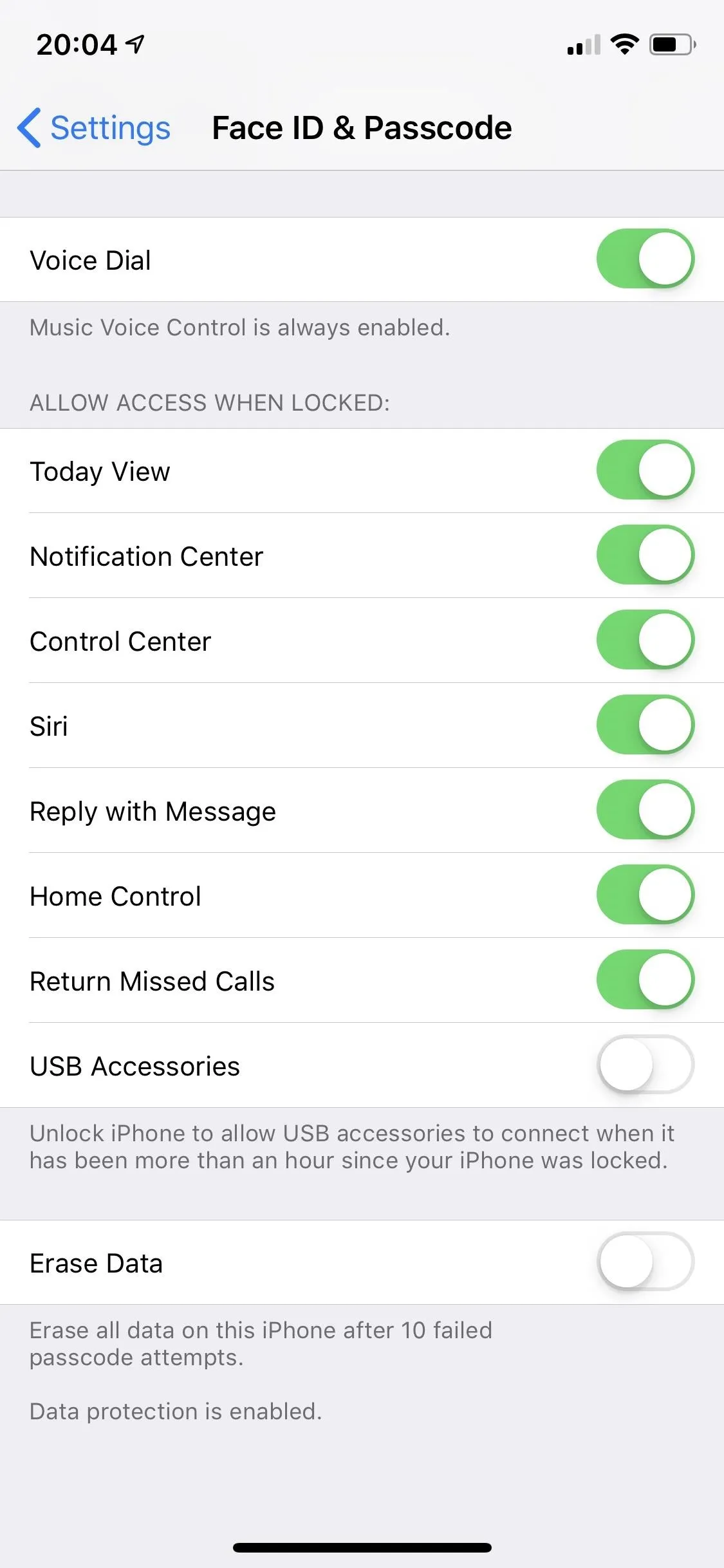
The biometric settings in iOS 12 (left) and iOS 13 (right).
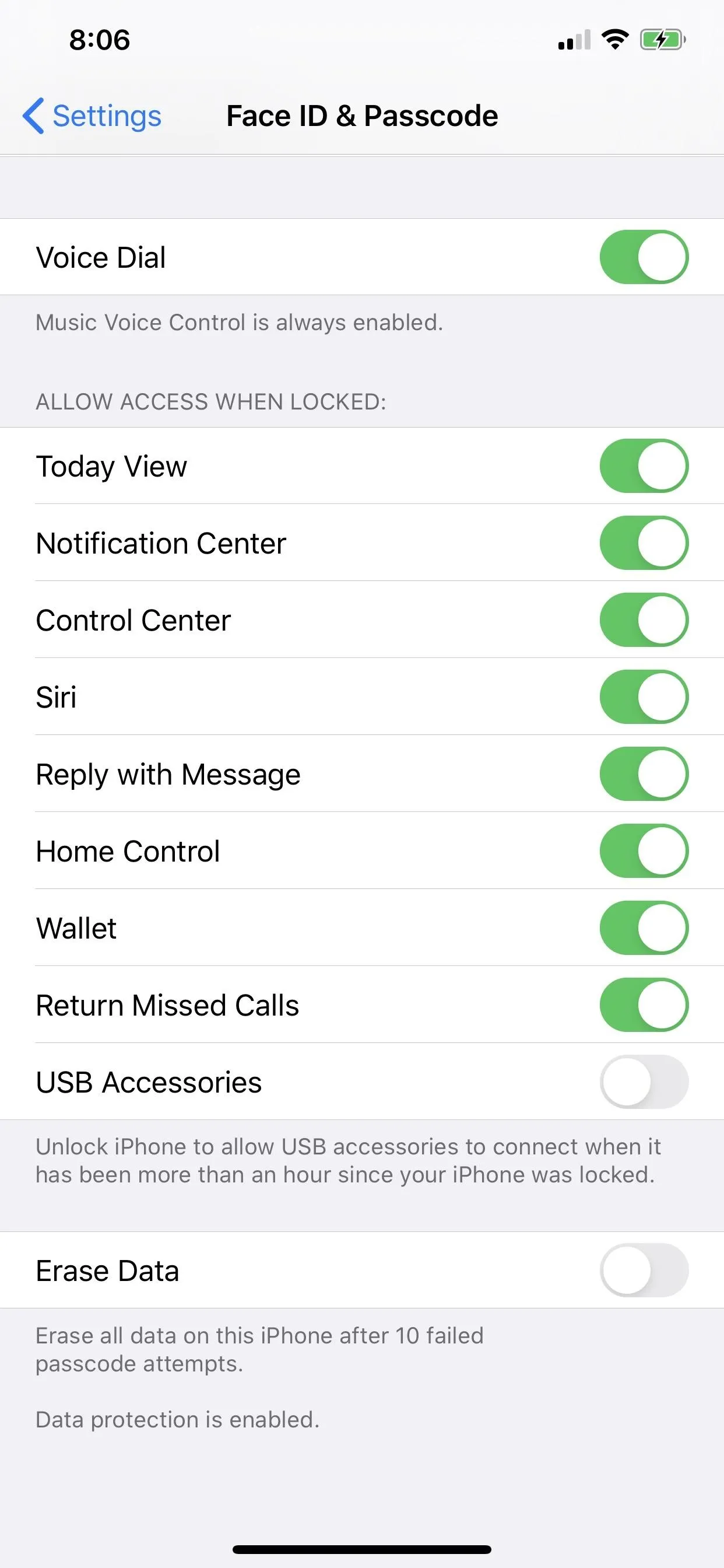

The biometric settings in iOS 12 (left) and iOS 13 (right).

26. Header Tabs Got a Makeover in Some Places
Some header tabs look different across apps such as in the Battery settings and in the iTunes Store.
27. The 'Edit' Button Is Now an Ellipsis Menu in Some Places
Some Apple apps have changed the "Edit" button in the top right to an ellipsis (•••) that holds "Edit" and more options via an action sheet.
28. You Can Use Dictation to Search
The dictation tool is now available in Search menus via the microphone button. Pretty much anywhere there's a search bar there's a mic now. It's a small but powerful new feature, since you can quickly use your voice to search throughout iOS. That said, third-party apps largely ignore this new option, so don't expect to find it in their Search menus.

29. There's a Completely Redesigned Share Sheet
Share sheet, aka activity view, is completely redesigned, with a header with basic info on what you're sharing, quick contacts, and a new vertical action extensions list. While the basic functionality is still the same here, you might find the vertical view more efficient than iOS 12's horizontal view.
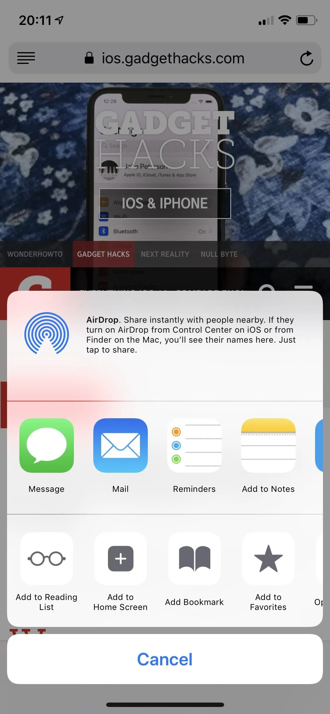
The activity view in iOS 12 (left) and iO 13 (right).
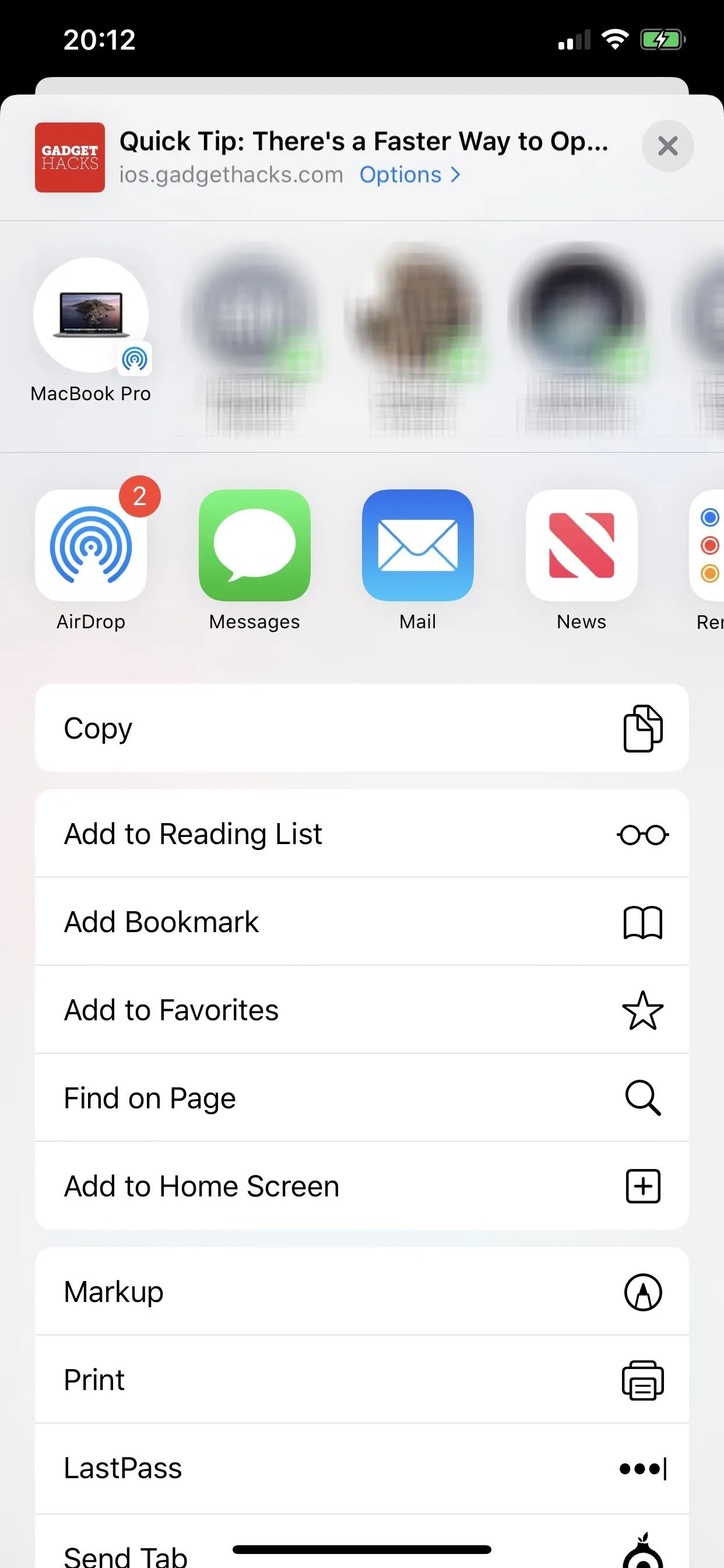

The activity view in iOS 12 (left) and iO 13 (right).

30. The Share Sheet Has Suggested Sharing Options
The row of quick contacts (seen above) not only has people you call or message frequently but also devices you AirDrop too, so you can transfer content much faster now. Of course, you can always choose the proper "AirDrop" option to see all compatible AirDrop devices in the area.
31. The AirDrop Button Moved to the Share Extensions
Speaking of which, AirDrop in the Share sheet is now an app-style icon in the sharing options row. However, devices you frequently AirDrop to will show up in the row of quick contacts. When you tap the AirDrop button, devices are separated by your devices and other people's devices.
32. Actions Options in Share Sheet Are in a List, Not a Row
The actions options in the Share sheet have moved from a bottom row to a vertical list of options. It better distinguishes share vs. action extensions, so there is no confusion what's what.
33. The Markup Tools Looks Different
The markup tool icons such as pencil and markers look like real ones now vs. just outlines. A simple upgrade that makes choosing your tools just that much easier.
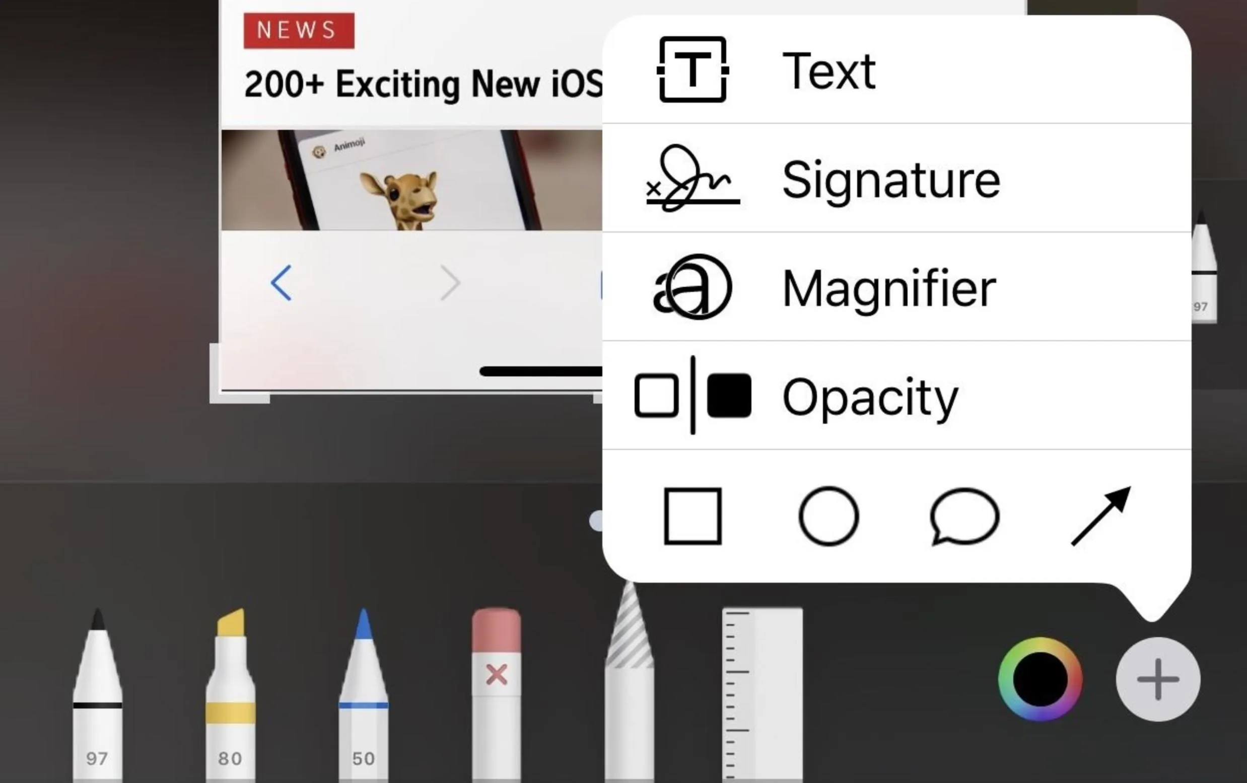
34. There's a New Opacity Markup Tool
When you tap the plus (+) icon in the markup tools, there's a new option for "Opacity," which gives a slider in which you can add a white overlay at different degrees of opacity. So if you need to draw more attention to your markups than the image, you can add a semi-transparent white layer over the image so that it's less distracting.
- More Info: Make Your Markups Stand Out More on iPhone
35. Cryptographic Operations Can Be Built into Apps with Swift
While Apple had a framework for cryptography before that developers could use, now there's a new CryptoKit for devs to utilize in Swift. New features include encryption algorithms such as SHA-256, as well as some other features, so you may see some improved cryptographic operations in apps. This framework does not mean iOS 13 has built-in support for cryptocurrency, though it's a step in that direction.
Files Improvements
While there aren't a ton of new features for Files, Apple's files manager for iOS, there are a few important ones you'll want to know about, especially if you use the app a lot.
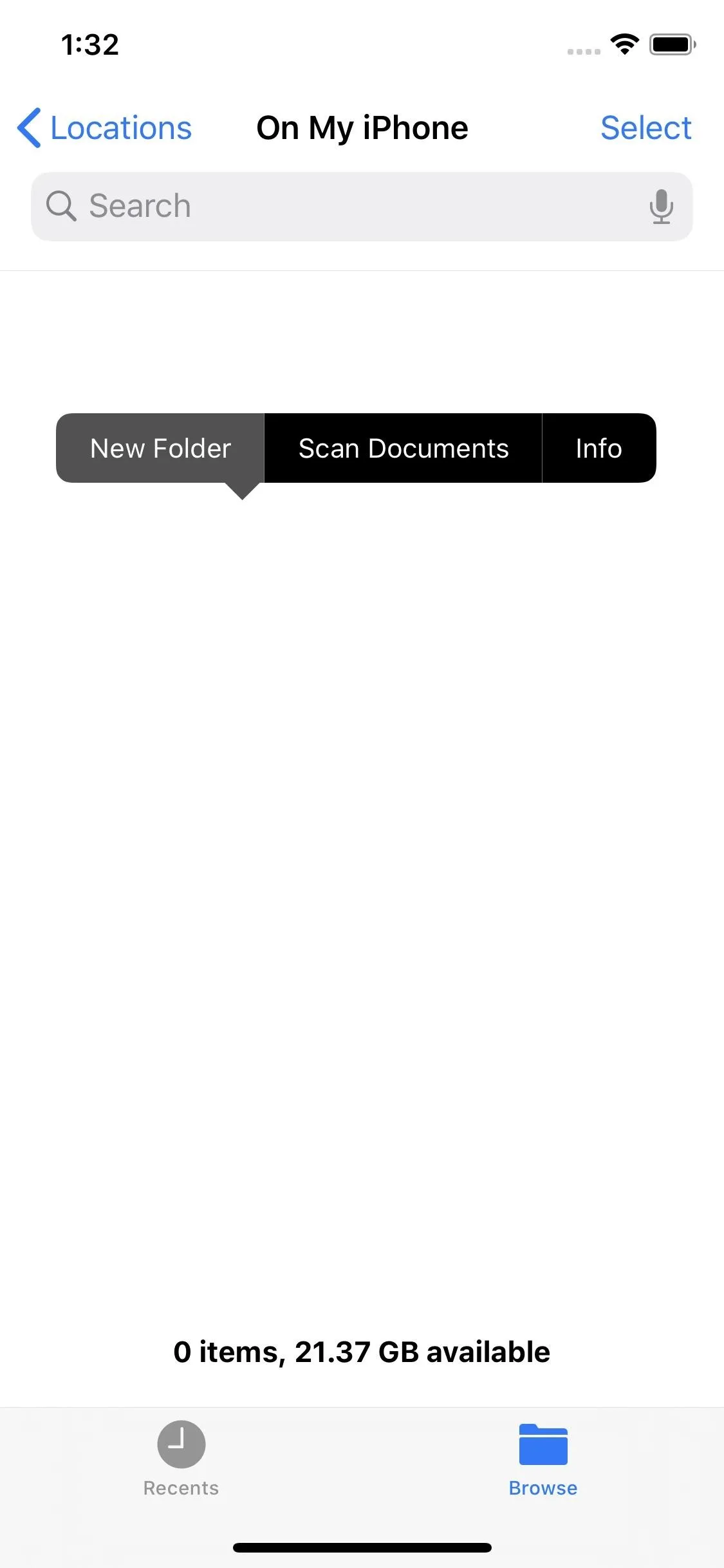
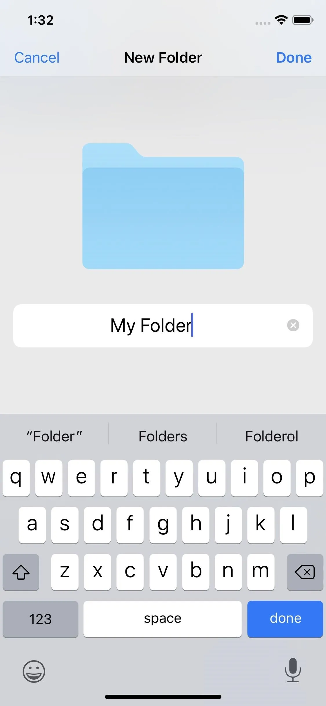
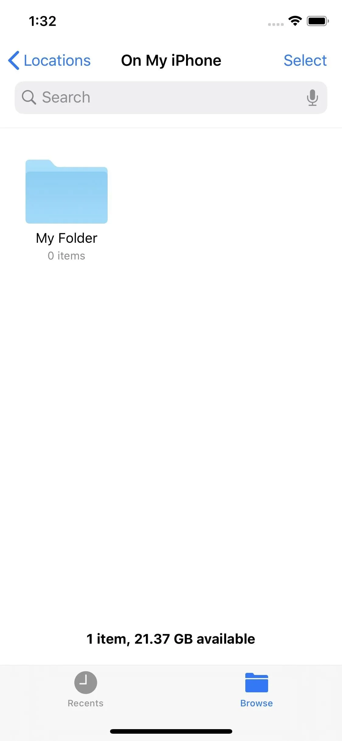
36. You Can Create a New Folder for on My iPhone in the Files App
For some reason, you couldn't create a folder in the "My iPhone" folder in Files before, but you can in iOS 13. Just hit the ellipsis (•••), then "New Folder."


37. You Can Scan Documents Right to Files
While you could scan documents into Notes before, it wasn't that useful because you were limited to doing everything from the Notes app. Now, you can scan documents right from the Files app, where you'd like to store the files in the first place, whether in iCloud, on your iPhone's storage, or in a third-party cloud service.
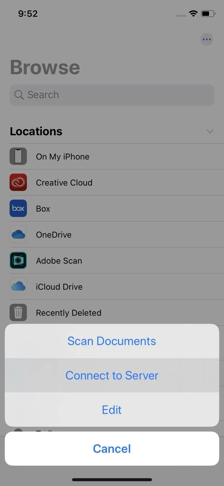
38. Files Supports Connecting to a Server
If you have an SMB server hosted on your home network or elsewhere, you can now connect to it via the Files app. And it'll work pretty much like any third-party cloud storage app you have connected, so you can not only access files on your server, such as an NAS, but you can write files to the server as well.



39. You Can Access Files on External Storage
If server integration wasn't enough for you, Files now supports the ability to access files on a USB drive, SD card, or hard drive. Whatever you can connect to your iPhone will work as long as it's a storage device.
40. There's a New Downloads Folder
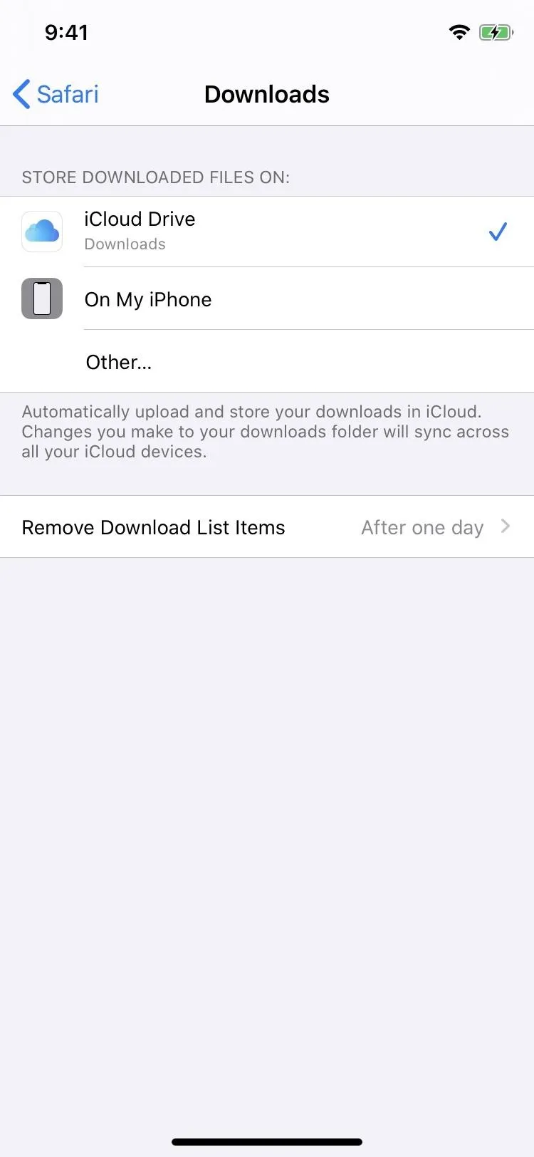
Anything you download from Safari or Mail will automatically be placed in a new "Downloads" folder in the Files app. By default, it's located in iCloud Drive, but you can change where downloads go to if you want them on another service or stored on your device directly.
41. Compression Works, So You Can Zip and Unzip Files & Folders
This one's awesome. Before, you couldn't open ZIP files on your iPhone, but now you can. Not only that, but you can create your own ZIP files from files or folders, which makes them more shareable.
42. There's a Better Search Tool with Search Suggestions
Let's say you want to find a document, but you're not sure what the name is. Before, if you would type in "doc," it would only show you results for things that have "doc" in the file or folder name somewhere. However, in iOS 13, if you do the same thing, it'll do that but will also give you suggestions such as "Pages document" or "PDF document." And that's just one example of the suggestions. Once you tap it, you could fine-tune the results by adding more keywords.
43. There Are New Shortcuts if You Use an External Keyboard
If you connect and external keyboard (great if you also connect a mouse!), there are now new keyboard shortcuts to help you navigate the Files app better.
Siri Improvements
If you use Siri or Shortcuts, there are a few new things you'll want to know about.
44. You Can Type to Siri Without It Taking Over Your Home or Side Button
Before, it was either you use Siri with voice input or Type to Siri with the Home or Side button shortcut. You could still use Hey Siri either way, but you may prefer using the button shortcut instead of saying "Hey Siri," while still retaining the ability to type to your assistant when needed. That's now possible. Instead of turning on Type to Siri, swipe down on the home screen and type your search in there. Then, scroll to the bottom and tap the new "Ask Siri" option.
45. The Shortcuts App Is Preinstalled
In iOS 12, we saw the new Shortcuts app, which took over Workflow, but it wasn't automatically installed on devices that updated. Instead, you had to download it just like you had to with Workflow in past years. Now, since it's a bigger and bigger part of iOS, it's finally preinstalled. You can still delete it, but you don't have to worry about downloading it either.
46. The Shortcuts App Is the Centralized Place for Suggestions Now
Before, Siri-suggested Shortcuts were available in the Siri & Search settings, which many people wouldn't even know to find. Now, with Shortcuts being preinstalled in iOS 13, suggestions have moved into the app.
47. There's a New Indian Voice for Siri Available
The title there pretty much explains it all.
48. Siri Has an Improved Voice
Speaking of voices, Siri's voice is more natural-sounding, "particularly while speaking longer phrases, with a voice that is generated entirely by software," as Apple puts it. Its neural TTS system helps by improving prosody, or the patterns of stress, intonation, tone, and rhythm in spoken language.
49. Siri Provides for Proactive Suggestions
Siri offers more personalized suggestions in Apple Podcasts, Safari, and Maps, and it can even detect events in third-party apps and has more integration in Apple Messages and Reminders.
50. SiriKit Adds Support for Audio-Related Apps
If app developers choose to implement SiriKit for Audio, you could then use Siri to play music, podcasts, audiobooks, and radio stations from within those apps instead of Apple's own apps.
51. You Can Ask Siri to Tune into a Live Radio Station
If you have a favorite radio station in Apple Music or a third-party radio app such as TuneIn, iHeartRadio, and Radio.com, you can now access it even faster by telling Siri to tune into it.
52. Your HomePod Can Give Personalized Experiences for Each Home Member
The updated Siri for HomePod can now recognize different family members by voice. By doing so, Siri can provide a more personal experience for each home member. So if someone wants to listen to a playlist from Apple Music on their account, they can without affecting your Apple Music account. They can even send messages and perform other personalized requests.
And if you or a family member wants to hand off music, podcasts, calls, etc. to iPhone, it just takes bringing the iPhone close to the HomePod to do so. Live radio is also supported as described above but requires sign-in with the Apple ID used for iTunes.
Control Center Improvements
The Control Center, which you access from either a swipe down from the top right or a swipe up from the bottom, depending on your iPhone model, has a few more things that make it even more convenient.
53. You Can Select a Different Wi-Fi Network
After expanding the connectivity control panel in the Control Center, long-press the Wi-Fi icon to select a different Wi-Fi network right away.
54. And Get Quick Access to Wi-Fi Settings
After long-pressing the Wi-Fi icon, there's a new option for "Wi-Fi Settings" that jumps you right to them in the Settings app, something we've been wishing would happen for a long time.
55. You Can Select a Different Bluetooth Device
After expanding the connectivity control panel in the Control Center, long-press the Bluetooth icon to select a different Bluetooth device right away. You won't be able to pair Bluetooth devices here, but you can select from any paired ones that are available to connect to.
56. And Get Quick Access to Bluetooth Settings
After long-pressing the Bluetooth icon, there's a new option for "Bluetooth Settings" that jumps you right to them in the Settings app. If you need to pair a new set of headphones, a computer mouse, or other Bluetooth peripheral, this is a fast way to start doing it.
57. There Are New Glyph Icons for the Volume Control
There's a glyph icon in the Control Center's volume slider that shows an iPhone when you aren't using external headphones or speakers, and it displays a Bluetooth symbol for Bluetooth devices.
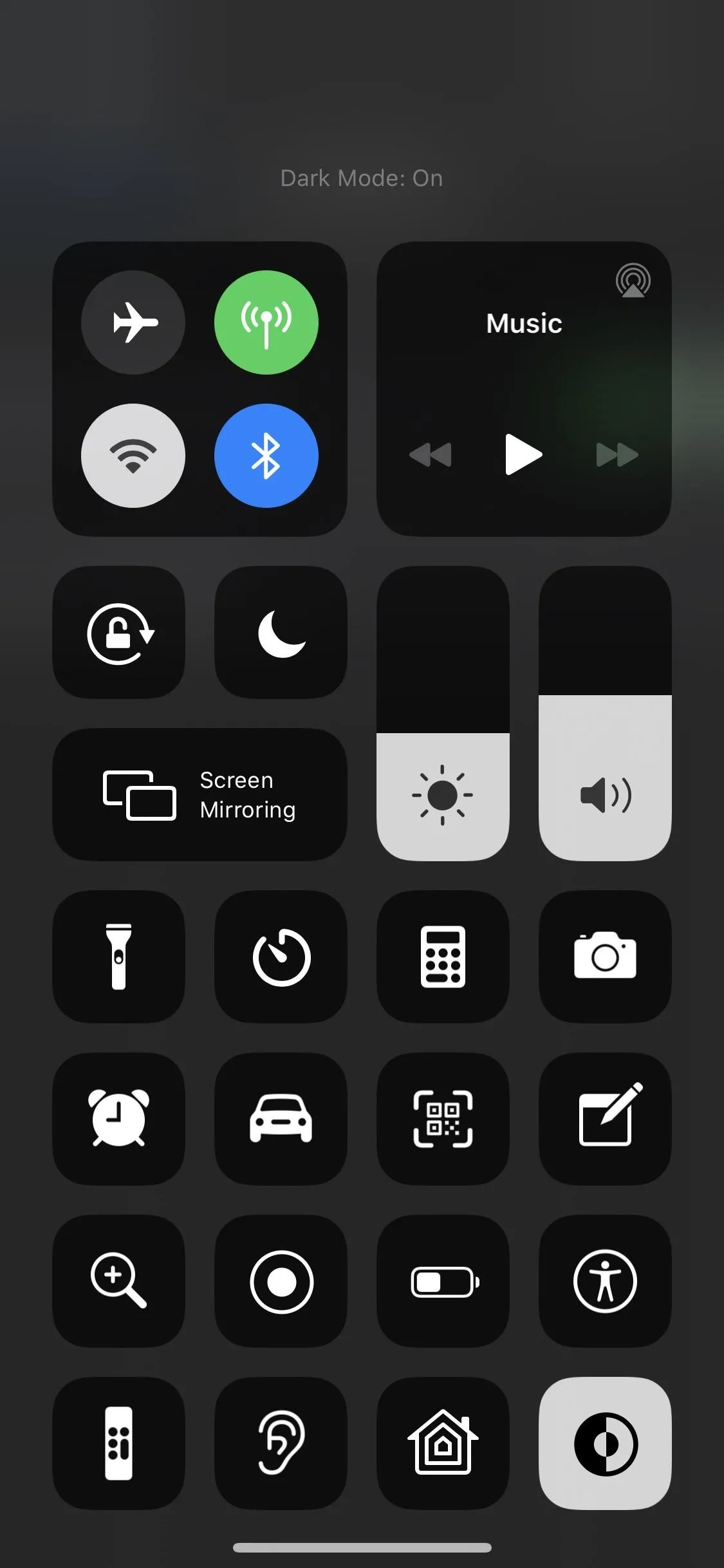
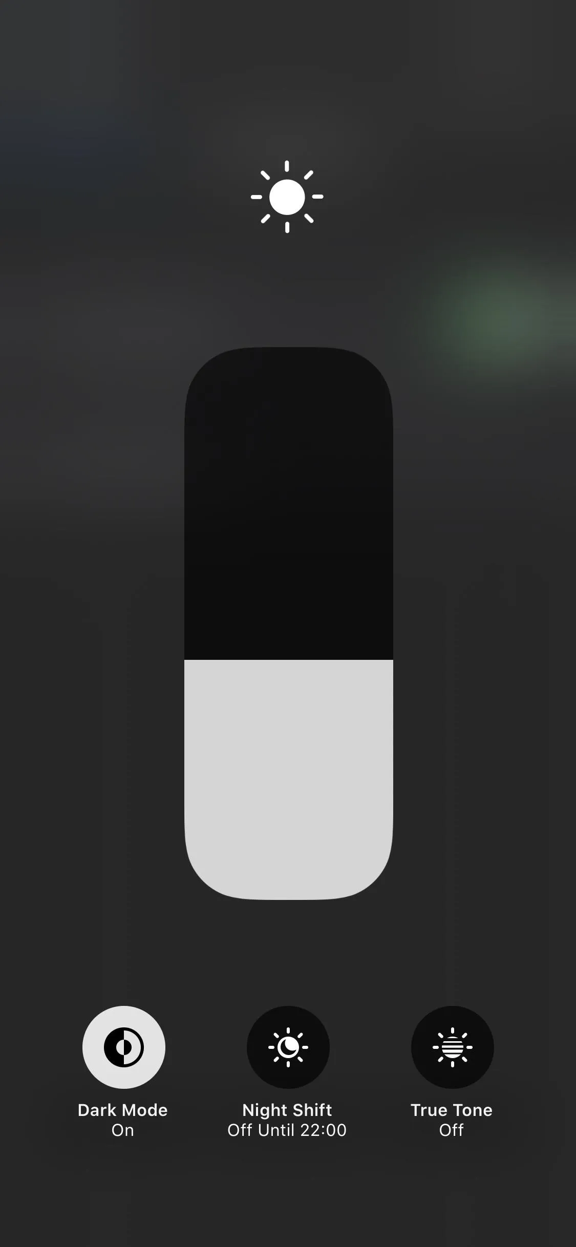
58. You Can Control Dark Mode from the Brightness Slider or Solo Toggle
There's a new "Dark Mode" option in the brightness slider to go from Light to Dark Mode quickly, so you don't always have to go into the Settings or rely on your Dark Mode schedule. There's also a solo Dark Mode toggle you can add for even quicker access.


Mail Improvements
Mail has needed improvements for a while now, and iOS 13 is finally starting the process. While there is a lot of new stuff here, the thing I wanted the most — a "Select All" option during search queries — is noticeably absent. However, there is a new gesture to select multiple emails at once that fills that gap.
59. Icons in the Toolbar Are Streamlined
The toolbar when reading an email now only contains a Reply and Trash icon, but the Reply button houses the Flag and Move Message options.
60. Reply Menu Has More Options
In the Reply menu, there are options for reply, reply all, trash, forward, mark as unread, move to junk, move to a different mailbox, archive, mute, and flag options.


61. You Can Mute Conversations
Mute conversations either via the new Reply menu, from the "More" menu when swiping on emails in lists from a mailbox or folder view, or when long-pressing to bring up the contextual menu.
62. There Are Options When Muting Threads
Settings are available to choose "Mark as Read" or "Archive or Delete" when muting threads.
63. Attachments Can Be Added or Removed from Replies
You can choose when to include attachments with replies.
64. Long-Press for More Options
There are more options when long-pressing an email on all iPhone models vs. what was only available when Peeking and Popping with 3D Touch before.
65. There Are Different Flag Colors
When flagging in an email directly, you can choose different flag colors. But only from the Reply menu in the email itself.

66. You Can Block Emails from Specific People
There's an option to block incoming emails from a specified sender now. First, you choose whether you want emails from blocked senders to go to your trash folder or to just go to your inbox silently. Then, you block the contact or sender either from within an email directly or from within Mail's settings.


67. There's a Toolbar Above the Keyboard
A new formatting bar above the keyboard lets you insert media and attachments and perform other edits.
- More Info: Use Mail's New Formatting & Attachments Toolbar in iOS 13 for Rich Text, Document Scanning & More
68. There Are More Formatting Options
There are new text formatting options for fonts, size, color, strikethrough, alignment, lists, and indents.
69. More Fonts Are Supported
All system fonts and acquired fonts are supported.
70. The Photo Picker Doesn't Take Up the Whole Screen
The new photo selector is smaller so you can view email and choose photo at the same time.
71. The Send Button Looks Different
The old "Send" button when composing a draft is now an up arrow icon.
72. Emails Have Backgrounds for Separation
Emails and contact names in the To, Cc, and Bcc fields are now highlighted with a background when one of those fields is selected, to help separate them better.
73. The Email Address Auto-Complete Is Better
Not much to say about this one but the obvious: It provides better email address auto-complete.
74. There Are New Message Headers
When composing a draft, the "New Message" header, which also shows the subject line when filled in, is HUGE now and below the "Cancel" button instead of beside it, though it can be hidden and reverted to the old view by swiping up on the draft.
75. There's Less Confusion When Replying & Forwarding
You can no longer create a new draft when reading an email, only Reply or Forward.
76. There's a Fast Way to Select Multiple Emails
Multiple emails can be selected by dragging two fingers together down or up a list while in edit mode.
Messages Improvements
The Messages app got some love in iOS 13, too. There are some interesting features for iMessage, as well as Animoji and Memoji news to be excited about.
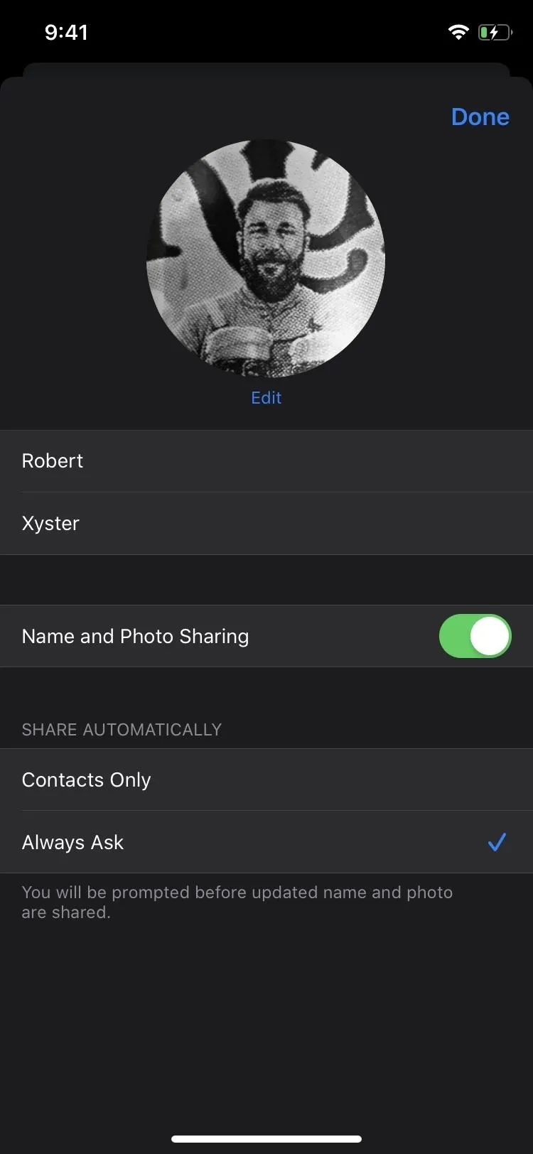
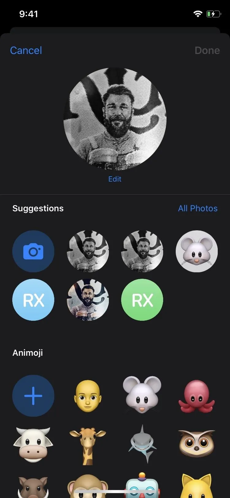
77. You Can Add Profile Photos for iMessage
If there is no photo of you in the other person's contacts, you can add a profile photo and share it on a case-by-case basis. Profile pics, profile Memoji, or profile monograms all work.


78. There Are More Memoji Goodies
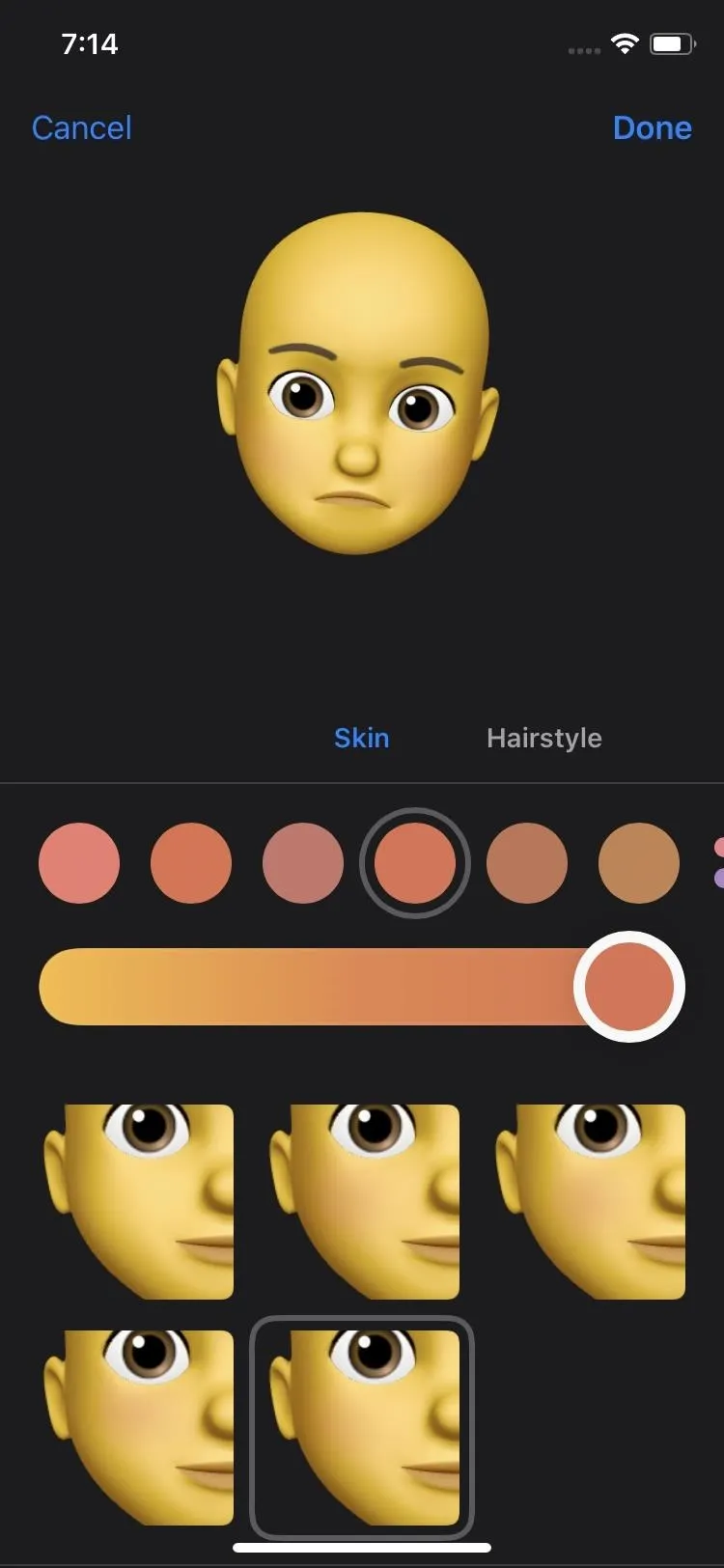
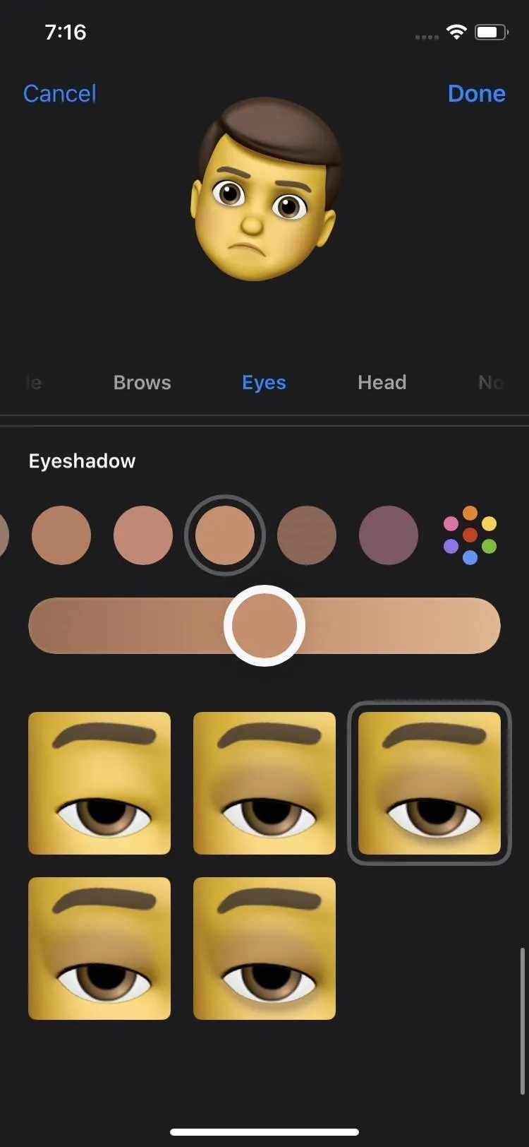
We've got more Memoji customizations such as braces, piercings, makeup, hairdos, etc. Completely new tools include blush for cheeks, beauty spots, eyeshadow, eyeliner, brow piercings, forehead marks, lipstick, nose piercings, mouth piercings, tongue piercings, and teeth, while headwear, eyewear, facial hair, earrings, hairstyles, eyelashes, and eyebrows received more options.


79. And There Are New Animojis
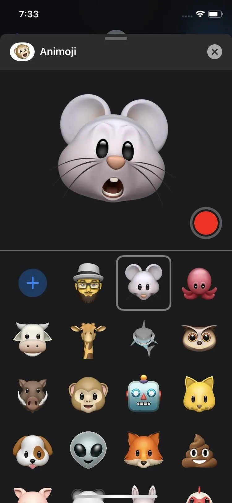
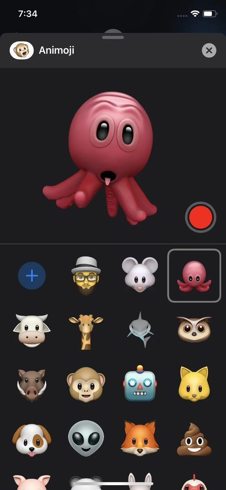
There are three new ones, so have fun with the mouse, octopus, and cow heads. That brings the total up to 27 Animojis.


80. There Are Memoji Sticker Packs
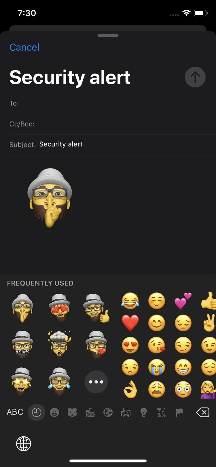
Memoji stickers packs are created for each Memoji you make. Plus, all of the Animojis have stickers too. To help keep them organized, stickers have their own iMessage app icon in the Messages toolbar. And you can access frequently used stickers right in the Emoji keyboard.



81. Details Are a Bit More Organized
The Details pane for each conversation is more organized now, so information is easy to browse, such as photo attachments and web links.
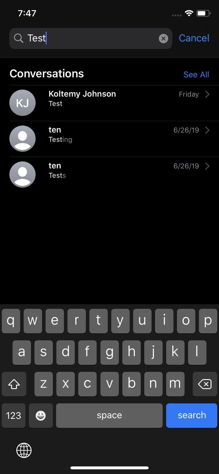
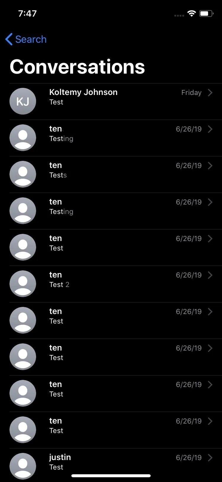
82. Faster Results When Searching
Searching messages gives immediate suggestions, so before you even type anything, you'll see message threads, web links, photos, other attachments, and more.
83. Searches Are Categorized
Searches will have categorized results with terms highlighted. So no more digging for a photo or document someone sent you. Even web links get their own section in the search results.
84. Specific Threads Can Be Searched
You can search in specific conversations, not just the whole app. You still use the search tool on the main page with all your threads, but after searching for a word, you can enter those threads to find multiple instances of them. Tapping on one jumps you right to that part of the conversation. Before, you could only see the last mention of the search in the thread, not all of them.


85. More Devices Support Animoji & Memoji Stickers
All A9 and higher devices support Memoji and Animoji sticker packs. That means everything iPhone from the iPhone 6S and up can join the fun.
Photos & Camera Improvements
The Photos app in iOS 13 receives a lot of love, with a slightly better interface, better curation, more on-device machine learning to help show you only the important stuff, and so on. The Camera app also has a few goodies to know about.
86. The 'Photos' Tab Sorts by Time Better
You could view in days, months, and years in the "Photos" tab before, but it was a bit confusing. Now, it's very clear, with "Days," "Months," and "Years" getting their own tabs, as well as "All Photos."

iOS 12 (left) vs. iOS 13 (right).
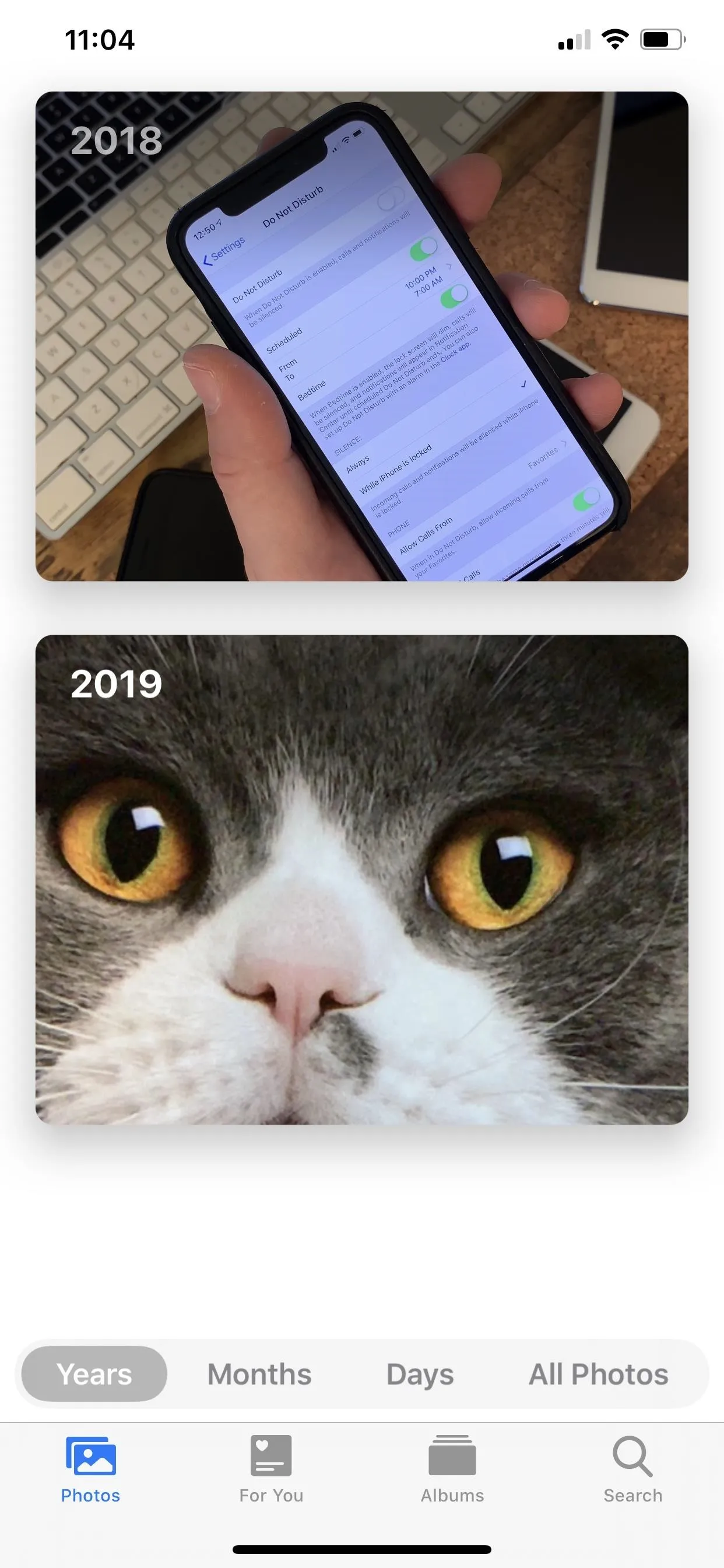

iOS 12 (left) vs. iOS 13 (right).

87. Media Is Curated with On-Device Machine Learning
In the new "Years" view, content is contextual so that you may see different results on different days. For the "Months" view, it curates photos and videos by events, which could be anything, such as a birthday party, family outing, concert performance, festival, social event, special trip, anniversary, and so on. When it comes to "Days," the feed is curated so that only your best shots show up; Pictures and videos are highlighted in bigger slots that may be interesting to you or may represent the day best — those highlights will playback in a live preview full of motion.
88. Duplicate Content Is Hidden in the 'Photos' Tab
In the "Photos" tab, the app automatically hides duplicate content in the time-based views, so that you see the best shots always and less clutter. However, you can view the rest in the "All Photos" view, as well as in albums directly in the "Albums" tab.
89. There's an 'On This Day' Feature in the 'Photos' Tab
In the "Years" view, Photos may look back at images and videos from a significant event around today's date in past years, so you reminisce more accurately.
90. The 'Photos' Tab Will Help You Remember Birthdays
If it's the birthday of somebody found in your "People" album, you may see media that involves them over the years in the "Years" view of the "Photos" tab. These will remind you of past experiences and help jog your memory so you can send the appropriate birthday wishes, if any.
91. Media Displays in the 'Photos' Tab for Specific Events
For the "Months" view in the "Photos" tab, it curates photos and videos by events. As mentioned before, that's birthday parties, family outings, concert performances, festivals, social events, special trips, anniversaries, and so on.
92. Event Titles Display in the 'Photos' Tab
Months displays the location or event's name to help you discover past content more easily. You can see events such as a birthday party, family outing, concert performance, festival, social event, special trip, anniversary, etc.
93. The 'Days' View in the 'Photos' Tab Only Shows the Good Stuff
Things that won't appear in the "Days" view in the "Photos" tab are screenshots, whiteboard photos, receipts, and other documents.
94. There Are Contextual Transitions in 'Photos' Tab
When navigating content in any of the "Photos" tab's views, there are animations and transitions that help you keep your place in the timeline. Switching between "Years," "Months," "Days," and "All Photos" is easy since you'll never lose your place.
95. Live Photos & Videos Auto-Play in 'Photos' Tab
There are new auto-play previews for highlighted videos and Live Photos in the "Photos" tab. By default, they are muted, but if you tap one to view it, the sound will play. Go back to the list view before it's done playing, and the audio will continue, but only for that particular video or Live Photo.
96. Smart Photo Previews Help Identify Shots More Easily in the 'Photos' Tab
The "Photos" tab has a lot going on. As for smart photo previews, it varies the size of images and videos in the grid to help you better distinguish between media. And to make it even better, you may see a zoomed-in version of the real deal to show off the best part of the photo or video. Tap on it to view the full uncropped content.
97. Zoom In or Out in 'All Photos' to Scan More Easily
If you want to view all of your content, you can in the "All Photos" view in the "Photos" tab. There's a new (+/-) button that lets you zoom in from a five-wide grid to a three-wide one. Zoom in one more time, and you're viewing the image or video in the center of the screen. You can also use the buttons to zoom back out. Pinching also will let you zoom in and out in a similar manner.
98. Live Photos Can Be Much Longer Now
Live Photos can play longer if other Live Photos were taken within 1.5 seconds of the one being played. Since Live Photos already contain up to 1.5 seconds of footage before and after the shot — and depending on how many Live Photos you take within the needed time span — you can have a seriously long playback. However, from what we've seen, this is only for your enjoyment. If you send a Live Photos you saw that seemed overly long to someone else, they will only get the three-second version.
99. Searching for Multiple Words at Once Is Easier
You can perform multi-keyword searches without having to tap each word individually.
100. Memories Chooses Music Base on Your Habits in the Music App
If you use the "Memories" option in the "For You" tab, whenever you view a memory, the music that plays was pulled from the Music app based on your listening history, so it's more in tune with the type of songs you enjoy.
101. You Can Actually Edit Videos Now!
Perhaps the biggest new feature in iOS 13, the majority of the edits you could perform on photos you can also perform on videos now. So you no longer need a third-party editor unless you want to combine clips and add transitions.

102. Videos Can Be Reverted Back to the Originals
Video edits are nondestructive, so you can revert back to the original state, just like you could before with photos.
103. Edit Mode Shows the Preview Intensity for Each Adjustment
When editing a photo or video, whenever you adjust the slider underneath an adjustment such as Brightness, Saturation, Sharpness, and so on, the circle surrounding the adjustment's icon in the toolbar will show the strength of the intensity you chose. This makes it easy to see which effects are increased or decreased at a glance.
104. The Intensity of the Enhance Adjustment Can Be Adjusted
Just like with the adjustments toolbar, the enhance feature, which is basically the new "Auto" option in the adjustments list, can also have its intensity adjusted. Works for both image and videos.
105. You Can Control a Filter's Intensity
There were filters before, but now whenever you chose one, you can adjust its intensity via the slider underneath it, just like you can do on Instagram. Works for both image and videos.
106. You Can Quickly Toggle Off Adjustments
For every icon in the adjustments toolbar that's highlighted with the intensity preview indicator, you can tap on it to toggle off the effect, to see what the image or video looked like before that adjustment. Tap it again to reapply the effect.
107. You Can Review Each Effect Applied in Before/After Views
In edit mode, you can individually review each effect applied in before-and-after views. When on any tool section except cropping, tap the photo or video itself, and the original image will show you what it looked like before your edits.
108. You Can Adjust the Temperature & Tint
In both photos and videos, there are new white balance adjustment tools for "Warmth" (temperature) and "Tint." The temperature one goes from blue to yellow, while tint goes from green to magenta.
109. As Well as Sharpness, Definition & Noise Reduction
Control the intensity of the new "Definition" slider for clarity adjustments in photos and videos. Also new are the "Sharpness" and "Noise Reduction" which also help with the quality of the image.
110. Vibrance Is Also a New Adjustment You Can Make
The last new adjustment for photos and videos is the "Vibrance" tool, which brings out the colors in vivid detail.
111. And You Can Add a Vignette
In both photos and videos, you can use the new "Vignette" tool to add shading to the edges. It's been said that there are options for Strength, Radius, and Falloff vignettes, but those options have not been discovered yet.
112. There's a Red Eye Fixer
If people in your photos have the red-eye effect, you can tap the new "Red Eye" icon, then tap each red eye, to remove the redness. This does not work in videos.
113. You Can Pinch-to-Zoom During Edits
Just like it sounds like, you can pinch-to-zoom during edits on photos and videos. Before, you were locked into the full frame.
114. There's a High-Key Light Mono Effect in the Camera
There's a new "High-Key Light Mono" effect for monochromatic Portrait photos on a white background in the Camera app. Works on compatible iPhone models.
115. Change Position & Intensity of Portrait Lighting Effects in the Camera
Adjust the position and intensity of Portrait Lighting effects in the Camera app. This only applies to iPhone XR, XS, and XS Max.
Music Improvements
Apple's Music app didn't get a massive update this time, but there are some very welcomed features to use with your Apple Music subscription service and some for your personal music library too.
116. You Can View Time-Synced Lyrics
You could always view lyrics in Apple's subscription service, but now you can have an easier time singing along to music you haven't memorized the words for with time-synced lyrics. Not all songs that had lyrics before will have synchronized lyrics, but many do.
117. Tap Instead of Swipe to View 'Up Next'
Before, to view the songs in the queue to play next, you'd swipe up on the Now Playing screen in Music. In iOS 13, the "Up Next" list has a tab at the bottom of the Now Playing screen you toggle on to view what's coming up. The play controls are still visible unless you swipe up on the list to view songs playing seven or so spots later, then it takes over the whole Now Playing screen. If you always want to see what's coming up, leave the tab highlighted. Otherwise, you can tap to go back to the current album view.
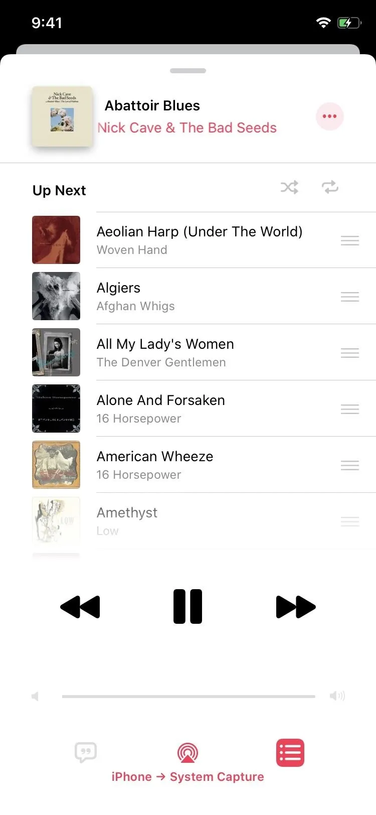
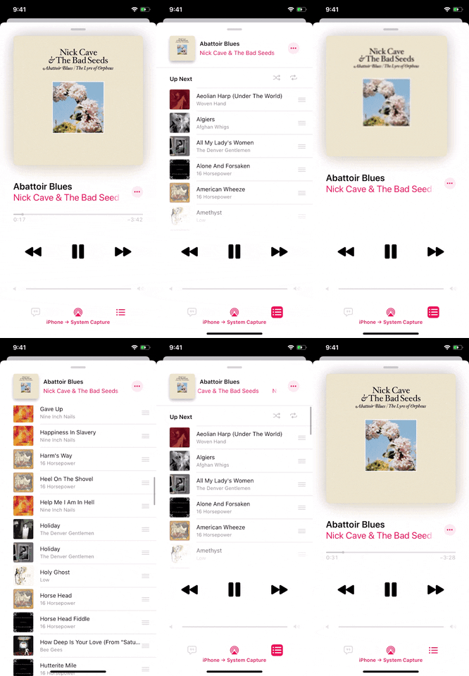


118. Music Tells You if a Song Is Already in a Playlist
From now on, whenever you attempt to add a song to one of your playlists, if it's already in there, Music will prompt you with "This song is already in your playlist." You can "Skip" adding it or add it again if you want.


Maps Improvements
Maps has a decent amount of improvements in iOS 13, some of which may finally pull you over from Google Maps or Waze or whatever navigation app you were using if not Apple Maps.
119. There Are More Detailed Maps
Apple has rebuilt the map from the ground up. The map has more details with realistic views of roads, beaches, parks, buildings, and other objects. Satellite images are also more detailed. However, there's a catch: It's only available in select cities and states right now. By the end of 2019, the new map should be rolled out across the entire US, with other countries getting it in 2020.

Apple

Apple

Apple

Apple
120. Events Will Show on a Location's Info Card
If a location (e.g., Apple Store, movie theater, etc.) has upcoming events, you can view them on the locations' information card. For the most part, it's up to businesses to add events to Apple Maps, so it'll probably be a while before everyone adapts it.

The old card in iOS 12 (left) vs. the new one in iOS 13 (right).
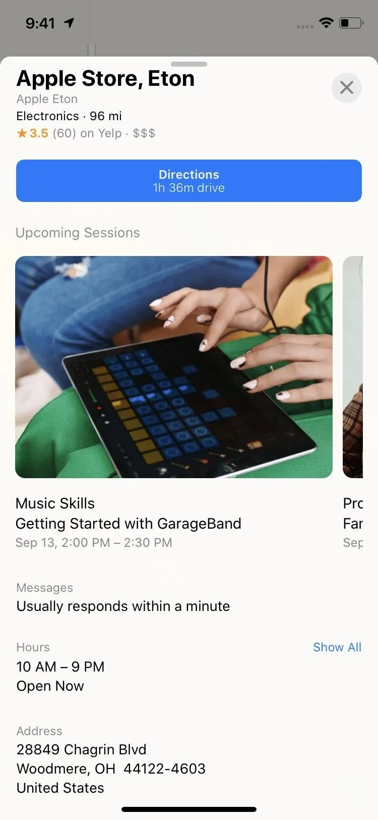

The old card in iOS 12 (left) vs. the new one in iOS 13 (right).

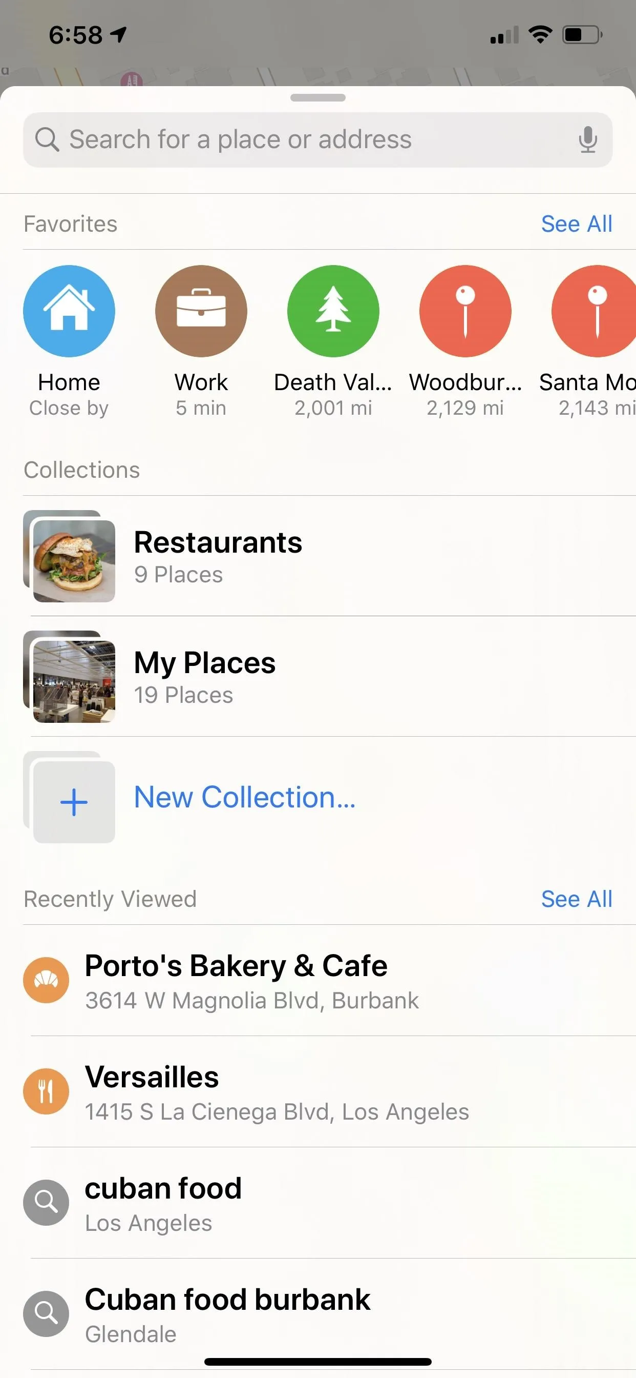
121. Favorites Can Be Added in Launch Screen
Before, on the Maps pull-up launch screen, you could tap "Favorites" at the bottom of the list of recent searches to view locations you've hearted. Now, those favorite places are right at the top of the launch screen.

Favorites in iOS 12 (left) vs. iOS 13 (right).
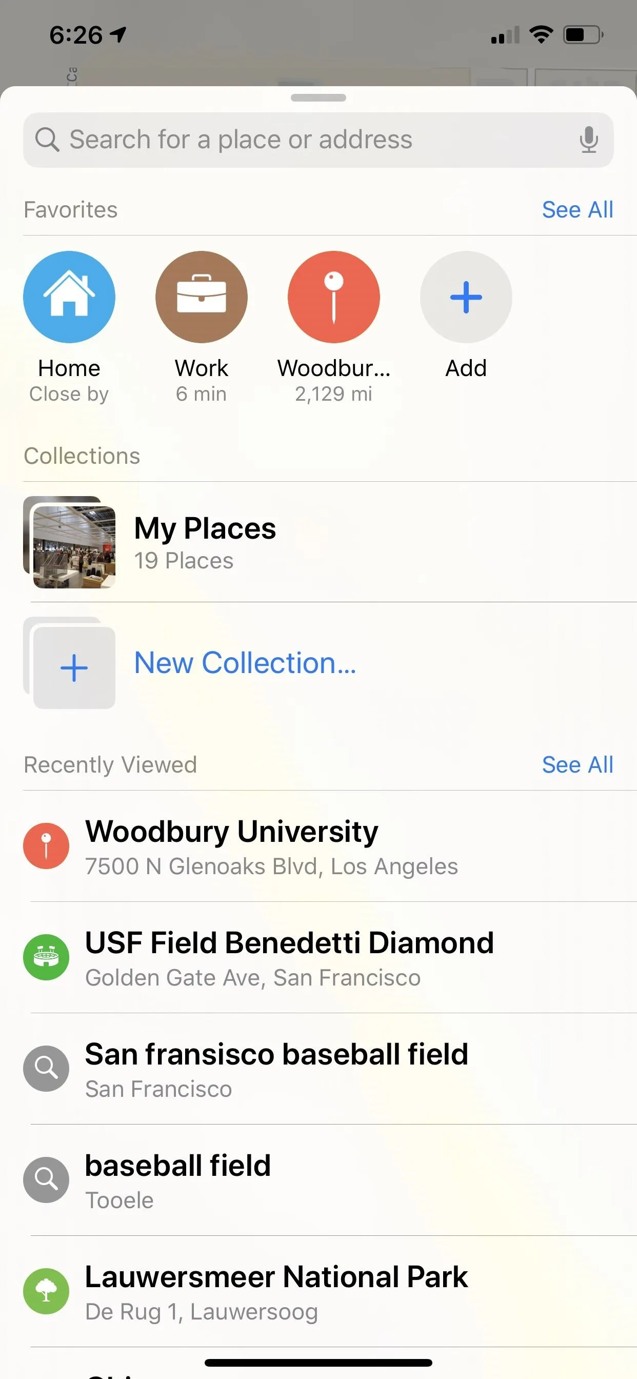

Favorites in iOS 12 (left) vs. iOS 13 (right).

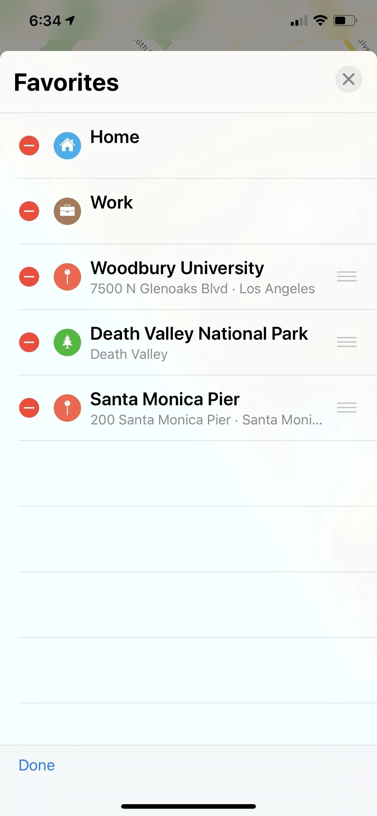
122. Favorites Can Be Reorganized Now
In earlier iOS versions, you could only view your list of favorites. Now, you can do that and rearrange them as well. Tap the "Edit' button, then drag and drop ones with lines next to them to where you want them. This comes in handy if you want something near the bottom of your list up at the top to show up on the launch screen right away.

Favorites in iOS 12 (left) vs. iOS 13 (right).

Favorites in iOS 12 (left) vs. iOS 13 (right).

123. You Can Create & Share Collections of Locations
New to iOS 13's Maps are Collections. You might already have one created from all the pins you've set in the past, but you can also make new ones and add any location to them you want. Better yet, your Collections are shareable, so you can share all your favorite restaurants in one go to anyone.



124. Look Around for a 3D-Style 360-Degree Street View You Can Navigate
We've had access to "Flyover" cities and virtual city tours in Apple Maps, as well as satellite 3D views of most locations, but now we've got even more to help navigate places before arrival. The new "Look Around" feature gives an immersive 3D experience with 360-degree views. If you see the binoculars icon, tap that to get started. The transitions as you move around or amazingly seamless.


125. Junction View Comes to China
The US has had "Junction View" for some time now, which helps you get in the correct lane before a turn comes up. Now China has access, so they can be lined up "in the correct lane before they need to turn or enter an elevated road."
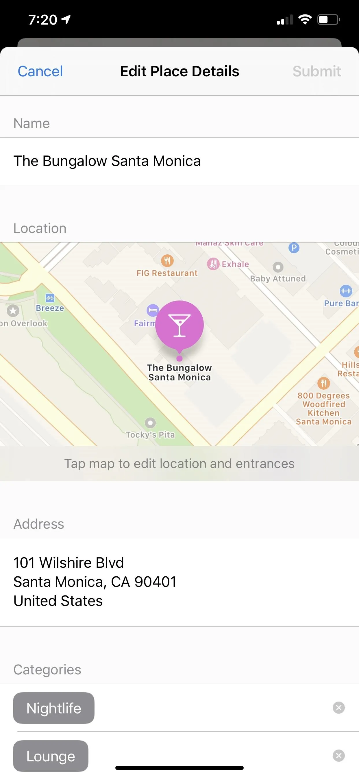
126. The Feedback Page Is Easier to Use
Whenever you need to report an incorrect address, wrong business hours, wrong category, or a different issue, it's now a little bit easier. Instead of having to access different tabs from the feedback screen, it's all on the same page now.

The feedback screen in iOS 12 (left) vs. iOS 13 (right).

The feedback screen in iOS 12 (left) vs. iOS 13 (right).

127. Siri's Navigation Directions Are Easier to Follow Along With
According to Apple, Siri gives a "more natural language" experience for navigation in Maps, which should help you during directions.
So instead of saying "in 1,000 feet turn left," Siri says "turn left at the next traffic light." Improved navigation also guides you closer to your end-point destination, which is especially important for large venues.
128. You Can View Your Real-Time Flight Status
Instead of installing a ton of airport and airline-related apps to help you on your journey, you can use Maps for most of the general information. While there are already a lot of airports that have indoor maps, iOS 13 also adds real-time info pertaining to your flight departure times, flight terminals, gate locations, delays, and terminal info, to name a few of the prominent features.
129. Real-Time Transit Information for Public Transportation
If real-time flight status information wasn't enough, we've now got real-time transit information too. You can view live details for public transportation, including departure and arrival times, bus and train locations, and outages and cancellations. There's also a more helpful schedule available for transit stops and connections.

Viewing a train route in iOS 12 (left) vs. iOS 13 (right).


Viewing a train route in iOS 12 (left) vs. iOS 13 (right).

130. MapKit Gives Developers More Options Such as Putting Overlays on the Map
Developers can now do more with Apple Maps integration in their apps. "Vector overlays, point-of-interest filtering, camera zoom and pan limits, and support for Dark Mode," according to Apple.
131. Maps Is Way More Useful with CarPlay
If you have a vehicle with CarPlay, iOS 13 provides you with easier router planning, better search tools, and improved navigation. And you can also view the Favorites and the new Collections. And for China, you've got access to the Junction View feature in CarPlay as well.
Reminders Improvements
One of the apps that needed the most attention was Reminders, which had always been just a tiny fraction of its full potential, mostly ignored by Apple as least significant. That changes in iOS 13, with a complete redesign that works.
132. The Reminders Interface Is Actually Nice Now
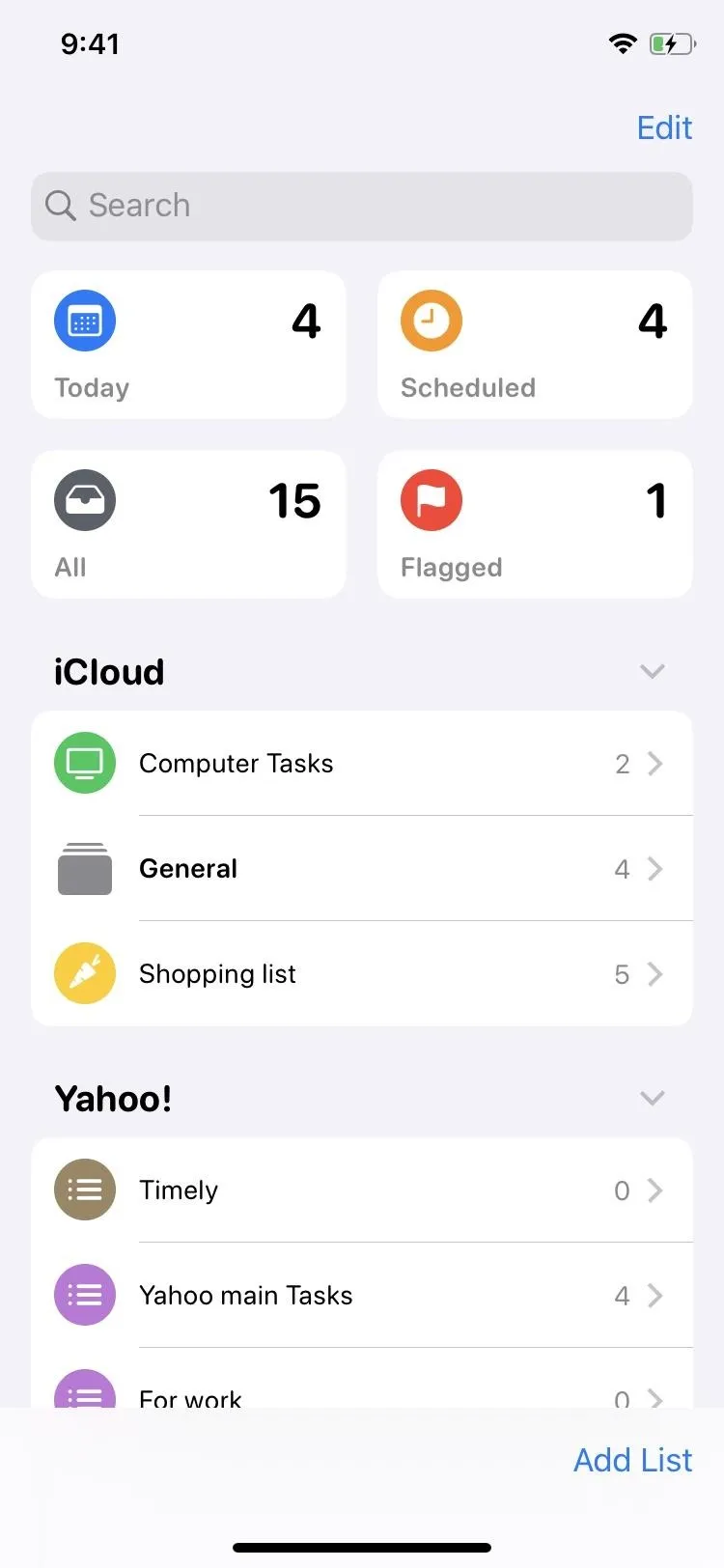
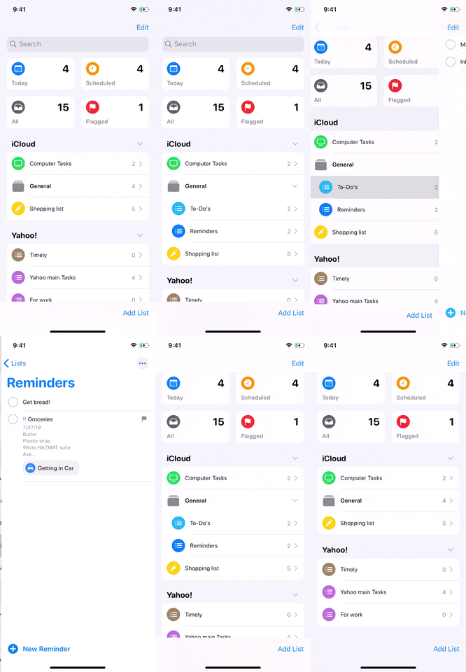
The whole user interface looks less 2013 and more 2019. The main screen of the Reminders app had remained unchanged since iOS 7, and there was something about it that made it annoying to use. Since iOS 13, I've actually been using the Reminders app daily in part because it's just easier to glance at and navigate. There are no cascading cards for each of your lists anymore. Instead, you see groupings which you can expand and minimize while still being able to view other groups and folders.
133. You Can Actually Tell What List Goes to What Account
Speaking of the groupings on the main screen, it clearly shows which lists are connected to what account. Before, there was no way to tell, but now there are clear groupings and labels for iCloud, Yahoo, Outlook, Gmail, and other accounts. This is similar to what the Notes app has done for some time.
134. There Are Smart Lists for Today, Flagged, Scheduled & All
Diving into the main Reminders screen some more, you don't just see groups of lists anymore, you see folders up top for items that need attention currently (Today), everything you've flagged as important (Flagged), things that are on a schedule (Scheduled — the old app did have a Scheduled card), and everything if you want to see every item in all lists in all accounts (All).
135. Customize List Colors with 12 Color Options and 60 Symbols
To make your list stand out more, you can customize the icon to a different color and even a different icon that better represents the list's purpose. The old app didn't even have icons, but now you can choose between 12 colors (there were only 7 before) and 60 symbols. However, the downside is that it only applies to iCloud lists, not lists in third-party accounts. For those, you're stuck with only 7 colors and the default list icon.
136. Can Group Multiple Lists Together
On top of being able to view groups and expand/minimize them, Reminders also lets you group multiple lists into a folder you can name. So if a group's number of lists begins to spiral out of control, you can slim things back a bit by organizing its lists into topics.


137. Tasks Can Be Added as Subtasks to Other Reminders
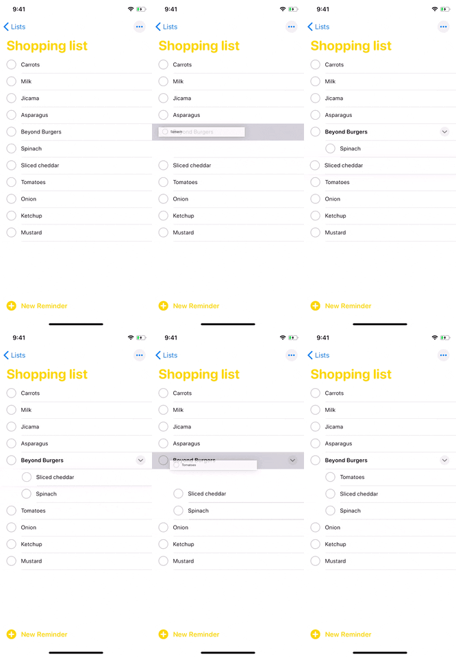
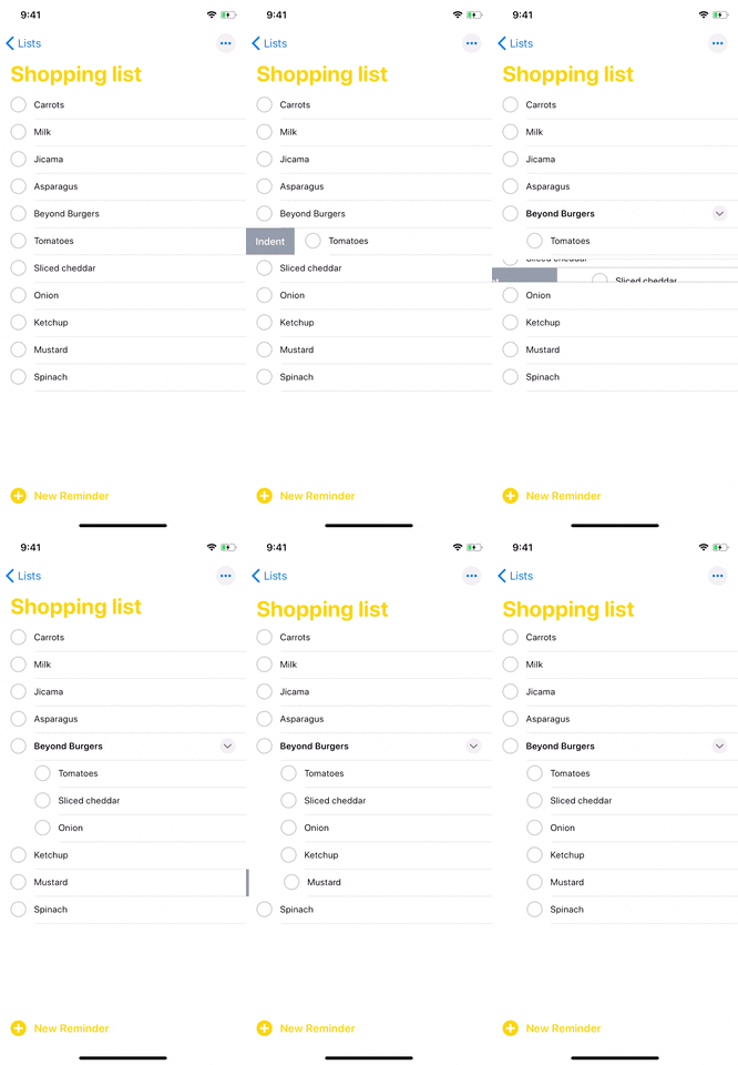
To keep things even more organized, you can also group individual tasks under the main task. For instance, instead of creating a shopping list and putting everything you need to buy on there, you can group items by recipes. That way you can keep your burger ingredients separate from your salad ingredients without having to create different lists.


138. Attachments Are Finally Supported
Before, Reminders was always just text-based, but now you can add media too. You can take a photo or scan a document right from the app itself, as well as choose an image from the Photos app.
139. You Can Flag Reminders as Important
Don't confuse this with the "Priority" level, which is still alive in kicking. Instead, flagging a reminder will put a little flag icon next to the reminder, as well as add it to the "Flagged" smart list on the main page.
140. The Quick Toolbar Makes Adding Information Easier
Also new to Reminders it the quick toolbar that appears over the top of any keyboard you're using. With it, you can add times, dates, locations, flags, or attachments. Some of those things could be done before only by going to a reminder's Details page, and some of those things are totally new.
141. You Can Add Web Link Previews to Reminders
Aside from being able to add images and scans to reminders in the app, there's also the ability to throw in a related URL. For instance, if you needed to renew your vehicle registration, you could write that as the reminder, then add a web link to the DMV's webpage for renewing. Even better, doing so will create a preview similar to how links appear in Messages.
142. Siri Can Help You Create Your Reminders
Siri is finally helping out in the Reminders app. When you're typing a reminder out, you can use more descriptive information, and Siri will take those details and suggest relevant actions. For instance, if you have a work meeting every Thursday at noon, you could say "Start working meeting every Thursday at noon." Siri will take that "every Thursday at noon" part and set recurring alerts for the reminder every week without having to touch the date and time settings.
143. You Can Tag People in Reminders to Get Alerts in Messages
Also new to Reminders is the ability to tag your contacts in individual tasks. While at first it seems pointless, unless it's for a reminder you're sharing, it's actually beneficial if you regularly message that person. That's because the next time you get a note from them in the Messages app, when you go to read it, there will be a Reminders notification there to jog your memory.
144. Siri Will Suggest You Create a Reminder from a Messages Conversation
I haven't seen this one in action yet, but during a Messages conversation, Siri is supposed to offer suggestions to add to Reminders when a task-oriented message is sent or received. Someone could be asking you to do something or remember something, or you could be telling somebody you're going to complete a task.
145. You Can Get a Daily Notification for That Day's Reminders
In iOS 13, by default, a "Today Notification" will be set for the Reminders app that'll appear in your Notification Center at 9:00 a.m. every day, but only if you have reminders due that day. With it, you can see all of the tasks you need to get done without ever having to open the Reminders app itself.
Notes Improvements
Notes received some minor updates in iOS 13, and while mostly minor, they make writing, jotting down notes, and organizing folders that much easier.
146. You Can Hide Sub-Folders
In iOS 12 and under, the main Folders screen in Notes was auto-expanded with no way to minimize sub-folders in the list. That changes in iOS 13, as you can expand and collapse sub-folders to your heart's content.
147. You Can Move Folders Around
Before, the only swipe action Notes had for folders was "Delete." Now, there's an option to move the folder to another location. However, it only applies to folders in iCloud or On My iPhone, not any in third-party accounts. (You can't even create folders for third-party accounts anyway.)
Plus, in the new ellipsis (•••) menu that replaces "Edit" inside of folders, you can hit "Move This Folder" from the action sheet. Additionally, you can long-press a folder or sub-folder from the main Folders screen and move it that way too.
148. Folder Contents Can Be Viewed as a Grid of Icons
Inside of a folder in iOS 12 and under, the four-squared icon would show you all attachments found within the Notes app. That button is no longer there, though, that's not technically true. If you swipe down when in the folder to view the search bar, you'll see it appear up top. However, it does not show attachments anymore. Instead, it lets you view your folder's contents as a grid of icons now, not just a list.
149. You Can Sort Notes by Dates or Titles on the Spot Now
In iOS 13, when you swipe down to reveal the search bar inside a folder, there's a new option to sort your notes. You could sort notes before, but only via the Settings menu for Notes, and it would apply for all of your folders. You can still do that to choose the default sorting, but now you can sort just one folder's content by Date Edited, Date Created, or Title.
150. You Can Share Entire Folders with Other Users
If you want to give another iCloud user access to an entire folder, you can do so from the swipe menu. Best of all, you can make it either view only or let other people make changes. It's also possible to do so from within the folder itself via the new ellipsis (•••) menu that replaces "Edit."
151. You Can Prevent Collaborators from Making Changes to Notes
You could share a specific note with others for a collaborative experience, but there were no options to share the note without giving others access to modify things. Now, you can choose to let users view the note only.
152. Apple Ditched the Full-Screen Modal View for Attachments
Just like before, you can via all attachments — photos and videos, document scans, sketches, websites, and other documents — found within the Notes app. Previously, you'd do so via the four-squared icon inside of a folder in iCloud or On My iPhone. Now, you do it from the new ellipsis (•••) menu. It's actually a little slower this way.
There still is no option to limit what you see to just the current folder, which hopefully will be coming soon. But one improvement is that the Attachments screen is no longer a full-screen modal. Instead, it's a sheet modal, so instead of only being able to hit "Done" to exit, you can swipe down on it.
153. You Can Start a New Note with a Subheading
Before, you could only choose between Title, Heading, and Body to start new notes with. For instance, if you have it set to Heading, whenever you create a new note, the first things you type will be formatted as a heading. Now, you've got another option — Subheading.
154. Checked Items in Notes Can Be Sorted Automatically
Normally, when you tap on a checklist item in a note to check it off as done, it would stay right where it's at. In iOS 13, that's still the case, but in Notes' settings, you can choose to have checked items move to the bottom of the list automatically to put emphasis on tasks still at hand.
155. The Drawing Tools Menu Makes More Sense
Apple previously had five default color options available after tapping on the marker, highlighter, or pencil in the drawing tools. You could also touch the color picker to view more options. Now, in iOS 13, those defaults colors are gone, and only the color picker remains. While it may seem like less options is not a feature, it actually declutters things. First, you may not ever use those default choices. And second, tapping the marker, highlighter, or pencil tool no longer hides the other tools so that you can switch more easily.
156. The Import Media Option Is Just for Photos Now
Sketch is gone. And that could be good depending on your idea of how helpful it was. I never sketched anything before, but instead drew things directly in the note itself, not as a sketch attachment. So now, the plus (+) sign in the toolbar has changed to a camera icon to better illustrate that you can only scan documents, take photos or videos, and choose from your photo library.
Security Improvements
Apple has added even more privacy and security-related features to iOS to an already strong system. But when it comes down to it, there can always be an improvement. And that's what iOS 13 does.
157. Log in to Apps & Sites with Your Apple ID
You can sign in to apps and websites with "Sign in with Apple," which uses your Apple ID. To use it, you need two-factor authentication on your Apple account. You don't have to fill out any more forms or create passwords, and you can use Face ID or Touch ID to work its magic.
All apps that have third-party sign-in options are required to support Sign in with Apple. And those developers can even let users who already have accounts switch to Sign in with Apple, so they don't have to deal with the other login credentials.
158. You Can Use Alias Emails with 'Sign in with Apple'
One of the things developers can ask for when letting you create an account with Sign in with Apple is your email address. You can choose to share your Apple ID email address, or you can select to use an alias with the "Hide My Email" feature. It automatically creates an alias email address that will forward messages to your real email address, and you can always cut the alias out entirely if you're getting too many unwanted emails.
159. Sign in with Apple Works on Android and Windows Too
While the new Sign in with Apple works on iOS, iPadOS, macOS, tvOS, and watchOS, it also works in any web browser as long as the site's owner added the option. Plus, app developers can include the sign-in option in Android and Windows versions of apps, so you don't have to be tied down to the Apple ecosystem.
160. Find My Replaces Find My iPhone & Find My Friends
Instead of having to keep track of privacy and security-related settings for two apps, Find My iPhone and Find My Friends, you can now do it all from one single "Find My" app. The consolidation makes sense, making it less confusing overall when trying to manage features for the two services.
161. Other Apple Users Can Help Find Your Lost Devices
One of the biggest things in the new Find My app is the added ability of "Offline Finding." What that does is gives your devices matching public encryption keys that change throughout the day. They talk with other users' Apple devices via Bluetooth, sending location data from their devices to Apple's servers. When you go to find your device, you're sent the location data, which is decrypted with your private key.
Ultimately, this means if you lost your device and its not connected to the internet via Wi-Fi or cellular data, all hope is not lost, since you can leverage Bluetooth and other people's internet nearby. The implementation is secure, anonymous, and can't really be explained in a couple paragraphs, so check out our full explainer to learn more.
162. Give Location Permissions to an App Just Once or Anytime
Before, you would either give an app location access or not. That created a problem if you wanted it to use your location in some scenarios but not always. That changes in iOS 13, as you can now select to give the app access never, always, or just during the current user session.
163. Receive Alerts When Apps Are Using Location Data in the Background
You could always tell an app was using your location in the background when the tiny location symbol showed up in the status bar. But which app was it? Who knows. To find out, you'd have to dig deep into your settings, and even then it might not be obvious. In iOS 13, it is obvious, as you'll get an alert whenever an app is using your location in the background.
164. Prevent Apps from Getting Your Location via Wi-Fi or Bluetooth
According to Apple, "API changes and new controls help prevent apps from accessing your location without your consent while you're using Wi-Fi and Bluetooth."
165. Turn Off Geotags for Photos Shared to Social Media
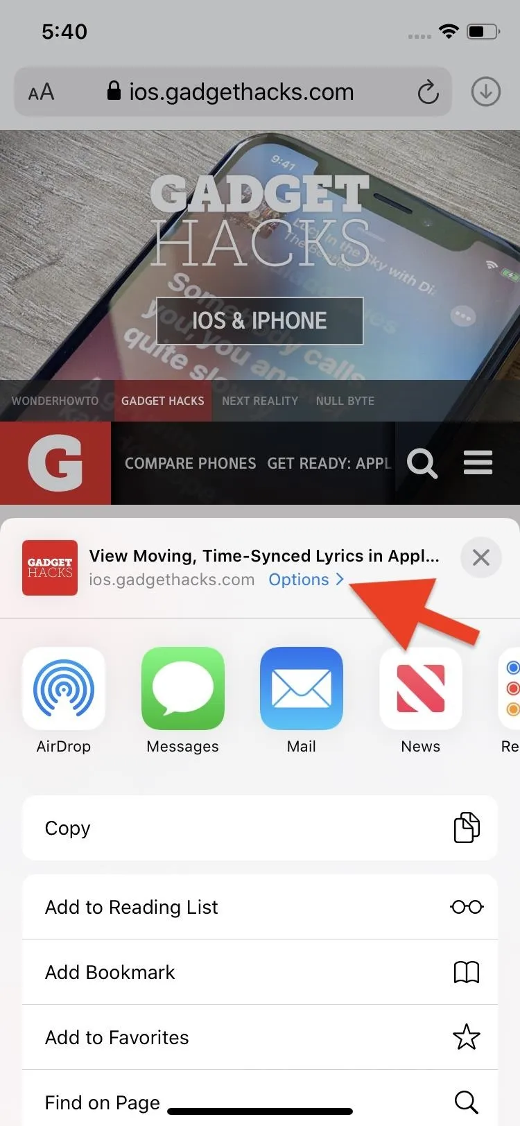
From now on, whenever you share in images from Photos with the Share sheet, you can choose not to include location data. Just hit the "Options" button in the Share sheet, and you can toggle location on or off.
166. Safari Has Enhanced Protections to Prevent Fingerprinting Devices
Apple previously stated that there are new browser font protections in Safari to prevent fingerprinting devices. These protections would help keep companies from tracking your web-browsing activities across sites.
However, we're not entirely sure if it was implemented yet or if it was in a previous iOS 12 update. Apple's preview site originally had "Enhanced anti-fingerprinting protection in Safari" as a feature but has since removed it from the webpage, though, it still exists on other country versions of the preview.
Safari Improvements
Safari has been given quite a bit of love in iOS 13, so there are a ton of significant new changes to help make browsing the web easier on your iPhone.
167. You Can Take Full-Page Screenshots of Long Webpages
If you wanted to show off a full webpage in one image before, you'd have to stitch together multiple screenshots or just record your screen for a video instead. That changes in iOS 13, as you can take one screenshot, then choose to capture the entire webpage without any more snapping. Results save as PDF files in your preferred location in the Files app.
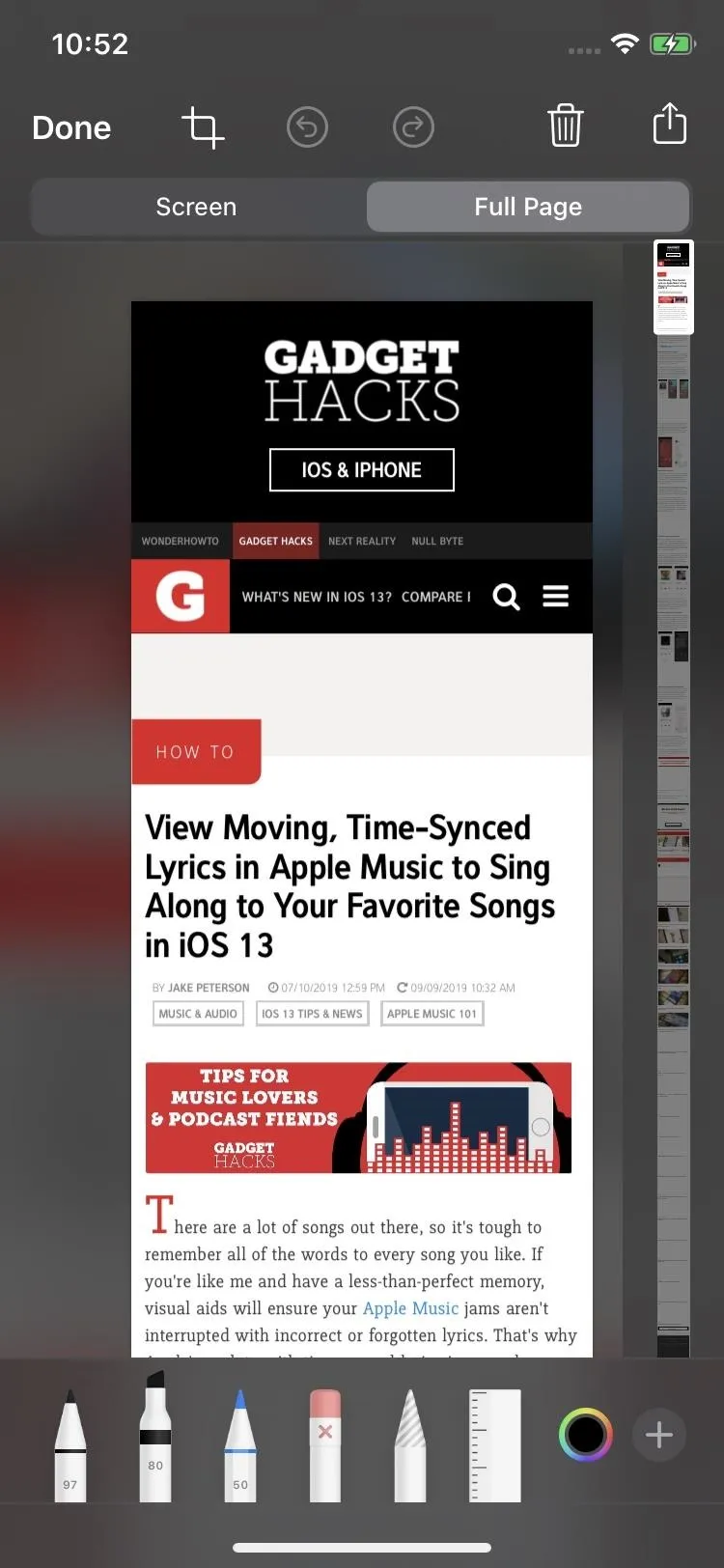
Editing the full-page screenshot (left); The final PDF output (right).
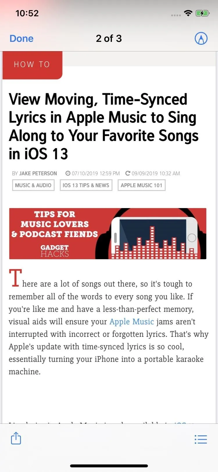

Editing the full-page screenshot (left); The final PDF output (right).

168. There's a New Website View Menu
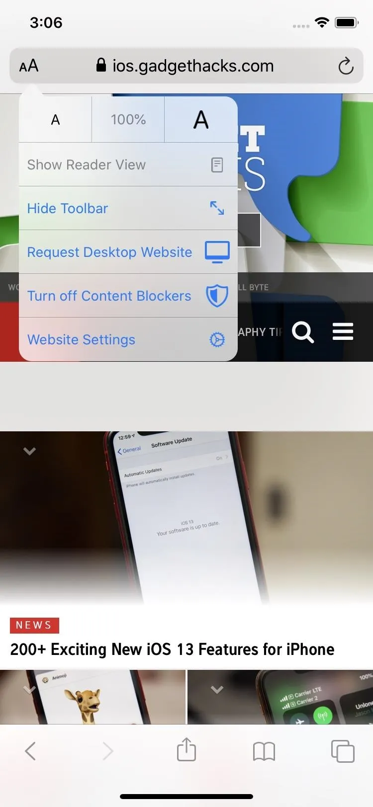
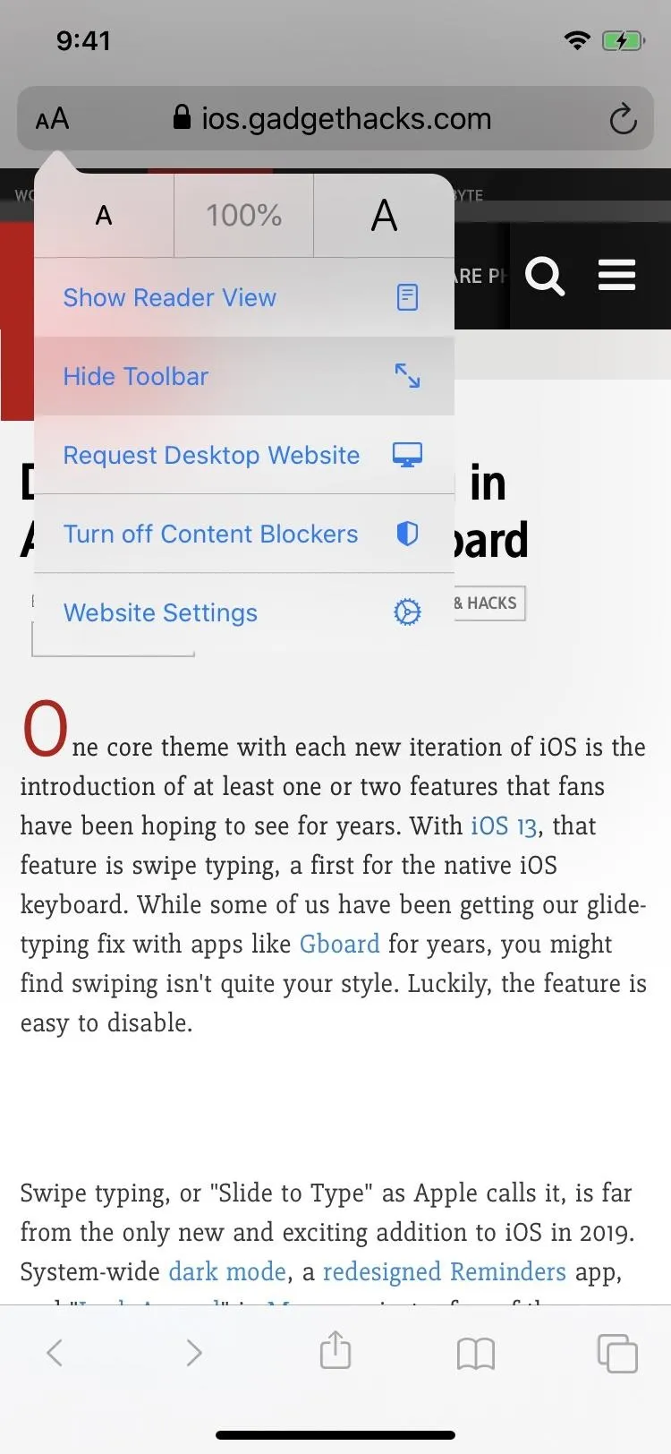
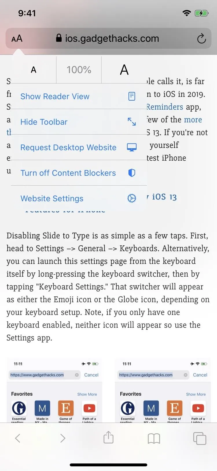
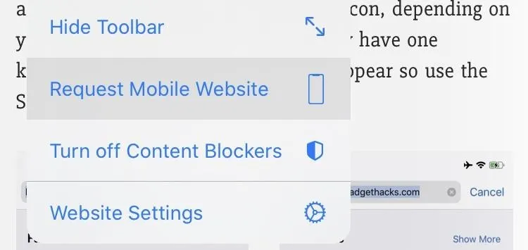
There are more options for viewing webpages in Safari, so Apple had to create a place to put them all. You can find that menu in the "AA" icon in the search bar. Here, you can use Reader, adjust page size, ask for the desktop or mobile site, turn on or off content blockers, and more.
- More Info: The New Website View Menu in iOS 13's Safari


169. You Can Disable Content Blockers for Just One Webpage
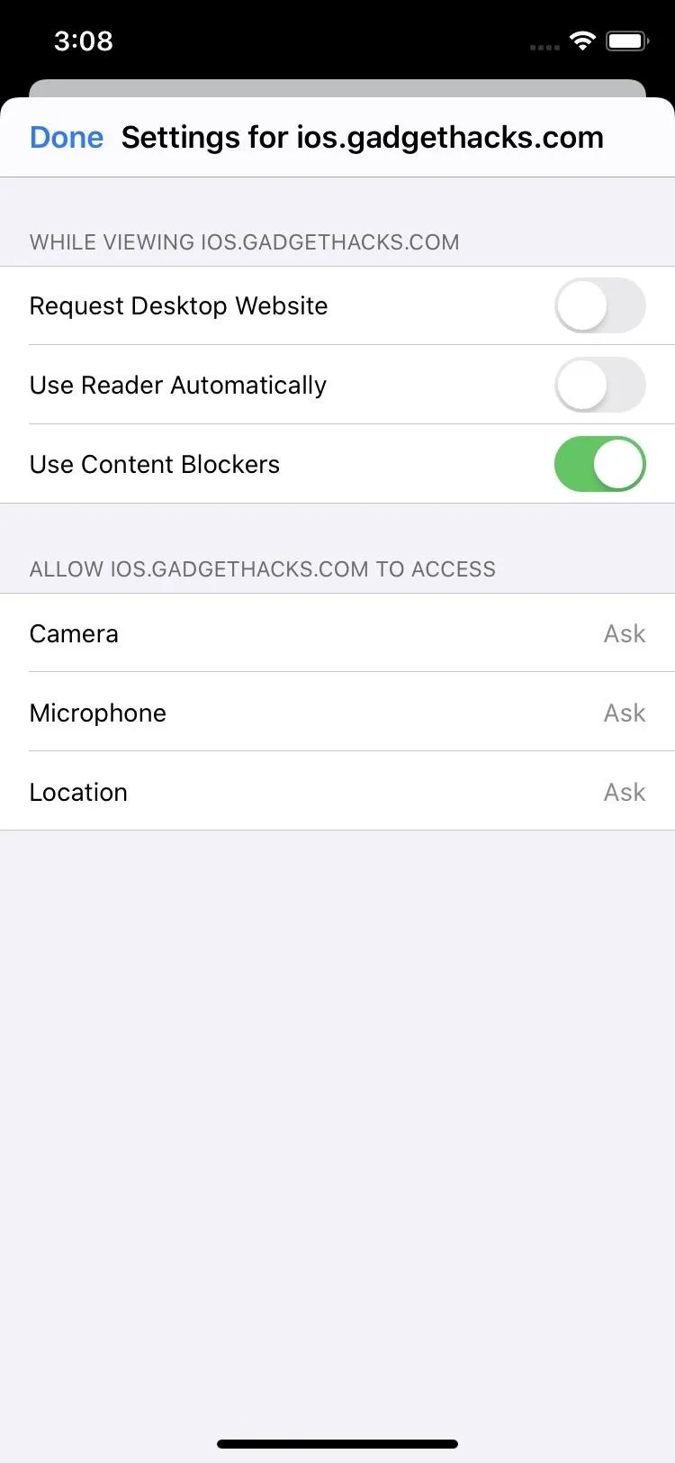
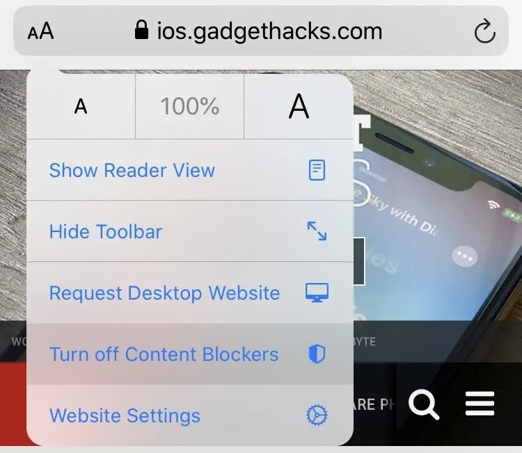
Before, you could only whitelist websites so that they could show ads, and that could only be done in the content blocker's app itself — if it even gave the option. Now, not only can you disable or enable content blockers per domain, you can toggle it on or off for just the one webpage you're on. So if one webpage has obtrusive ads that prevent you from viewing the real content, you can reload just that page with the content blocker enabled.
170. The Top & Bottom Toolbars Can Be Hidden While Scrolling
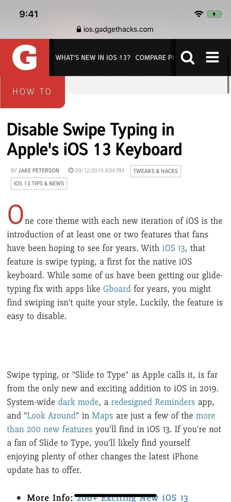
To give you more reading room on webpages, iOS 13 now lets you easily hide the top and bottom toolbars as much as possible. You could hide the same toolbars before, but now you don't have to do any scrolling to do it. Plus, once you hide the toolbar the new way, scrolling won't bring it back. Instead, you'd have to tap the top minimized toolbar to open them back up.


171. Text Size on Webpages Can Be Adjusted from 50% to 300%
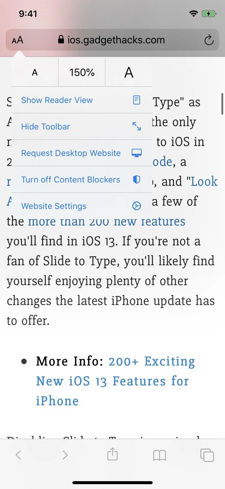
Instead of pinching-and-zooming to enlarge webpages, you can now use the "Page Zoom" settings to adjust most of the content on the page from 50 to 300 percent. Plus, you can choose the default zoom level for the domain, so you never have to adjust the size again.


172. Requesting Desktop Websites Moved from the Refresh Button to an Actual Menu
Before, you'd have to long-press on the refresh icon to get to ask a website to give you its desktop version. But it's an easily missed feature since it's hidden. Now, it's moved to the View menu, clearly labeled.
173. There's a Request Mobile Website Option Now
When going back to the mobile view for a website, there's now a "Request Mobile Website" option instead of a confusing "Request Desktop Site" option. It's about time Apple fixed this.
174. You Can Specify That Specific Sites Use Desktop Website by Default
If there's a website you're constantly viewing the desktop site for, why keep requesting it when you can set it and forget it? That's right, iOS 13's Safari now lets you set domains to either load directly to their mobile or desktop versions, if available.
175. Long-Press the "AA" Icon Switch from Reader & Regular Views
You can now long-press the "AA" icon to enter and exit Reader Mode quickly. Before, it was a tap.
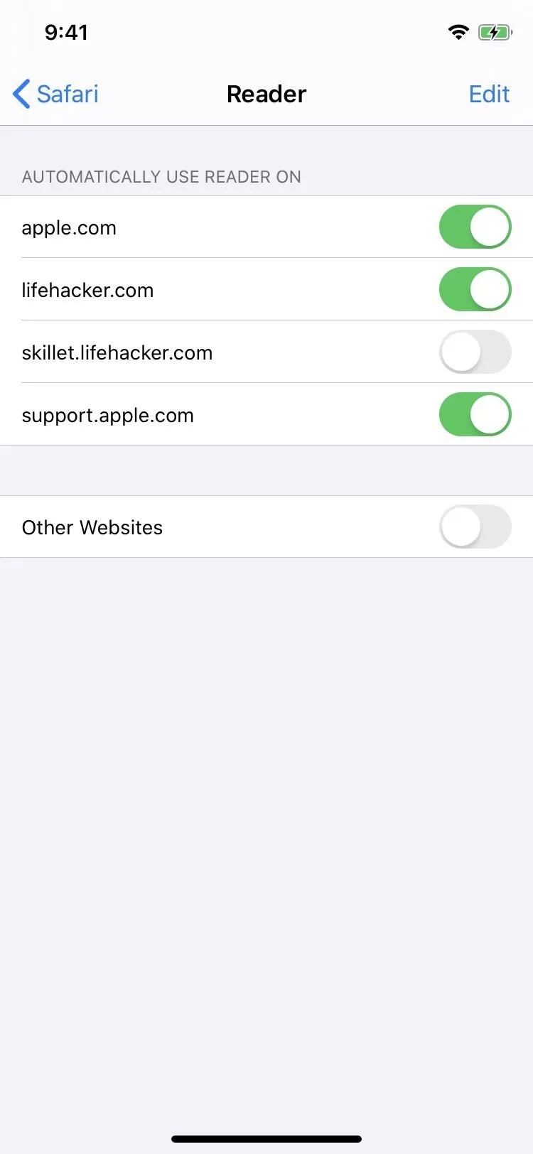
176. It's Easy to Make Sites Use Reader Mode by Default
You can specify that specific sites use Reader Mode by default from the View menu instead of a long-press. Plus, you can still turn on or off Reader on a per-webpage basis.
177. You Can Manage Sites That Default to Reader Mode from Safari's Settings
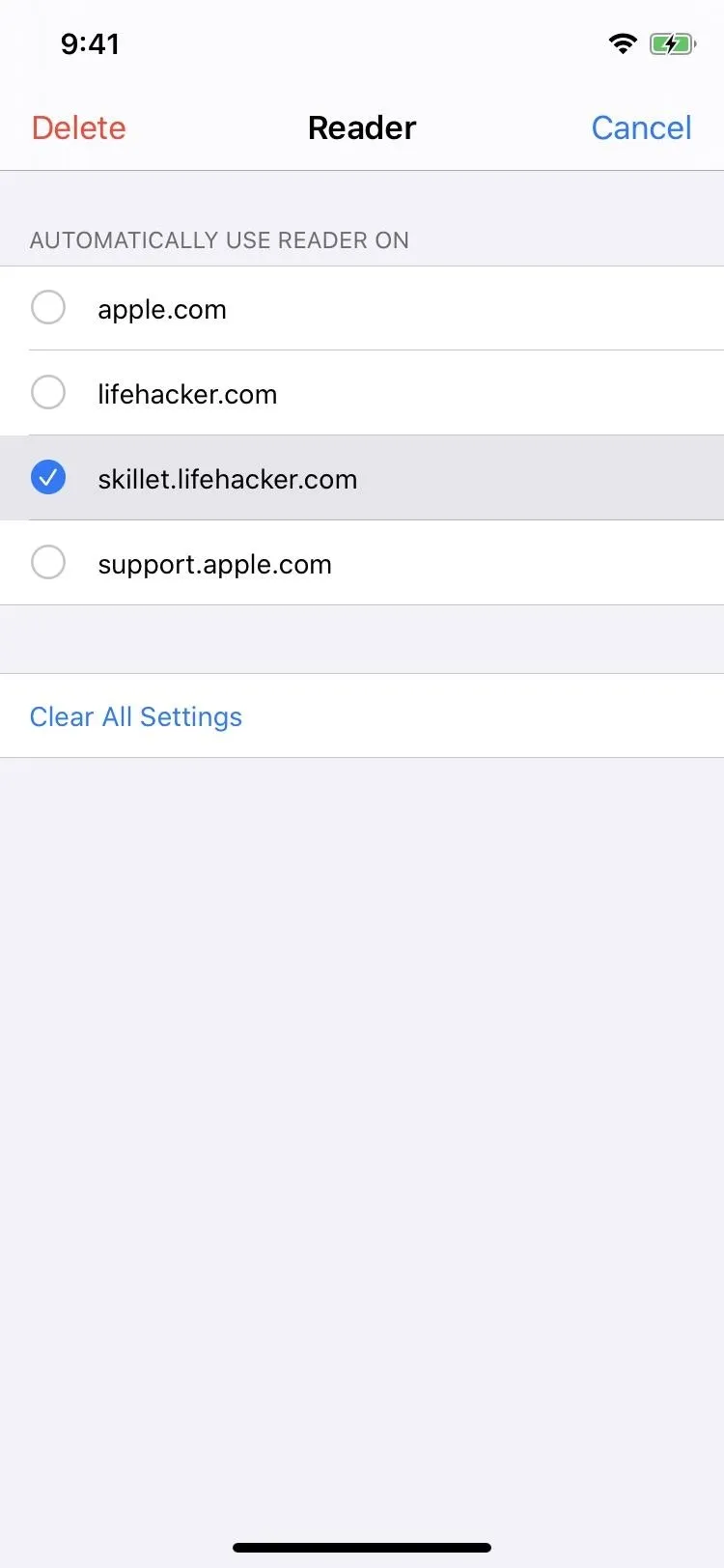
If you ever change your mind about which site you want to default to Reader Mode or not, instead of hunting them down site by site in your browser, you can dive into Safari's settings and see the whole list of domains you've set preferences for and adjust them accordingly.


178. Each Site Has Settings for Camera, Microphone & Location Access
Permissions are available per website to ask, deny, or allow access to Camera, Microphone, or Location. Before, it was all or nothing, which was a pain, to say the least. Now, you have total control from the "Website Settings" in the View menu, and you can adjust your site preferences for the Settings app.
179. There Are New Sharing Options for PDF & Web Archive
When you use the Share sheet to share a webpage, you can tap "Options" to pick from Automatic (which sends as normal), PDF, Reader PDF, or Web Archive.


180. There's a Downloads Manager in Safari
That's right, you can finally download files from Safari. Just tap a download link for music, videos, documents, and other files and the Downloads Manager will appear with the download's progress.
- More Info: Use Safari's New Downloads Manager in iOS 13

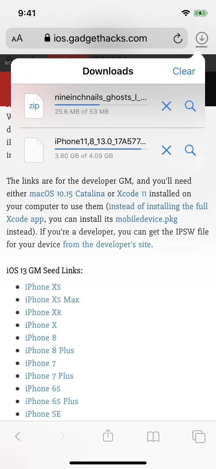


181. You Can Pause & Resume Downloads When Needed
With the new Downloads Manager, you can pause and resume downloads at any time, like if it's a large file and you need to free up bandwidth for something else temporarily.
182. You Can Play or View Downloads Right in Safari
Also in the Downloads Manager, you can play some content, such as music files, right away. You can also view images and other media without ever leaving Safari.

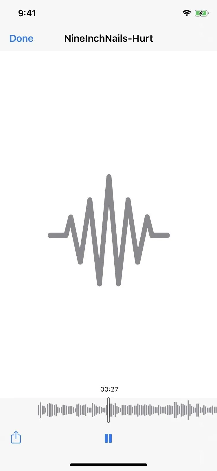


183. And Share Downloads Right from Safari
You can also share downloaded content right from the Downloads Manager. As you can see above, when previewing a song file, there's access to the Share button.
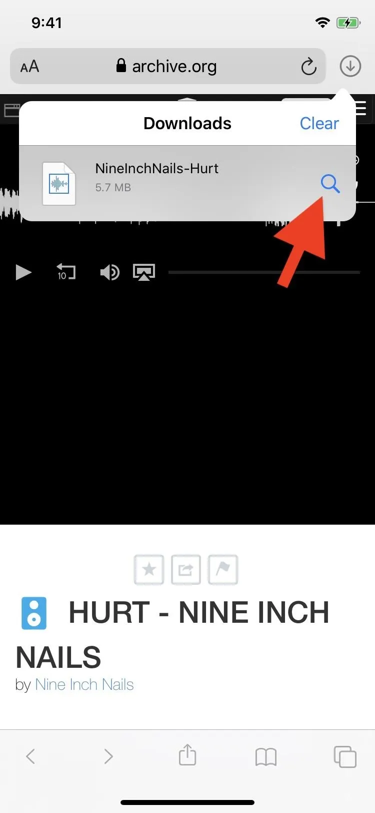
184. You Can Jump to a Downloaded File's Location
The Downloads Manager lets you jump right to the folder when items download, located in the Files app. Just tap the magnifying icon next to the file in question, and it will open up its location right away. If it's a file that can't be previewed, you could also tap the file name to jump to the location.
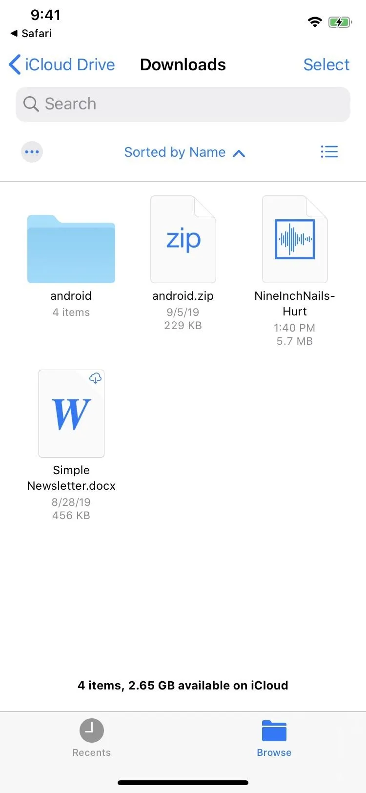


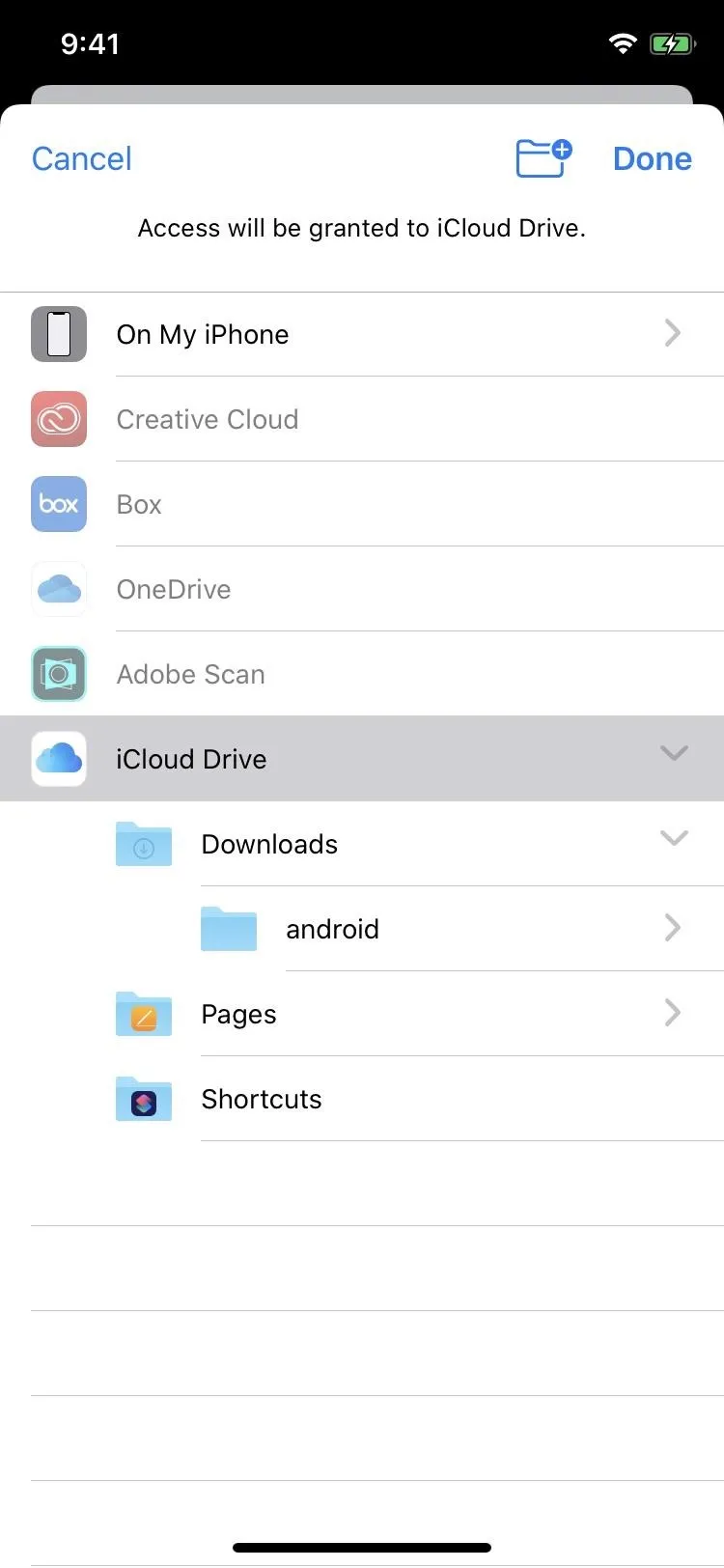
185. You Can Change the Downloads Location via Settings
By default, the location for downloads is in the "Downloads" folder in iCloud Drive, but you can change it to be in any folder you want, even in third-party cloud services.


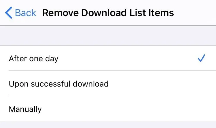
186. The Downloads Manager Can Be Manually or Automatically Cleared
The list of downloads in Downloads Manager can be cleared manually or automatically every day or when downloads are successful, so it never has to stay cluttered.
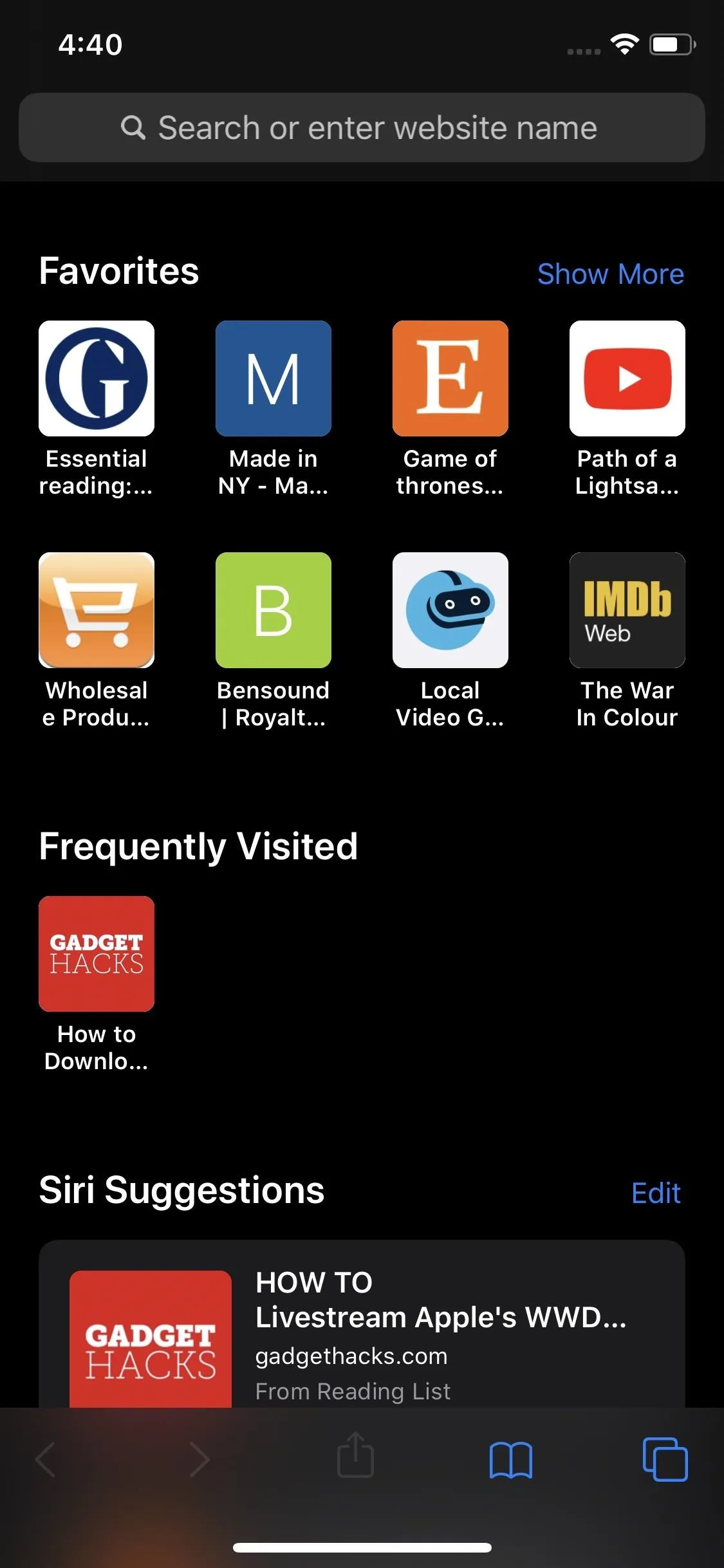
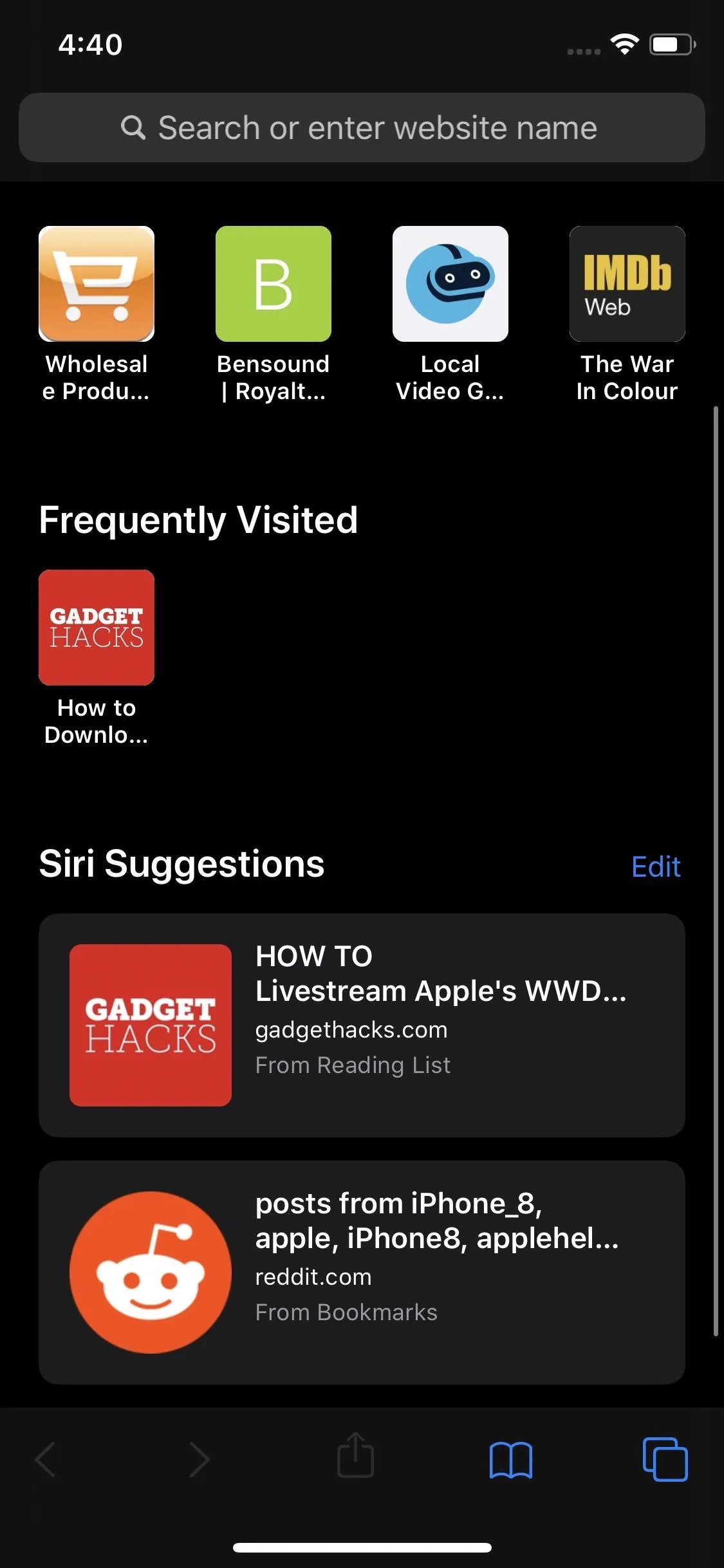
187. There's an Updated Start Page
An updated start page includes bookmarks and frequently visited sites and Siri suggestions.


188. Folders & Favicons in the Start Page Have Drop-Shadows
It's a small change, but it looks much better, especially for white favicons which tended to blend in with the background.
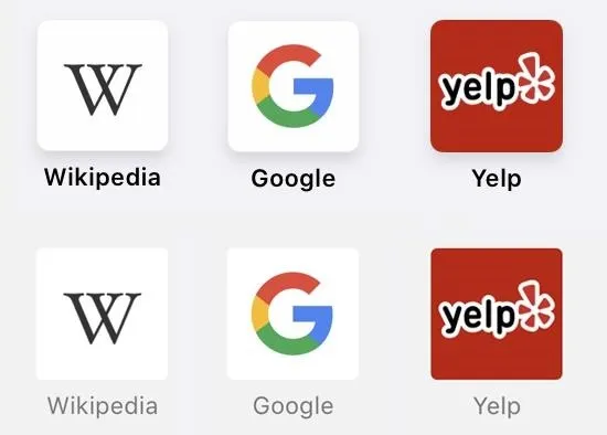
Top row is iOS 13; Bottom is iOS 12.
189. Folders in the Start Page Are All-Around Better
Another small change for the start page is that the folders have gray backgrounds instead of white. With the drop-shadow, they're very easy to see. Plus, underneath each folder, the number of webpages within the folder is listed, something that wasn't there in previous iOS versions.
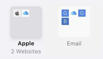
The new folders in iOS 13 (left) vs. iOS 12 (right).
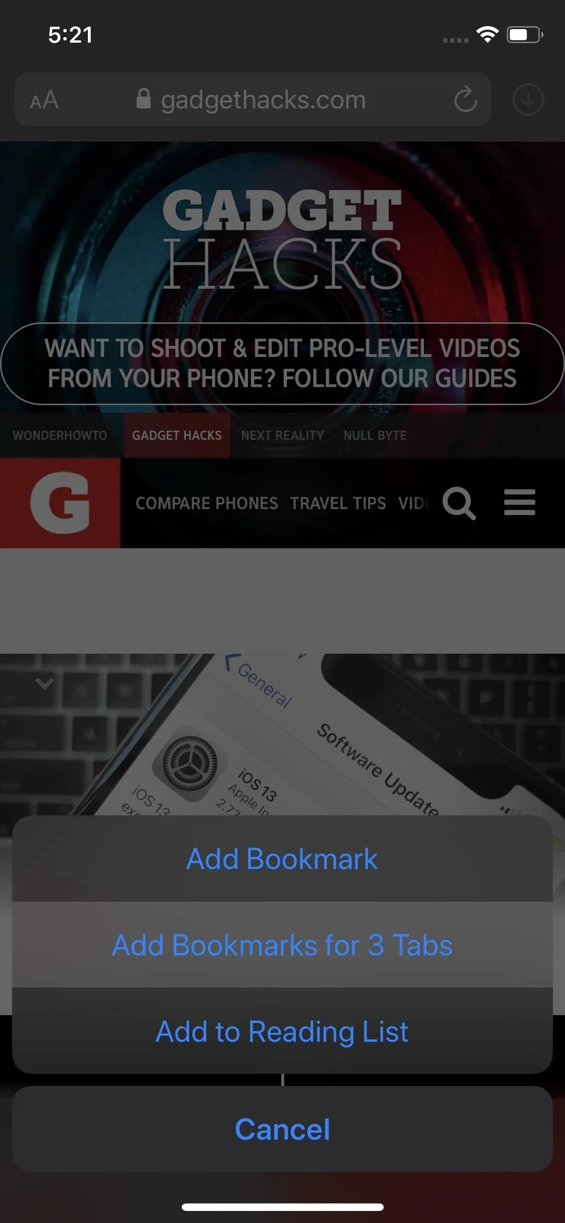
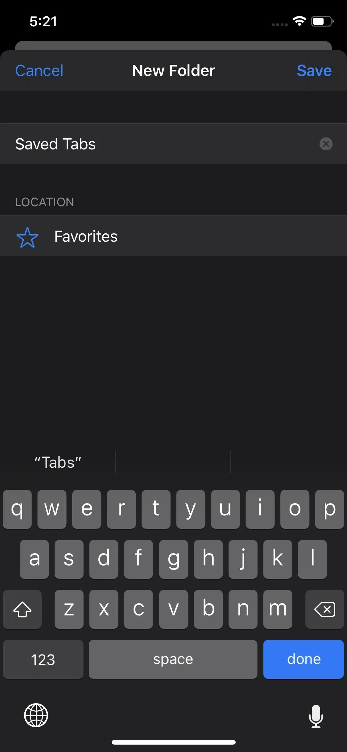
190. You Can Save All Open Tabs as Bookmarks at the Same Time
If you have too many tabs open but are afraid of losing some of them, you can save all of them as bookmarks. That way, you can reset Safari's tabs while making sure you can still go view things you had "saved" in tabs before.


191. Editing & Deleting Bookmark Folders Is Easier
In iOS 12 and under, you'd tap-and-hold a bookmark folder on the start page to get "Edit" and "Delete" options. On 3D Touch iPhone models, pressing just right could be difficult. Now, iOS 13, a tap-and-hold or long-press will bring up the options in a redesigned contextual menu.
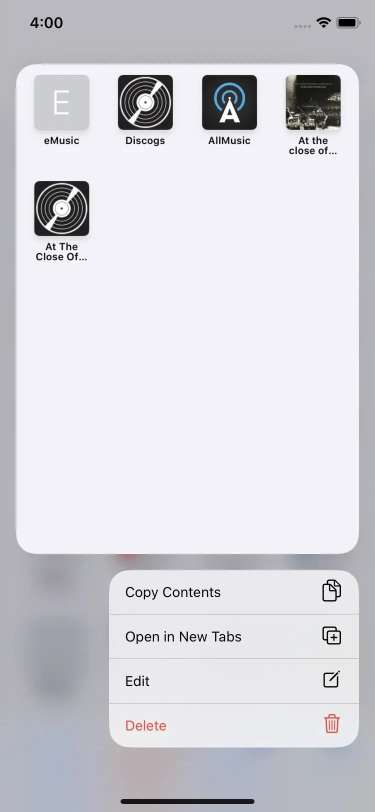
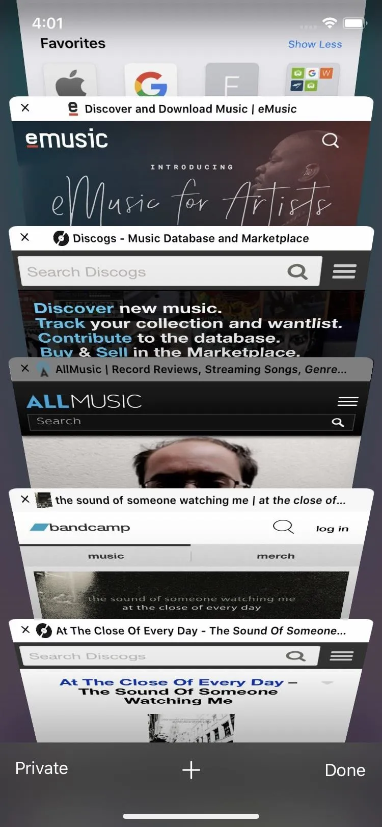
192. You Can Open All Bookmarks in a Folder in New Tabs in One Go
Why you would want to do this, we're not sure, but if you wish, you can open up all of the bookmarks in one folder at the same time. Each bookmark opens in a new tab. It may not be wise to do it to a folder with hundreds of saved pages, but if you need to reference four or five websites, it's a quick way to open them all up.


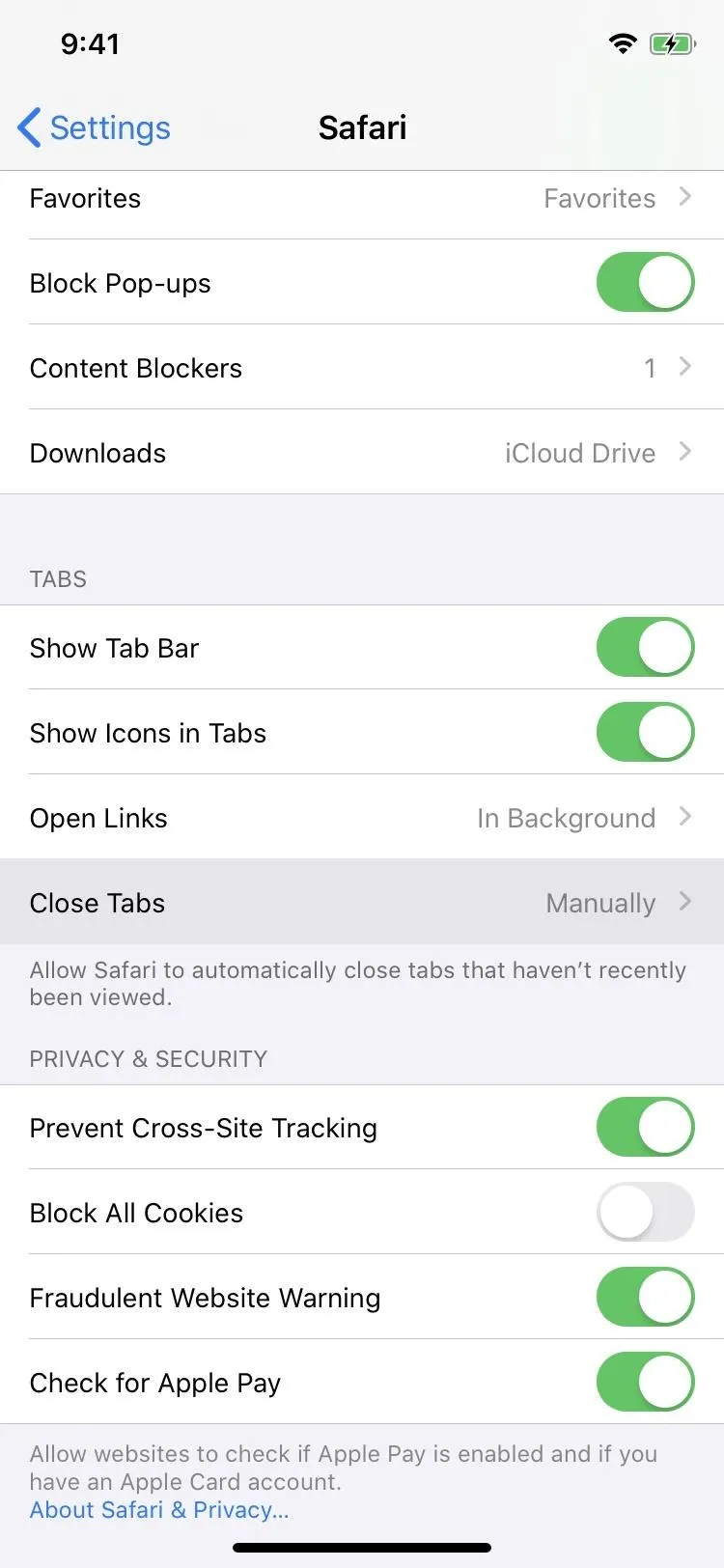
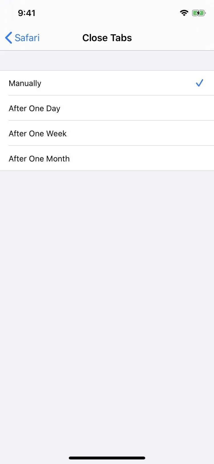
193. Tabs Can Be Set to Automatically Close After a Day, Week, or Month
If you don't like being responsible for keeping your open tabs tidy, Safari can now auto-remove them after one day, week, or month. The options are in the Safari settings, and you may even see a prompt to change your settings when closing tabs in Safari manually.


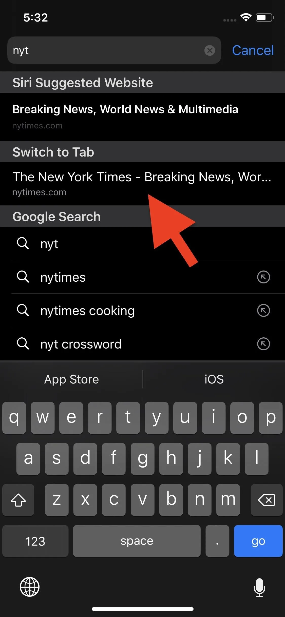
194. The Search Bar Can Help You Find Open Tabs
The Smart Search field (the URL bar) can be used to switch to open tabs for sites you search for. When you search for a domain, it'll suggest you open up a tab already from that site.


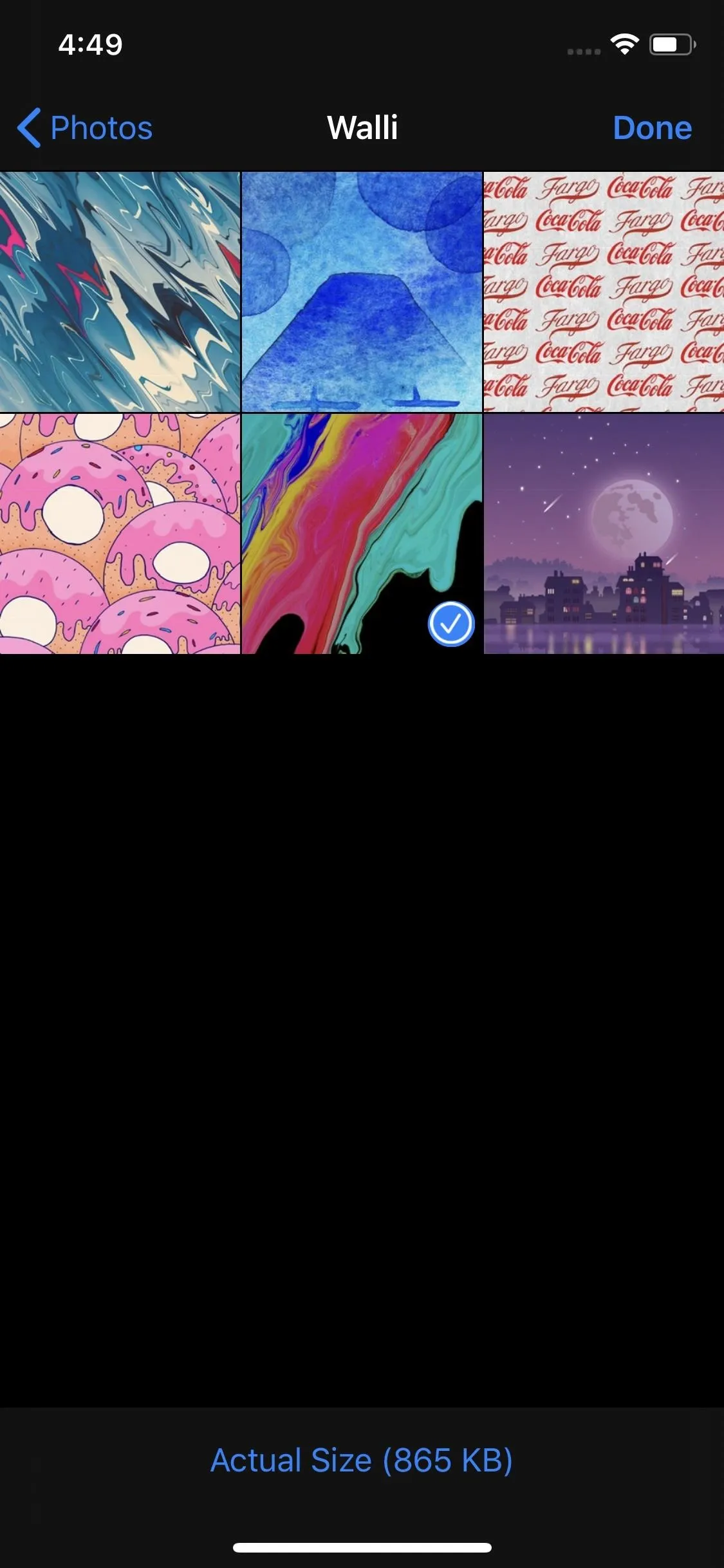
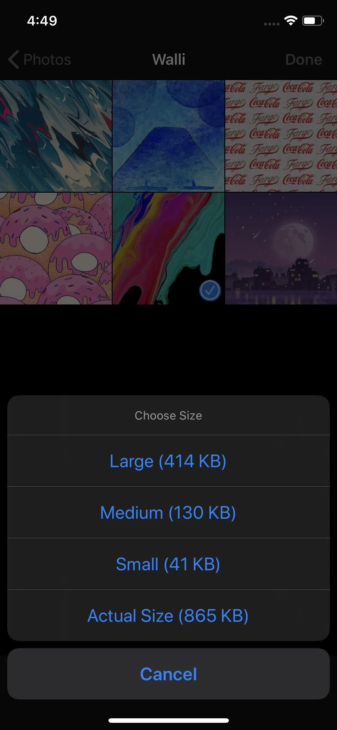
195. You Can Choose Different Photos Sizes When Uploading to Websites
You're not stuck uploading the original size photo anymore. Now, you can choose between the actual size, small, medium, or large.


196. Private Browsing Makes Sure You Know Its Private Browsing
Private Browsing Mode has a HUGE notice on the start page so there is no confusion when in Dark Mode. While there really was no confusion before, that addition of Dark Mode may confuse people since darker toolbars in Safari had always meant Private. The new warning appears whether you're in Dark or Light Mode.
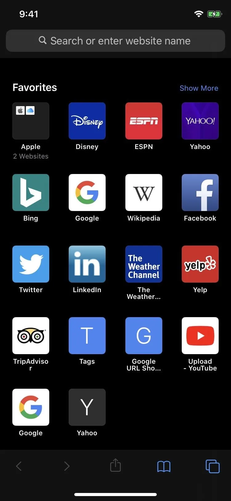
Dark Mode regular tab (left) vs. the Private one with Dark Mode (right).
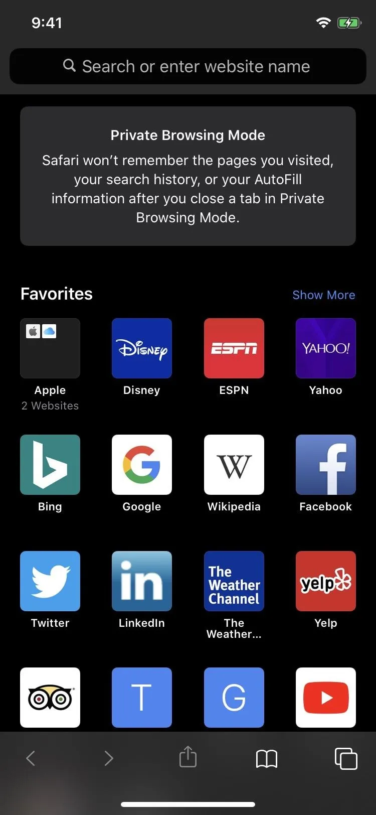

Dark Mode regular tab (left) vs. the Private one with Dark Mode (right).

197. Your Bookmarks & Browsing History Are E2E Encrypted
There's end-to-end encryption for bookmarks and browsing history that sync to iCloud. That means not even Apple can see your bookmarks or history.
198. There Are Warnings When Trying to Create Weak Passwords
A warning will appear whenever you try using a weak password for a new account. Safari would suggest strong passwords before with the AutoFill feature, but it never said you're picking a crappy one until now.
Home Improvements
If you have a few HomeKit-enabled devices and accessories or a lot of them, you'll likely be happy by some of Apple's HomeKit improvements in iOS 13.
199. HomeKit Can Detect & Record Specific Activity Securely (Coming This Fall)
With the new HomeKit Secure Video feature, you can set your compatible HomeKit-enabled cameras to detect and record moving activity. Pets. People. Cars. Whatever. While the camera manufacturer may have features like that, Apple's implementation keeps your home's video and audio footage safe and secure.
200. A Local Apple Device Can Analyze All of the Video Feeds (Coming This Fall)
If you're wondering how the new activity detection works in iOS 13 for security cameras, it uses one of your local Apple devices, such as an iPad, HomePod, or Apple TV. Instead of analyzing data in the cloud as most camera companies do right now, it's much more private to analyze streams locally. Then, when necessary to record, it uploads that footage encrypted to iCloud where it's safely stored.
201. Your Security Video Footage Remains Private & Secure (Coming This Fall)
Speaking of HomeKit Secure Video, which is new in iOS 13, it keeps all of your security footage off of the security camera manufacturer's servers. Instead, any footage that needs to be recorded will first be encrypted, then uploaded to your iCloud account. And it can only be decrypted by your connected Apple devices. That way, no one can see your recordings, not even Apple — only you. Overall, it's a more secure way to view, share, and store any activity that the camera sees.
However, it's not a requirement. You can still choose to have your video and audio data analyzed and stored by the camera manufacturer if you want. And you can even use both theirs and Apple's services. But when using Apple's HomeKit Secure Video, you will need to be on a paid iCloud plan with 200 GB of storage or more. That may change to 50 GB or more soon.
If you use Apple's new feature, video clips will be held in iCloud for ten days and won't count against your storage allotment. And some cameras will be updated to support HomeKit Secure Video, so you may not need to get a brand new security camera system.
202. You Can Control When Cameras Stream, Record, or Shut Off (Coming This Fall)
If you choose to use HomeKit Secure Video, new privacy settings give you total control of when cameras stream, record, or shut off, all right from the Home app.
203. HomeKit-Enabled Routers Protect IoT Devices & Network (Coming This Fall)
Going further than video camera security improvements, Apple supports HomeKit-enabled routers in iOS 13. By using a new router with HomeKit compatibility, you're adding an extra layer of security.
Essentially, you're locking down any activity to your home only, building a firewall around each connected HomeKit device, so there is no unauthorized access to lights, security cameras, speakers, and more. With the Home app, you control the services your accessories communicate with in your network, as well as on the internet.
204. You AirPlay 2 Speakers Work in Scenes & Automations (Coming This Fall)
You can play songs, playlists, and radio stations via Apple Music with AirPlay 2-enabled speakers in any scenes and automations you build in the Home app.
205. Siri Shortcuts Work with Automations Now (Coming This Fall)
That's right, iOS 13 gives you the ability to create automations with the Shortcuts app.
206. There Are More Accessory Controls in Home
Overall, you'll find more control over your HomeKit accessories in the Home app.
Voice Control
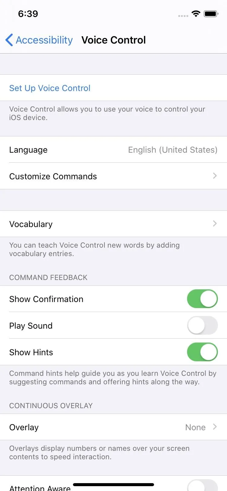
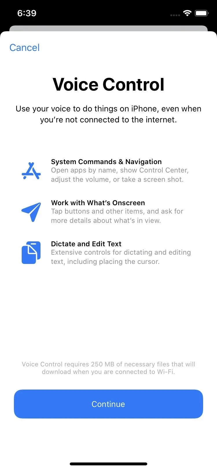
Voice Control is a brand new feature in iOS 13, something that's great for those with accessibility issues, but also fun for those without. Technically, Voice Control has been around for a while, but it was pretty bare-bones and a Siri replacement. Now, its powers are vast, it has its own menu, and you can still use Siri if you want. In fact, the best way to turn Voice Control on and off is to use Hey Siri.
207. Voice Control Lets You Use iPhone Just with Your Voice
The whole premise of Voice Control is just that — using your voice to control your iPhone. This goes beyond Hey Siri commands, and you don't even need the internet to use it.


208. All Voice Control Processing Happens on the Device, Not in Servers
Anything you ask Voice Control to do stays on your device. Apple does not analyze any requests from servers in the cloud. Instead, everything is done locally.
209. You Can Navigate an Entire App Entirely by Voice
Voice Control isn't limited to just Apple's iOS system. Instead, any app is fair game, so you can play Words with Friends using your voice or get Netflix to start a movie for you.
210. Navigation Commands Make It Easy to Jump to Certain Areas or Tasks
When you need Voice Control to do something on your iPhone, simple commands make it easy to jump to certain areas of the screen or perform specific tasks. Commands include things like "open [app]," "go home," "open Control Center," "deleted that," and so on.
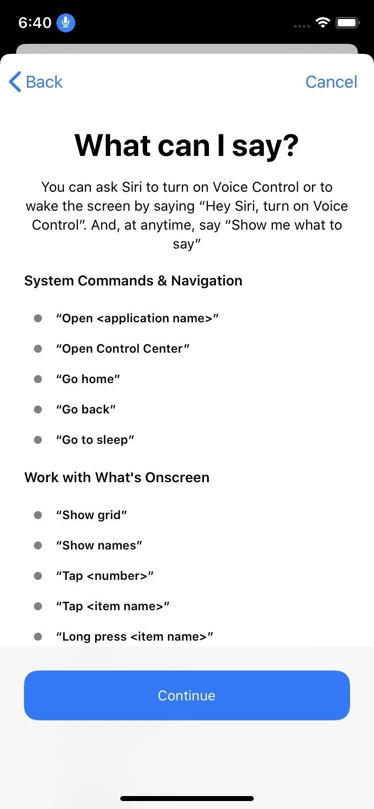
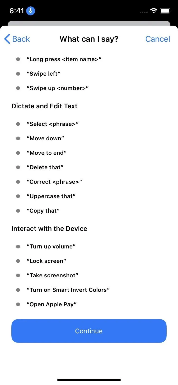


211. You Can Show Names or Numbers Next to Tappable Items
If you don't know what a task is called, you can make Voice Control show you the names of buttons on the screen. Or, you can have it show you numbers next to each tappable option. Just say "show names" to view names or "show numbers" for numbers.


212. Or You Can Use Numbers When That Doesn't Work
When names or numbers aren't showing up right for buttons or when you need to interact with a particular section of the screen that's not labeled, you can make Voice Control show you a grid on the screen instead. The numbers in the grid are situated over each item in the app you're in so you can interact with everything.
The command is "show grid," and you can say a number to show a smaller grid for just that number's square. Then, just say "tap [number]" to tap that area, "swipe left [number]" to swipe left on the selection, and so on. You can zoom in, drag and drop items, and even perform complicated swipe gestures. "Hide grid" will hide all numbers.
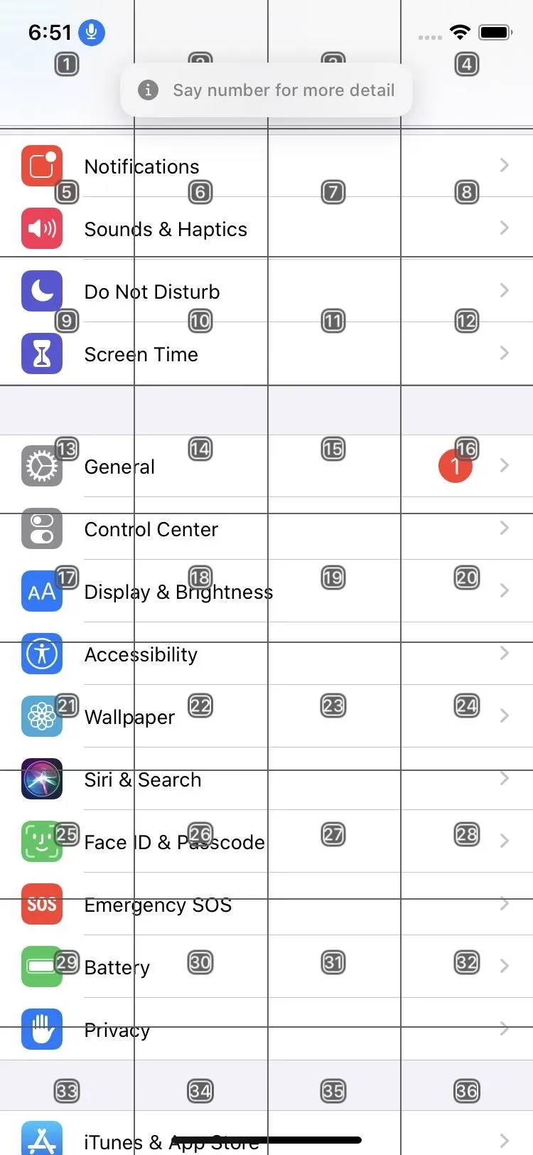
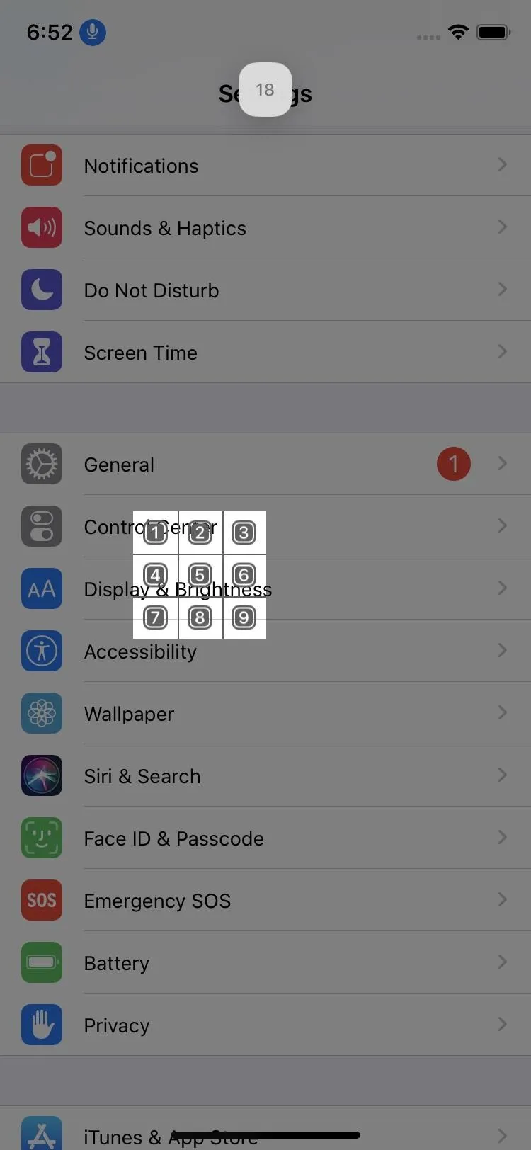


213. Touch Gestures Work Using Your Voice
Even without the grid above, you can still use touch gestures. "Tap [task]," "swipe left [email title]," and "zoom in" are just some of the touch gestures you can perform using your voice.
214. Dictate Text with Your Voice
When you need to write an email or compose a nose, you can do so with Voice Control, which uses the Siri speech recognition engine and machine-learning for accurate audio-to-text transcriptions.
215. You Can Use Rich-Text Editing Tools Using Your Voice
What's the point of being able to write text with your voice if you can't edit it the same way? That's why Voice Control comes equipped with rich-text editing system. A lot of the commands to do so are easy and intuitive, such as "undo that" or "redo that." If you need to replace some text, just say "replace [the text in quetion] with [the text you want to replace it]." Need to move up three lines? Say "move up three lines." Other commands such as "select," "capitalize," "bold," etc. work as well.
216. Add Custom Words for Voice Control
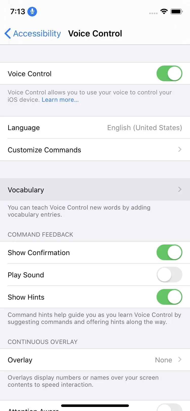
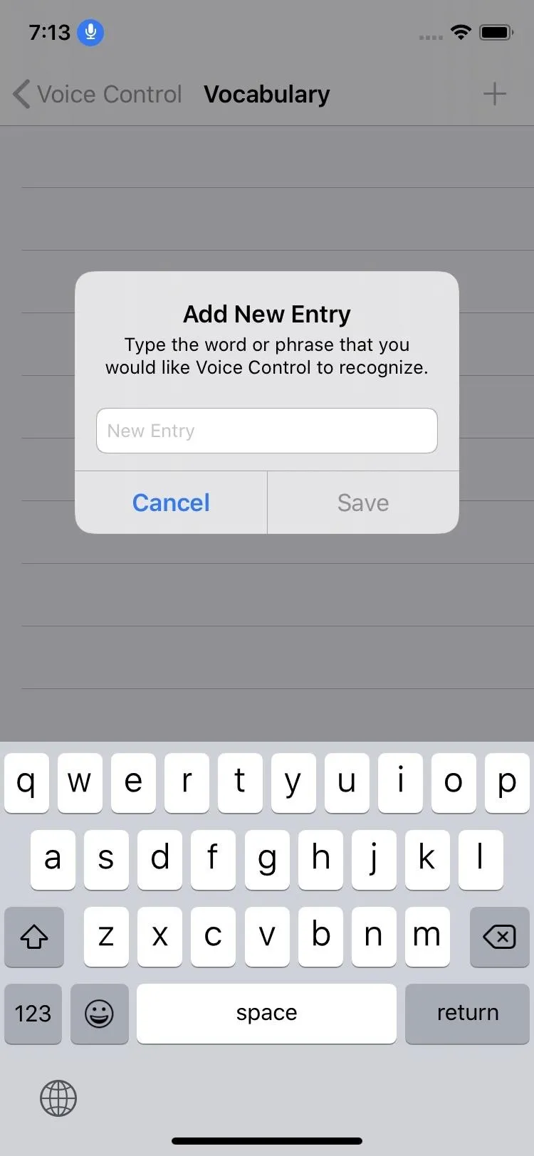
If Voice Control doesn't understand a word you're trying to say, you can teach it that word. In the Voice Control settings, you can tap "Vocabulary," then the plus (+) sign to add a new word.


217. Ask to Correct a Word or Emoji and Get Suggestions
When you type the wrong word or you'd rather use an emoji instead, you can ask Voice Control to correct a word and give you a list of suggested replacements. Just say "correct [text]" to see the list appear.
218. It Knows When You Want Dictation and Are Speaking Commands
Think you'll have a hard time using both commands and having your speech dictated? According to Apple, "Voice Control understands contextual cues, so you can seamlessly transition between text dictation and commands."
219. You Can Record Custom Multistep Commands
There are a ton of built-in commands you can start using right away, but if you need something that's not there, you can make it yourself. In the "Customize Commands" section, you can tap "Create New Command" to get started. You can even record multistep commands and give them a keyword phrase to speak instead of having to speak the whole multistep command. As an example, if you love to send messages with Invisible Ink, you can set all of the required steps to do so in one custom command for quicker action.
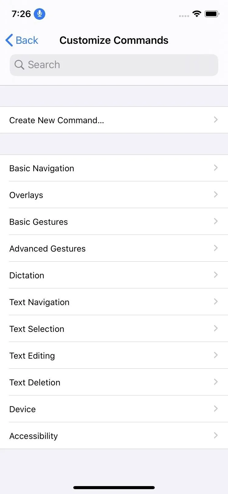
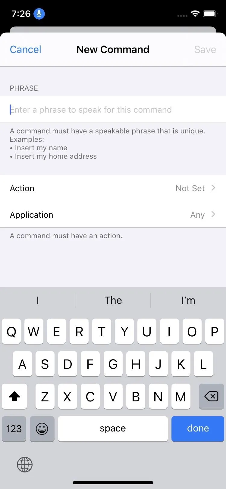
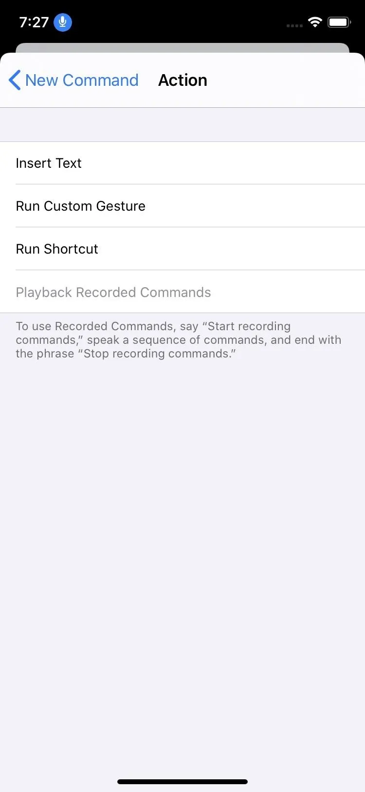


220. Built-in Commands Can Be Disabled
If a particular built-in command is causing you issues, you can go into the Voice Control settings, find it, and disable it, so you have no more problems.
221. Voice Control Sleeps When You're Not Facing the TrueDepth Camera
Voice Control has Attention Awareness built-in, which can be toggled on or off. With it on, whenever you look away from the TrueDepth camera on the iPhone X and up, the microphone input is disabled. That way, if you're talking with a friend in person and aren't looking at your screen, your iPhone isn't trying to interpret anything being said. When you look back at the camera, the mic turns back on.
Accessibility Improvements
The Accessibility settings menu has received a few upgrades besides Voice Control.
222. Accessibility Is More Important in Settings
Before, you'd have to go into Settings –> General –> Accessibility. Now, you just go to Settings –> Accessibility, as it has its own dedicated space up front and center.
223. The Accessibility Menu Has Been Revamped
To go with its new location, Apple reorganized everything in the Accessibility menu. There are quite a few changes, from name changes to moved settings and more.
224. Face ID Can Use Haptic Feedback
You can enable haptic feedback for successful authentication with Face ID. So whenever you use Face ID to unlock your device, you'll feel it. There was some vibratory feedback in other Face ID uses before, so the new thing here is device unlocking.
225. You Can Disable Haptic Feedback for Face ID Device-Wide
As we said, haptic feedback for Face ID was supported before pretty much everywhere besides device unlocking, but there was no way to disable it if you didn't like it. Now there is.
- More Info: How to Turn Off Haptic Feedback for Face ID
226. More Apps Lets You Disable Auto-Playing Videos
You can disable auto-playing videos not just in the App Store and iTunes but in other Apple apps, with third-party apps being able to use the public API to let you do the same.
227. Disabling Message Effects from Playing Automatically Is Now Easier
Previously, the only way you could disable Message Effects, whether bubble or screen effects, was to enable "Reduce Motion," which unhid the setting. Now, you can disable Message Effects from the "Motion" accessibility settings without having to also enable "Reduce Motion."
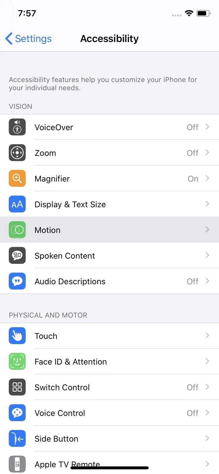
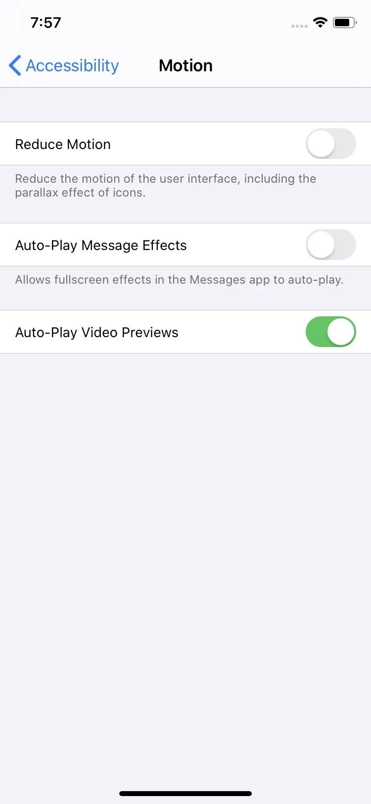


Performance Improvements
If you're not getting a new iPhone 11 model, it doesn't matter. Your older iPhone will still work fine with iOS 13 — and it should even work better.
228. Face Unlock Is 30% Faster Than in iOS 12
This applies to iPhone X, XS, XS Max, and XR models.
229. App Downloads Are 50% Smaller Than in iOS 12
This applies to all iPhone models that support iOS 13.
230. App Updates 60% Smaller Than in iOS 12
This also applies to all iPhone models that support iOS 13.
231. App Launch Speed Is 2x Faster Than in iOS 12
Yes, you can see where I'm going with this — this applies to all iPhone models that support iOS 13.
Other Improvements
- Daily Reading Goal in Books, where you can build streaks and reach achievements
- You can send spam and unknown callers for Phone directly to voicemail
- Caller verification will appear in the Phone app if the carrier supports SHAKEN/STIR
- There's a new Contacts app icon that looks smoother
- The Reminders app icon looks slightly different
- App Store's "Updates" tab is gone, replaced with new "Arcade" tab
- To view updates for apps in App Store, you need to tap your profile icon from any of the working tabs
- The subscriptions menu item is more noticeable, coupled with purchases now
- Voice Memos has a new splash screen
- You can pinch to zoom in Voice Memos
- Health will show you if the volume of your headphones is too loud
Cover photo by Justin Meyers/Gadget Hacks


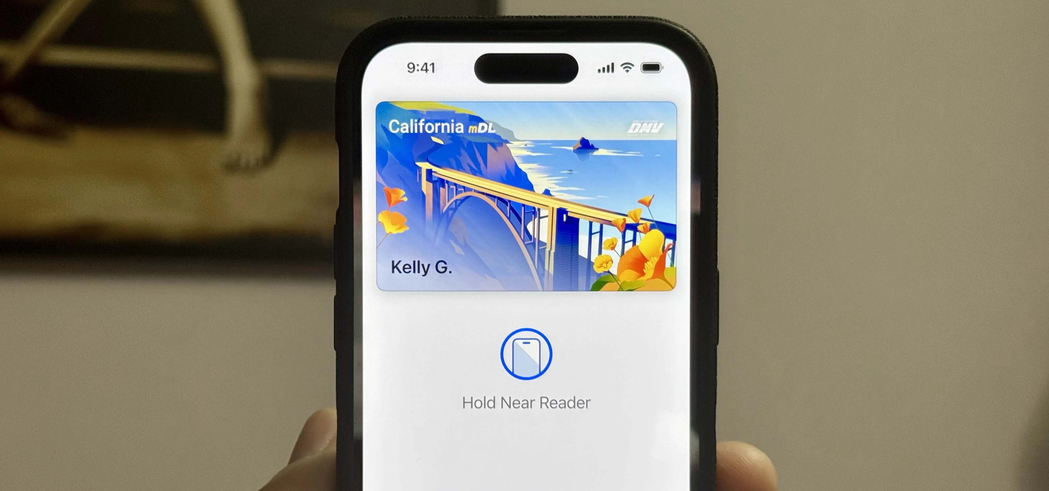




Comments
Be the first, drop a comment!