There's no denying that there are some seriously useful new features in iOS 11 for iPhone. But there's also no denying that Apple got a few things wrong with the latest iOS update, as well as left a few important features out.
Some of the items listed below are things Apple broke in the newest iOS 11 update, while others are things we've been wishing they'd include for years but still haven't. We'll keep updating this list as we find new issues and obvious omissions from Apple's newest mobile operating system for iPhone, so make sure to share your thoughts with us about anything you think should have made the cut here.
1. 3D Touch App-Switching Gesture Is Gone
Back in iOS 10, when you 3D Touched on the bottom-left corner of the display, it would let you switch quickly back and forth between apps. If you pressed longer, it would open up the App Switcher. Unfortunately, Apple removed this awesome feature in iOS 11, and it was intentional. It was probably done since it would work oddly on the new iPhone X, but what does that matter on all of the other iPhones? Apple claims it's coming back in a future iOS 11 update, but only time will tell.

Sayonara, 3D Touch gesture (left), hello, overused home button (right).


Sayonara, 3D Touch gesture (left), hello, overused home button (right).

2. App Store Wish List Is No More
If you've added any paid iOS apps to your Wish List before, brace yourself, because you will no longer be able to access that list in iOS 11. You won't even be able to add apps to your Wish List. And the final blow is that the new iTunes 12.7 that you were probably automatically updated to removed the iOS App Store completely. This means you won't be able to access your old Wish List unless you downgrade iOS or downgrade iTunes.

Say goodbye to this feature in iOS 11.
3. No Third-Party Apps in Control Center
One of the more impressive updates to iOS 11 is the redesigned Control Center which lets you add extra controls via the Settings app, such as Screen Recording and Notes. However, this is limited to just Apple software.
I'd love to be able to more in the Control Center, like look up a word in my Dictionary app or search for a password in LastPass. Since this is just the start of iOS 11, it's possible that Apple could open up the Control Center to third-party apps, but we're not betting on it.


4. No Quick Setting to Edit Control Center Tiles
One thing missing from the new Control Center that stands out is the omission of an "Edit" option like that on the Today view for widgets. That way, you don't always have to go to Settings -> Control Center to add, remove, or reorder Control Center icons, you can just tap on "Edit" from the Control Center itself to be sent right there. Maybe one day.
5. Connectivity Controls Are Confusing Now
Another problem with the new Control Center is the pane of connectivity controls. Previously, when you tapped on either Bluetooth or Wi-Fi, those settings would turn off. Now, when you tap on them, they are simply disconnected from the current device or network, respectively. In order to turn them off, you have to go into the Settings app or turn on Airplane Mode.

6. Auto-Brightness Setting Is Buried Deeper
While on the topic of what's missing from the Control Center, Apple should add a toggle to turn on and off Auto-Brightness. It's the least they could do since they buried the Auto-Brightness preference deeper into the Settings app.
7. New Notification Center Needs Some Work
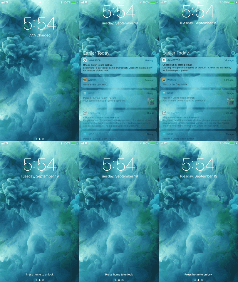
Notifications will take some getting used to. Why does my pull-down notifications screen look like the lock screen cover sheet now? Why do my notifications only partly show up when I swipe down from the top of the lock screen? Why is there no way to dismiss the lock screen cover sheet without pressing the power button? Some people have taken a more positive approach to this new setup, but Apple still has a few kinks to work out.


8. Volume HUD Is Still a Problem
We hoped this issue would finally be resolved, but nope. When you open the Photos app and play a movie, the volume HUD still pops up right in the middle of the video. Thankfully, this is not a problem everywhere. Safari got an updated video player with new volume controls and third-party apps can follow suit.

9. No Group Video Chats in FaceTime
This was thought to be a sure thing by like everyone, but it absent from iOS 11. I'm hoping Apple is still working on this because we shouldn't have to use third-party apps to fill the void. I mean, it would be pretty amazing to start a FaceTime video chat right from an iMessage group chat, right?
10. Huge Title Fonts in Apps
We're talking massive. If you don't know what I'm talking about, just remember how the Music app looked in iOS 10. Remember how "Library" and the other tab names were in big bold font at the top of the screen when you were on each tab? Well, that's now the standard look across most Apple apps, including Messages, Mail, Settings, Notes, and more.


11. Have to Jump Through Hoops to Rate Songs ... Still
Okay, despite Apple heavily promoting Apple Music, it doesn't seem to be important enough to be able to love, dislike, or rate songs with stars on the service — or more importantly, in your own music library.
You have to have the Music app open, slide up the Now Playing sheet, hit the ellipsis icon, and then love or dislike the song. If you want to rate a song, you have to tap on "Rate Song" to bring up the star options (if you even have it enabled in your settings), then hit "Done." Pain in the ass, right? You could use Siri, but not everyone likes to use Siri, especially when they're in a gym when you're trying to mind your own business.
Plus, how often do you listen to music with the Music app open? Why can't we just get a freakin' option to rate songs on the lock screen player or in the Control Center?


12. Can't See Song Ratings Easily ... Still
Why do you have to jump through the same hoops above just to see what you rated a song as? There should be an indicator on the Now Playing screen, in the lock screen player, and in the Control Center player. I know I'm getting hung up on a lot of this rating music stuff, but I came into the iPhone from an iPod background. I'm sure that's how a lot of others got hooked on iPhones, too. So why are all the things that made the older iPods so good getting ditched?
13. No Default Way to Toggle Flashlight Off from Lock Screen
While this is not a new issue, Apple still has not added a quick way to turn off the flashlight from the lock screen. Unless you actually use the flashlight with the Control Center open the whole time (the display will eventually time out), you still have to use the Control Center to turn it back off. Why not just click one of the volume buttons? There is a workaround, but there should be a real option besides buying an iPhone X (which has a flashlight toggle right on the lock screen).
14. Deleting Mail Is Still a Pain in the Ass
I thought my video on the topic was enough to show how ridiculous deleting emails in bulk was on the iPhone, but I guess that wasn't a big enough concern for iOS 11. Apple, please make this easier!
15. Can't Unhide Hidden Apps Anymore
While Apple did add a way for anyone to hide purchased apps on their iPhone in iOS 11 — not just those with the "Family Sharing" feature turned on — they also made it impossible to unhide those apps.
Well, you couldn't unhide app purchases in iOS 10 either, to be fair, and the only way to do so was from iTunes. But that's where the shitty part comes in ... the new iTunes 12.7 removed all traces of the iOS App Store from it, which also means you can no longer use that to unhide apps on your iPhone.
16. Screenshots Previews Can't Be Disabled
Don't get me wrong, there's a lot of cool abilities in Apple's new screenshots editing tool, but if you don't actually use those features, why would you want to see a screenshot preview every single time you take a screenshot? There should be a way to disable this feature, at least until you actually need it. You can dismiss the previews, but not disable them entirely.

17. Night Shift Is Less Convenient
I use Night Shift every single night on my iPhone, so the two-gesture shortcut to enabling it in iOS 10 was great. But that two-gesture approach from the Control Center is now a three-gesture one in iOS 11. Why did they feel the need to hide it behind the brightness slider? And why can't I get an individual Night Shift toggle in the customization options?

Big button in iOS 10 (left) vs. nothing in iOS 11 (right).


Big button in iOS 10 (left) vs. nothing in iOS 11 (right).

18. Non-Animated GIFs Show Up in Animated Album
One of the biggest issues with the Photos app before was that animated GIFs were never animated. Well, iOS 11 solved this by finally supporting animated GIFs. They even go into their own "Animated" album. However, if it's a non-animated GIF, it will still show up in this "Animated" album. So it seems there's no impressive tech behind how Apple tells what's animated and what's not ... they just see the GIF extension and assume it's animated.
19. Live Fish Wallpapers Are Gone
Why did Apple remove all of the fish-based live wallpapers in iOS 11? It would make sense if they replaced them with new ones, but they just deleted them. So now there are only three live wallpapers to choose from in the Wallpapers options.

Live wallpapers in iOS 10 (left) vs. iOS 11 (right).


Live wallpapers in iOS 10 (left) vs. iOS 11 (right).

20. New Media Formats Don't Play Nice with Other Devices
This one shouldn't suck for very long, but right now, Apple's new video and image codecs aren't supported on many other platforms. When you share a video file with someone who uses Windows, for instance, they won't be able to see anything — only the audio will come through. Same goes for HEIF images, which may have a JPG or PNG extension like usual, but are compressed with a codec that is still highly uncommon. But expect other systems to start adding support for HEVC and HEIF soon, so hopefully, your images and videos will be shareable again.
These are just a few of the issues that iOS 11 needs to address. While Apple most certainly won't add solutions to all of the issues, maybe at least one will get some all-star treatment. And there are always more features we'd like to see, such as swipe typing in the keyboard, multi-user support, etc. What other iOS 11 problems did we miss? Sound off below.
- Follow Gadget Hacks on Facebook, Twitter, YouTube, and Flipboard
- Follow WonderHowTo on Facebook, Twitter, Pinterest, and Flipboard
Cover photo and screenshots by Justin Meyers/Gadget Hacks


Comments
Be the first, drop a comment!