


There's never an Apple announcement without some good ol' anger and backlash.
To be fair, Apple received some really positive feedback from parts of the iOS 11 presentation at WWDC back in June. Fans had been waiting for years to customize the Control Center, as well as for native screen recording. But if there was one thing that got fanboys and Apple haters raging about in unison, it's that weird, incomprehensible notification system.
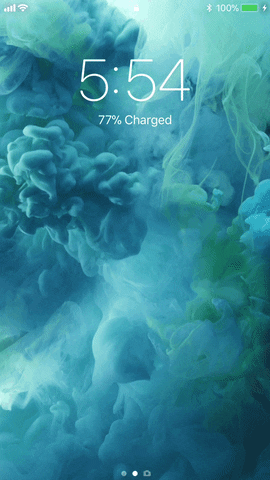
Seriously, what is up with the Notification Center? It doesn't make any sense. To access your notifications from within an app or your home screen, you swipe down from the top just like always — but when you do, you'll find yourself on your lock screen, which Apple called a cover sheet during the betas. And this isn't a bug. This nuisance was intentional.
If you have current notifications, they will show up here. If you tap on them, they will take you to the app. Pretty standard.
The biggest problem with the new Notification Center, in my opinion, is when you swipe down from the top of your lock screen. You see an "Earlier Today" section appear briefly, then disappear. Why couldn't they just keep the gesture the same? Instead, now you have to swipe up on the screen to see your recent notifications, and you need to be careful not to swipe up your Control Center instead.

Plus, worse yet, when you're on the lock screen and access your recent notifications, there's no way to get rid of them. You can't swipe up from the bottom of the screen to hide the shade — you have to click the power button then wake the iPhone again to remove them from the screen.
Naturally, the internet responded to this update with scorn and resentment. With context, it makes sense. Apple fans have been complaining for a while now that iOS's notification system isn't good. They call it out for being disorganized and frustrating to follow when ideally it should be entirely straightforward. iOS 11's approach only obfuscates the entire notification architecture even further.
Just check out what Reddit and the Twittersphere had to say following the presentation:
I hate that it turns into the lock screen when you pull the notification tab down
Still no grouping of notifications by app. This is seriously disappointing.
I don't like that Notification Center is now a lock screen. I'll get confused so many times in the Notification Center thinking if my phone is actually locked or not ??.
Notifications are currently what frustrates me the most about iOS. Grouping by app would at least partially alleviate the issue, but that was removed without comment.
Android notifications right now are so well done, between quick reply and grouping by app with nice animations to show hidden notifications. I just don't understand how Apple is content with what they have right now.
Of course, there were a lot more issues in the iOS 11 betas, and they actually fixed issues such as weird swipe gestures on the lock screen, so there's a chance Apple can change these issues too.
It's also possible that we could all be overacting a bit based on the sheer shock of being greeted by our lock screens when we were expecting the Notification Center. And actually, there are some positives to this UI change, and we've outlined them all in the following guide. So if you're still pissed at iOS 11's notifications, maybe take a second to open this link:
- Follow Gadget Hacks on Facebook, Twitter, Google+, YouTube, and Instagram
- Follow WonderHowTo on Facebook, Twitter, Pinterest, and Google+
Cover image and screenshots by Jake Peterson/Gadget Hacks


Comments
Be the first, drop a comment!