


Apple likes hiding things in its software, including secret apps, hidden iMessage effects, status bar customization, nameless icons, and red screen mode, but some of its best Easter eggs are right in front of you on the Home Screen.
Some of Apple's app icons on iOS 17, iPadOS 17, and earlier versions have hidden meanings, useful but easy-to-miss details, changing visuals, and other clever elements. While most app icons are pretty straightforward, Apple UI designers made the following iPhone and iPad apps a little more special.
Jump to an app:
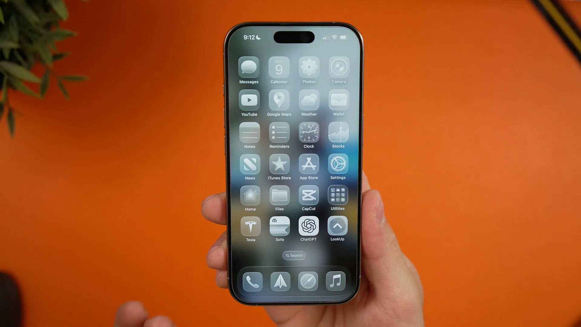
1. The Clock Icon Is a Working Clock
You might not have noticed it until now, but the Clock app's icon on the Home Screen, in the App Library, and in Spotlight Search is a functional analog clock face. Look at it, and it will tell you the same time that's in your status bar, along with a constantly moving second hand.
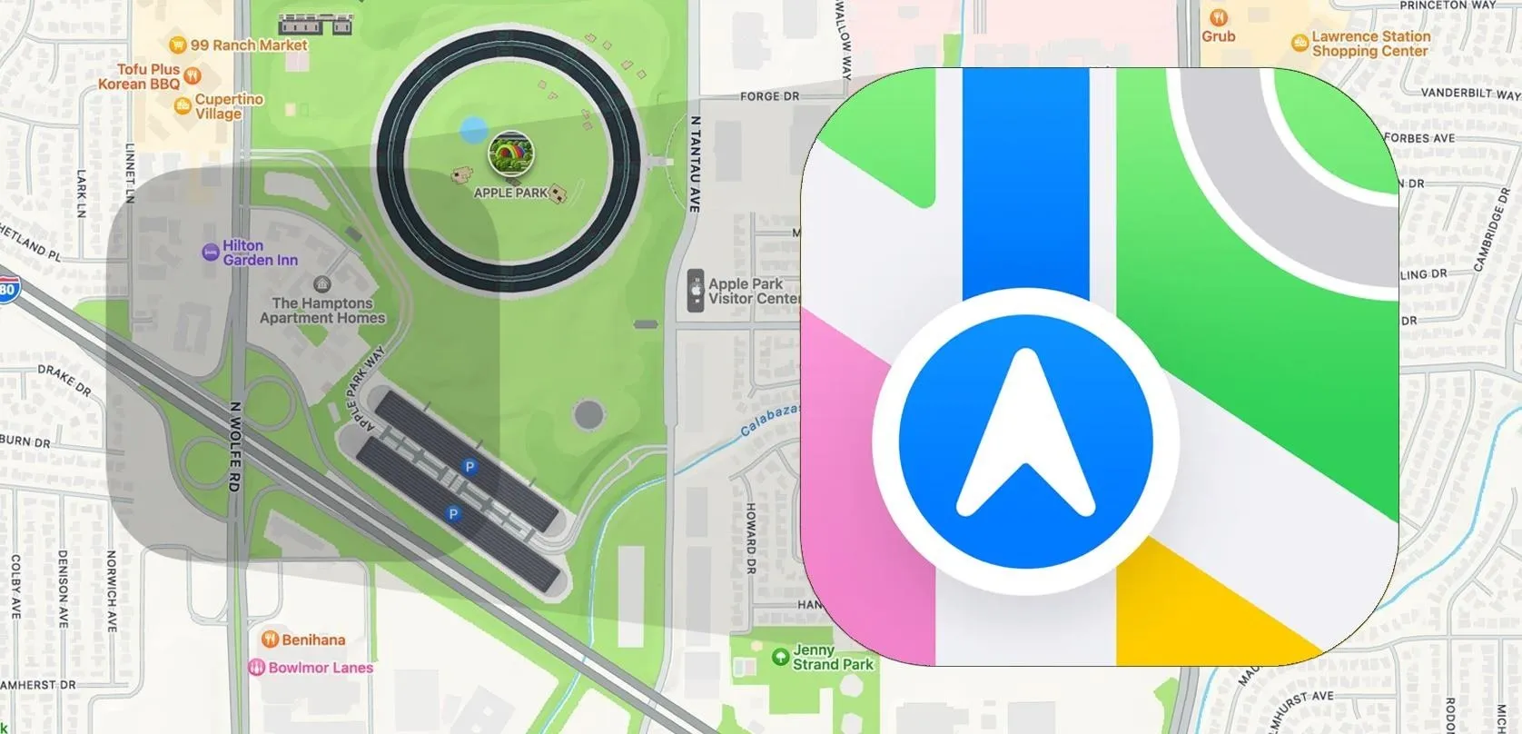
2. The Apple Maps Icon Shows Apple's Campus
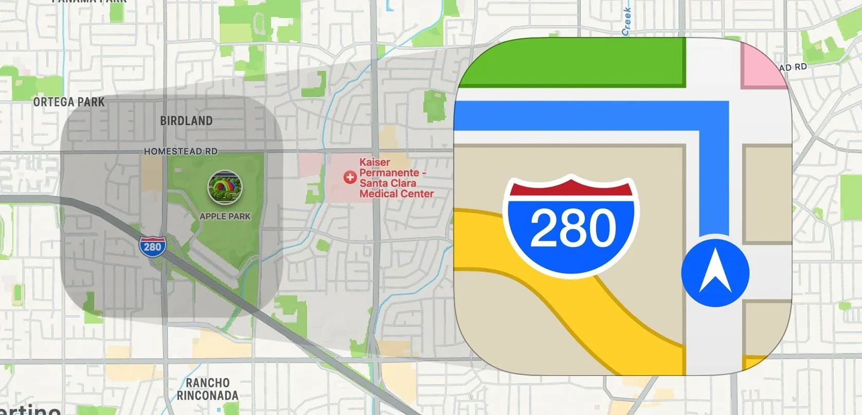
Before Apple Maps even existed, the Maps app for iPhone OS and iOS was Google Maps. Still, the icon represented the location of 1 Infinite Loop, Apple's original headquarters in Cupertino, CA. When Apple Maps was first released on iOS 6, the app icon kept the location but highlighted turn-by-turn directions (though it erroneously showed driving off a bridge onto Interstate 280).
Apple switched things up on iOS 7, showing the future site of its new campus, Apple Campus 2. The campus was not open to employees until 2017 when it became known as Apple Park. Since the area was still in construction, the icon's design was less obvious than the 1 Infinite Loop version.
When iOS 11 came in 2017, Apple updated its Maps icon with a piece of its spaceship building at Apple Park. It was a nice touch to celebrate the completion of Apple Park, which was also where Apple held its first event in September when iOS 11 was released. It also clearly marked Apple Park in the Maps icon.
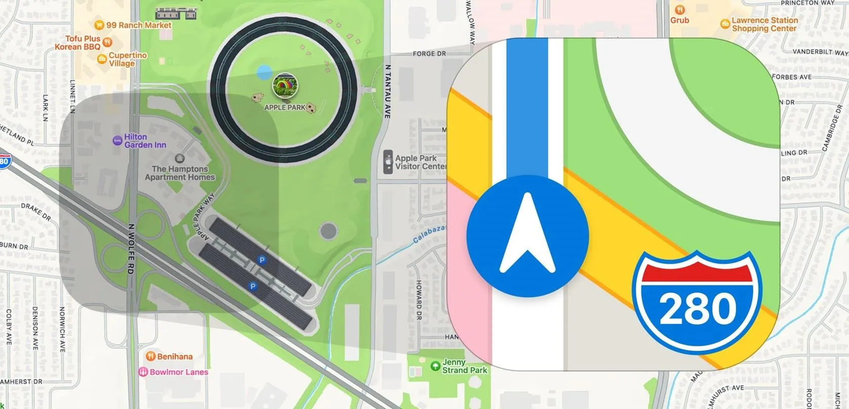
The most recent version of the Maps app icon first appeared on iOS 15 in 2021. It mostly follows the same pattern as the previous iteration, but the colors are brighter and more shaded overall. The green has also spread across N Wolfe Rd, perhaps lining up with the grassy area Apple Maps shows at the location.
Additionally, Apple has ditched the yellow-gold color for Interstate 280, opting for a simple white road instead. The yellow-gold color now fills the land area below the interstate east of N Wolfe Rd. This change may be because Apple wanted to distinguish the spaceship building from the road, which were both white. So, moving gray up to the building would require replacing the gray-like color previously used for land.
The new flatted design simplifies the look for a more minimalistic and streamlined appearance.
3. The Testflight Icon Visualizes App Development Phases
In 2020, Apple changed the icon for its TestFlight app — a tool to help third-party developers beta test their apps and for iPhone users to try out new apps and app updates before everyone else.
Instead of just the flat three-bladed propeller, it's now a visually rich 3D representation of the propellor but with much more going on. The propellor's blades are now app icons in various stages of development. They even show the angled pitch associated with actual blades. And the circle around the propellor better shows the tip vortices and thrust.

4. The Flashlight's Icon Changes Switch Positions
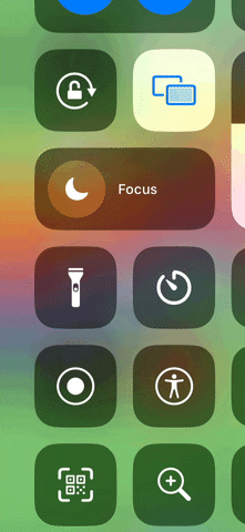
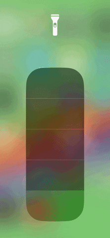
While you won't see the Flashlight app's icon on your Home Screen, in a Spotlight Search, or in your App Library, it does appear on your Lock Screen and in Control Center, and it does a pretty fantastic thing.
The colors invert when you long-press Flashlight's icon on the Lock Screen to turn it on, but what's more impressive is that the switch on the icon moves the button from the off position at the bottom to the on position at the top.
You'll notice the same thing when you tap the Flashlight control in Control Center, but the whites turn to blues instead of black. But long-press the Flashlight control to open the brightness controls, and you'll see the on-off button movement more clearly since it's the only thing visually affected there.

5. The Podcasts Icon Pays Tribute to the iPod
Apple didn't invent podcasts, but it sure made them famous. The word "podcast," first used in 2004, is a portmanteau of "iPod" and "broadcast," but Apple didn't add support for podcasts in iTunes until 2005 and didn't release the Podcasts app for iOS until 2012. Still, there were third-party apps that iPod users could use to play podcasts before Apple's official implementation.
When designing the Podcasts app icon, Apple used the "i" in iPod to highlight it as a core part of the term's origin. The lowercase "i" in Apple's clever design also resembles a person's shoulders and head as well as a microphone.
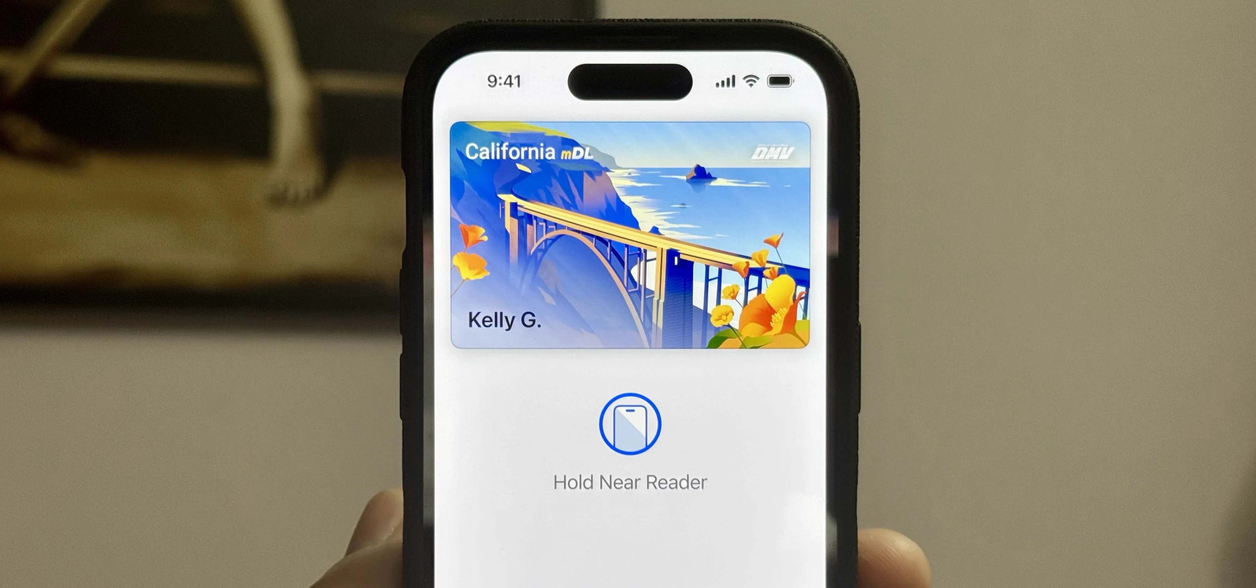
6. The Calendar Icon Is a Working Calendar
This may be the most obvious "Easter egg" in this list, but the Calendar app's icon shows the current date with the day of the week, making it just as functional as the Clock app's icon. However, it wasn't always like this.
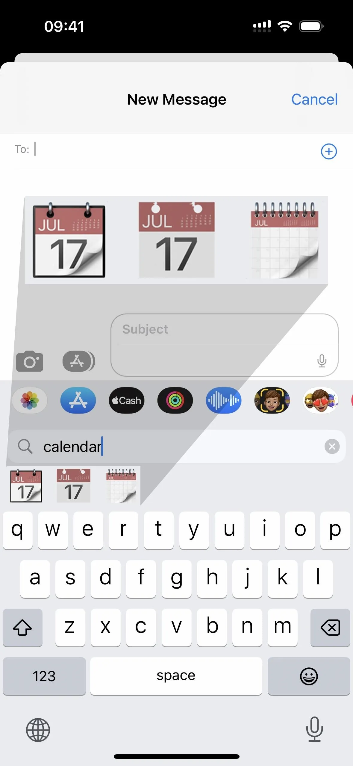
Before Apple's dynamic Calendar app icon, the date shown was always July 17 without a day of the week. It was even like this on the iCal app icon on Macs before the iPhone even existed. July 17 marks the day Apple introduced the iCal app in 2002 during the summer Macworld Expo. It's also the date Apple put on its first calendar emoji, which eventually led to the creation of World Emoji Day on July 17.
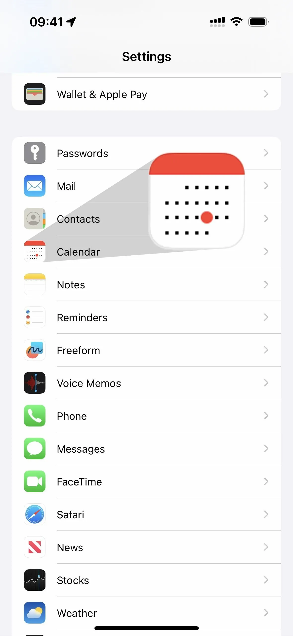
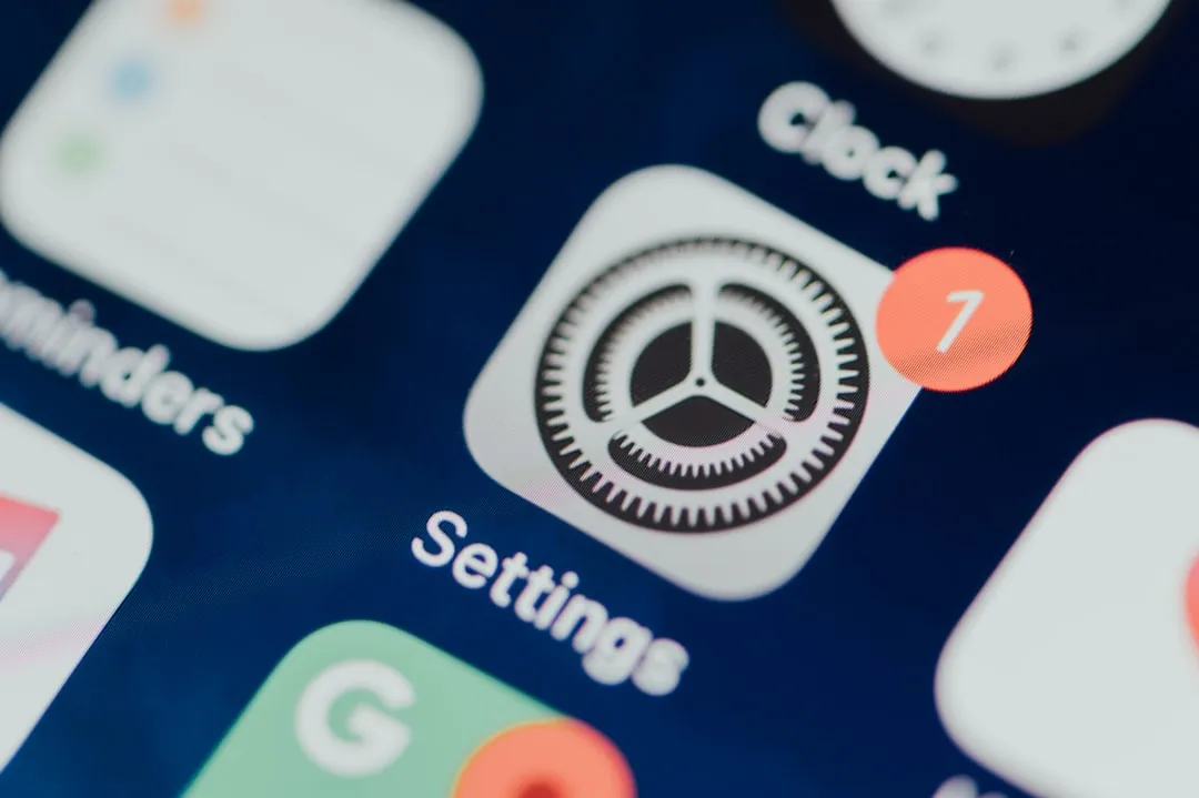
While July 17 no longer appears on the Calendar app's icon, you can see it in three emoji. The tear-off calendar and torn-off calendar page emoji both clearly show "17," while the spiral calendar puts the 17th directly in the middle. Also, when you open the Settings app, the icon used for the Calendar app shows days as dots, with a red dot pointing out the 17th.
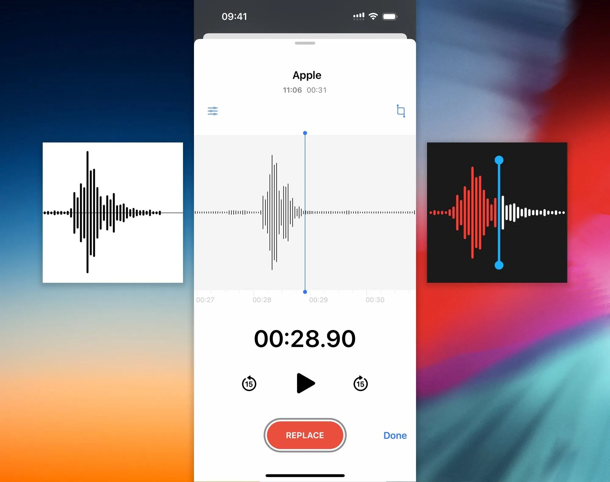
7. The Voice Memos Icon Is Waveform for 'Apple'
There is no evidence of this from any Apple reps, but people say that if you say "Apple" in the Voice Memos app, the waveform looks like the Voice Memos app icon. Some rumors suggest it's the waveform of Steve Jobs saying "Apple" to honor him after his passing.
The waveform icon for Voice Memos first appeared on iOS 7, replacing the old microphone image. The icon was improved on iOS 12, replacing the black-waveform-on-white look with a red and white waveform on a black background with a blue playhead marker. The waveform itself looks similar in both icons.
Cover photo, screenshots, and GIFs by Justin Meyers/Gadget Hacks


Comments
Be the first, drop a comment!