Now that iOS 11 is official, everyone can enjoy all of the great new features available, but there are certainly a few bad seeds in there that you'll probably find annoying. Luckily, a lot of these disagreeable quirks can be changed for the better.
In the new iOS 11 for iPhone, some settings that you're used to using frequently have moved, there are auto-playing videos, thumbnail previews in your way, and other annoying issues that we have some solutions for. There will surely be more annoying issues to deal with as we dig deeper into Apple's newest mobile operating system, and we'll be sure to update this guide as we find them.
1. Auto-Brightness Settings Moved
If you hated using Auto-Brightness on your iPhone, either because it didn't do a great job or because you just like having control, you'll immediately notice that it's no longer in the "Display & Brightness" settings. It's not entirely gone, though, just moved to a less convenient location.
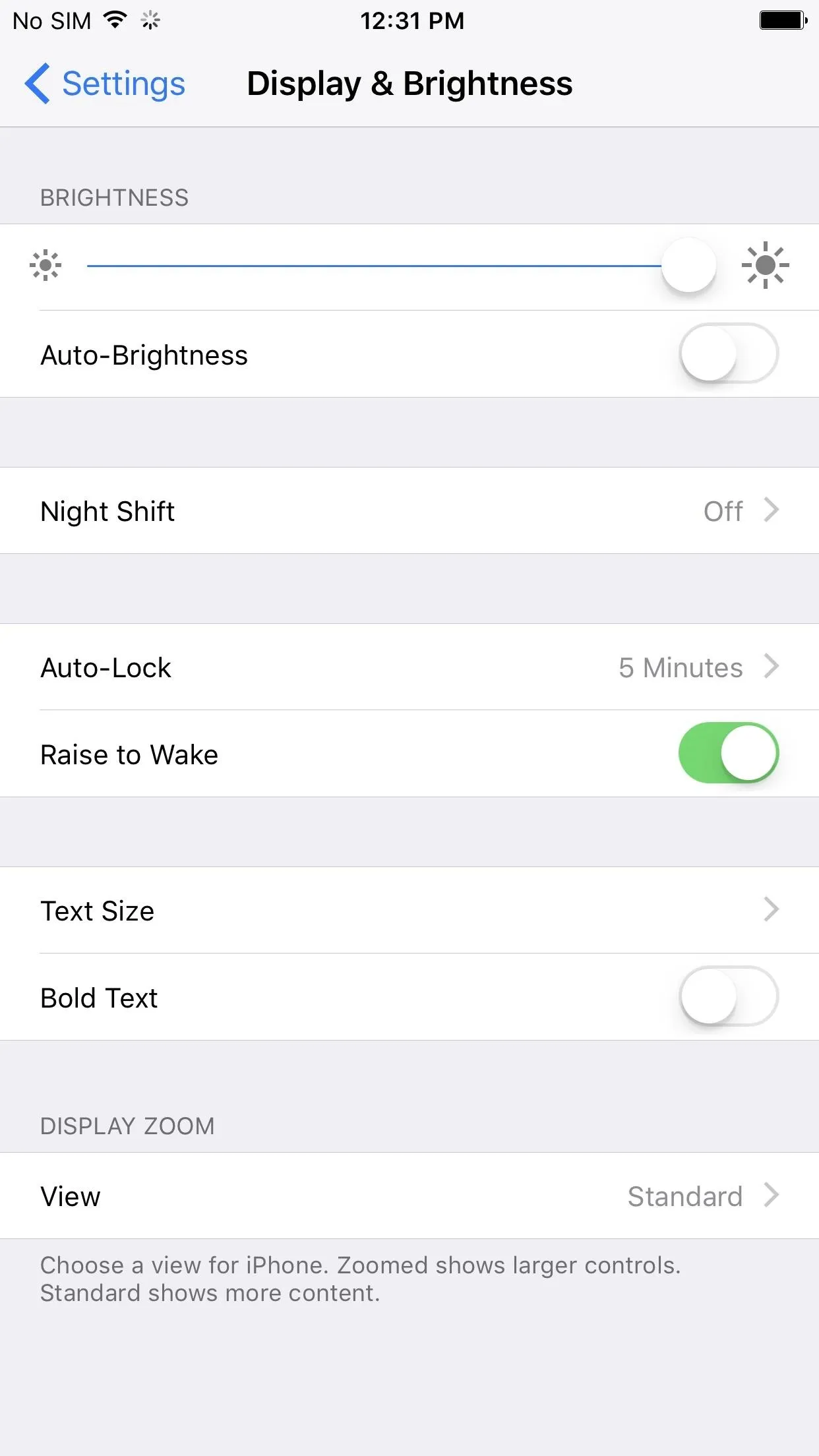
The Display & Brightness settings in iOS 10 (left) vs. iOS 11 (right).
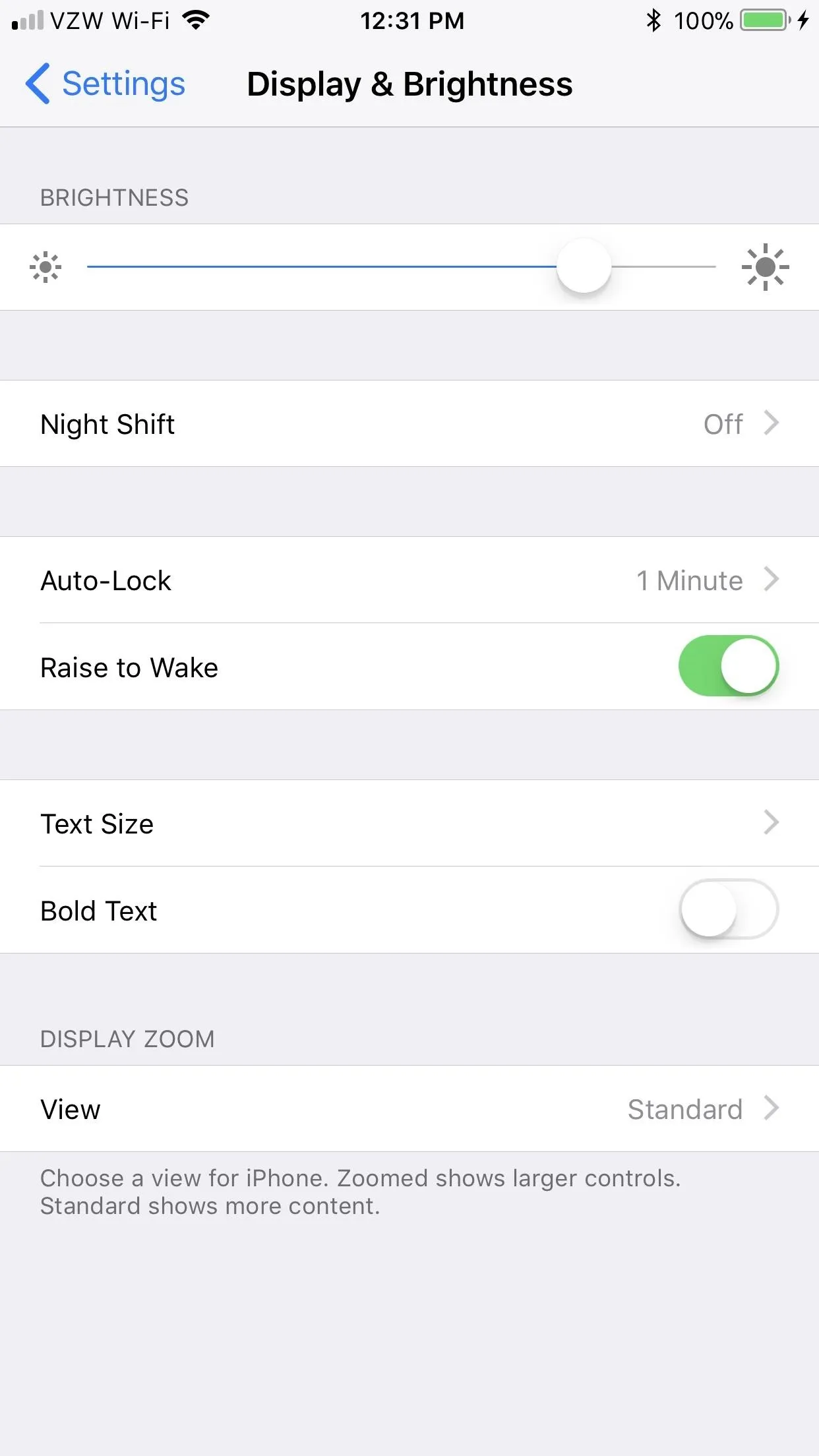

The Display & Brightness settings in iOS 10 (left) vs. iOS 11 (right).

2. And So Did the Option to Add Email Accounts to Mail
Back in iOS 10, to add a new email account to the Mail app, you would go to "Mail" in the Settings app, then "Accounts" to add a new account. You could also add new email accounts from the "Calendar" or "Contacts" settings. Well, Apple decided to group the "Add Account" option into its own section in the Settings menu.
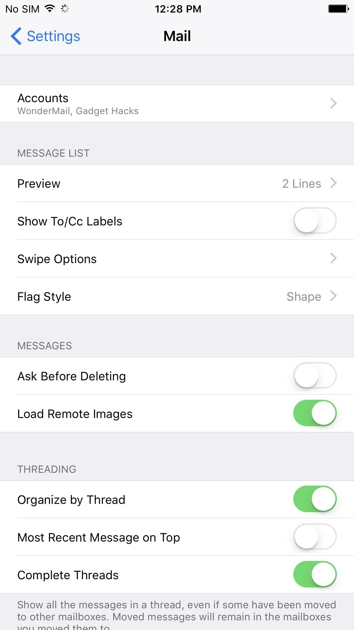
Mail settings in iOS 10 (left) vs. iOS 11 (right).
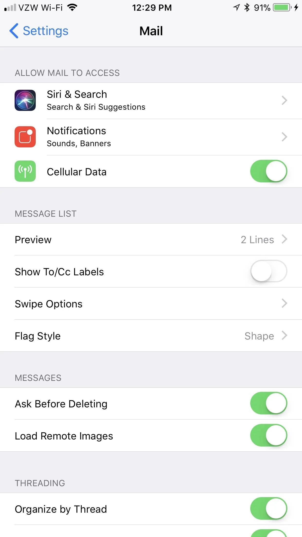

Mail settings in iOS 10 (left) vs. iOS 11 (right).

3. Videos Auto-Play in the App Store
When you check out new apps and games in the iOS App Store, if they have a video preview available, they will automatically start playing. Don't like this? It's easy to turn off.
4. Night Shift Mode Is Hidden
If you use Night Shift mode every night like I do, you'll quickly see that the big "Night Shift" button is not included in the new Control Center anymore. Well, it's still available in the Control Center, it just takes another gesture to get to it.
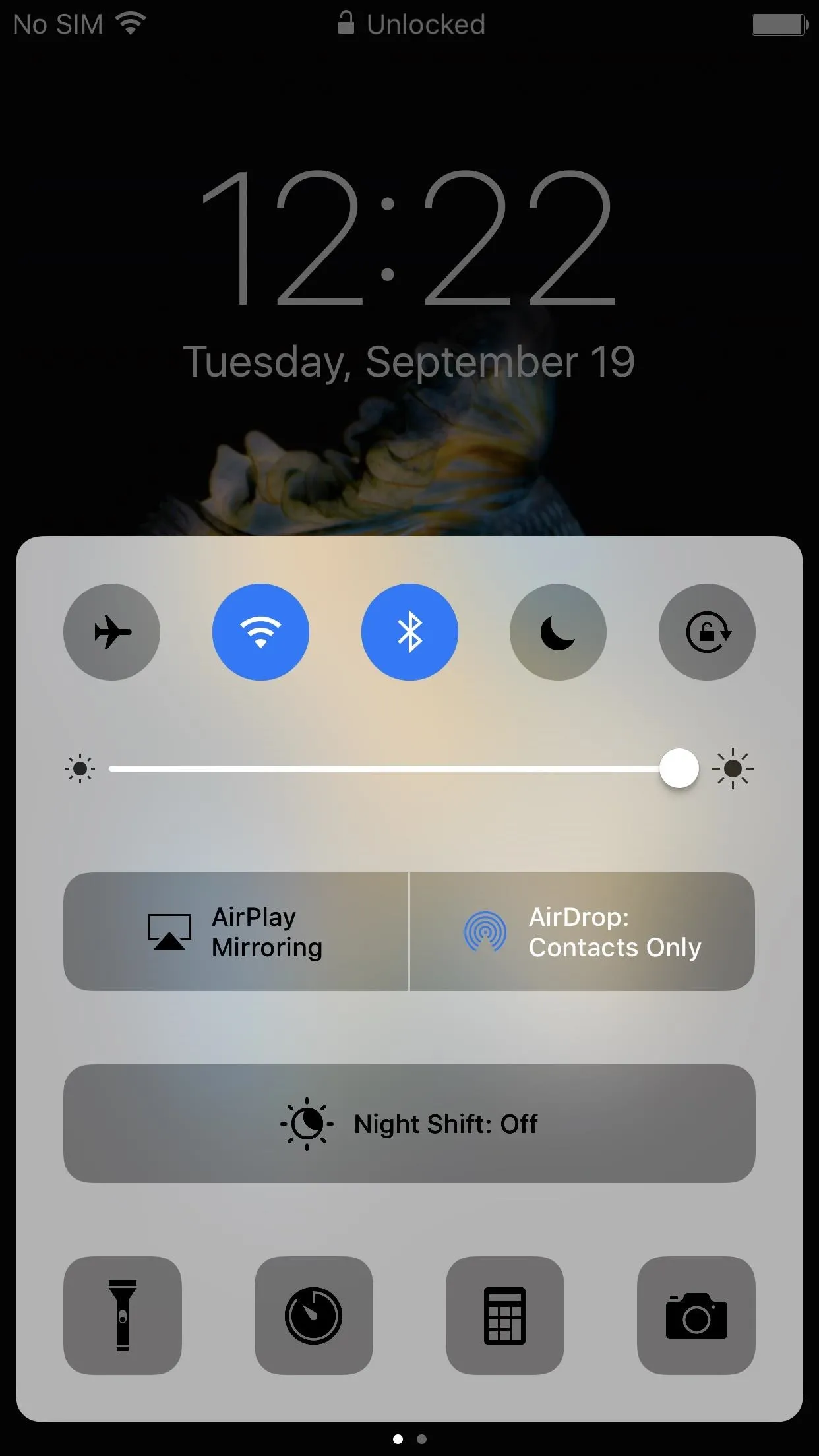
Big button in iOS 10 (left) vs. nothing in iOS 11 (right).
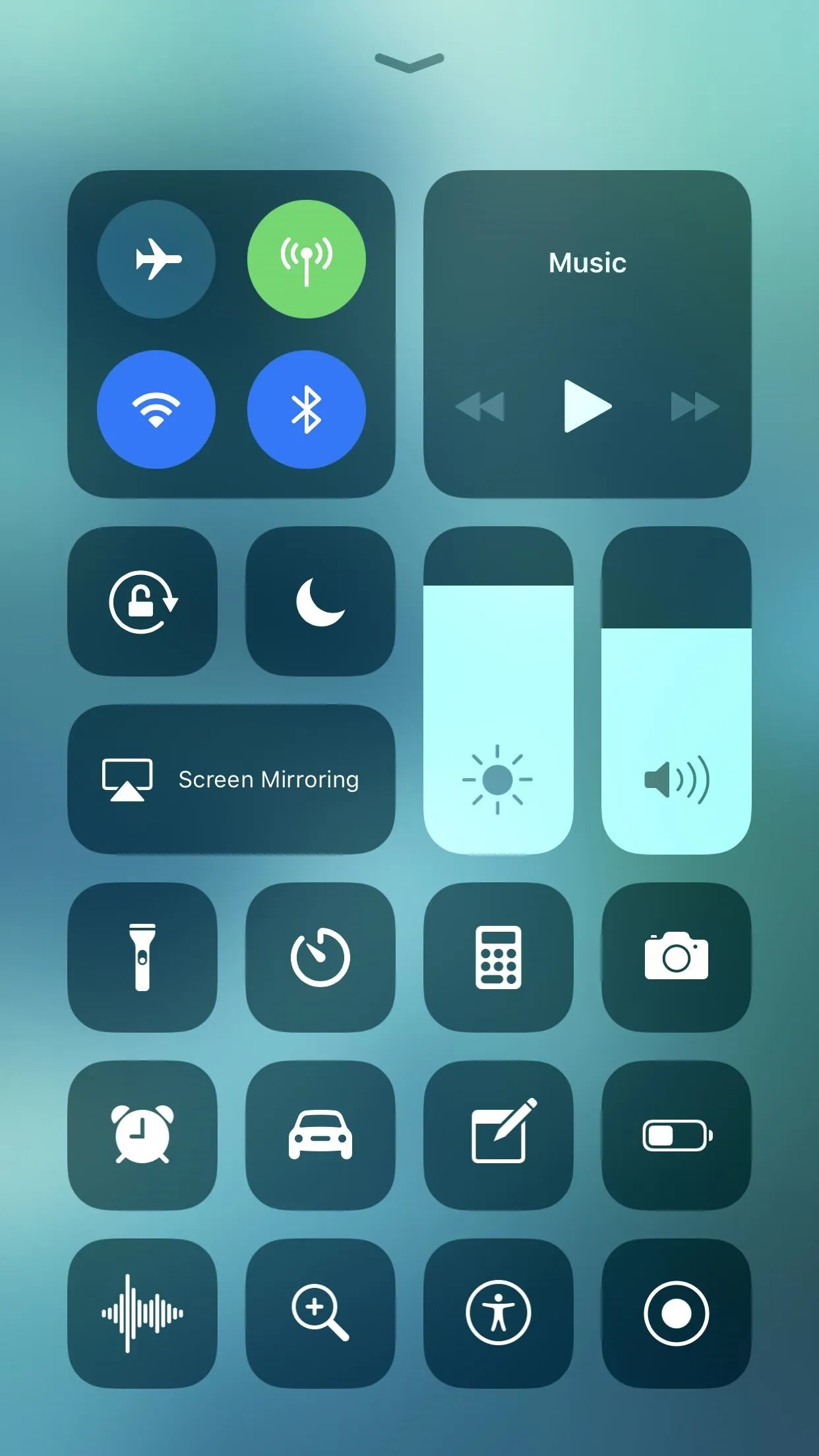

Big button in iOS 10 (left) vs. nothing in iOS 11 (right).

5. Bluetooth & Wi-Fi Won't Turn Off
Back in iOS 10, when you would tap on the Bluetooth or Wi-Fi toggle in the Control Center, the setting would turn off. It would even say so. Now, when you tap on them, they won't turn off, they will only disconnect from the current device or network, respectively. While there is no long-press or 3D Touch action to turn them off, there are other ways to do it.

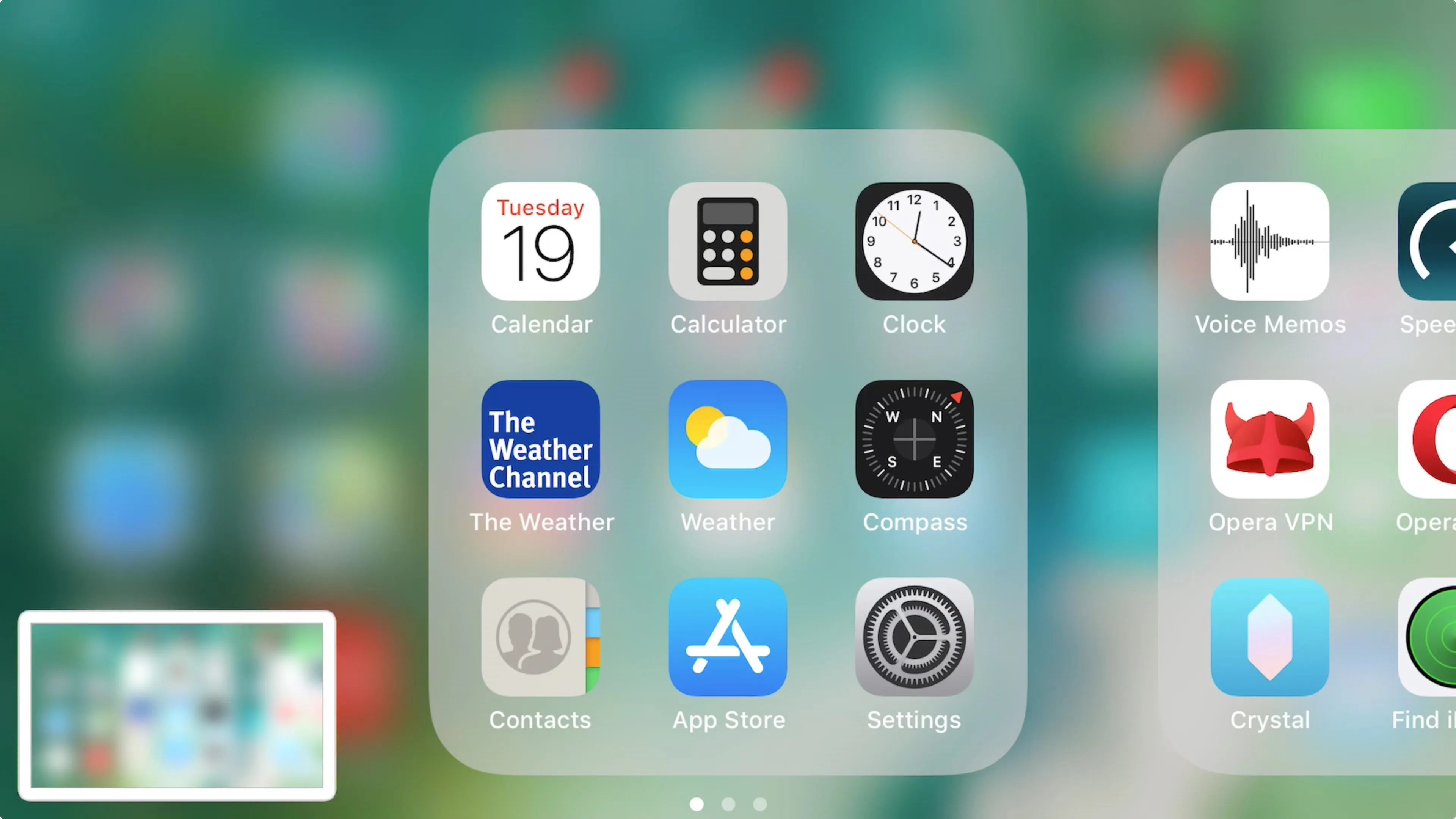
6. There Are Thumbnails Every Time You Screenshot
While most people will probably love Apple's new screenshot editing feature, there will be at least a few that will hate seeing that thumbnail image appear in the corner of the screen every time a screenshot is taken. While there is no big setting to turn the new screenshot tool, you can quickly dismiss the preview.
7. The Fish Live Wallpapers Are Gone
Apple added a bunch of new wallpapers to iOS 11, but they also removed a few from iOS 10 that will surely be missed, specifically, the live wallpapers of fish. Luckily, there's a way to get them back, only they won't work exactly as they did before. Still, it's better than nothing.
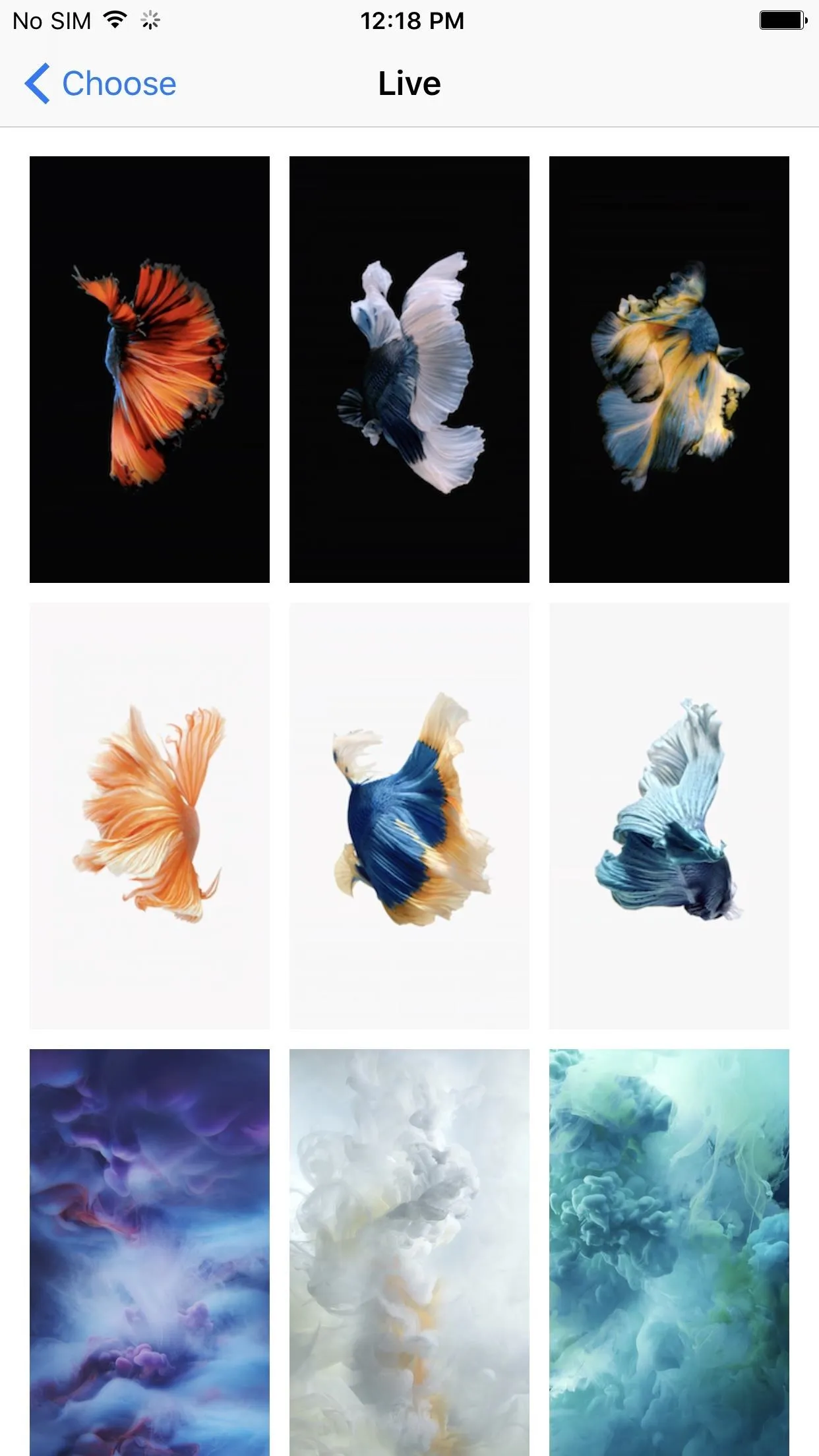
Live wallpapers in iOS 10 (left) vs. iOS 11 (right).


Live wallpapers in iOS 10 (left) vs. iOS 11 (right).

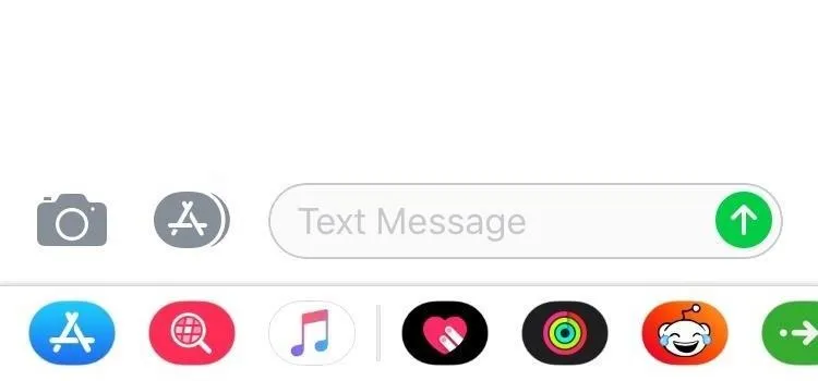
8. There's an App Drawer at the Bottom of Messages
This may not sound horrible to you, but if you don't use any iMessage apps when you're texting or iMessaging others, then it just becomes an annoying thing to look at every time. There is a trick to disabling it, though, so that's good. Everybody wins.
9. There's No More 3D Touch Gesture for the App Switcher
For those of you who preferred 3D Touching the bottom-left corner of your screen to access the App Switcher instead of the home button to quickly switch between apps, we've got bad news: it's no longer available. It was revealed to be an intentional change during the betas, but Apple also claims it will come back in a future iOS 11 update. Until that day, they've at least added another on-screen option for accessing the multitasking screen.
Anything else about iOS 11 on your iPhone that absolutely annoys you? Share your experiences in the comments below. We'll try to find answers to your problems!
And to be honest, iOS 11 isn't bad at all, so don't less these issues deter you from everything that's great. Be sure to check out our roundup of iOS 11 features to learn everything you can do with your iPhone that you couldn't do in iOS 10.
- Follow Gadget Hacks on Facebook, Twitter, Google+, YouTube, and Instagram
- Follow WonderHowTo on Facebook, Twitter, Pinterest, and Google+
Cover photo and screenshots by Justin Meyers/Gadget Hacks


Comments
Be the first, drop a comment!