While the Mail app didn't get as much love from Apple in the iOS 11 update as Maps, Photos, Safari, Siri, Camera, Messages, Notes, and the App Store did, there are still a few new features you need to know about when emailing on your iPhone.
Sadly, they did not make bulk deleting emails any easier, which was at the top of my wish list. And the new "Top Hits" search feature seems to be just a macOS High Sierra feature, not an iOS 11 one. Apple did, however, make it easier to add quick doodles to your emails, among other things.
#1. You Can Insert Drawings
Apple brought over the same cool drawing tools from the Notes app over to Mail, so you can doodle all you need to without having to do it in another app and upload it as an image or attachment.
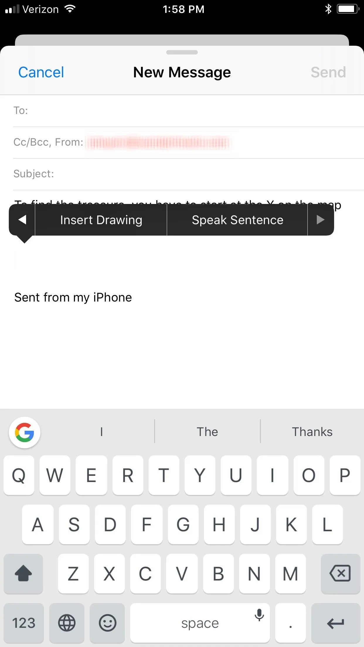
To insert a drawing into your email, just tap where you want to add it to bring up the options. From there, hit the right arrow until you see "Insert Drawing" and tap on that. The drawing window will open where you can doodle away using different pen styles and colors. When ready, hit "Done" then "Insert Drawing" to add it to your email, then continue typing away.
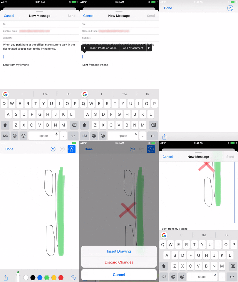


This is a pretty nice addition to the Mail app, just don't expect true inline drawings — where you draw directly in the email versus on a pop-up window — to appear anytime soon on iPhones since there's not as much space to work with inside an email composition screen as there is on iPads. Still, it would be nice if Apple added a cropping feature in the drawing screen so you can avoid all that unnecessary white space for tiny doodles.
#2. The UI Was Slightly Updated
This could be a good or bad thing, depending on your view. When in a mailbox folder in iOS 11, such as "Inbox," the name of the mailbox was taken from the center of the top section and super-sized underneath the back button. This makes for at least one less email visible in the list. Also new, the "Search" bar looks much better now.
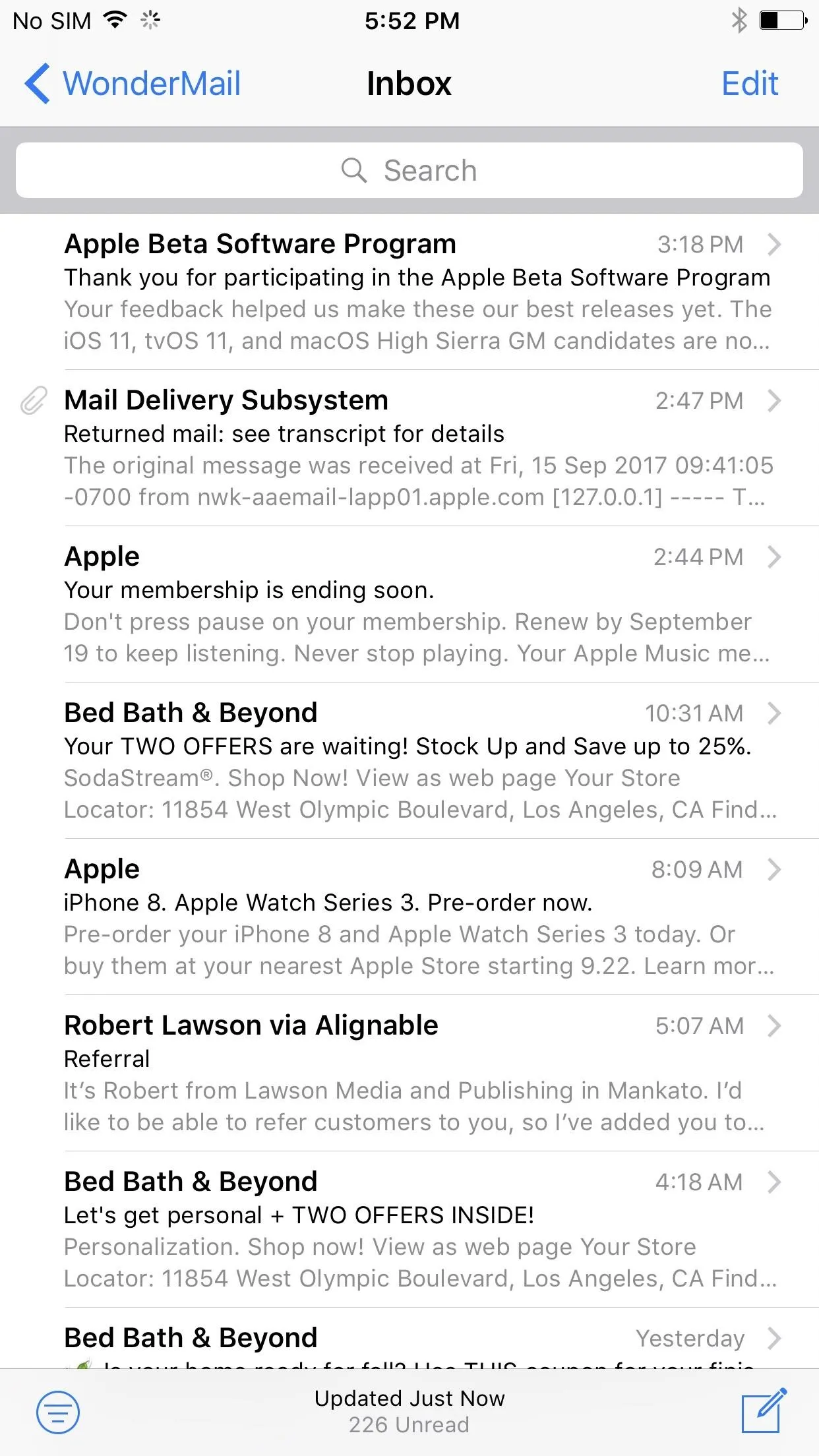
A mailbox in iOS 10's Mail (left) vs. iOS 11's (right).
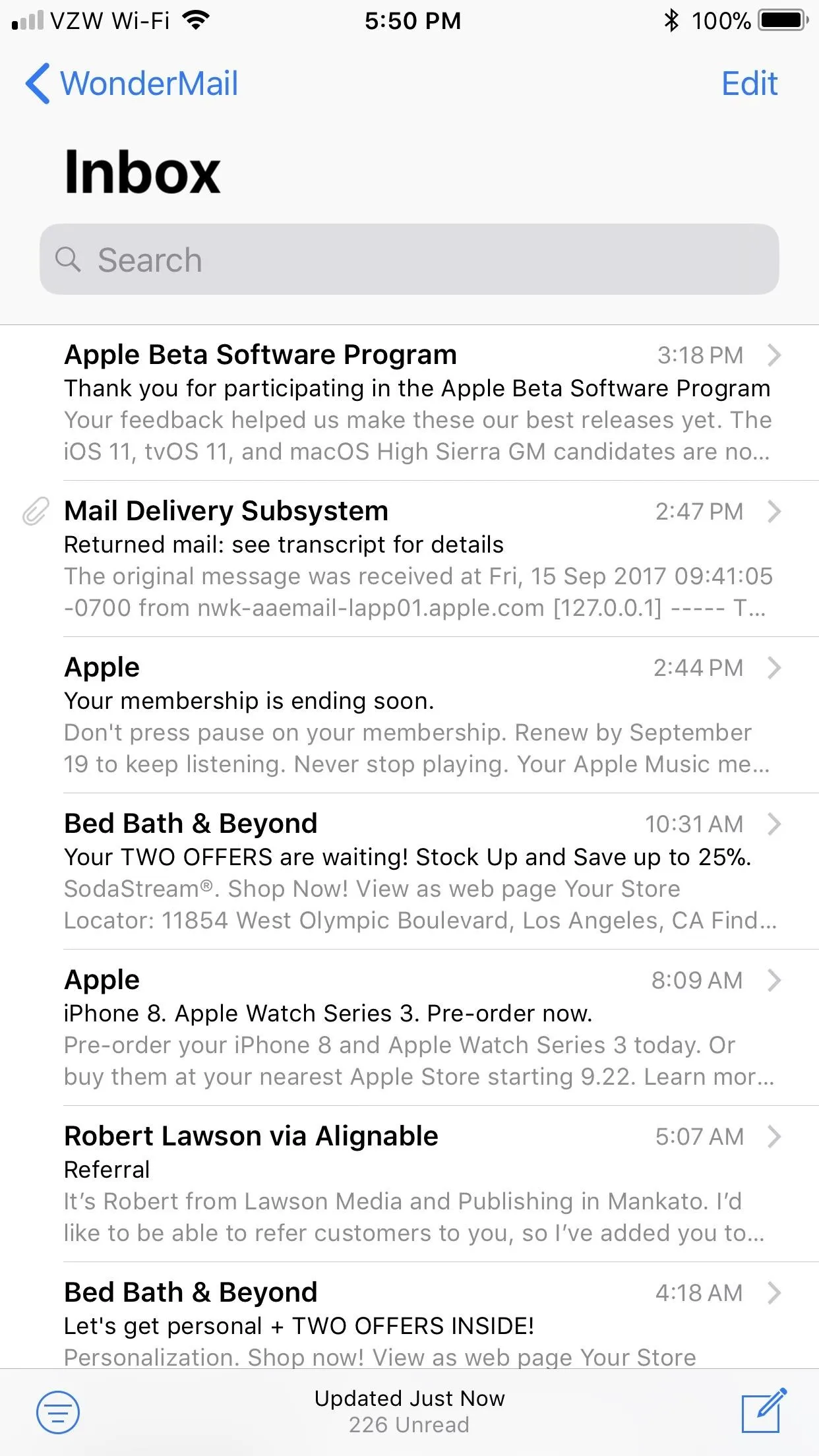

A mailbox in iOS 10's Mail (left) vs. iOS 11's (right).

#3. Read Threads Will Auto-Collapse
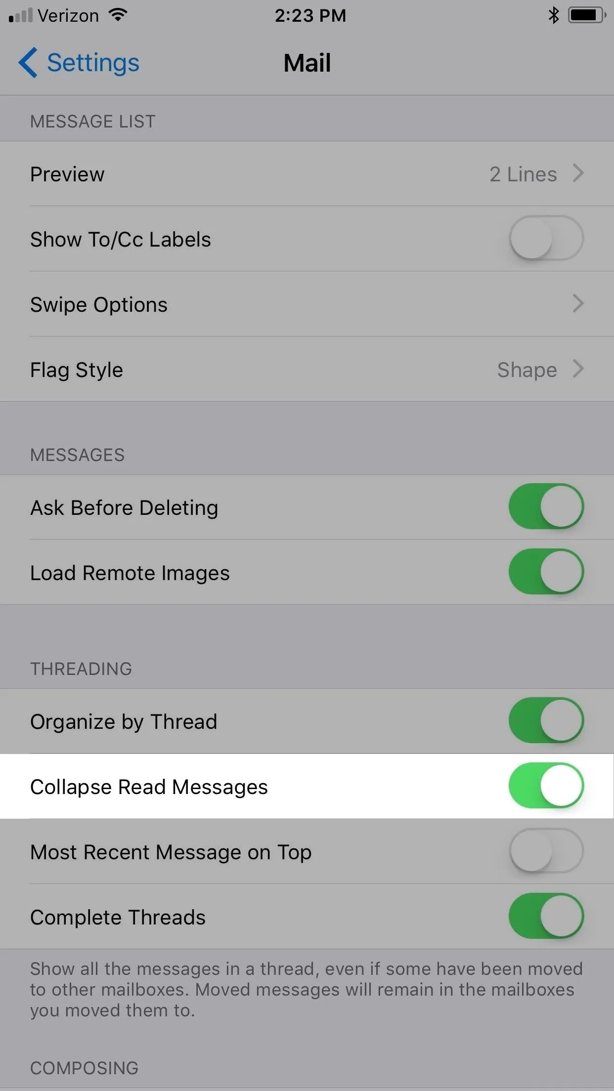
There's a new option in the "Mail" preferences in the Settings app called "Collapse Read Messages," which is toggled on by default. This will effectively shrink all of the emails in a thread that you've already read except the one you specifically opened up, so you don't get lost right off the bat. To view the other messages in the thread, you would just tap on them.



#4. Adding New Mail Accounts Is Somewhere Else
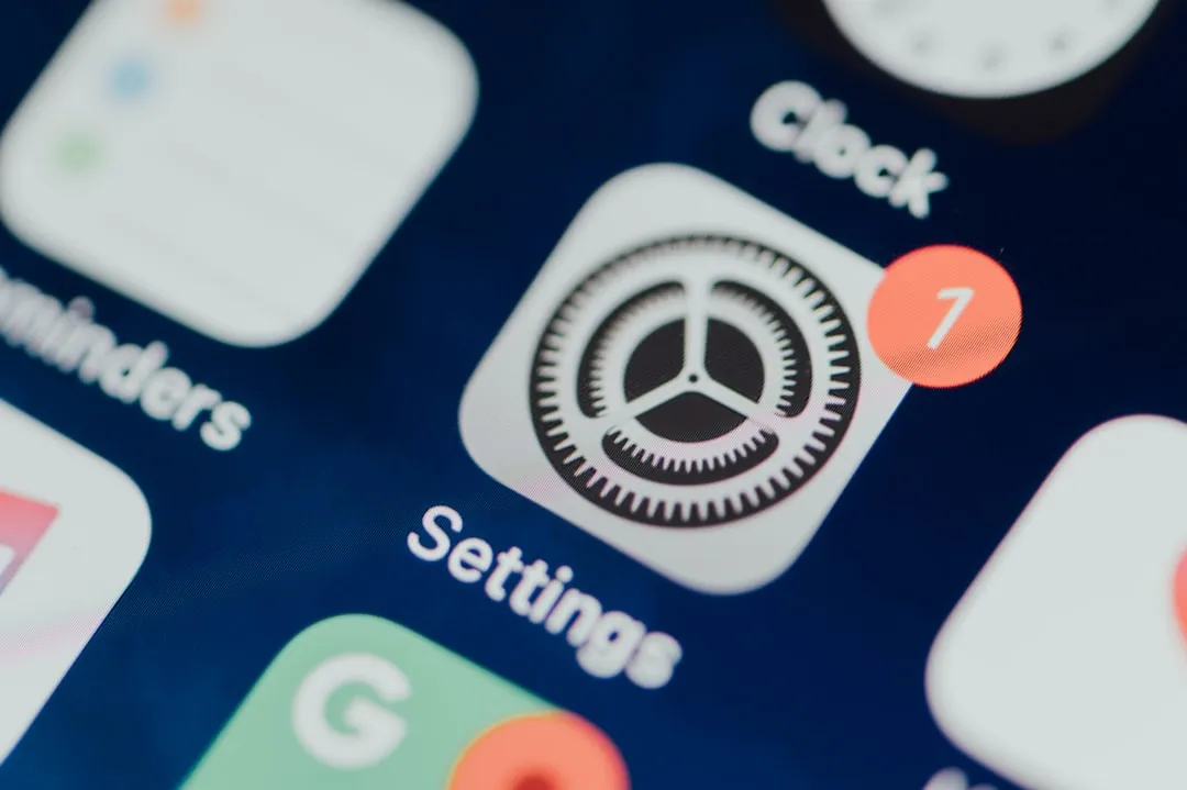
When iOS 10 came out, they split up the "Mail, Contacts, Calendar" option in Settings into individual preferences. So if you wanted to add new email accounts, you could tap on either "Mail," "Contacts," or "Calendar," then tap on "Accounts" to get to the right place. Now, Apple thinks it's better if the "Accounts" option has its own spot in the Settings app, plus they added "Passwords" to it. The logic is there, but it doesn't make it any less confusing.
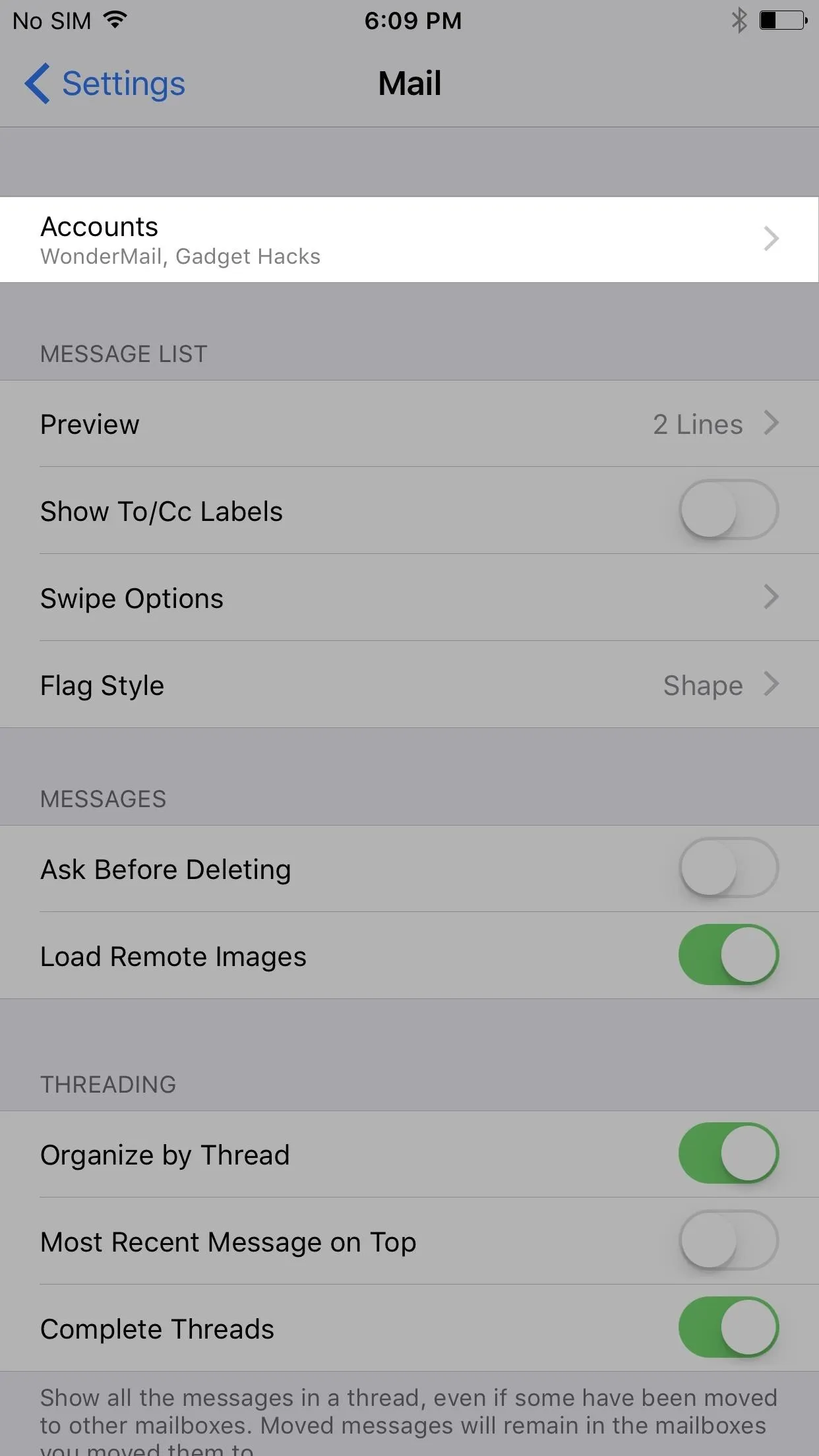
Tap "Accounts" in Mail's settings (iOS 10) vs. "Accounts & Passwords" in Settings (iOS 11).
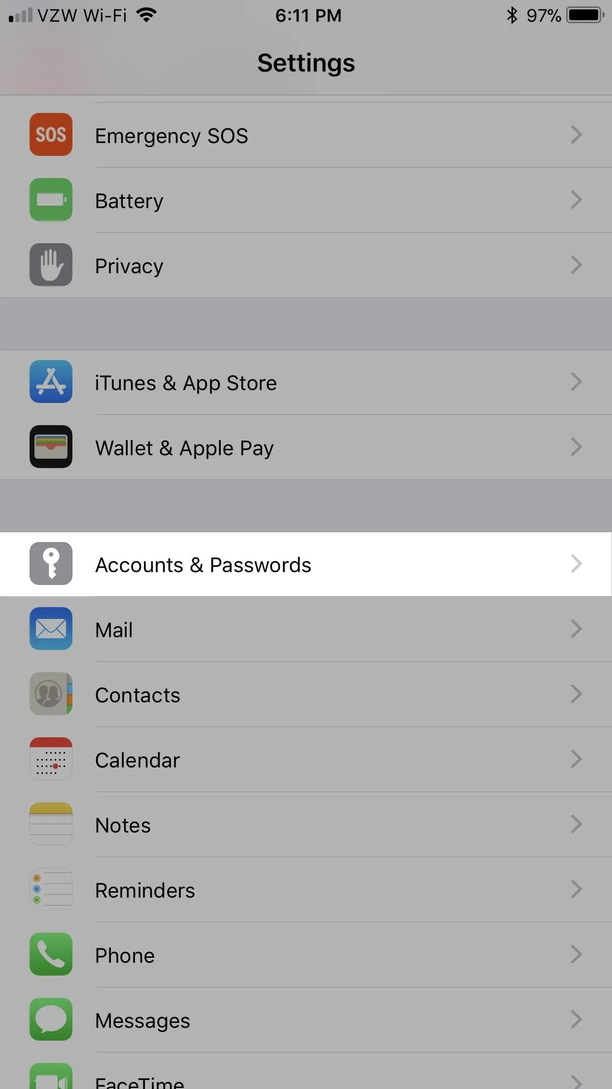

Tap "Accounts" in Mail's settings (iOS 10) vs. "Accounts & Passwords" in Settings (iOS 11).

#5. You Can Drag & Drop
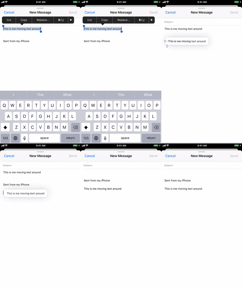
Overall, there are a lot of Apple apps that get the new drag-and-drop options, and Mail is one of them. You can select, drag, and drop both text and images. To do so, long-press on the word, highlighted text, or image, wait for it to pop out a tad, then drag and drop it where you want it.



As you can probably tell, Apple didn't give Mail as much love as their other apps in the iOS 11 update. I'm still pretty upset about the lack of bulk-email-deleting available, but maybe that will come in a future update one day. Maybe iOS 16.
- Follow Gadget Hacks on Facebook, Twitter, Google+, YouTube, and Instagram
- Follow WonderHowTo on Facebook, Twitter, Pinterest, and Google+
Cover photo, screenshots, and GIFs by Justin Meyers/Gadget Hacks













Comments
Be the first, drop a comment!