I love my iPhone, but it would be a lie to say there aren't some Android features I wish would find their way to iOS. While iOS has plenty of its own advantages, Android has pulled ahead in many other areas. With iOS 12 coming later this year, we're hoping Apple takes a hint from Google and adds some of these awesome features to the iPhone.
While we don't expect Apple will actually implement many of these features (since when has Apple ever listened to anyone else), iOS 12 could be the perfect time to change up the current system. We're not looking for iOS to become Android — we just want some of their better features.
- Don't Miss: 12 Cool New Features Coming to iOS 12 for iPhone
Hiding Home Screen Apps
I guess we should consider ourselves lucky — back when iOS 10 was released, Apple finally gave us the ability to remove stock apps from the home screen. While it's great to have that flexibility, there comes a time when you don't want to get rid of apps, but just hide them from view. After all, you can do it on Android.
As our own Dallas Thomas has said, Apple treats the home screen like one big app drawer. If you're not familiar with Android, the OS lets you place whichever apps of yours you want on the home screen, while hiding the rest. Where do the other apps go? Nowhere — you can simply view them all from the app drawer, like an "Applications" folder on your computer.
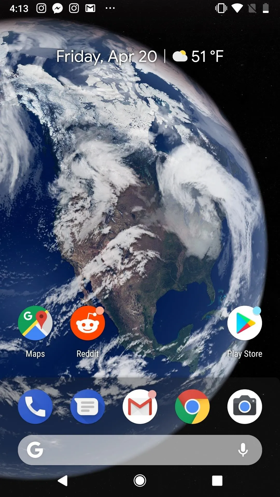
My very limited home screen
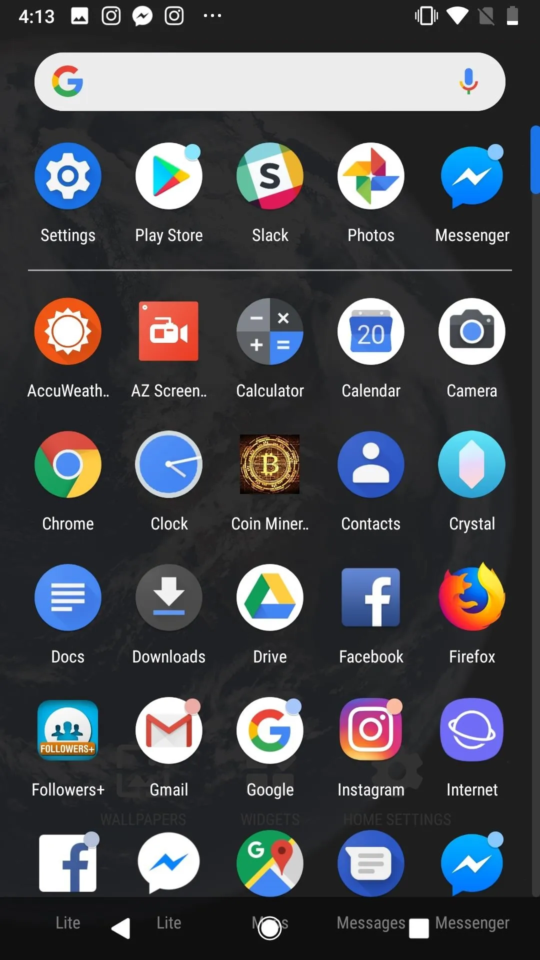
The app drawer with every app

My very limited home screen

The app drawer with every app
Android treats its home screen like a PC desktop, while iOS leaves nothing to the imagination. As much as we love our classic iPhone home screen, it's time to let us choose what we see.
Native Dual-Screen
By Apple's own admission, iOS 11 was a much bigger release for iPad than it was for iPhone. While the famed tablet had some split screen functionality in the past, Apple's most recent OS laid ways for multiple apps to be on-screen at once. On the iPhone, not so much.
Android has this feature, too — most apps are compatible with dual-screen, so you can work on that document while watching Netflix at the same time. On your iPhone, it's really one or the other. No dice.
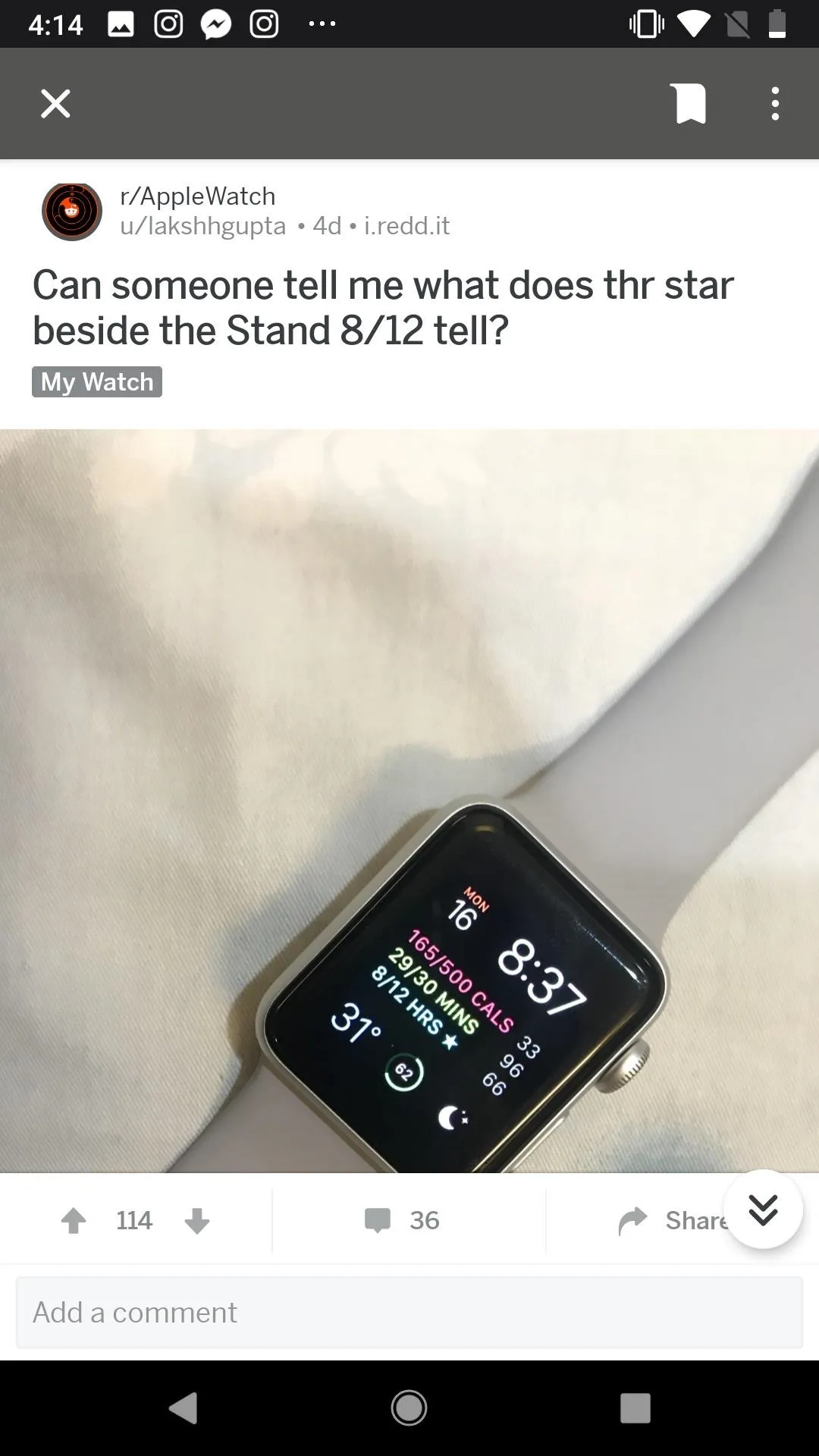
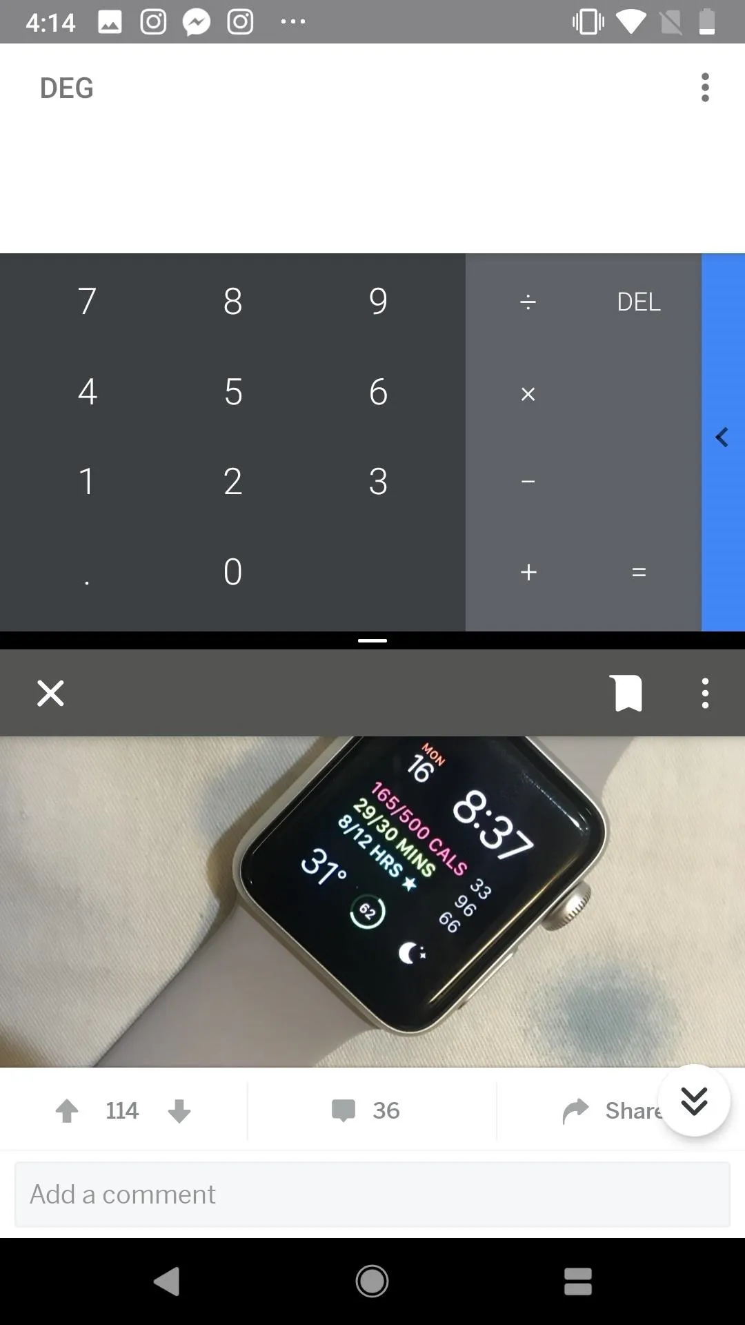


While you might cringe at the idea of split screen on a 4.7" display (or 4" if you have an SE or 5s) Apple has had plus-sized 5.5" iPhones for four years, and is rumored to be releasing both a 6.1" and 6.5" iPhone this fall. Any one of those devices would offer more than enough space to host two apps at once.
Picture-in-Picture
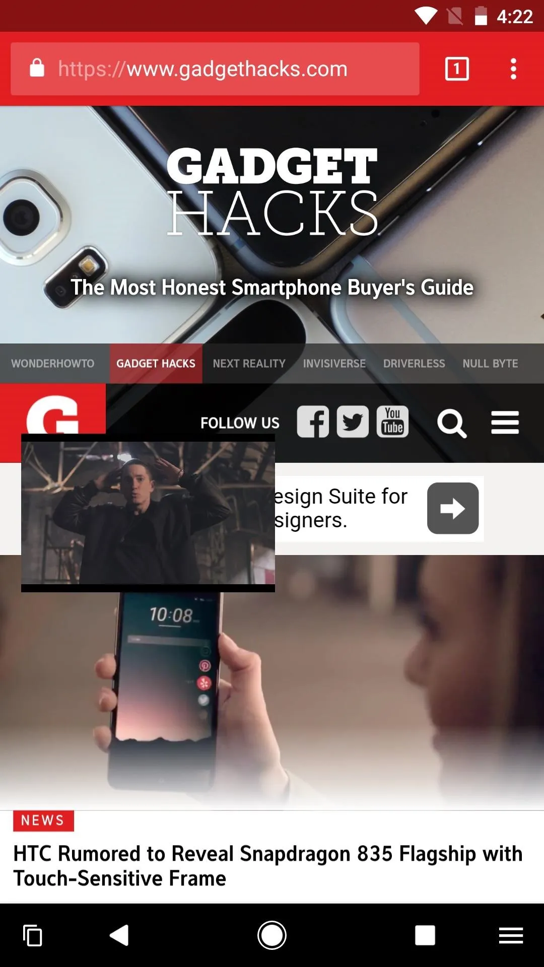
Speaking of multitasking with Netflix, where's our picture-in-picture mode for iPhone, Apple? The iPad has it, and so do Android phones. If you need to jump into Messages to text someone back, but want to keep watching your shows, you're out of luck on the small-screen flavor of iOS.

Kevin/Gadget Hacks
Kevin/Gadget Hacks

Kevin/Gadget Hacks

Kevin/Gadget Hacks
Settings Shortcuts in Control Center
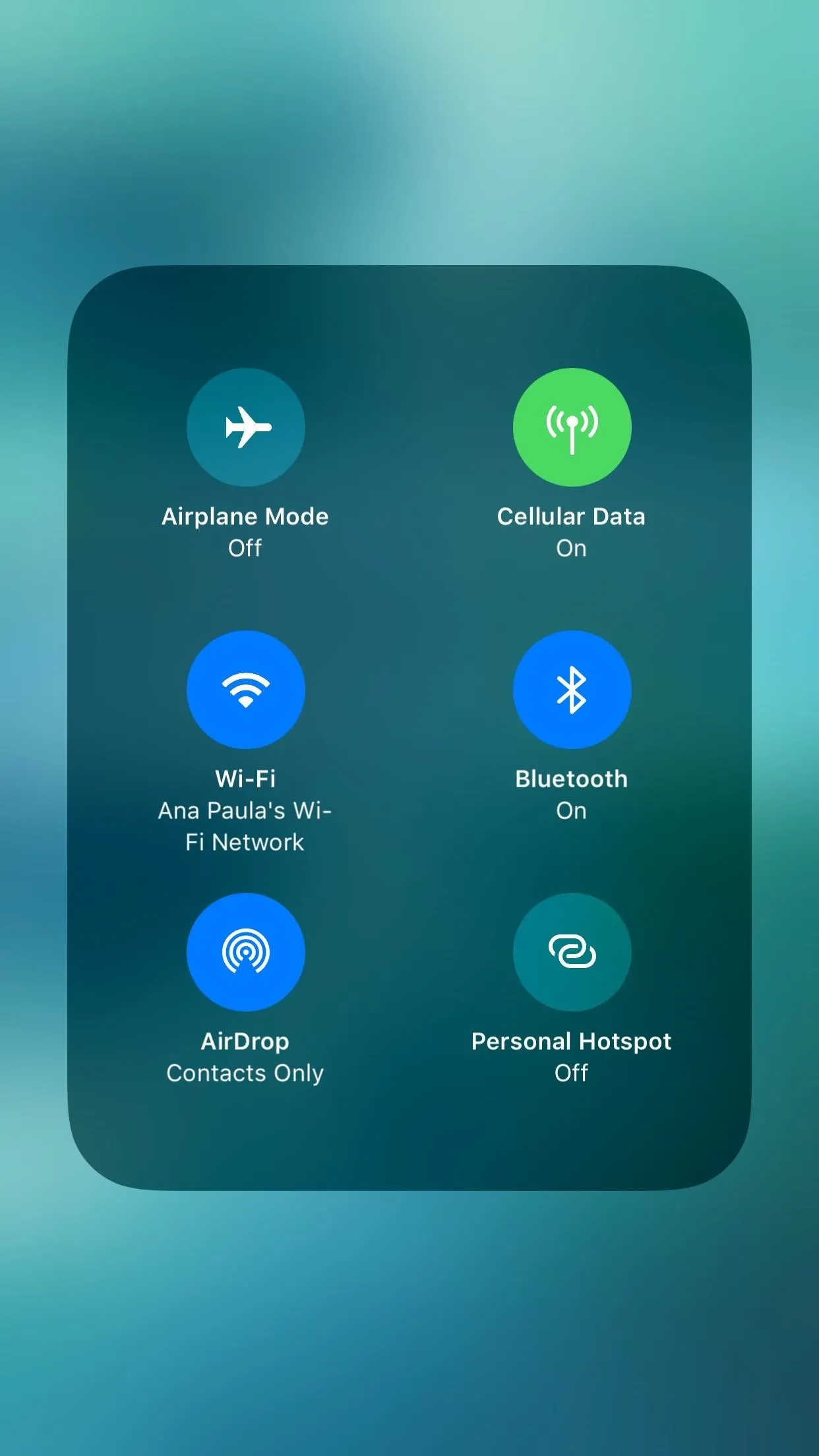
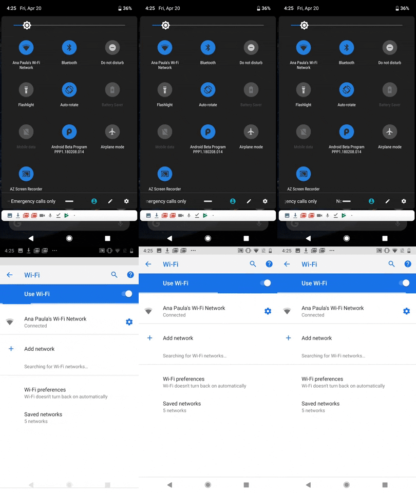
Control Center is one of the areas Apple improved most in iOS 11. The new, customizable features and functions make using your iPhone much more efficient. However, you still can't access the settings for any of the options here like you can on Android, which makes manually jumping into the settings app feel like a chore.
On Android, if you want to switch Wi-Fi networks, you simply access the Quick Settings menu, then access all available networks by long-pressing the Wi-Fi button. Of course, this can apply to other settings in this menu. On iOS, you can only choose to disconnect (temporarily) from the current Wi-Fi network. Implementing these expanded settings menus in an iOS fashion would only serve to improve the convenience of Control Center.


Notification Revamping
Apple, we need to talk about notifications. While iOS 11 introduced an overhauled notification system, trying to manage your incoming alerts is a bit of a nightmare. Your notifications are listed in chronological order, which sounds useful at first, until you have to sort through hours' worth of news, game alerts, Facebook invites, and Instagram popups to find that text you missed.
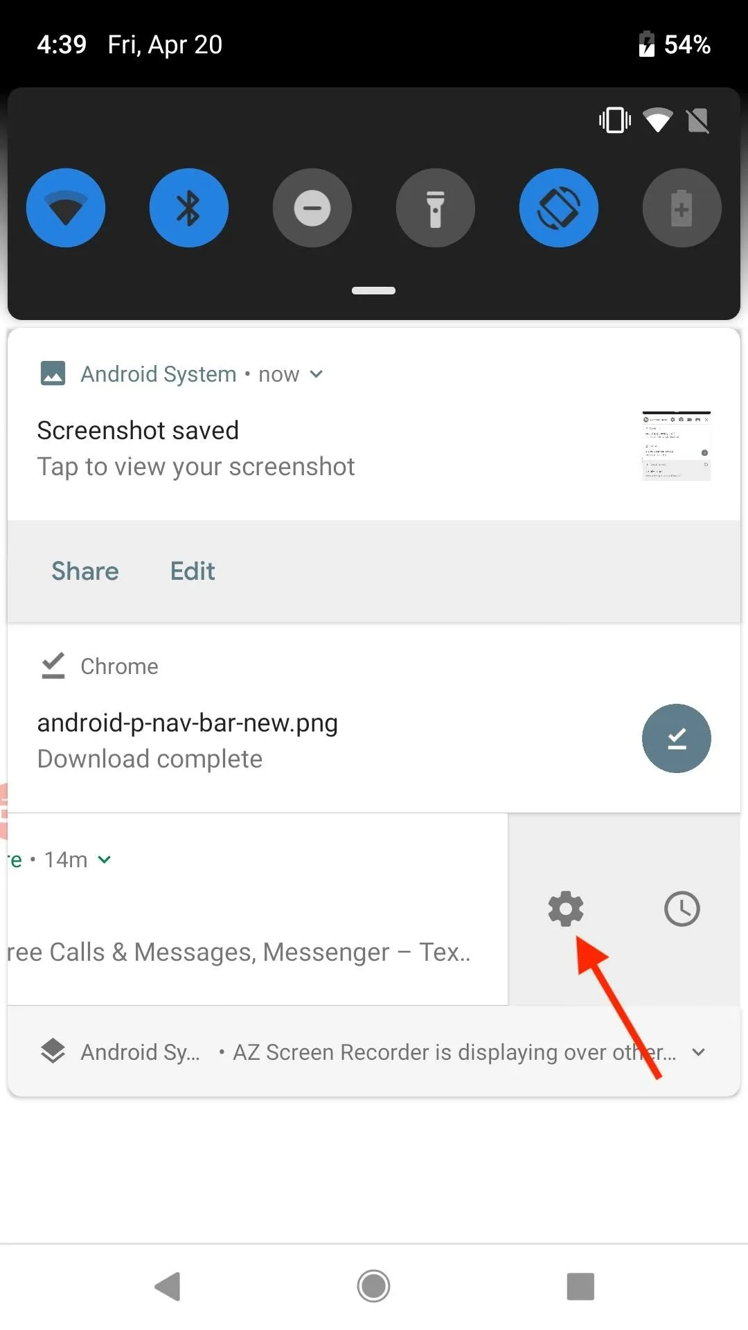
It only makes matters worse when you take a look at Android's system, which is way ahead of the game. Android groups your notifications by type, which can make analyzing and tackling your alerts much easier. But there's more — Android lets you snooze notifications, and set a time to be reminded about them later. And, if you want to adjust a certain app's notification preferences, you can do so from the notification itself. On iOS, you have to go back to the settings app.
Quickly access settings
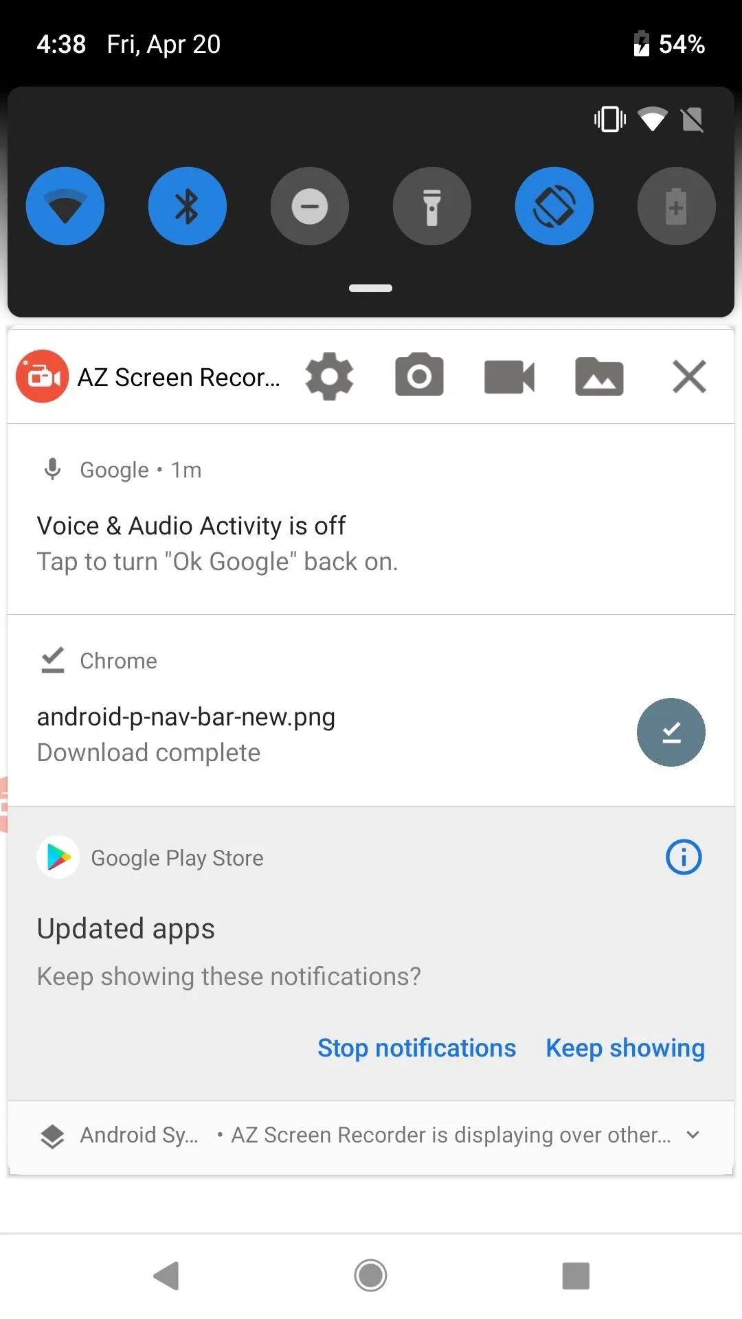
Long press for additional controls

Quickly access settings

Long press for additional controls
Quick replies make responding to messages fun on iOS, but in its current form, its too easy to get overwhelmed by your notifications. This is an area where Apple could really learn from Android.
Always-On Widget Support
While iOS does have widgets, Android has a slight advantage. There, your home screen doesn't have to simply be apps — you can place large, rich, and constantly updating widgets directly on the home screen. Clocks, weather, search bars, and more are available to choose from and customize the way you see fit.
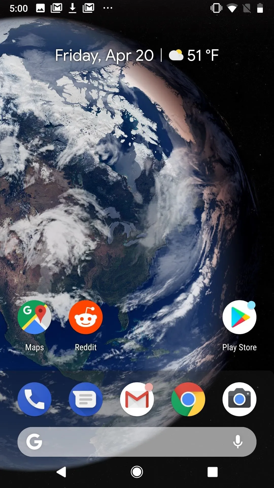
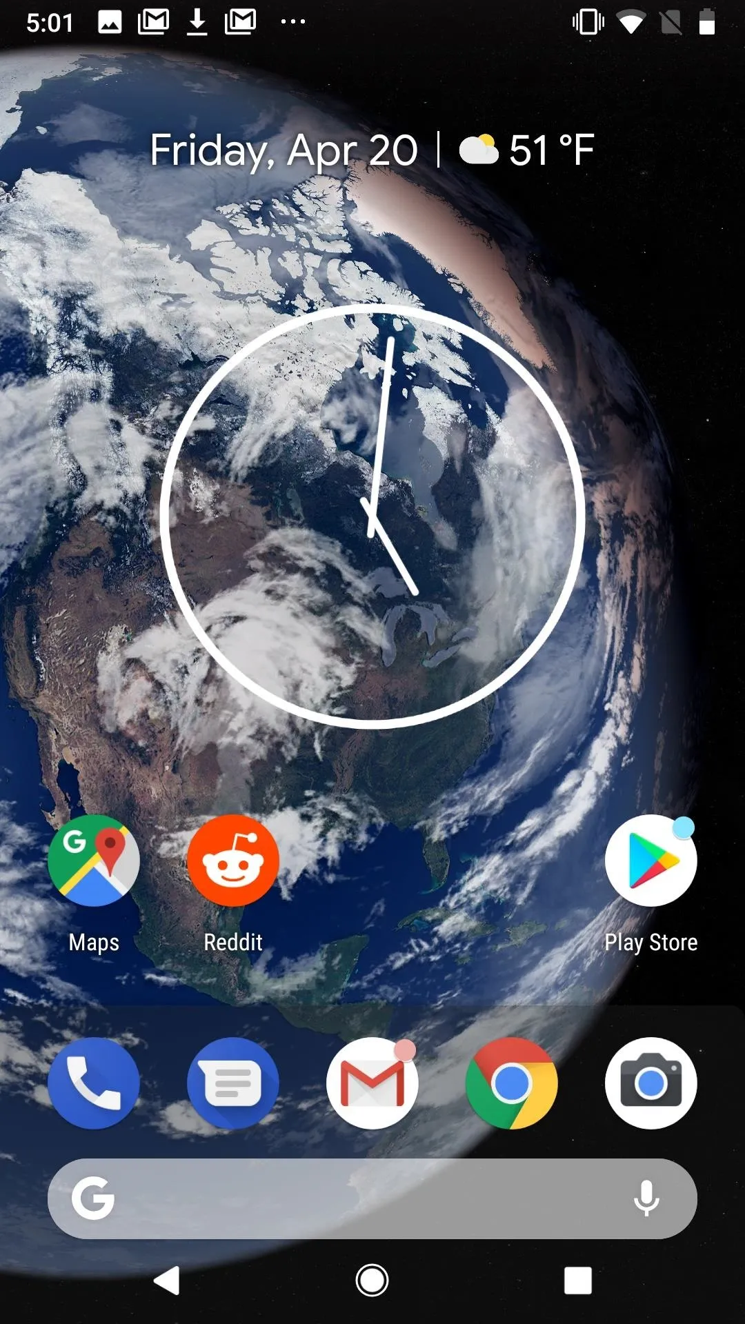


Having the option to add these live widgets to your iPhone's home screen would add an extra layer of depth to the iOS experience.
App Refunds
If you accidentally download an app on the App Store, or find a purchased app didn't meet your expectations, Apple does allow customers to apply for a refund. The problem is Apple makes things inconvenient, forcing you to go to its website and explain yourself.
Android, on the other hand, has a handy "Refund" button directly from the app's page in the Play Store. As long as you're within the refund window, you can return the app and get your money back.
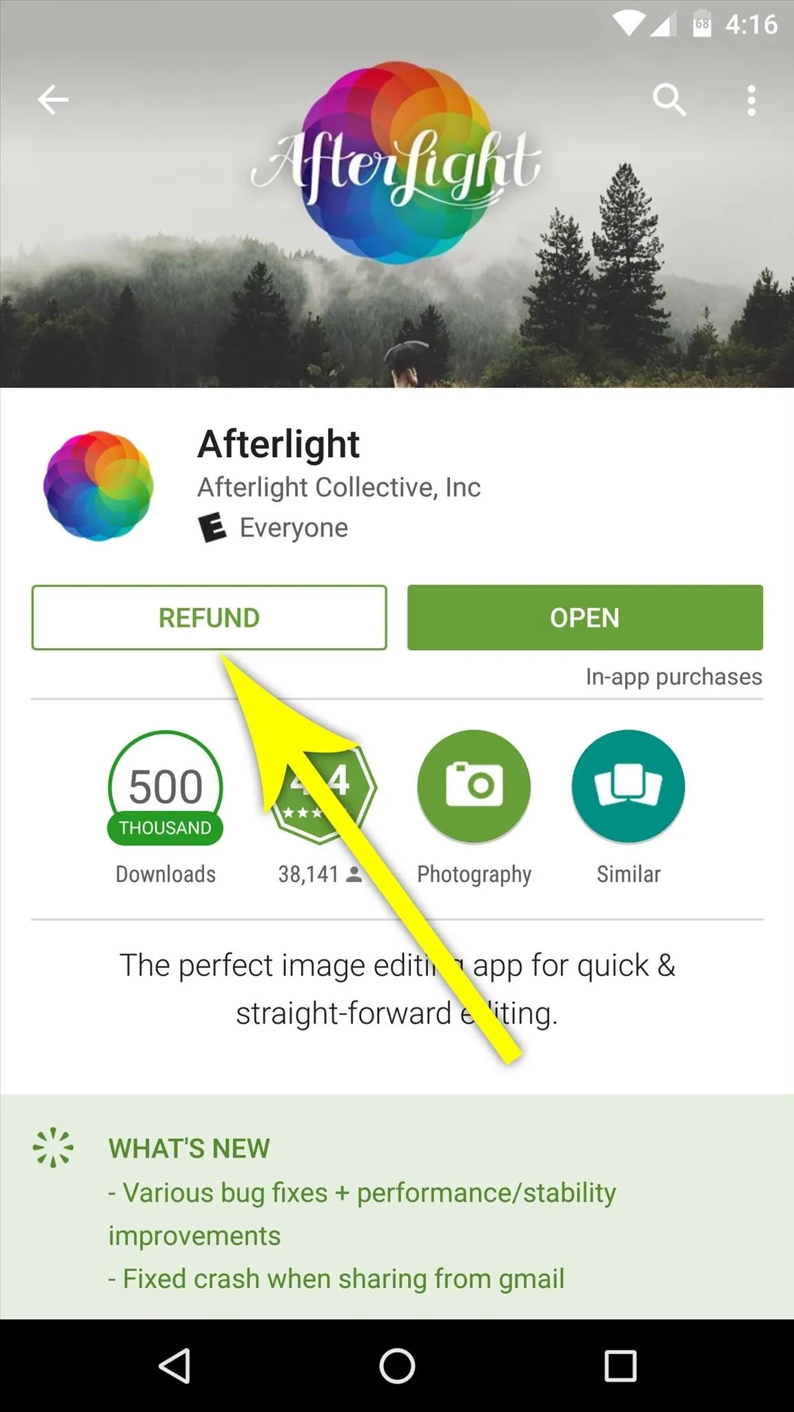
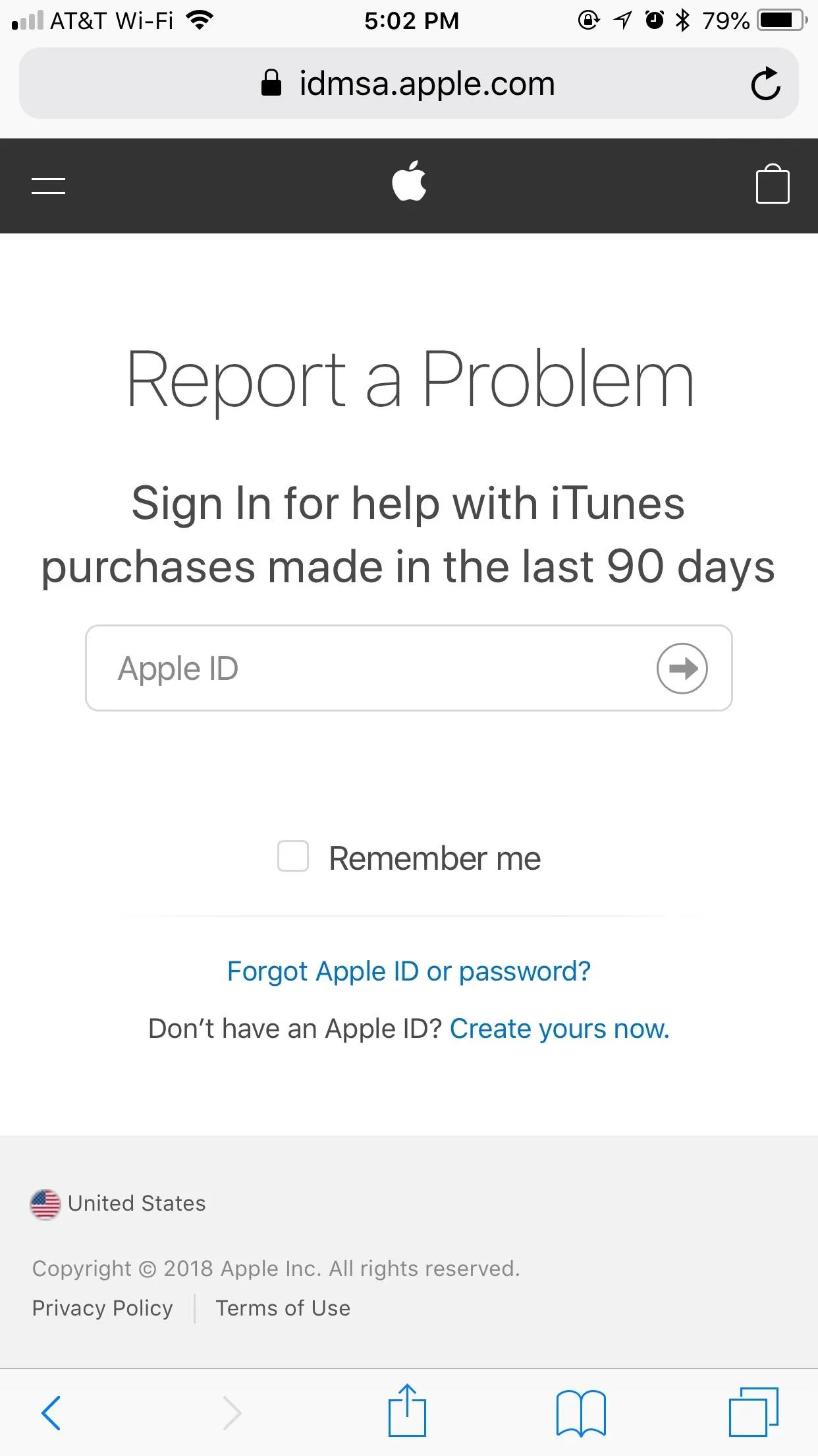


Apple may have pioneered the app market itself, but Google's nailed returns.
Customizable Lock Screen App Shortcuts
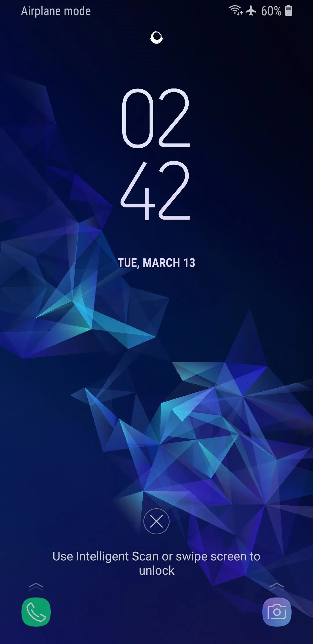
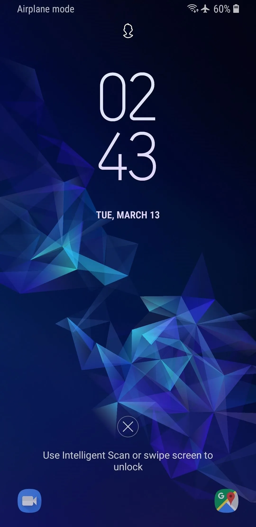
This is a feature a lot of Android users are probably wishing for themselves. Introduced in Android 8.0 Oreo for the Galaxy series, users can customize two app shortcuts on the lock screen, which launch the respective app when triggered.
The camera shortcut on iPhones is inarguably useful. However, it would also be helpful to have the option to switch it for any app we'd like. While two shortcuts would be ideal, I'd take one customizable option.


Banner Notifications for Phone Calls
Getting a phone call on iOS is the same as its always been — the entire display fills up with the incoming call, regardless of what you might be doing at the time. It doesn't matter that it's 2018 and most of our communication takes place over messaging — if you're getting a phone call, iOS wants you to know!
Android seems to have figured out this way of doing things is a bit dated. Instead, users can receive a banner notification for phone calls, just like they do for messages and alerts. That way, if its a call you don't want to answer, you can simply ignore it and carry on with whatever you were doing.
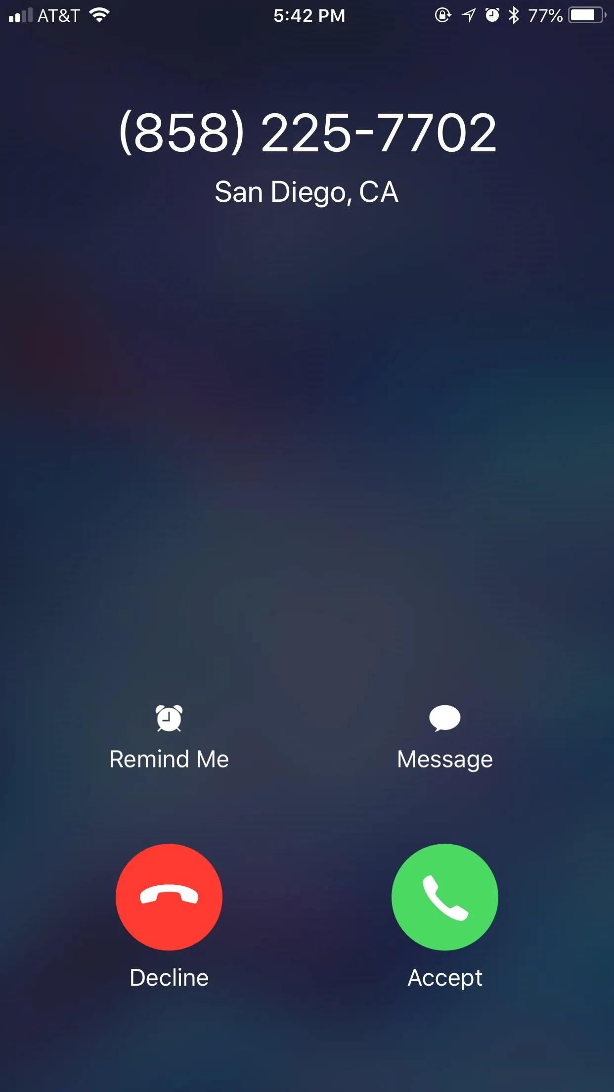
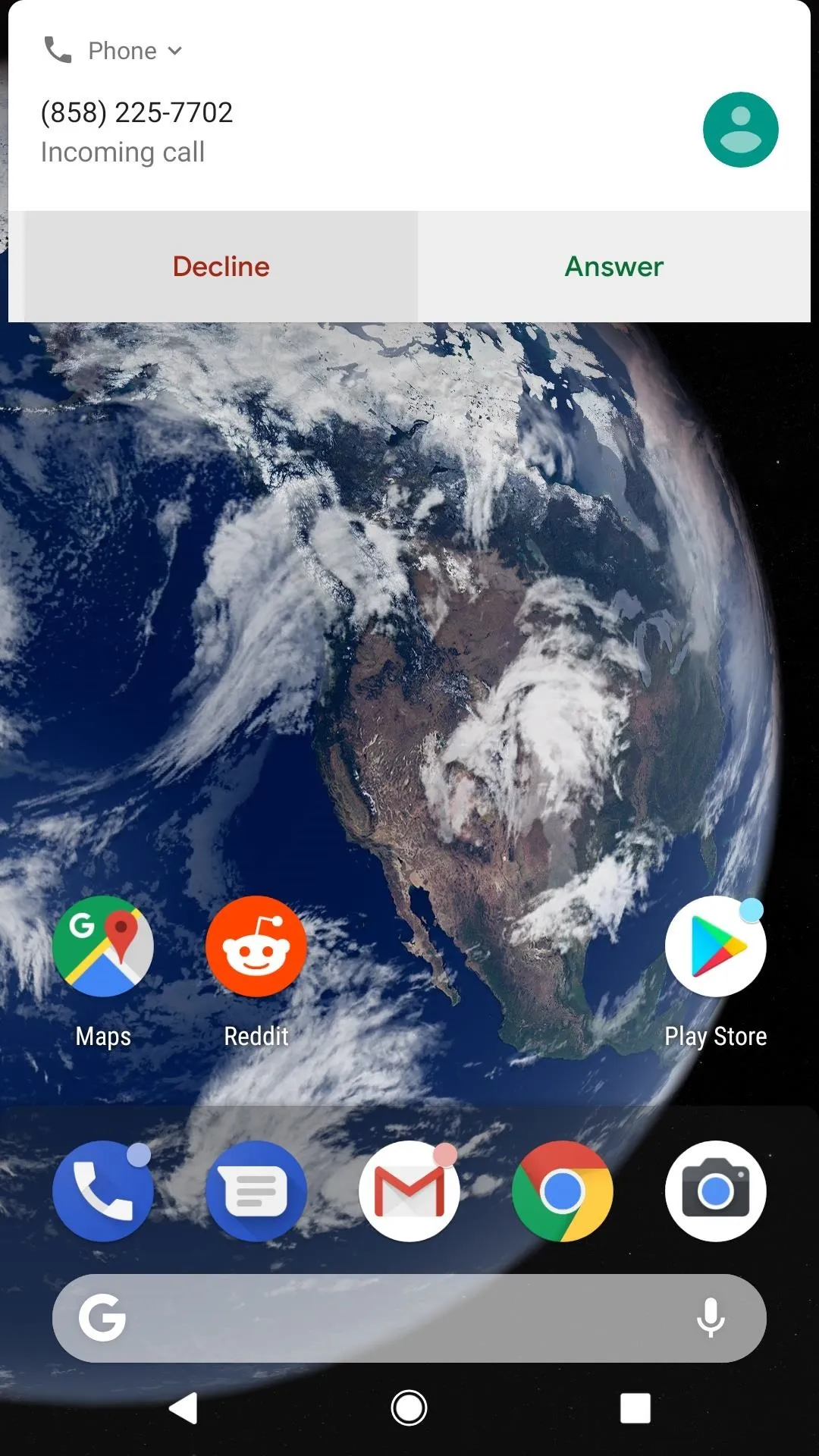


For any iPhone user who doesn't want to let go of phone call notifications from the past, I'm not saying Apple should do away with its current system — just as you have control over how you receive notifications for other apps, this should simply be one option for doing things.
Custom Icon Packs
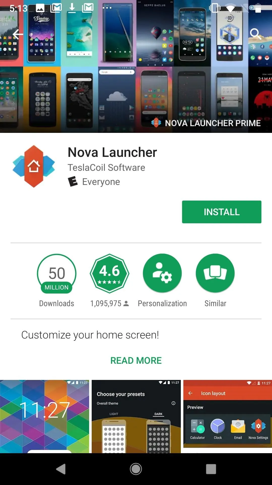
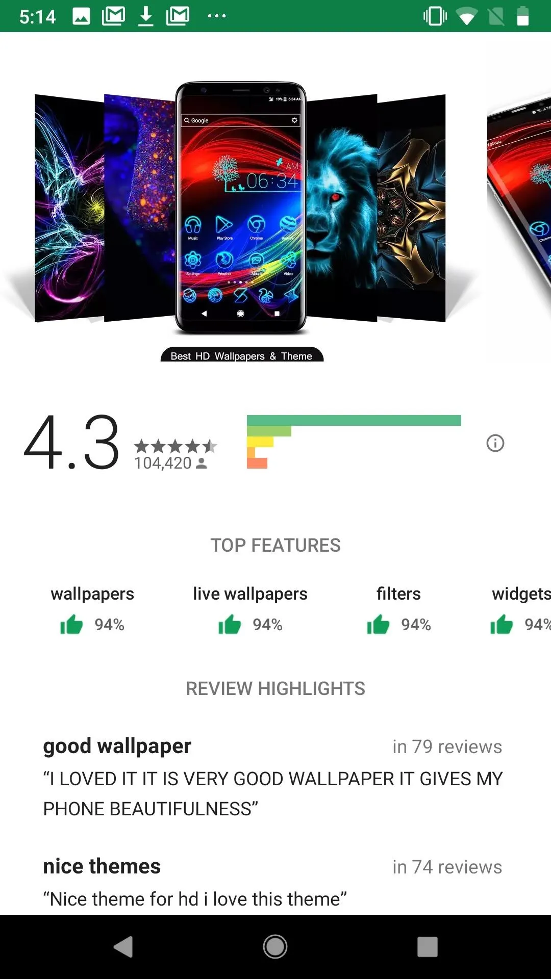
While you do have some limited, complicated control if you want to customize your app icons, iOS won't let you change them entirely. If you're a little bored with Apple's five year old design, you might want to point them in Android's direction.
Android devices have the option to download custom icon packs. These packs actually replace your app's icons, rather than the roundabout options found in iOS. It's clean and customizable, and there are plenty of options to choose from.


Always-On Display
Before 2017, always-on displays were out of reach for iPhone users. To achieve the feature, the device needs to have an OLED panel, since always-on displays only activate select pixels to work. Well, Apple has an OLED iPhone now, and will have two more by the end of this year. iOS 12 could be the perfect time for the company to hop on the trend.
Clear All in Multitasking
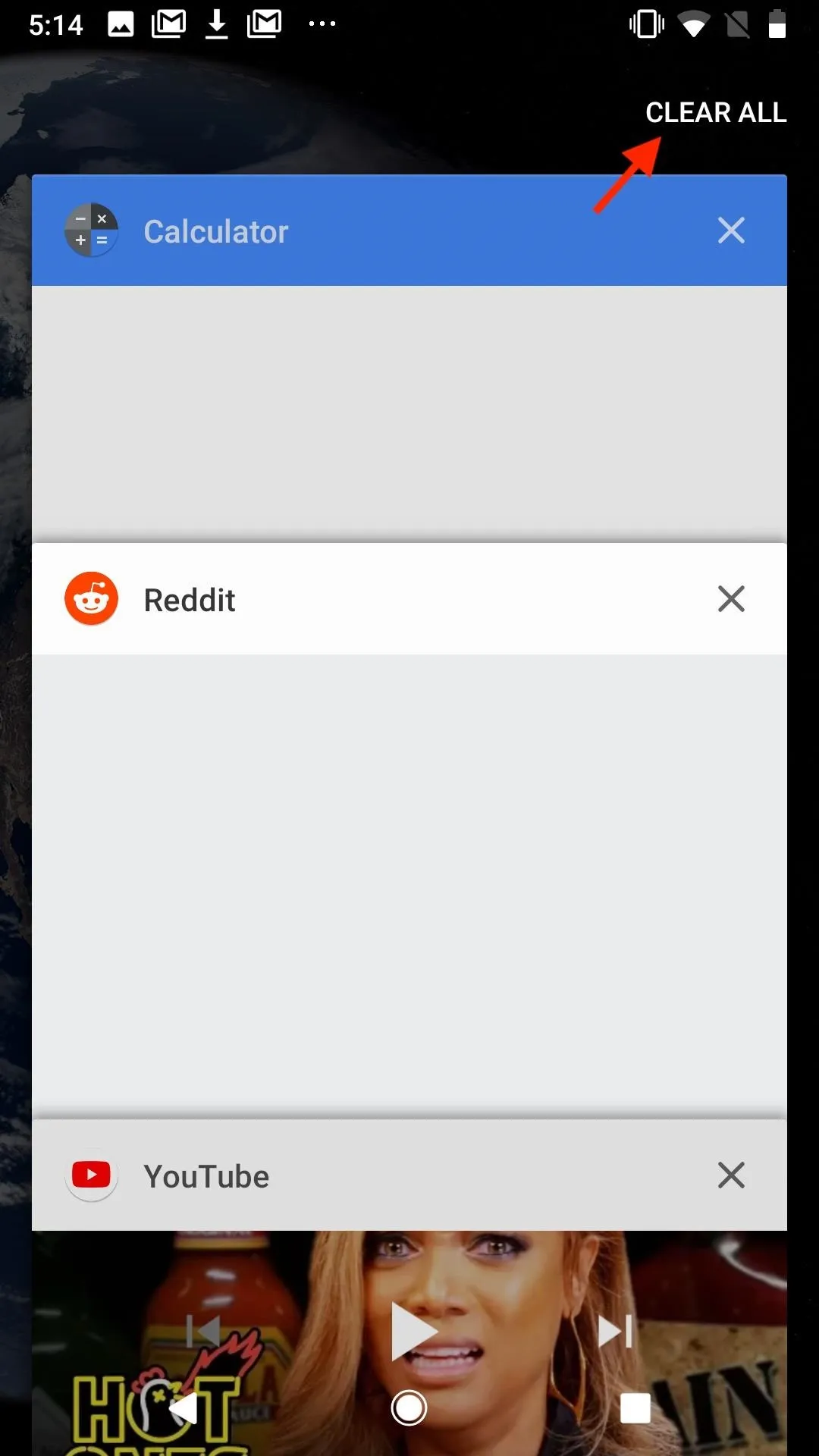
If you're like me, your multitasking view is helplessly cluttered with apps. It can sometimes make finding the app you want too difficult to even bother, but it also would take an eternity to clear each one by hand. While there are tricks you can try, there is, unfortunately, no "clear all" button for multitasking in iOS.
On the other hand, that button is there on Android. When you put the two side-by-side, the button's absense on iOS becomes painfully obvious.


- Follow Gadget Hacks on Facebook, Twitter, YouTube, and Flipboard
- Follow WonderHowTo on Facebook, Twitter, Pinterest, and Flipboard
Cover image and screenshots by Jake Peterson/Gadget Hacks, unless otherwise noted


Comments
Be the first, drop a comment!