While the United States, in general, doesn't have the worst overall pollution, the air quality can drastically change from one day to the next. If you're particularly sensitive to pollutants in the air, there are apps that show how clean or polluted the air is in your area, as well as in cities you plan on traveling to, but Apple's making those apps less relevant with a new feature in Apple Maps.
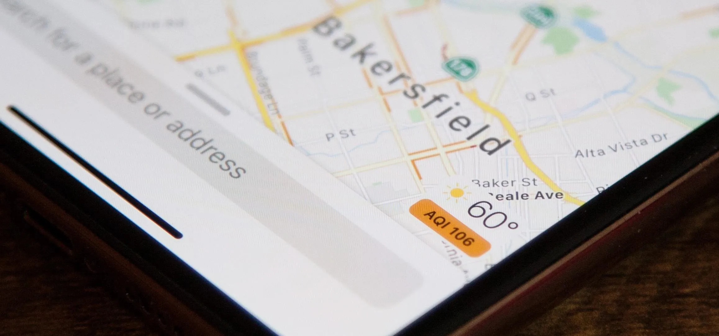
Ever since iOS 12.2, Apple Maps gives you the option to view the air quality index for an area in the US. With it enabled, you'll see a colored AQI label in the bottom right of the map, below the current weather conditions, which gives the reported air quality for that specific on-screen location.
Air quality data in Apple Maps is provided by Apple's Weather app, which added the air quality values and health concern ratings in iOS 12. That data comes from The Weather Channel, Apple's weather partner, who collects the data from various sources, primarily the EPA's AirNow system, as well as state and local agencies.
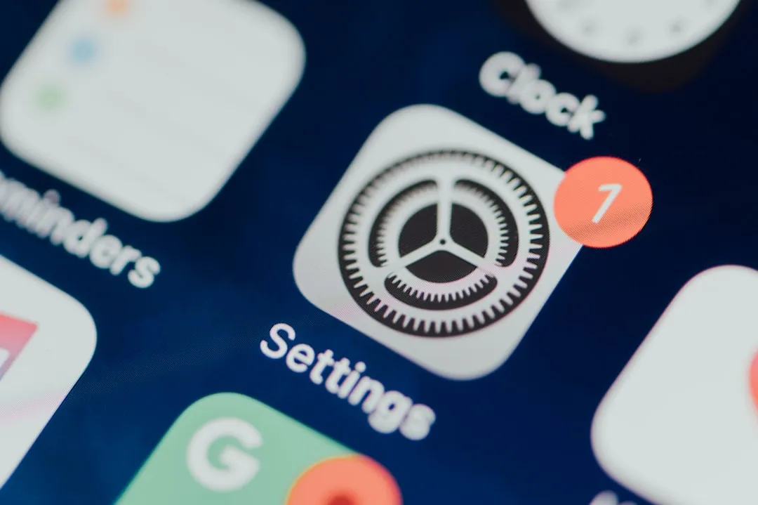
To turn on the feature in iOS 12.2 and later, open the Settings app for your iPhone, then tap "Maps" from the list. Next, look for the new Climate section, then toggle on "Air Quality Index" if it's not already switched on. In later iOS versions, it's on by default. Interestingly, there's also a toggle for "Weather Conditions." Prior to iOS 12.2, you could not enable or disable the weather icon overlayed on maps. It's also enabled by default.


Now, whenever you're zoomed in to a city or neighborhood, you'll see the AQI value and its associated color. The scale goes from 0 to 500, with zero being the cleanest air and 500 being the most hazardous to your health. And the color of the AQI label on the map corresponds with the value, green being the safest and maroon being the most dangerous.


According to the EPA, the AQI score is calculated using five air pollutants regulated by the Clean Air Act. Those include ground-level ozone, particle pollution (or particulate matter), carbon monoxide, sulfur dioxide, and nitrogen dioxide.
- 0–50, Green: Considered good, with satisfactory conditions and air pollution at little or no risk.
- 50–100, Yellow: Considered moderate, with some pollutants in the air causing health concern for only a small number of highly sensitive individuals, such as those sensitive to ozone.
- 101–150, Orange: Considered unhealthy for sensitive groups. The general public may not feel any effects, but older adults, children, and people with lung disease are at risk from ozone exposure. Also, those same people, as well as those with heart conditions, are at greater risk from particles present in the air.
- 150–200, Red: Considered unhealthy for everyone. You may begin experiencing adverse health effects when exposed, and sensitive individuals may feel more serious effects.
- 201–300, Purple: Considered very unhealthy, with everyone exposed to polluted air indoors and outdoors being at risk for serious health effects.
- 301–500, Maroon: Considered hazardous. Basically, don't go outside without protective gear, as this is an emergency condition, with everyone likely to be affected with serious health issues.
From iOS 12.2 to iOS 13.6, when you long-press, Haptic Touch, or 3D Touch on the weather/AQI icon in a Maps view, you'll only see the general weather forecast for that day — without any predicted air quality reports. However, the AQI information does appear in the expanded view in iOS 14 and later.

The expanded view in iOS 13.6 vs. iOS 14.


The expanded view in iOS 13.6 vs. iOS 14.

Cover photo and screenshot by Justin Meyers/Gadget Hacks














Comments
Be the first, drop a comment!