


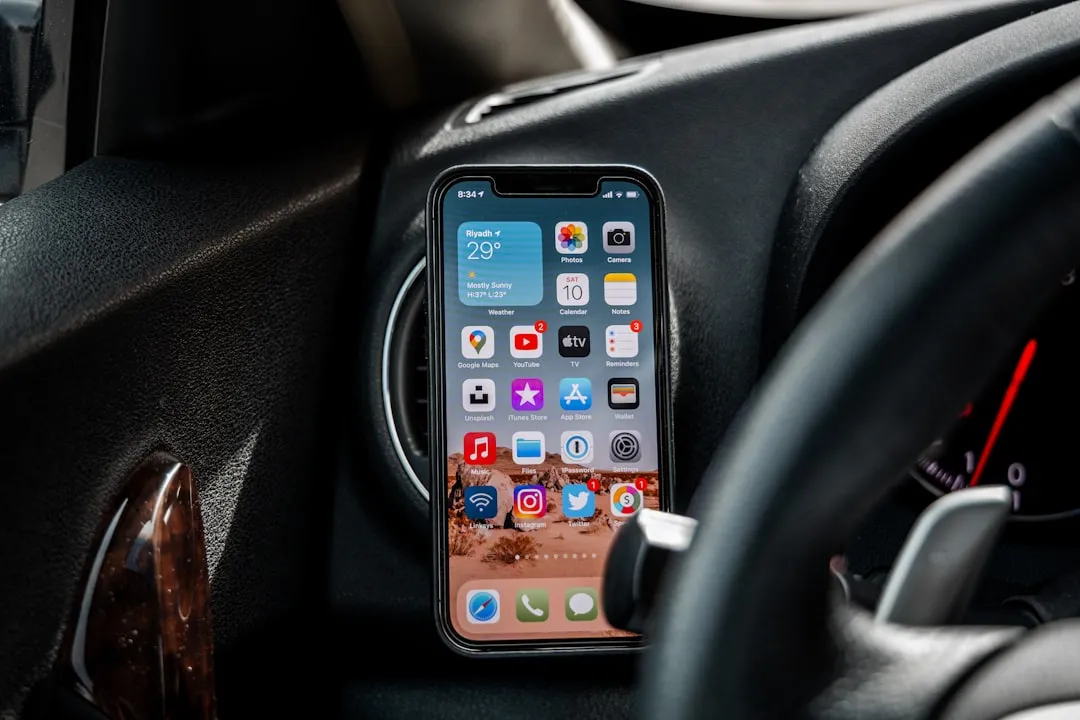
I've been playing around with iOS 7 for a while now, and for the most part, I dig it. It's a nice update for a stale OS, and there are a lot of great new features. But like any good piece of tech, there are a few things to be disliked.

Some of these are big issues, and some could be considered nitpicking, but given that I'm fairly used to the older iOS 6 version, they feel big to me. Paper cuts always hurt worse than gashes.
1. You Have to Swipe Left to Delete Emails Now
Before, I used to swipe right on an email to bring up the delete or archive option in the Mail app. Actually, you could choose swipe left or swipe right, but I preferred the latter. Now, you only have one option in iOS 7—swipe left to trash.

Swiping right on an email does nothing now.
However, swiping right from the left edge will take you back to all of your mailboxes, which is something I'm fairly used to doing in other apps, like Circa, where you'd swipe to the right to go back to the main news feed. It just seems a little weird in the Mail app.
On the Plus Side, They Did Give Us More Options
Though the swiping may be different now, the plus is that you have way more options now besides just delete. You can reply, forward, flag, mark as read, move the message to another folder, and my personal favorite—move to junk.


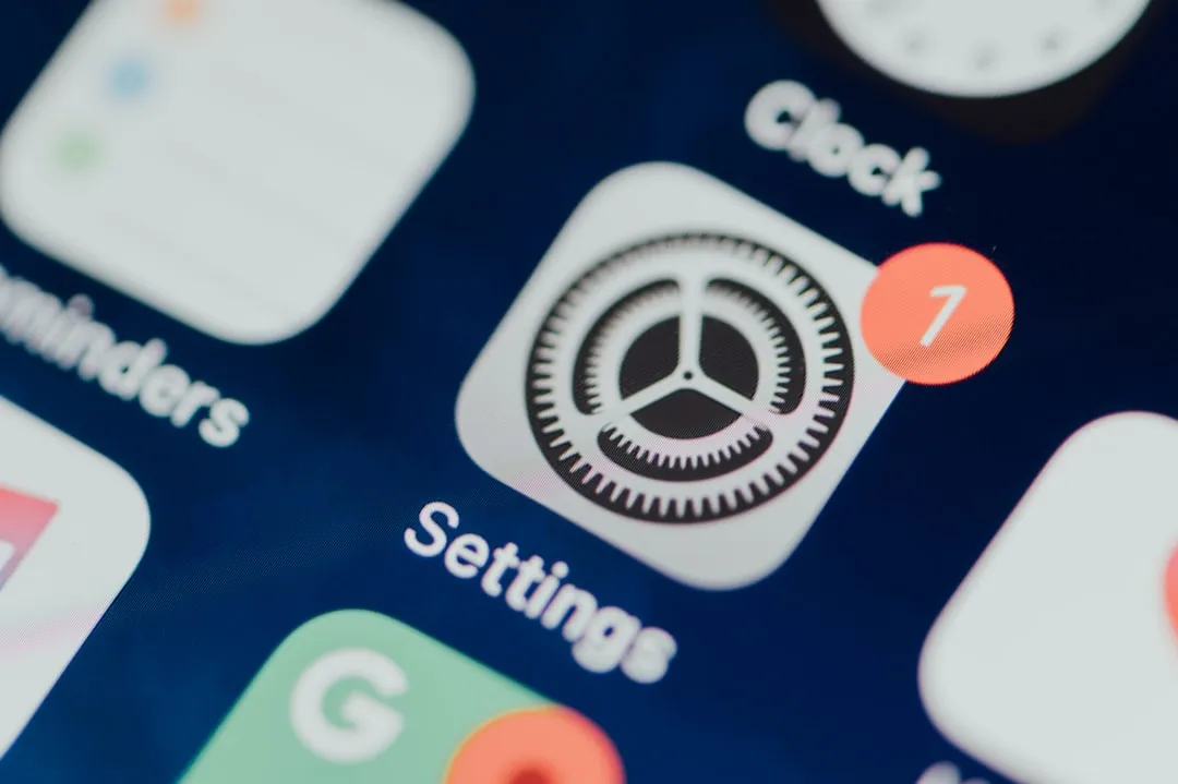
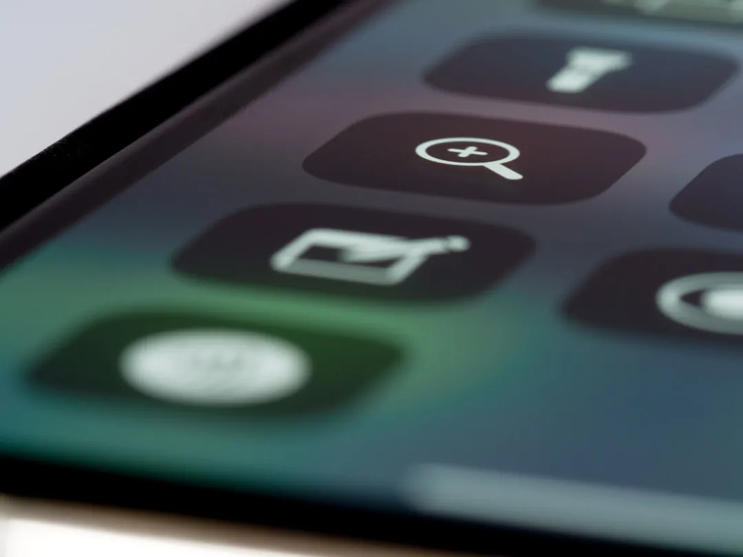
2. You Can't Customize the Control Center
The new Control Center is definitely a nice feature, but it's lacking any customization. Specifically, I have an issue with the bottom shortcut apps and how you can't set your own up. The flashlight, camera, and calculator are all great shortcuts, but a timer?


How about a shortcut to the alarm? Better yet, how about settings?
Or, how about make it possible for us to change those default options to whatever we wanted? I suppose the only one that couldn't ever move is the flashlight, since there seems to be no other way to access it.
They Did Get a Few Things Right Though
You have easy access to screen brightness, music controls, and a finally—a freaking flashlight! Now you can have one less app on your iPhone, though, I really like my old flashlight app that controlled the brightness levels. Maybe one day Apple will add that ability.
3. Swiping Right on the Main Home Screen Does Nothing
Before, you'd swipe right from the main Home screen to access Spotlight search, but now Spotlight is accessed by swiping down. What does swiping right do in iOS 7 then? Nothing.


If you're not going to put a shortcut for Settings in the Control Center, maybe this would be the place that you'd put it? Or, maybe just do it like Android does and make it swipe to the last Home screen page.
4. They Removed Panoramic Wallpapers... WTF!
Why put it in then take it away? As of right now, panoramic live wallpapers do not work. You can select a panoramic for your wallpapers, but all you'll get is the now-standard parallax effect.
If you want to see how they used to work, check out our guide on how to set a panoramic photo as a live wallpaper in iOS 7 (an early beta version) and watch the video below.
5. Animations Are Still Too Slow
In the 5th beta, they did speed up animations, but it's still fairly slow. To see what I mean, unlock your iPhone in iOS 7. See how long it takes for the Home screen to settle after unlocking?
Now try tapping on a folder and the Home button real fast. It takes a bit to go back to the Home screen page you were on, right? Now try clicking on a folder and tapping on the black space to return. Even slower.


If I can catch the animations in a screenshot, you know they're too slow.
However, Animations Do Make It Feel More Lively
At least now it looks a little cooler than the stale, non-animated iOS 6 screens. It may be a little slow, but what's a little speed compared to looks?
6. FaceTime Disorganizes You
In the new iOS 7, FaceTime gets its own app, which is great. Unfortunately, if you have a neat and tidy Home screen, it's going to throw it all off, because it force installs on your main Home screen page.
Why is this a problem?
If you're like me and utilize all of your app real estate, then your first and second pages are full. So, adding FaceTime to the first one pushed all of my pages over, leaving the app that was last on the main page in isolation.


But Hey, FaceTime Gets Its Own App!
And the disorganization that it causes won't affect everyone, since not everyone will have their first couple Home screen pages full like I did.
7. The Control Center Messes with Other Apps
The easy-access Control Center is great, but there are other apps out there that use a swipe up from the bottom gesture, and the Control Center makes those harder to use. Yes, these apps (i.e. Twitter, Google Now, etc.) will probably get updated to address this issue, but for now, it's kind of a pain.


Most Apps Will Get Updated to Avoid Control Center
Most of your apps will get updated to fix this issue with Control Center, and an updated app is a happy app.
8. You Can't Force Close Newsstand
Yes, you can finally put Newsstand in other folders, but there's one problem—you cannot force close Newsstand from the multitasking bar.


Yes, you can force close whatever magazine you're reading, but to close the Newsstand app itself, you have to exit the app, which will automatically remove it from multitasking. However, in iOS 6 you were able to force close Newsstand.


But You Can Finally Hide Newsstand!
And that's all that really counts to me.
9. Volume Controls Are Now Translucent
Let's say you're watching a video in the YouTube app, but want to turn the volume down. Easy. Adjust it with the volume buttons on the side of the device. But wait...
Then you get a translucent—not transparent—volume window that appears smack dab in the middle of your video.

Sure, it goes away, but not fast enough. If you're watching something on Netflix, they do have an in-app volume slider to adjust how loud the sound is, but unfortunately, this still makes the volume window appear over your video.

If you can't remember what it was like in iOS 6, it was transparent.

10. You Still Can't Clear All Notifications
Seriously, why? There may be some sort of patent out there blocking Apple from using slide-to-clear instead of X marks, but surely there's no patent out there for a "Clear All Notifications" button. Sometimes, I just don't want to look at all the ones that piled up—but they make you.

11. The Dynamic Wallpapers Suck
Okay, I should probably clarify that statement. I'm not talking about the idea of dynamic wallpapers—I love that they included some—but the ones they actually gave us don't work well with the new Home screen design.
Just look at the blue and green ones below. The app and folder names are hard to read. Sometimes even the time and battery up top.


The yellow dynamic wallpaper is even worse, and red isn't great either.


The three darker shades are a little better, but not much.


Even some of the static wallpapers make the text impossible to read.


The Good News? You Can Make the Text Easier to Read
Yes, there is a fairly simple fix that makes the text on your Home screen easier to read with dynamic wallpapers. Simply go to Settings -> General -> Accessibility and turn on Bold Text.

You will need to restart your iPhone for the change to take effect, but you can see the difference it makes in this example:


It's not a big change, but it's definitely a little better.
Keep in mind that this will also affect other things on your iPhone, like text messages and emails. So, if you don't like bold text everywhere, you can always change it back.
And Adjust the Contrast
To make it even better, Increase Contrast.

Here's a before (with bold text) and after (bold text plus increased contrast).


Still, not a huge difference, but better than the standard view.
And Get Rid of Folder Names Entirely
If bold and contrast isn't enough, and you tend to use a bunch of folders, use this glitch, which has been around since iOS 6, to remove folder names entirely.
First, download any app from the Food & Drink section in the App Store. If you already have one, you're good to go. Now, drag that app into any other app to create a folder. Notice that there is no folder name automatically entered—it's blank.


Now just hit the Home button and you're done. No folder name. And you can do it for as many folders as you want.


Or, Just Make Your Own Wallpapers
Check out our complete guide to customizing iOS 7 wallpapers for help.
12. Folders Are Harder to See
I never really liked the design of folders in iOS 6, and in iOS 7, I like them even less. Before, the app icons seemed a little bigger, even though they weren't, and that's because of the little border around the folder icon.

Without that border, they look shrunken down and harder to see. Yes, it's an optical illusion, but maybe they should have enlarged the app icons to make up for the lack of trim around the folder icon. Why not use that space a little better?

But why even have them uniform like that anyway? Why not doing something similar to Android and make the first app in the folder more prominent with the others cascaded behind it?

That would definitely fix the hard-to-read text issue above, because then you wouldn't even have to read what the folder said. You would just know by looking at the first icon.
13. Folders Show You Less Than Before
Yes, another thing bad about the folders. Before, you could view up to 16 apps in an opened folder, but now you're limited to only 9 before you have to view the next page.


Sure, it's a little thing, especially if you don't overload your folders, but if you do, it's a lot of extra work to get to the app you want.
14. You Can't Get Rid of the Music Player on Lock Screen
The lock screen has a huge music player now, and there's no way to get rid of it without first unlocking your phone. Before, double-pressing the Home button opened the music player, then you can hit the sleep button once to get rid of it.


Now there's nothing you can do. Even if you stop it using the Control Center player shortcut. You have to unlock the lock screen to show your wallpaper.


So, if you wanted to see the date on your lock screen, you gotta unlock.
But the Music Player Is Huge on the Lock Screen!
Overall, it's a vast improvement to the old lock screen player. Sure, you can't ever get rid of it without unlocking, but how often do you need to see the date or have a craving for your lock screen wallpaper? Plus, there's the extra benefit about being able to fast forward or rewind tracks now.
15. You Have to Click Before You Can Switch Tabs in Safari
Before, tabs we're easily accessible in the bottom of Safari by clicking on the tab icon that was always there. That made it easy and fast to switch tabs.
Now, that tab icon comes and goes when you scroll on a webpage. When it disappears, you have to tap on the search bar up top to bring up the tools at the bottom.


But You Get More Browsing Real Estate
Yes, once you get used to how you access tabs, there is the benefit of more space on the screen being utilized for the webpage you're viewing. Seeing more is always better than seeing less.
What Bugs You the Most About iOS 7?
Share your gripes below. Some of the above issues might actually be addressed in future updates. If not, they'll surely be things we can fine tune when an iOS 7 jailbreak comes out.
And not everything is bad. Visit our iOS 7 tips section, then check out our guide to the coolest 18 features of iOS 7 for some highlights from Apple's new mobile operating system. After that, make sure you know these 18 sneaky privacy-betraying settings to secure your iPhone.


Comments
Be the first, drop a comment!