Even though the Music app took a backseat during Apple's initial iOS 14 announcements, there's a lot going on in the updated app. Some of the new features and changes apply only to Apple Music subscribers, while others apply to your own music library, so there's something for everyone.
There are also a few things missing from Music, but we'll get to those later on. And there are some exciting sound improvements if you own Apple AirPods or Beats headphones, so audio can adapt to you whether you're in or out of the Music app.
1. 'For You' Is Now 'Listen Now' (Apple Music)
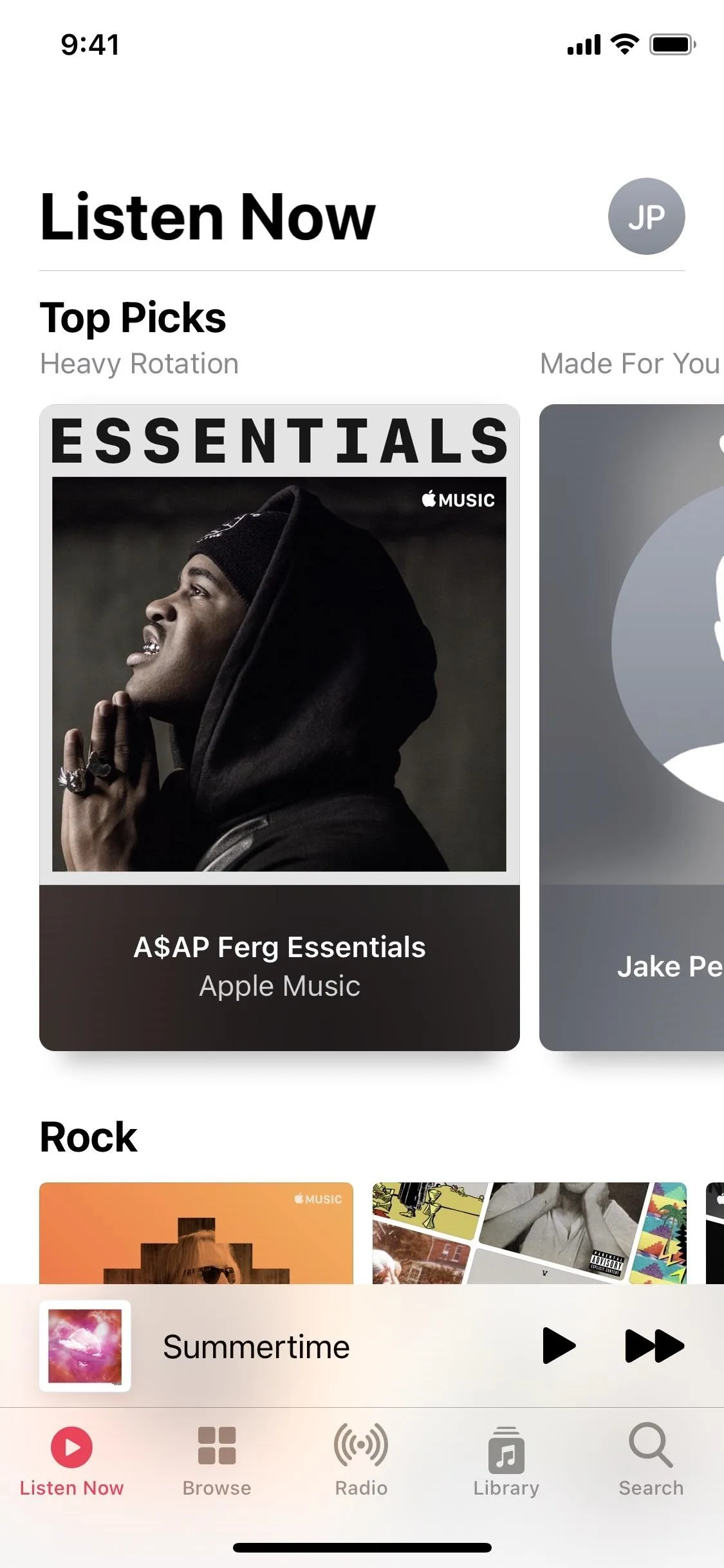
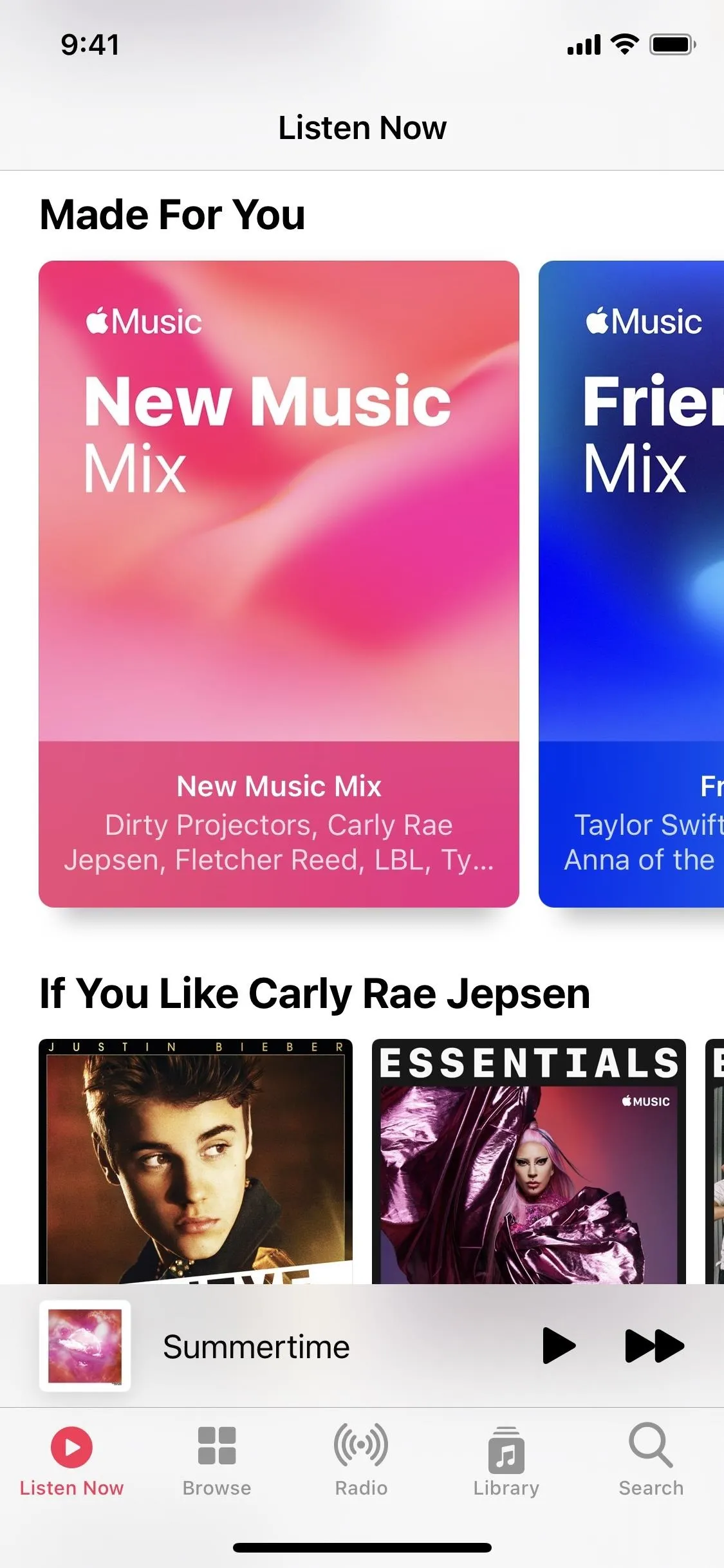
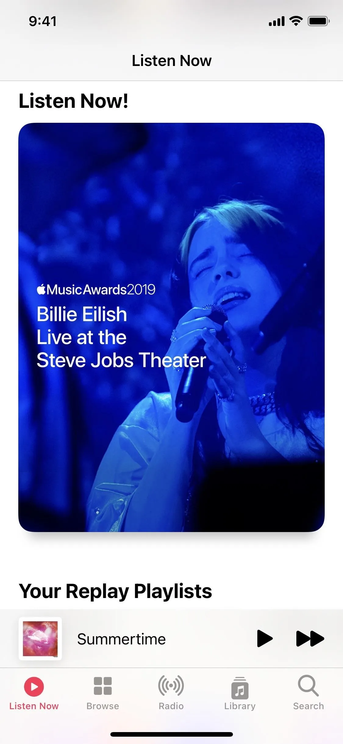
For Apple Music subscribers, "For You" is now "Listen Now" and maintains the first spot in the tabs, moving "Library" to the fourth position. Just like before, it's your home page for your Apple Music experience, where you can discover new music. And just like before, you can remove it if you want.
The name change is likely the result of Apple adding more ways for you to discover new music and playlists. Spotify is very good at this, and it's one of the reasons many Spotify users won't jump to Apple Music. They might now, though.
In the new Top Picks section, which features poster-like art to make them stand out as the essential items, you'll see your most-listened-to music, curated playlists, and more. There's also Stations for You, based on the artists you already follow. Apple has custom mixes here too.


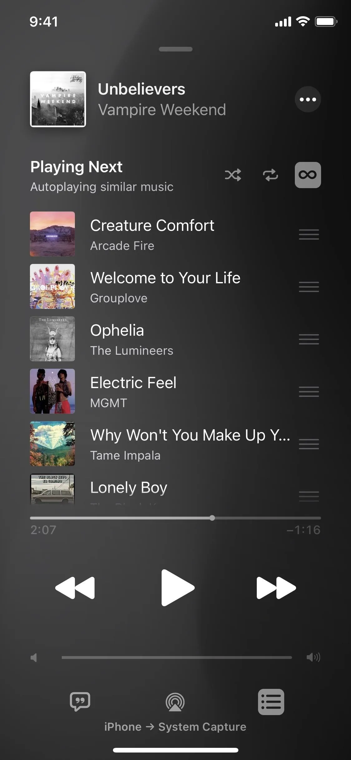
2. You Can Autoplay Music (Apple Music)
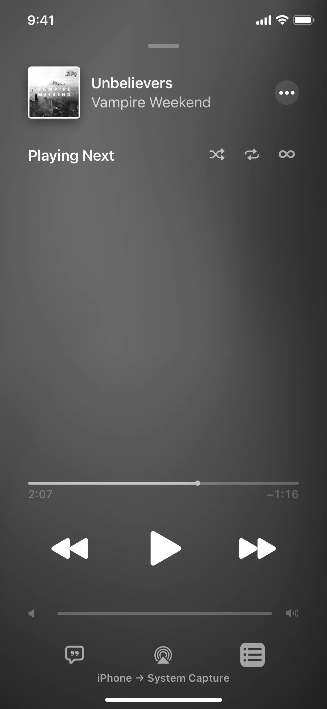
In iOS 13, when your track, album, playlist, etc. is done, the music stops. But in iOS 14, the music lives on as long as the new Autoplay button activated, but only if you're an Apple Music subscriber. The button's right next to the Shuffle and Repeat ones, and with it on, Apple Music will come up with likeminded music that it thinks you'll like and start playing that when your original choice has finished. It's another great way to discover new jams.


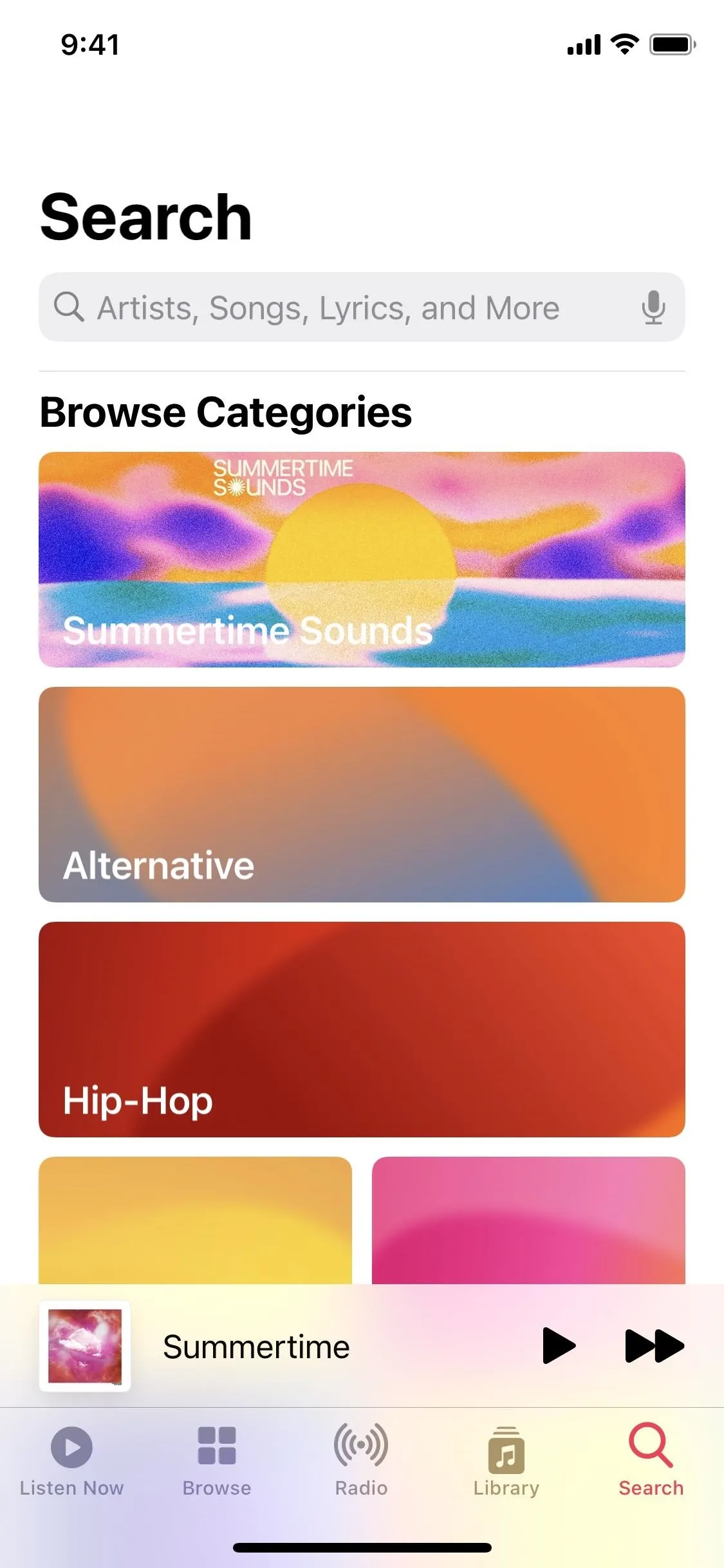
3. Genres & Moods Lists Are Easier to Find (Apple Music)
Before, if you wanted to browse through genres, you'd have to perform a search for it or find the very-easy-to-miss "Genres" link in the "Browse" tab. Now, as soon as you hit the "Search" tab, you'll see prominent cards for not only genres but moods and activity lists, such as "Summertime Sounds." So if you were going to search for a genre or mood, it's a little bit easier.
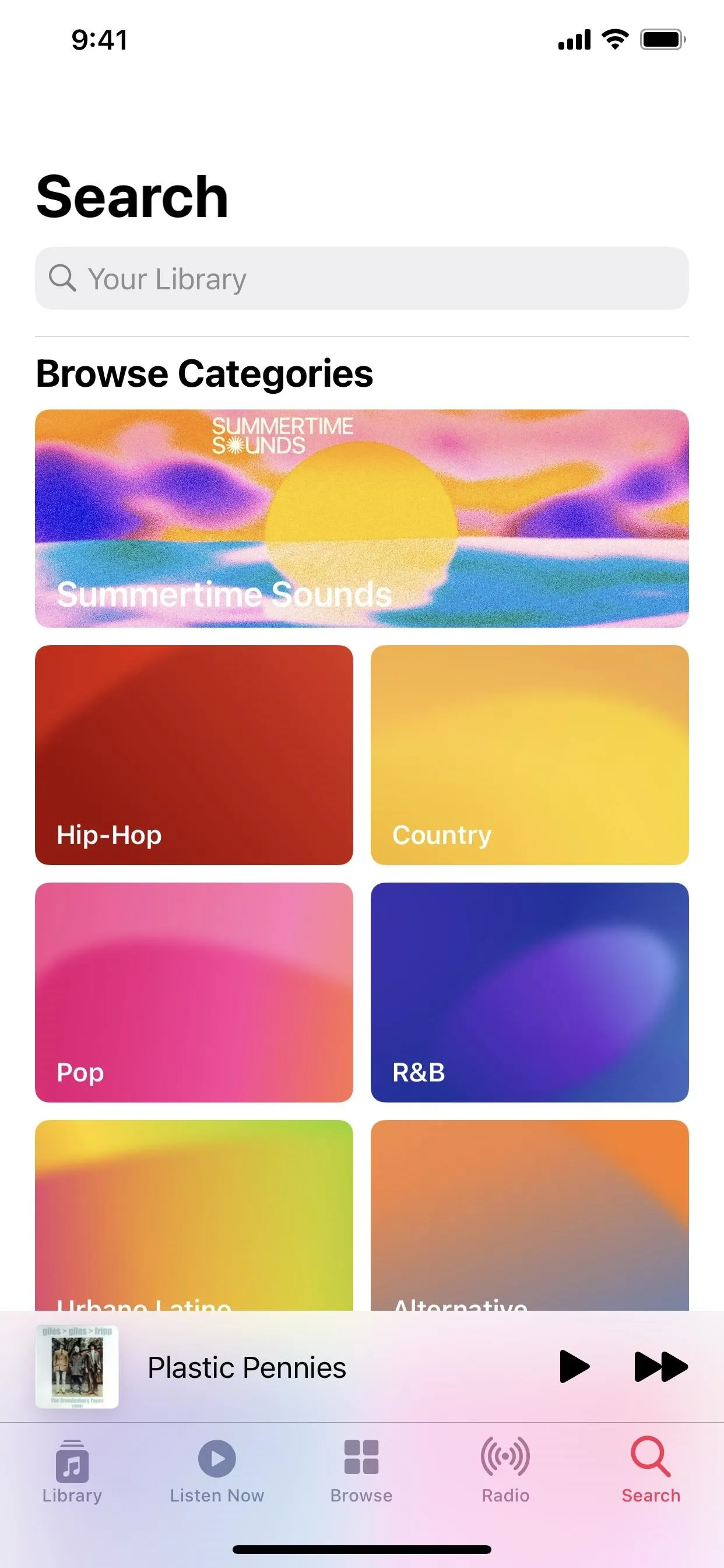


4. Search Is More Functional (Apple Music + Your Library)
Whether you're an Apple Music subscriber or not, searcing just got better.
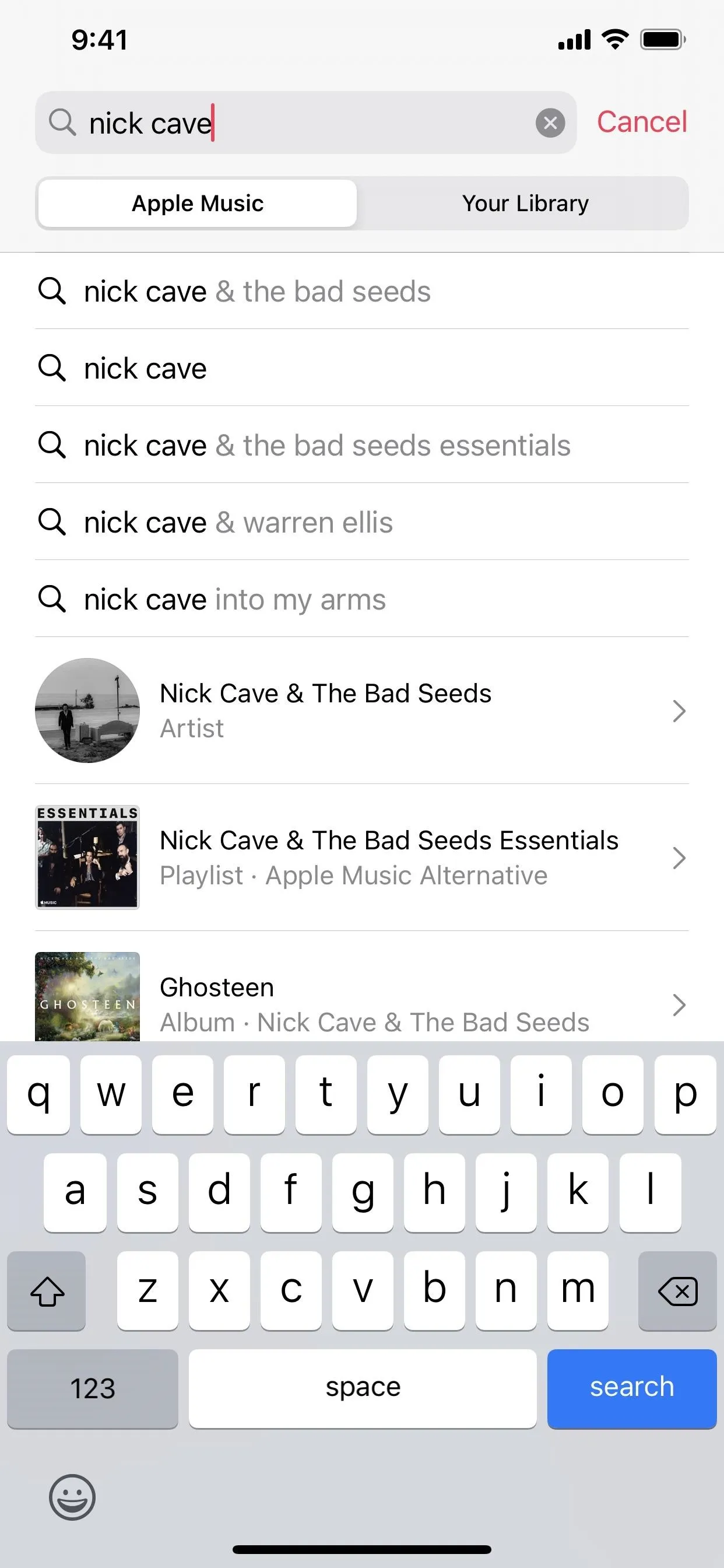
Instead of seeing a text-only list of possible and suggested results for an Apple Music search, you see the suggested searches in text alone and actual results for artists, playlists, albums, etc., complete with artwork. When you tap a suggested search, you get a big list of all of the Top Results instead of a list of broken up sections with "See All" links. Now, you see everything at once, and you can still drill down via the top options for Top Results, Artists, Albums, etc.
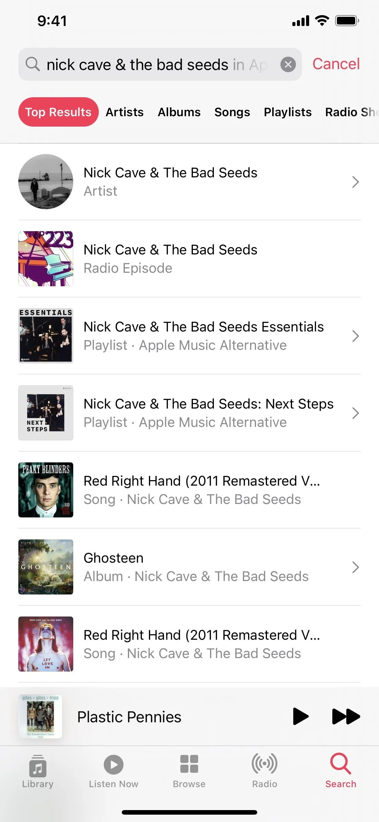


When you need to search your own music library, the results also show all of the Top Results instead of sections; only the top navigation filters aren't visible right away. A quick swipe down on the screen makes Top Results, Artists, Albums, Songs, and Composers appear.
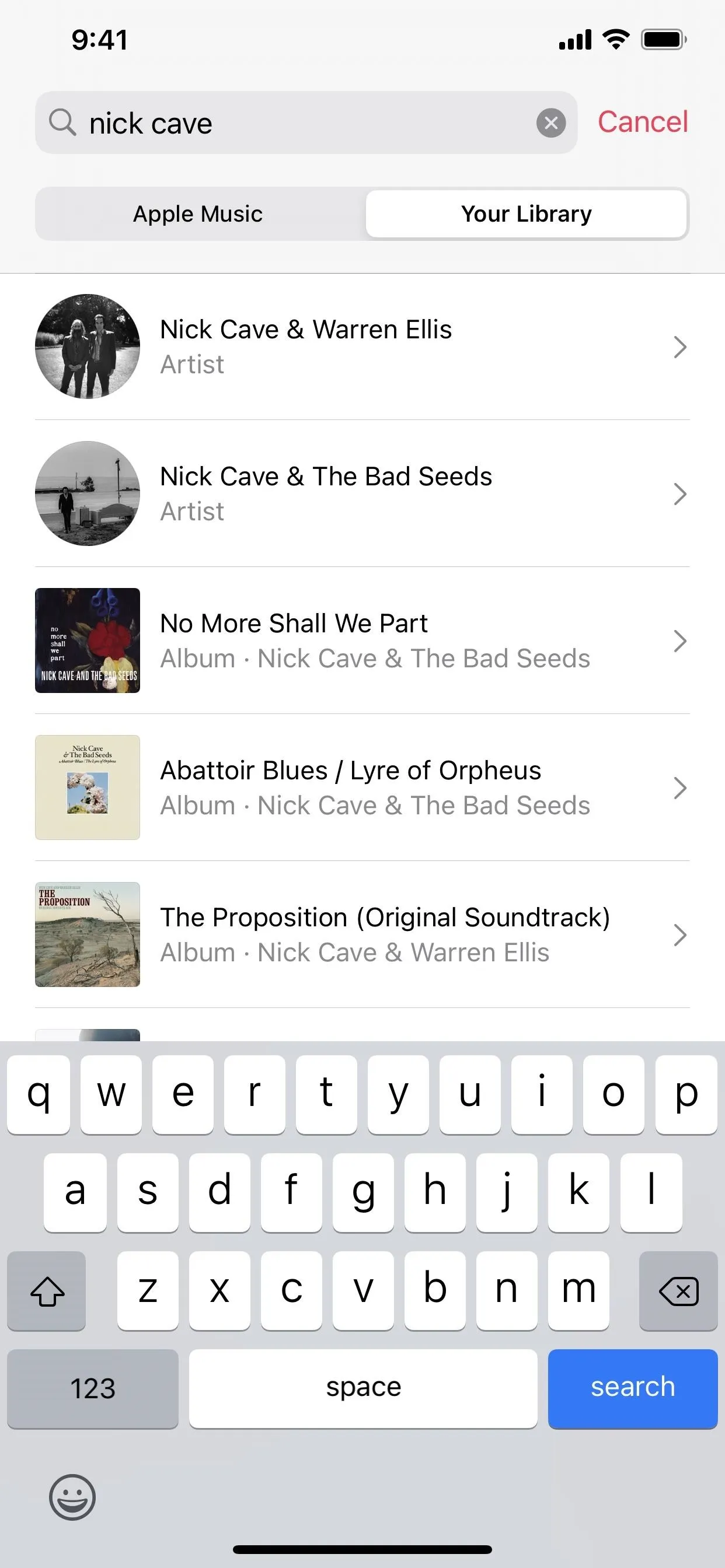
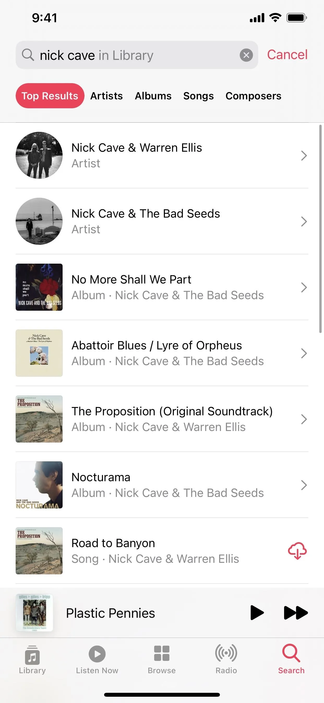


Additionally, in iOS 13, you could easily switch between Apple Music and Your Library during a search. In iOS 14, the visual indicator is not visible until you tap the search field again. So it's not missing, it's just hidden.
5. Filters Help Perform More Targeted Searches (Your Library)
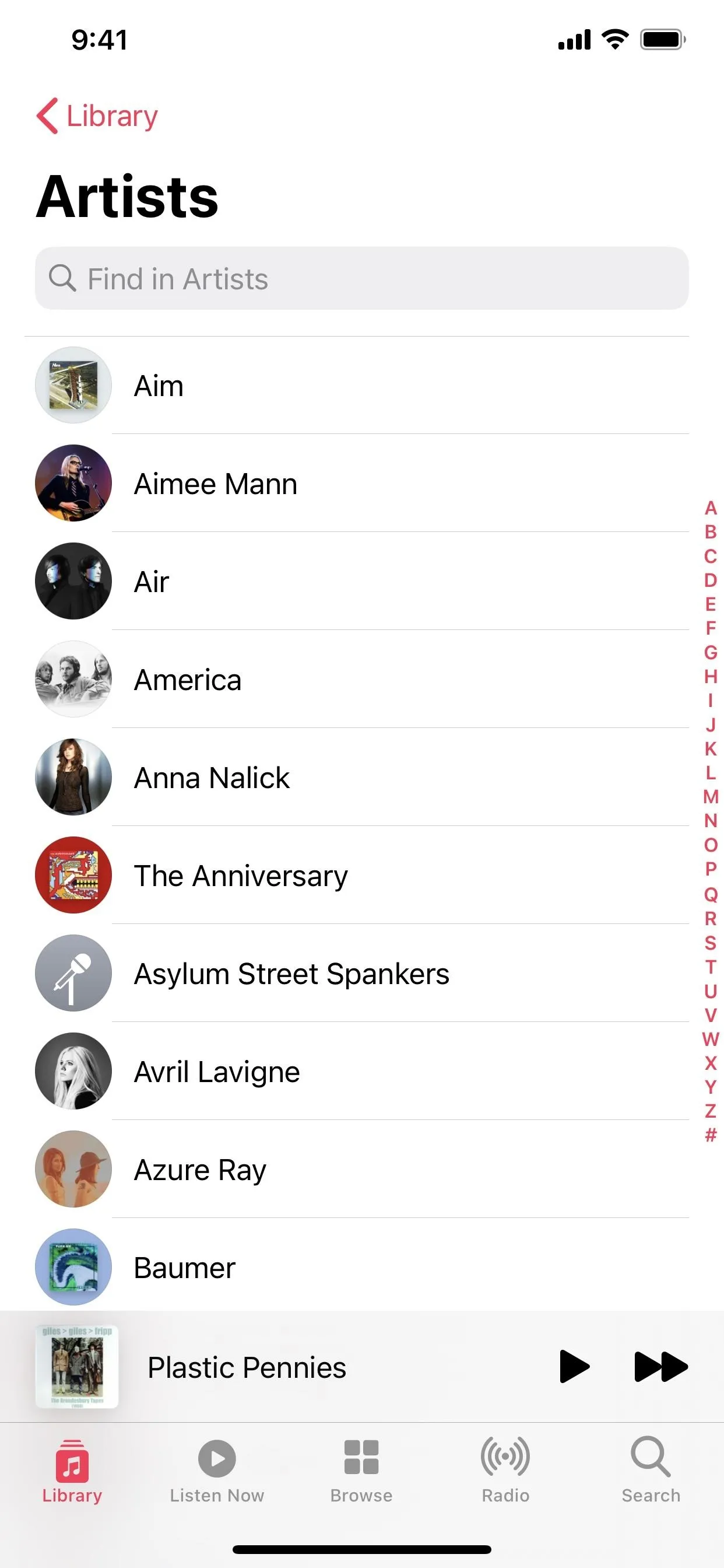
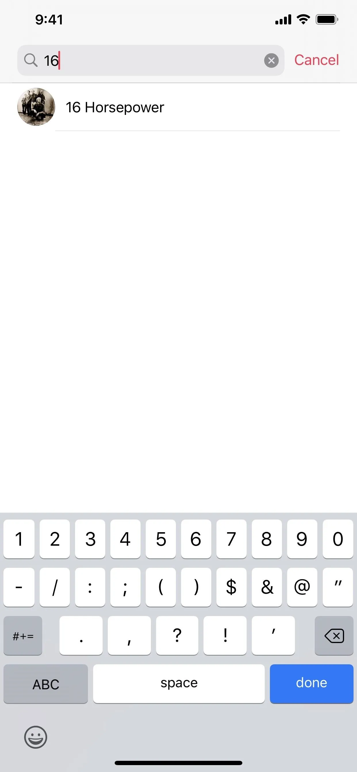
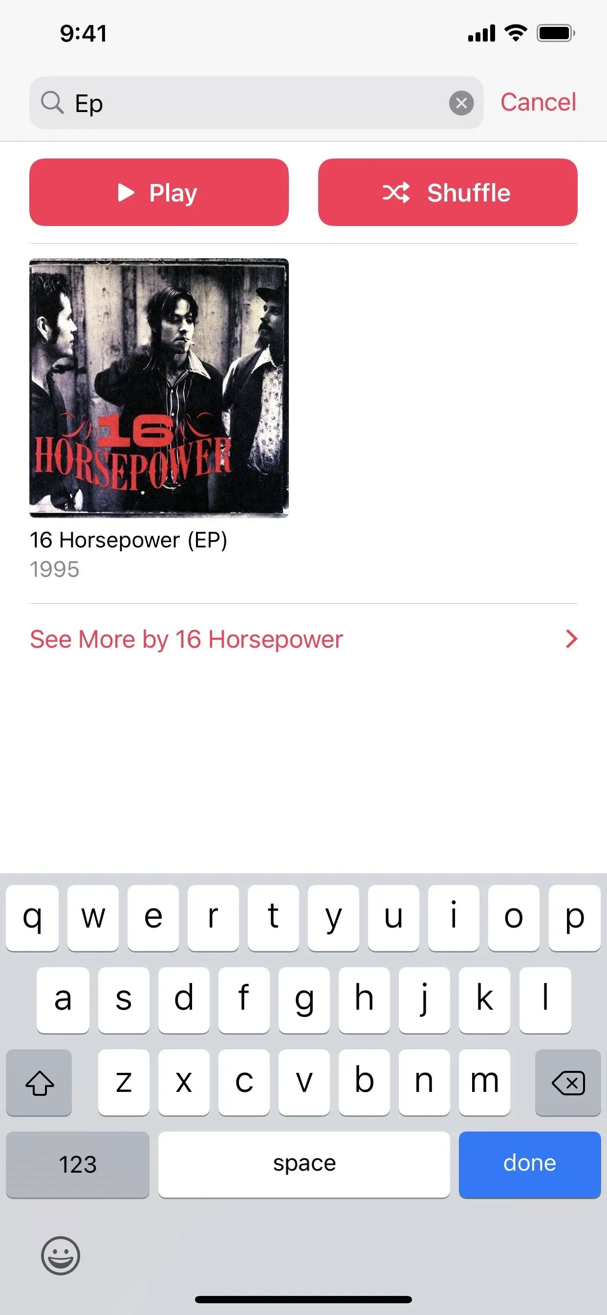
In the "Library" tab, when you select Playlists, Artists, Albums, Songs, Genres, Downloaded, etc., it looks the same as in iOS 13. But there's a hidden "find" tool in many of these pages to help you search for items in the current list only. Swipe down on the screen to make it appear.
As an example, you can search for an artist's name in the Artists list. And after selecting an artist, you can then search for one of their albums. It's much more useful than the general "Search" tab for Your Library.


6. Sorting Is Less Obtrusive (Your Library)
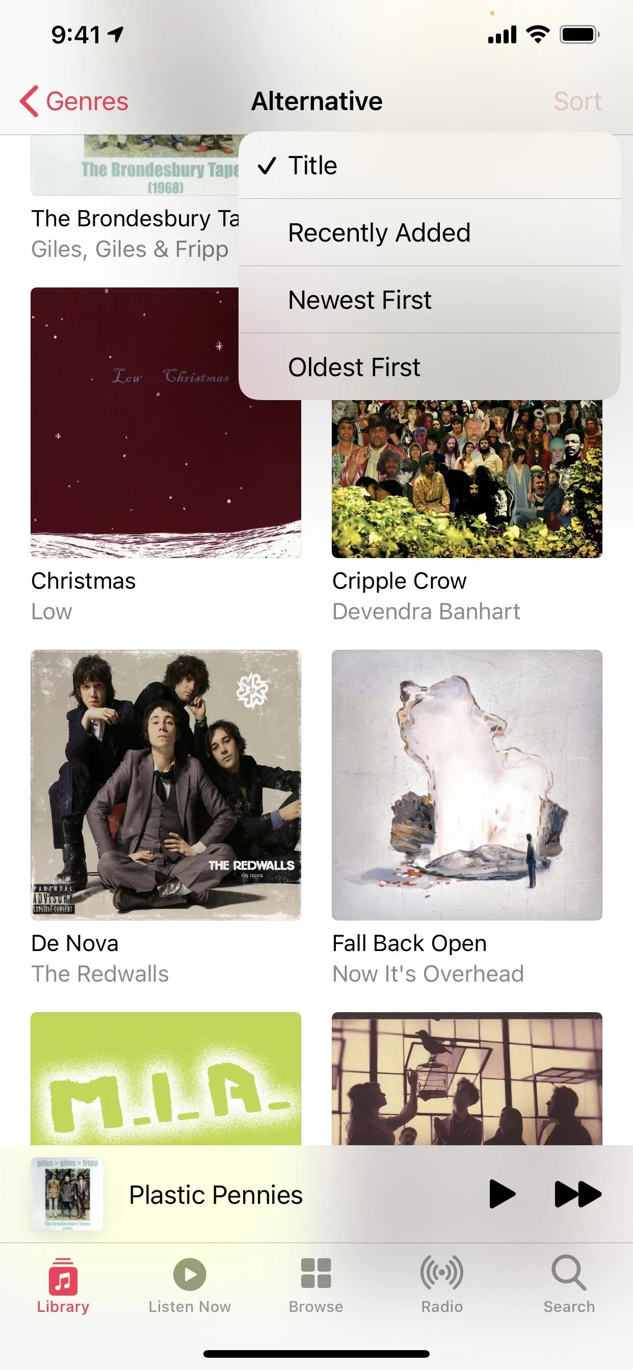
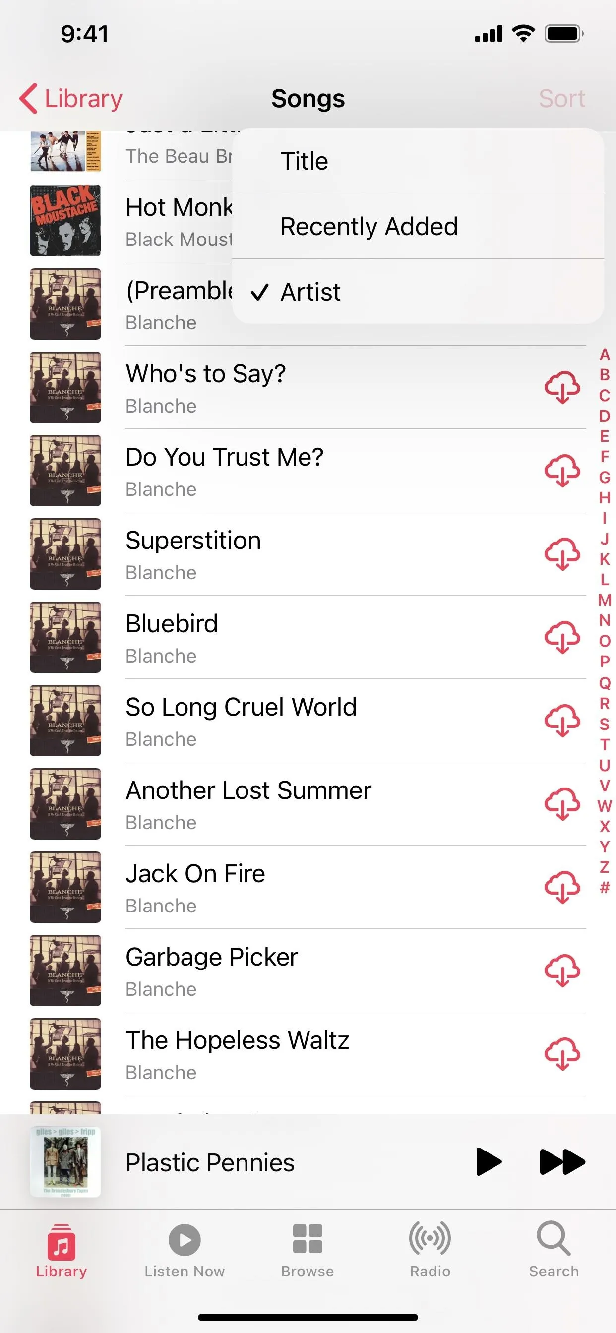
In iOS 13, whenever you would tap "Sort" on a page that could be sorted, a bulky action sheet would appear at the bottom of the screen. Now, the menu has turned into a smaller set of quick actions that stick right by the button.


7. Now Playing's Background Is Colorful (Apple Music + Your Library)
When you're checking out the Now Playing screen in full, the background will complement the album art, colored in blurred hues that match the artwork. It feels a lot more lively with ambient colors than a plain white background, especially since the gradient shifts around during playback.


8. The UI Was Revamped Slightly (Apple Music + Your Library)
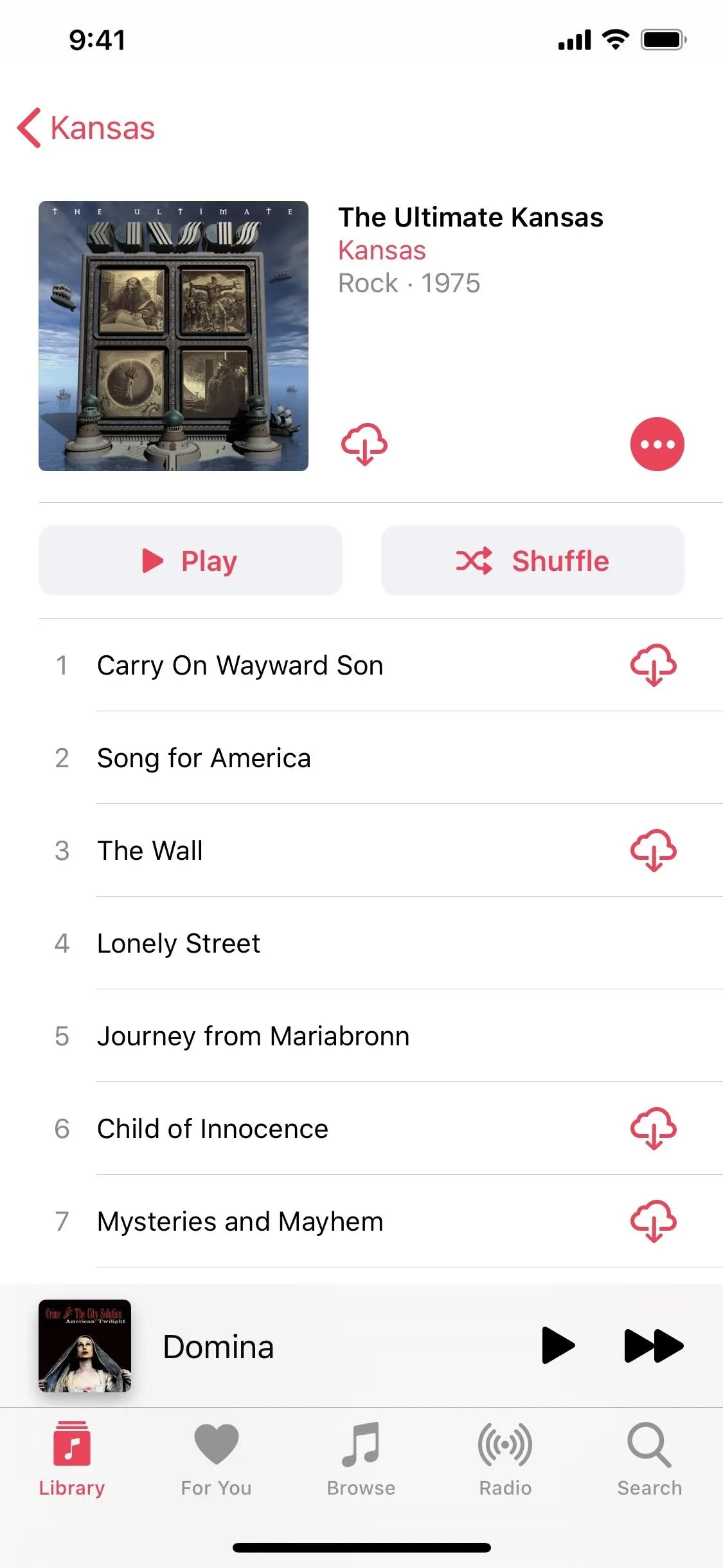
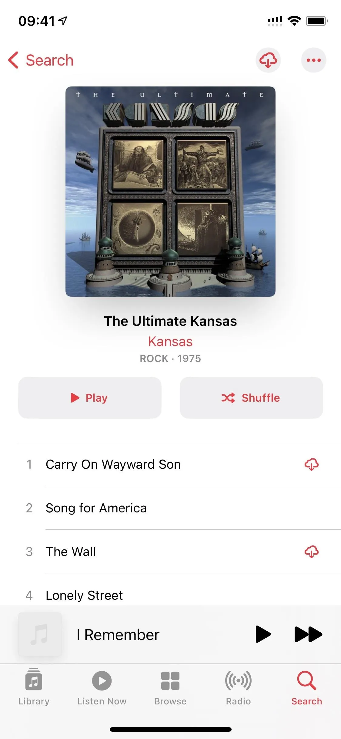
In older iOS versions, when looking at an album, the artwork would be in the top left with the album details to its right. Now, the artwork is upfront and center, more prominent than ever, with album details right below it. The download button switched to the top right next to the ellipsis icon instead of with the album details.


9. The Widgets Looks Better (Apple Music + Your Library)
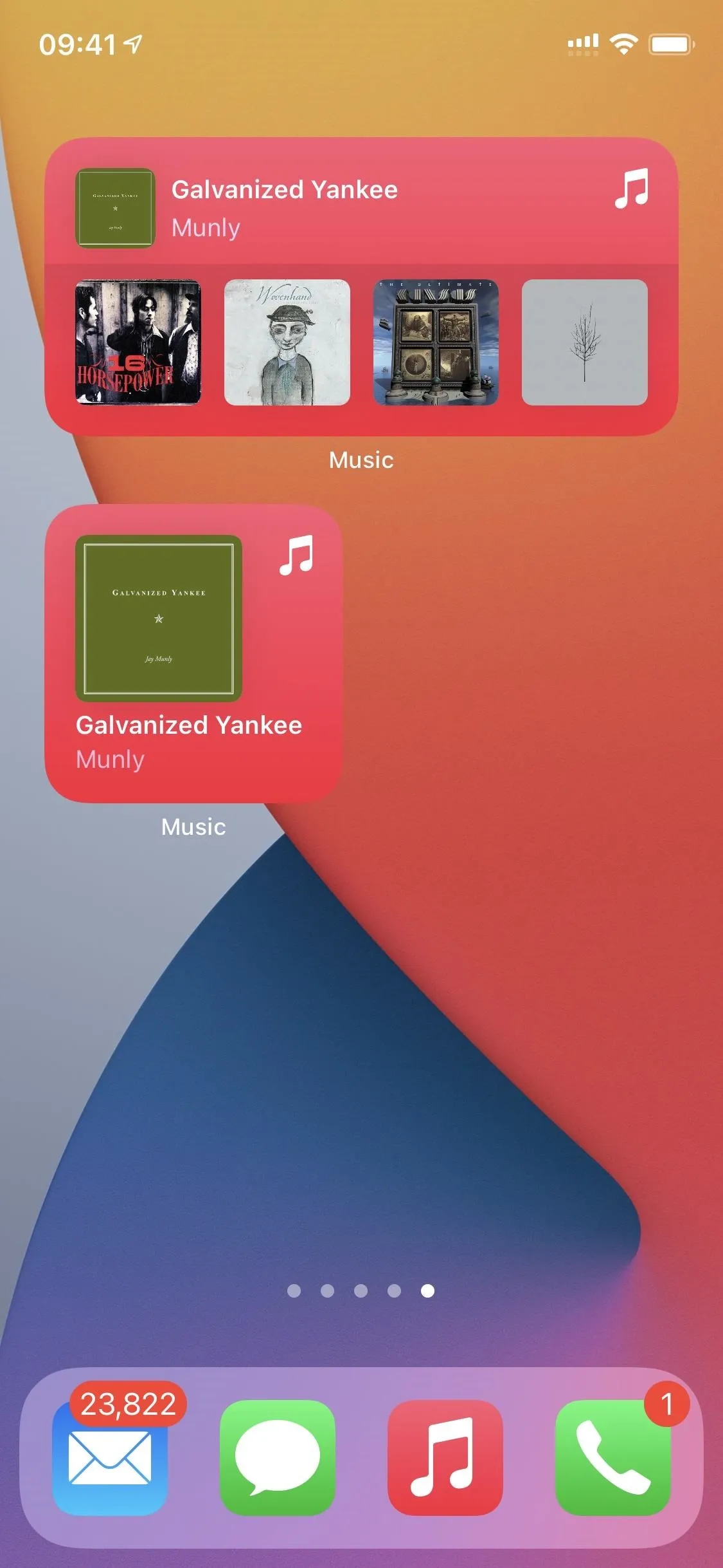
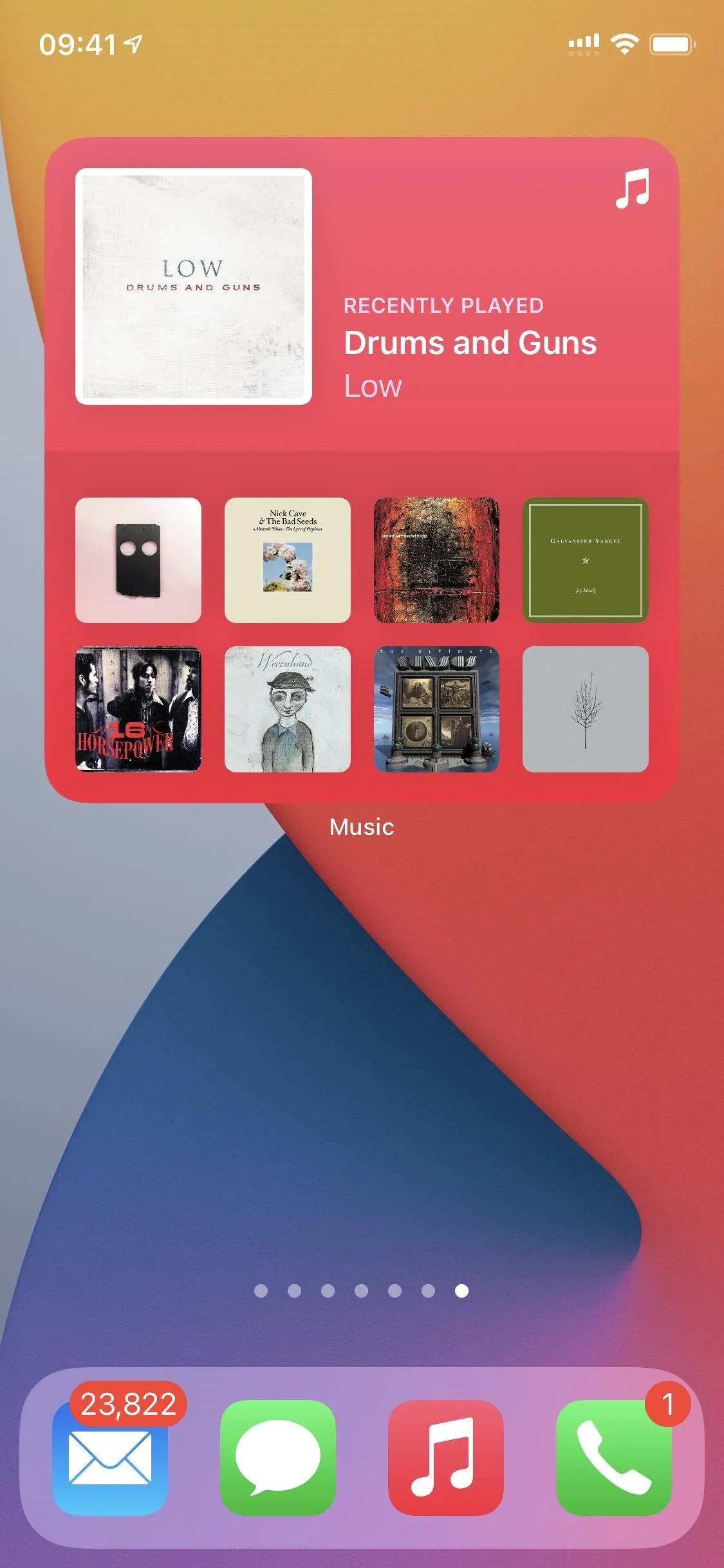
The Music app had a widget before on the home screen, hidden in the quick actions, which only showed a few recently played albums without any labels.
Now, there are three different widget sizes, and they go right on the home screen itself. The small one shows one album, the medium shows five, and the large has nine. Even better, there's a text label for the most recent option. These widgets look the same in the Today View too.
Unfortunately, due to the way Apple created widgets, there is no way to control music playback from the widgets since there is no API for user interaction beyond opening the associated app.


10. iTunes Purchases Can Download Automatically (Your Library)
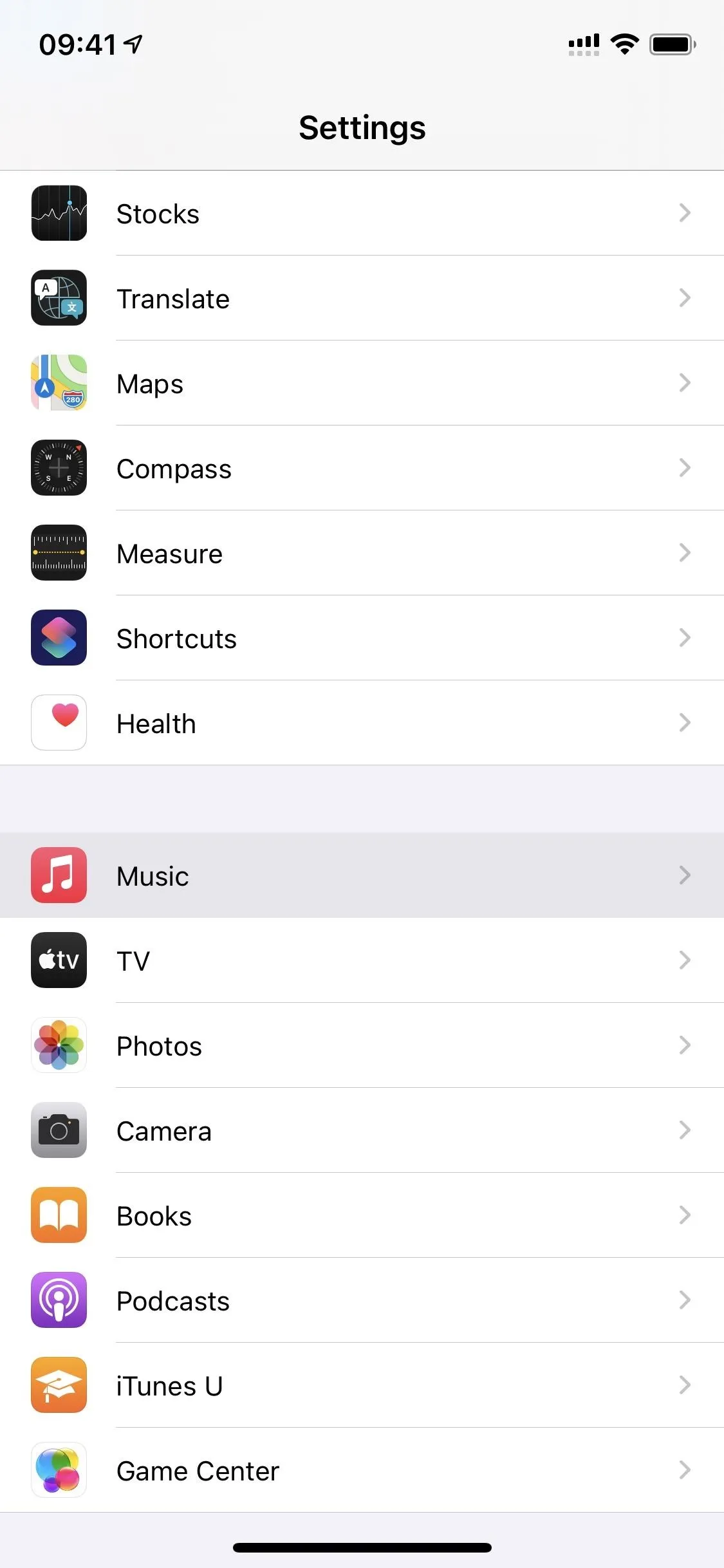
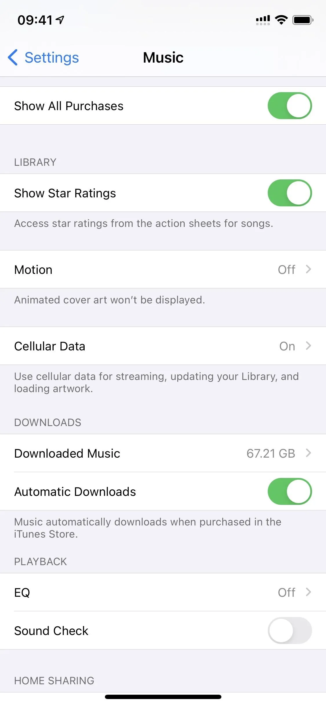
If you bought music from the iTunes Store and like the option of listening to all of your music offline, there's now an "Automatic Downloads" toggle switch in the Music settings. In older versions, you would have to download purchased music manually, and who wants to do that?


11. There's Motion & You Can Disable It (Apple Music)
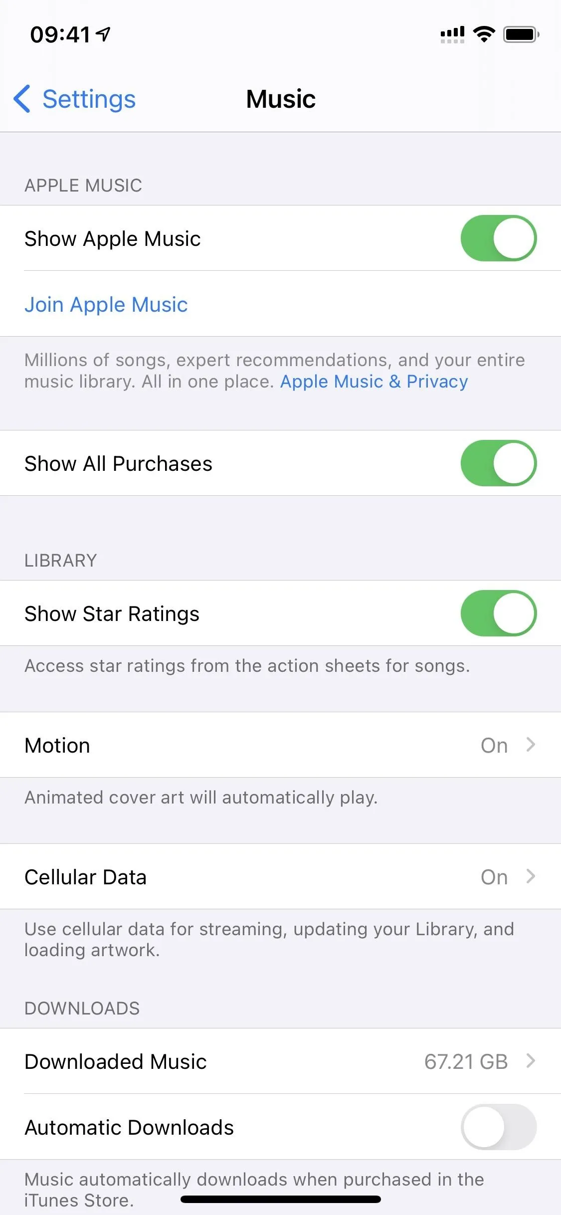
If you're an Apple Music subscriber and head to the "Listen Now" tab, you might see that some of the curated playlists art moves. The animated playlist art is a fun new feature, and we wish it appeared in more places.
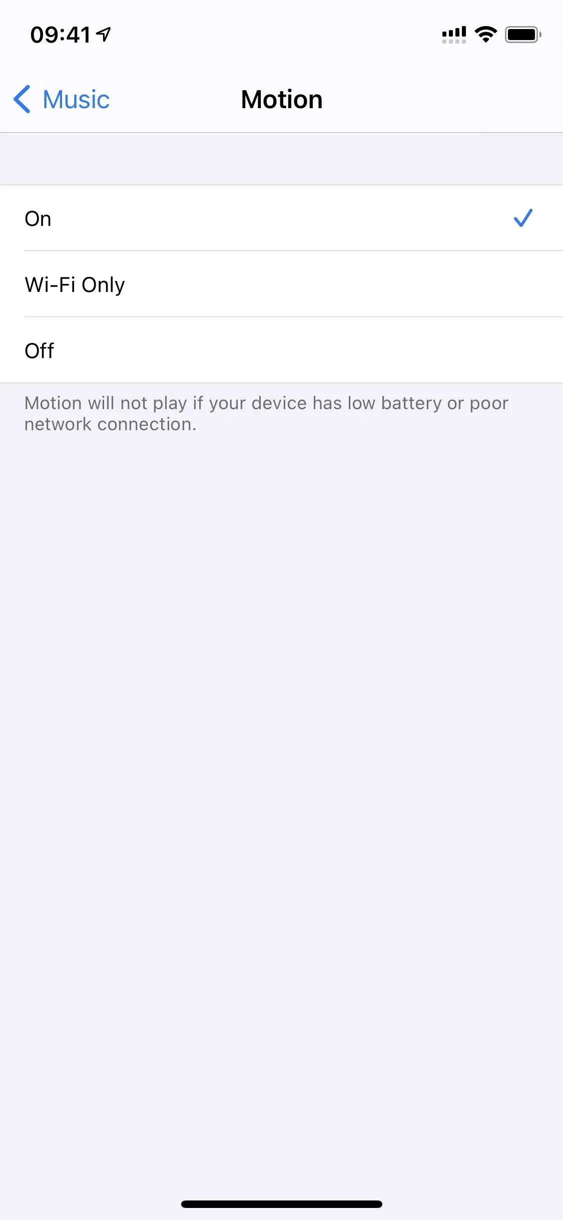
However, if you don't like it, there's a menu in Settings –> Music –> Motion to turn it off or set it to Wi-Fi only. If it's on, the motion will stop automatically when you have a low battery or a poor network connection. The setting doesn't seem to affect the slight color shifts on the Now Playing screen.


12. You Can Customize What You Hear (AirPods + Beats Headphones)
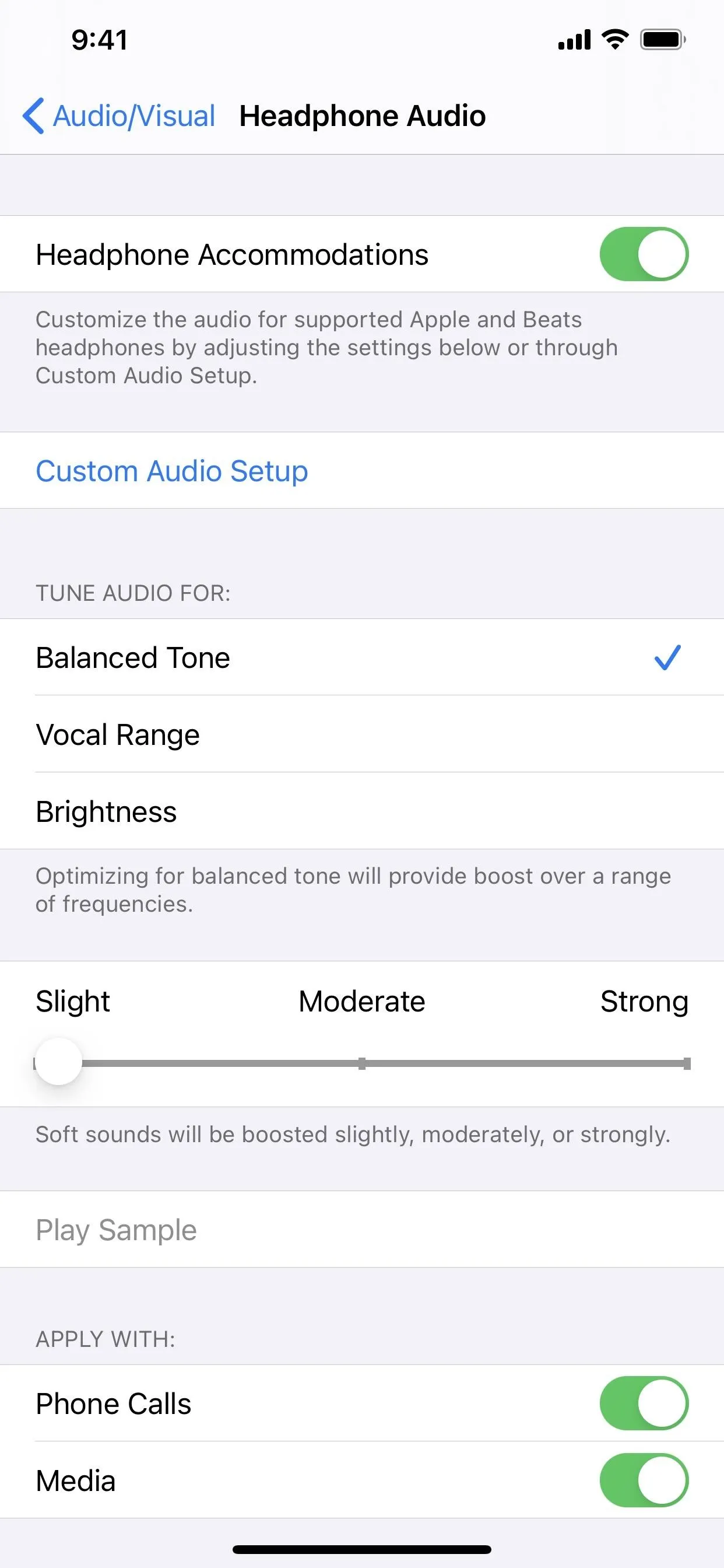
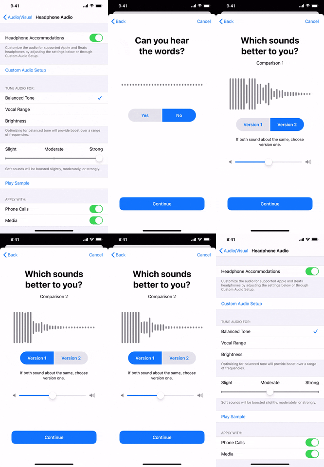
For those with hearing issues, there's a new accessibility feature called "Headphone Accommodations" that helps make music and other audio more crisp and clear when wearing supported AirPods or Beats. When you tap "Custom Audio Setup," it runs you through some steps to follow.
First, the self-guided tool gives you spoken words at different frequencies. If needed, it can adjust the tones of spoken content to amplify soft sounds. Then, there's a test to determine the level of the tones for music playback. Lastly, if you have an audiogram from the Health app, it can use that further to refine your listening experience with AirPods or Beats.
You can also adjust the settings manually if you think it needs a little tweaking. And you can have it apply to only phone calls or digital media or both.
According to Apple, it "also supports Transparency mode on AirPods Pro, making quiet voices more audible and tuning the sounds of your environment to your hearing needs."


13. There's Spatial Audio for Surround Sound (AirPods Pro Only)
If you have a set of AirPods Pro headphones, you're getting something everyone else is not: spatial audio. This applies more to watching movies than listening to music, but if there is any music you can play in 5.1, 7.1, or Dolby Atmos surround sound, things should sound better.
For it to work, your head and device movements are tracked using the gyroscope and accelerometer in your AirPods Pro and your iPhone. It then remaps the sound field, applying directional filters and adjusting the frequencies in each ear, so that it feels like the audio is coming from around you.
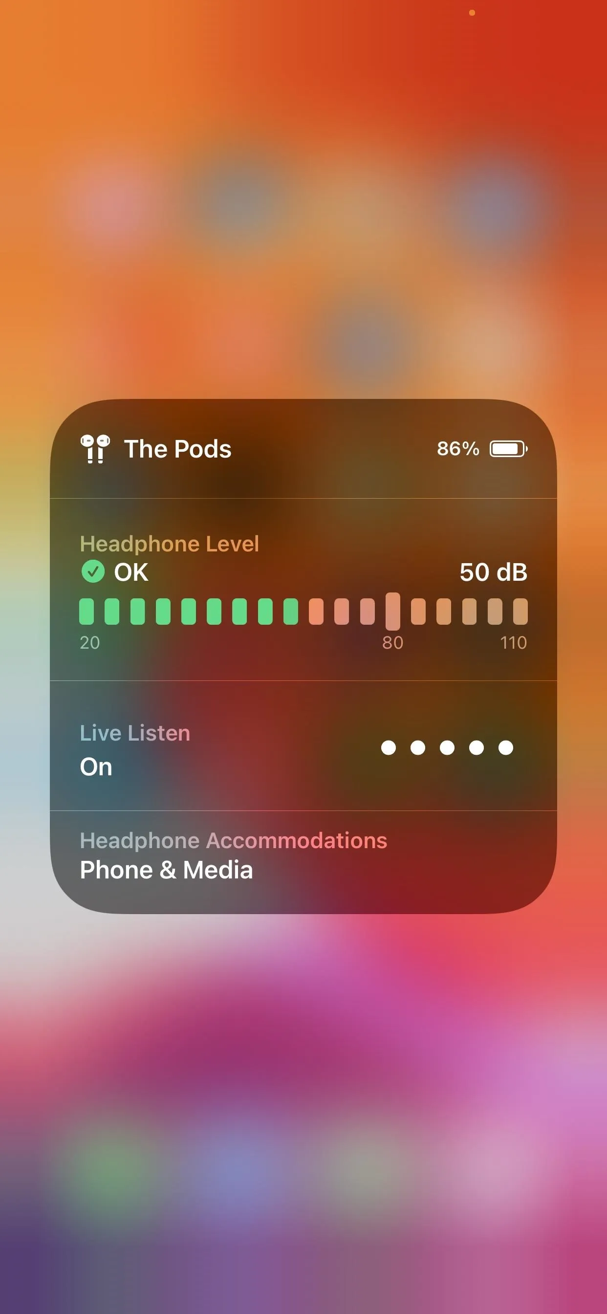
14. You Can See Your Headphones Level in Control Center (Headphones)
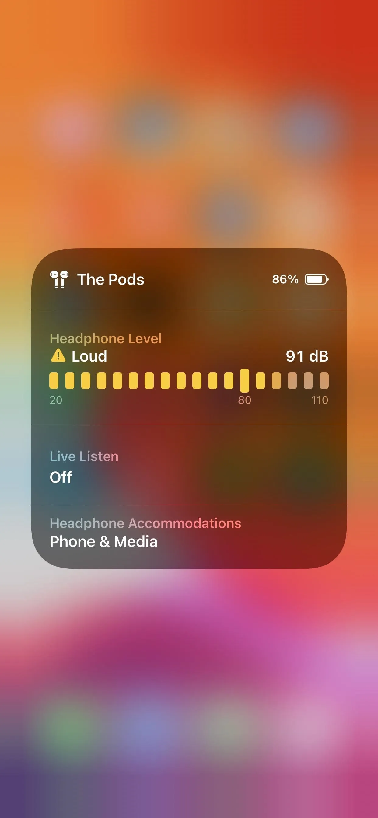
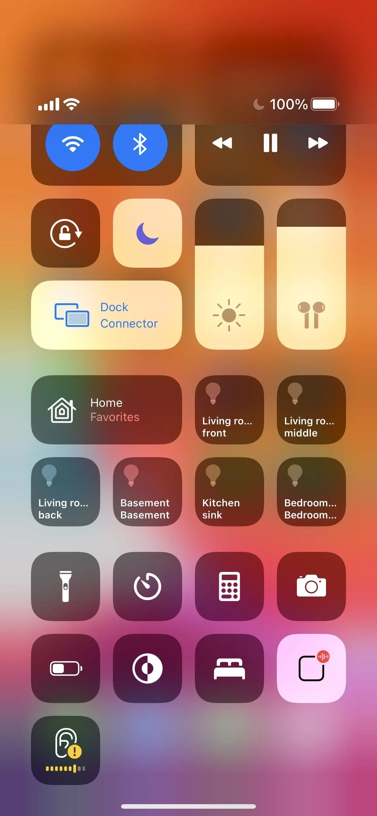
If you don't want to have to use those two headphones features above, you might want to start keeping track of how loud you're listening to music and movies. With the Hearing control, you'll now see the headphones level in there to let you know if the audio is in the safe zone or too loud for your ears. The small control will be green or yellow to let you know if it's good or too loud, and the levels indicator in the expanded control will also adjust colors.


What Else Is New in the Music App?
There are other improvements in the Music app, but most are all iPad-related, and we're only covering the iPhone side of things here. For instance, iPads have a navigation sidebar, where sections can be collapsed, and there are jump links to playlists and more throughout the app, as well as a redesigned Now Playing look.
In the Settings app, the "Volume Limit" option is missing from the Music preferences. Hopefully, this will come back in a future update.
Cover photo, screenshots, and GIF by Justin Meyers/Gadget Hacks





Comments
Be the first, drop a comment!