


Reviewed by Corey Noles
Apple's Photos app has felt like a science experiment gone wrong for the past year. After iOS 18's controversial redesign stripped away the familiar tab structure in favor of a confusing single-scroll interface, users made their frustration clear. Now with iOS 26 arriving this fall, Apple is course-correcting with meaningful refinements that bring back beloved features while adding genuinely useful new capabilities.
The changes aren't just cosmetic tweaks—they represent Apple listening to feedback and delivering tools that actually enhance how we interact with our photo libraries. Let's dig into what's actually changing and why it matters.
The great tab bar comeback story
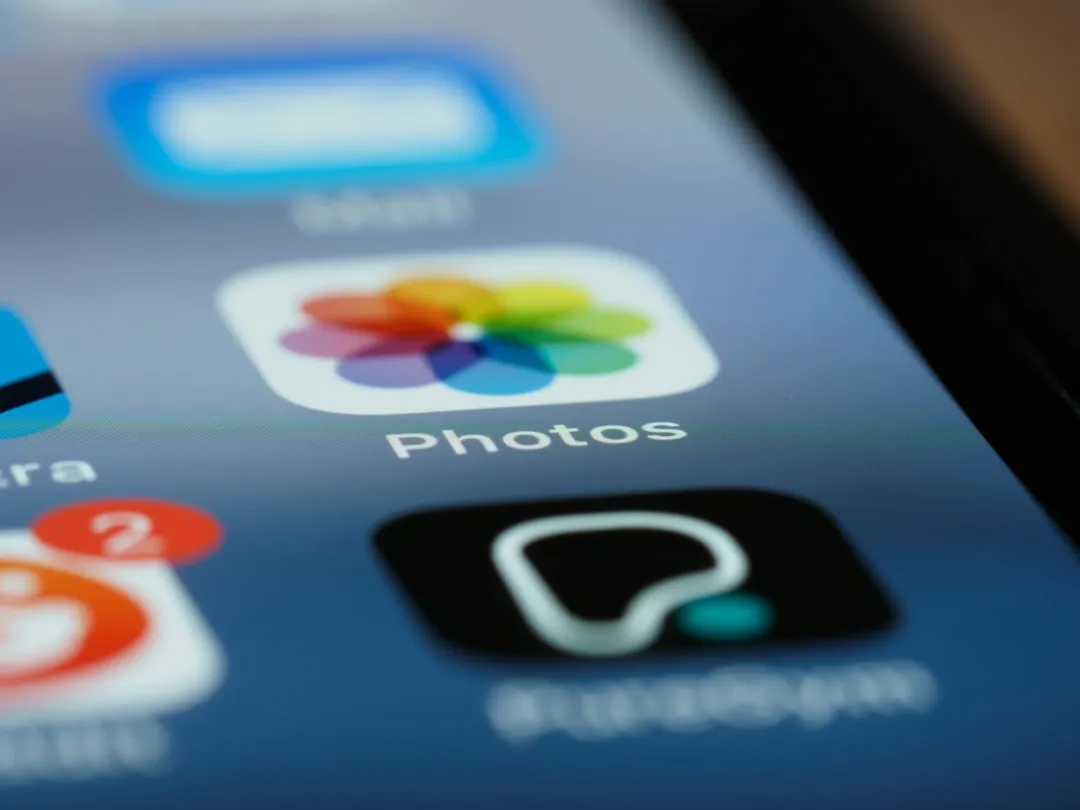
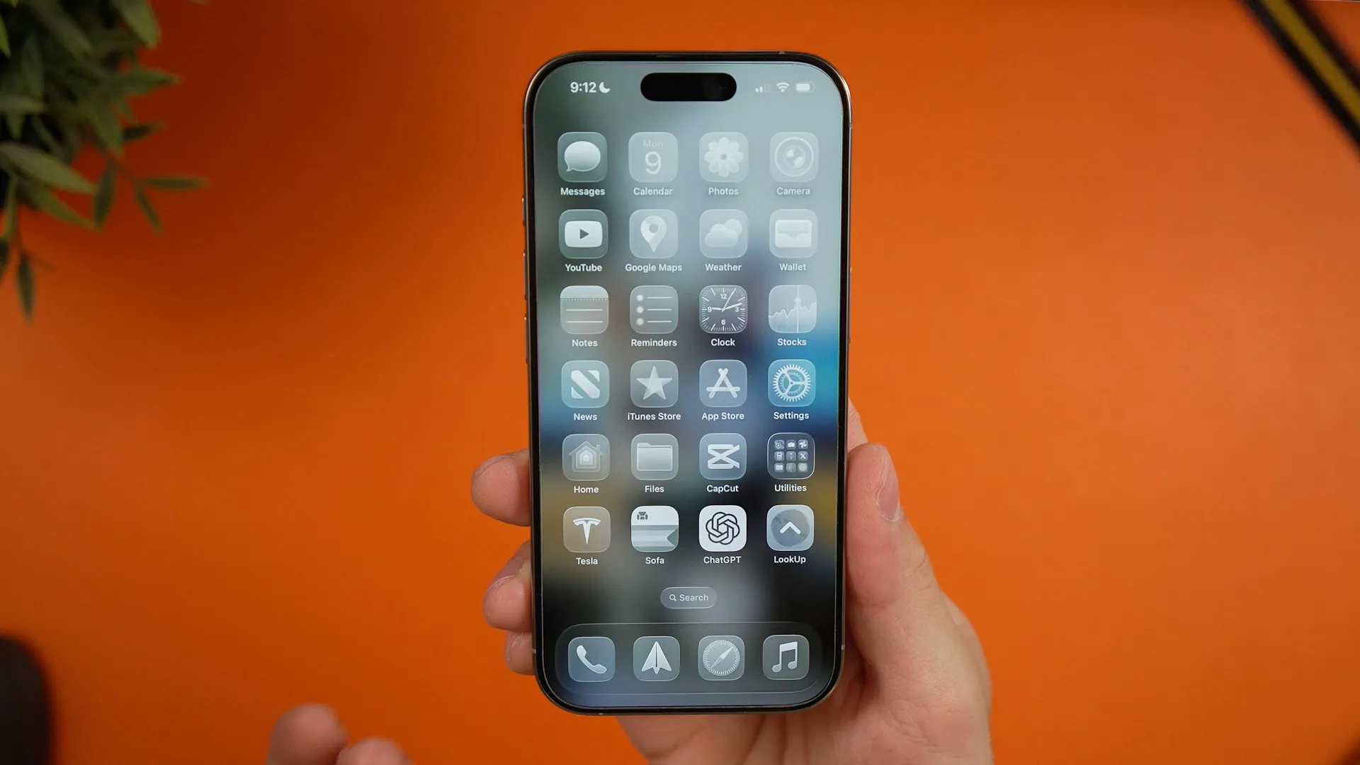
Remember when Apple decided tabs were passé? Photos navigation now features separate tabs for Library and Collections, marking one of the most significant design reversals in recent iOS history. The familiar three-tab structure—Library, Collections, and Search—brings back the intuitive navigation that millions of users missed.
This isn't just nostalgia-driven backtracking. Apple streamlined the viewing experience by removing the confusing carousel that let users accidentally swipe between views. The Library tab now displays your photo grid prominently, while Collections offers customizable sections with collapsible categories that don't feel cluttered like the previous single-scroll design.
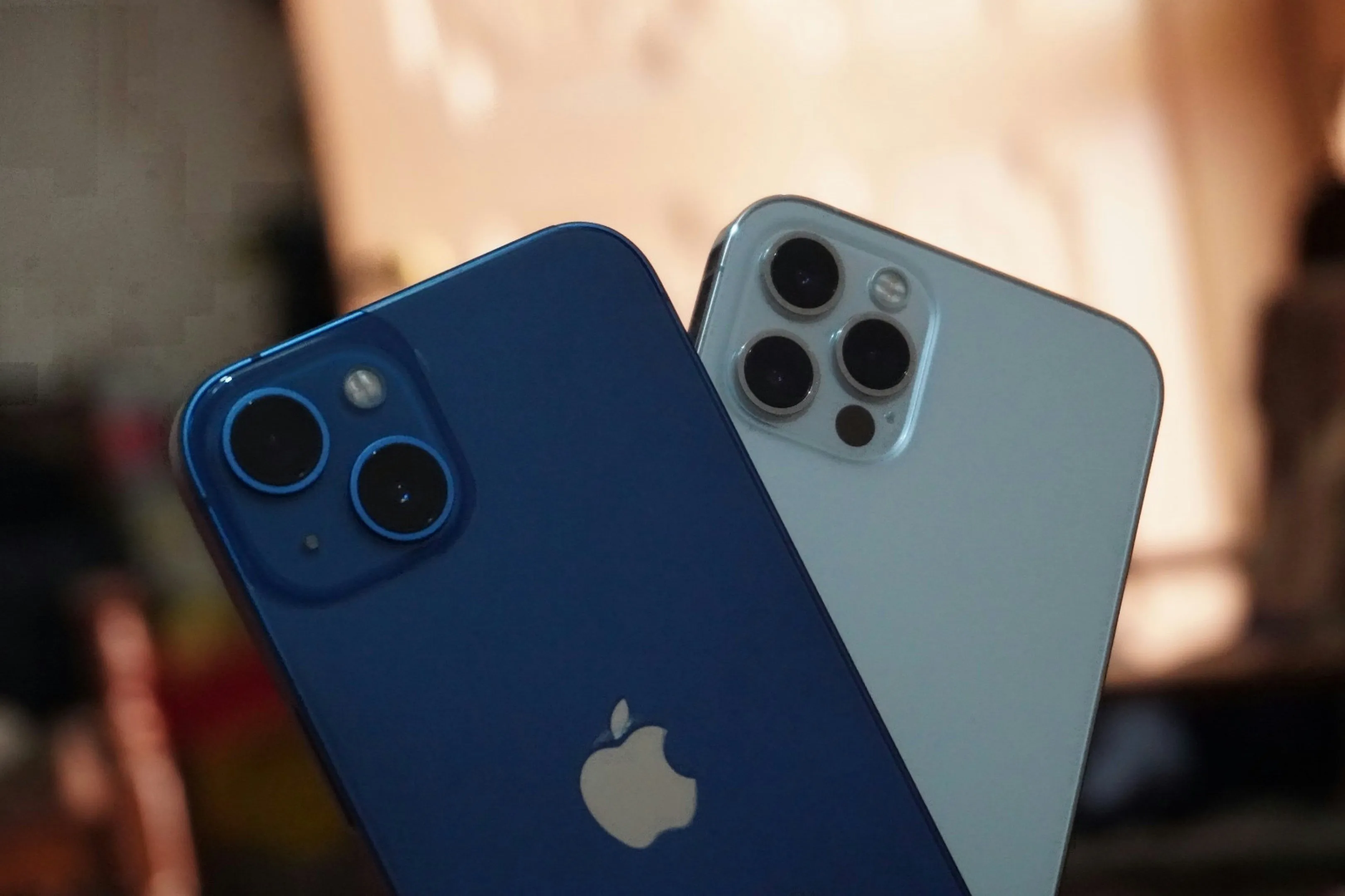
After two weeks testing the iOS 26 beta on my daily driver iPhone 15 Pro, the muscle memory difference is remarkable. Where iOS 18 had me constantly scrolling to find albums or accidentally swiping sideways, the tab system cuts that friction entirely. The app even remembers which tab you were using when you last opened it—a small but essential touch that shows Apple sweating the details that matter to real workflows.
Spatial Scene brings the magic home
Here's where things get genuinely exciting: iOS 26 brings the ability to create 3D spatial versions of any image, a feature previously exclusive to the Vision Pro. When viewing a photo, tap the new Spatial Scene button in the top-right corner to transform images into their 3D selves, giving them depth and movement.
What makes this particularly impressive is that the feature works for both new and old images, even ones captured years ago. Apple's machine learning analyzes depth information from single images to create convincing parallax effects. During my testing, family vacation photos from 2019 suddenly felt more immersive—portraits gained subtle background separation, while landscape shots revealed unexpected layers of terrain depth. The technology doesn't work on screenshots or videos yet, but for standard photos, the results can be surprisingly compelling.
This connects to Apple's broader AR/VR convergence strategy. Lock Screen wallpapers also benefit from this spatial effect, giving images a 3D-like depth that shifts as you move your phone. It's the kind of subtle enhancement that makes your device feel more alive without being gimmicky—and it's laying groundwork for how we'll eventually interact with memories in Apple's expanding spatial computing ecosystem.
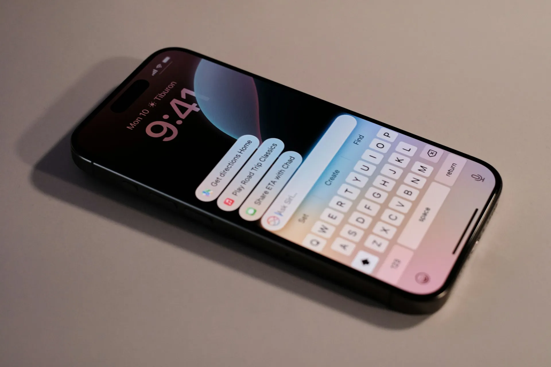
Liquid Glass transforms the everyday experience
Beyond structural changes, iOS 26 introduces the Liquid Glass design language throughout the Photos app. This isn't just about aesthetics—the translucent, glass-like elements create depth and context awareness that makes navigation feel more intuitive by reducing cognitive load when switching between different app areas.
Buttons, navigation tabs, and popup menus all adopt the new translucent appearance that reflects colors from your photos and surroundings. Early beta versions of iOS 26 drew criticism for being too extreme with transparency, so Apple responded by adjusting opacity levels for better legibility. This mid-course correction reveals something significant about Apple's evolving design philosophy: they're willing to iterate based on user feedback during development rather than stubbornly defending a vision that isn't working in practice.
The visual refresh extends beyond pretty effects. Menu bars in apps like Photos now feature more transparency while allowing background colors to show through, creating a sense of depth that helps users understand their location within the app hierarchy. In my testing, this spatial awareness made it easier to navigate complex album structures—you intuitively sense whether you're in a main category or nested deep within collections.
Enhanced customization meets practical improvements
Collections get a significant upgrade in iOS 26 with new view settings and the option to collapse and expand individual collections. This addresses one of the major complaints about iOS 18's approach—users can now hide categories they don't use while keeping frequently accessed collections prominent.
For power users managing extensive photo libraries, this granular control enables workflow optimization that wasn't possible before. The Collections view includes extended customization tools that let you change display sizes, building on the reordering capabilities introduced in iOS 18. Parents juggling thousands of family photos can collapse unused categories like Screenshots and Shared Albums, while photographers might prioritize Albums and Recent Days—the interface adapts to individual usage patterns rather than forcing a one-size-fits-all approach.
There's also a practical improvement many will appreciate: albums appear higher up in the interface, eliminating the need to scroll to the bottom to access them. Combined with Recently Saved content being integrated into the Recent Days collection rather than being buried in Utilities, these changes reduce friction for the most common tasks—finding recent shots and organized albums—that make up 80% of most users' photo browsing.
What this means for your daily photo workflow
The Photos refinements in iOS 26 represent something rarer than new features: Apple admitting when an approach didn't work and course-correcting thoughtfully. The return of tabs makes navigation more predictable, while Spatial Scene adds a genuinely useful way to experience memories with more depth and engagement.
How these changes combine creates compound benefits beyond individual improvements. The tab system's muscle memory efficiency pairs with Liquid Glass's spatial awareness to make complex photo management feel effortless. When you're jumping between reviewing recent vacation shots, organizing them into albums, and sharing favorites with family, the interface flows naturally rather than fighting you at every step.
Yes, there are trade-offs. The single-scroll interface of iOS 18 made it easier to quickly access collections like Screenshots and Videos, and checking iCloud sync status now requires several taps instead of being visible at the bottom of the Library. Power users can mitigate these limitations by customizing Collections to prioritize frequently accessed content and watching for the subtle sync indicators in the profile icon.
PRO TIP: During the beta period, spend time in the Collections customization settings. The ability to collapse unused categories and reorder frequently accessed ones can save significant time if you're managing large photo libraries across multiple devices.
The bigger story here is Apple's willingness to iterate based on real user feedback rather than sticking stubbornly to a design vision that wasn't working. With iOS 26 still in development and more beta releases coming, there's time for further refinements before the fall release. But the foundation is solid: Photos feels like Photos again, just with some genuinely useful new tricks that hint at the spatial computing future while solving today's practical problems.


Comments
Be the first, drop a comment!