The first thing most of us noticed after Apple announced plans for its wearable—the Apple Watch—was the importance and focus they placed on its interface. Starkly different from their Android Wear counterparts, the Apple Watch's interface has applications scattered around the screen and relies on the device's dial to zoom in and out.
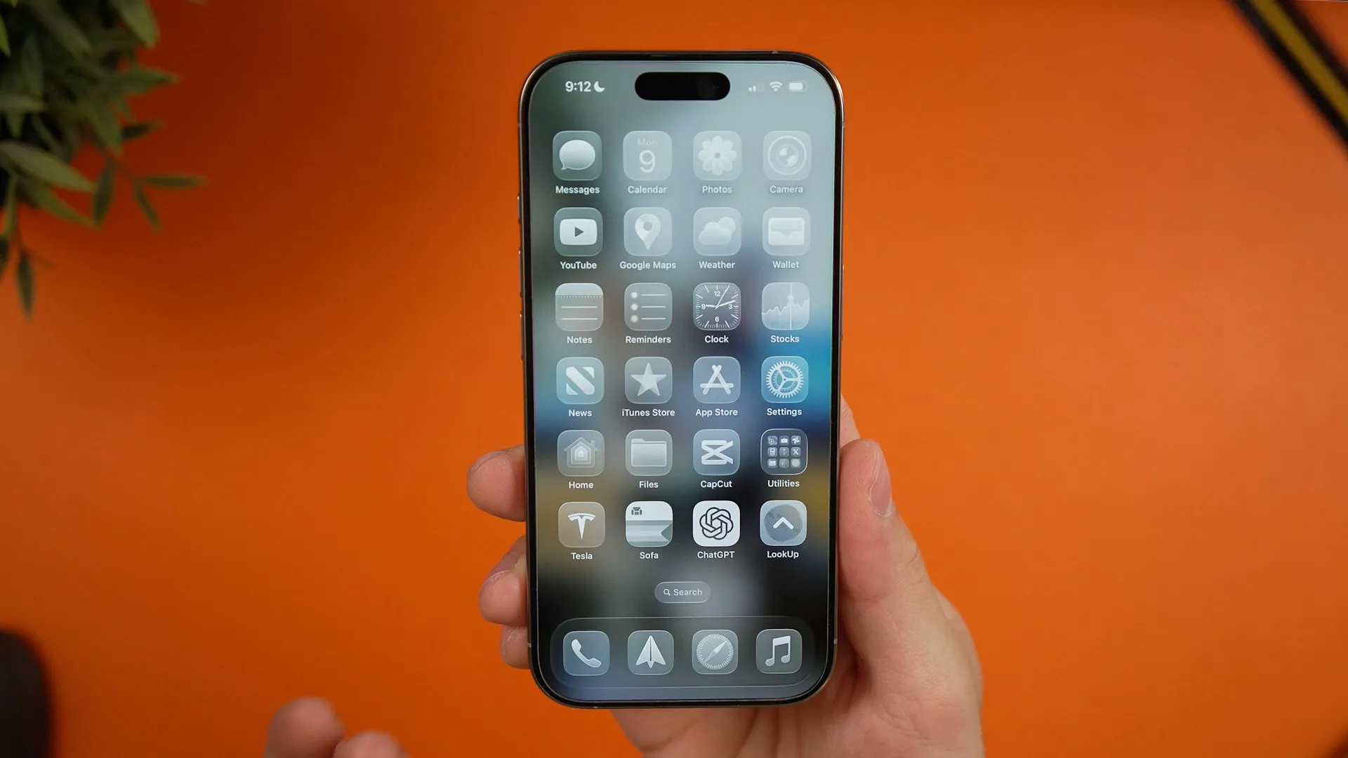
Being so different from the interface we're used to with iOS, naturally people wondered, "How would this look on an iPhone?" Enough so that Lucas Menge implemented the UI on his iPhone.
It may not have dials to zoom, but Menge's pinching gestures get the job done. Personally, I think it looks cool as hell but it doesn't seem practical. With the applications scattered about, it could get annoying tracking down the one app you want to open. The use of the traditional dock would make this interface more useful on an iPhone.
Although I wouldn't be too keen on using this particular interface, it would be a really cool idea for Apple to enable users to have the option of choosing a new home screen, or launcher, like Android does.
Let us know your thoughts on the Apple Watch OS running on an iPhone in the comment section below, or hit us up on our Facebook and Twitter feeds.


![Watch Series 10 [GPS 42mm case] Smartwatch with Jet Black Aluminum Case with Black Sport Band - S/M. Fitness Tracker, ECG App, Always-On Retina Display, Water Resistant](https://m.media-amazon.com/images/I/6105jZyXyPL._AC_UY218_.jpg)
![Watch SE (2nd Gen) [GPS 40mm] Smartwatch with Midnight Aluminum Case with Midnight Sport Band S/M. Fitness and Sleep Trackers, Crash Detection, Heart Rate Monitor, Retina Display](https://m.media-amazon.com/images/I/61eE8SSyPWL._AC_UY218_.jpg)
![Watch SE 3 [GPS 40mm] Smartwatch with Starlight Aluminum Case with Starlight Sport Band - S/M. Fitness and Sleep Trackers, Heart Rate Monitor, Always-On Display, Water Resistant](https://m.media-amazon.com/images/I/61xkvg-RStL._AC_UY218_.jpg)



Comments
Be the first, drop a comment!