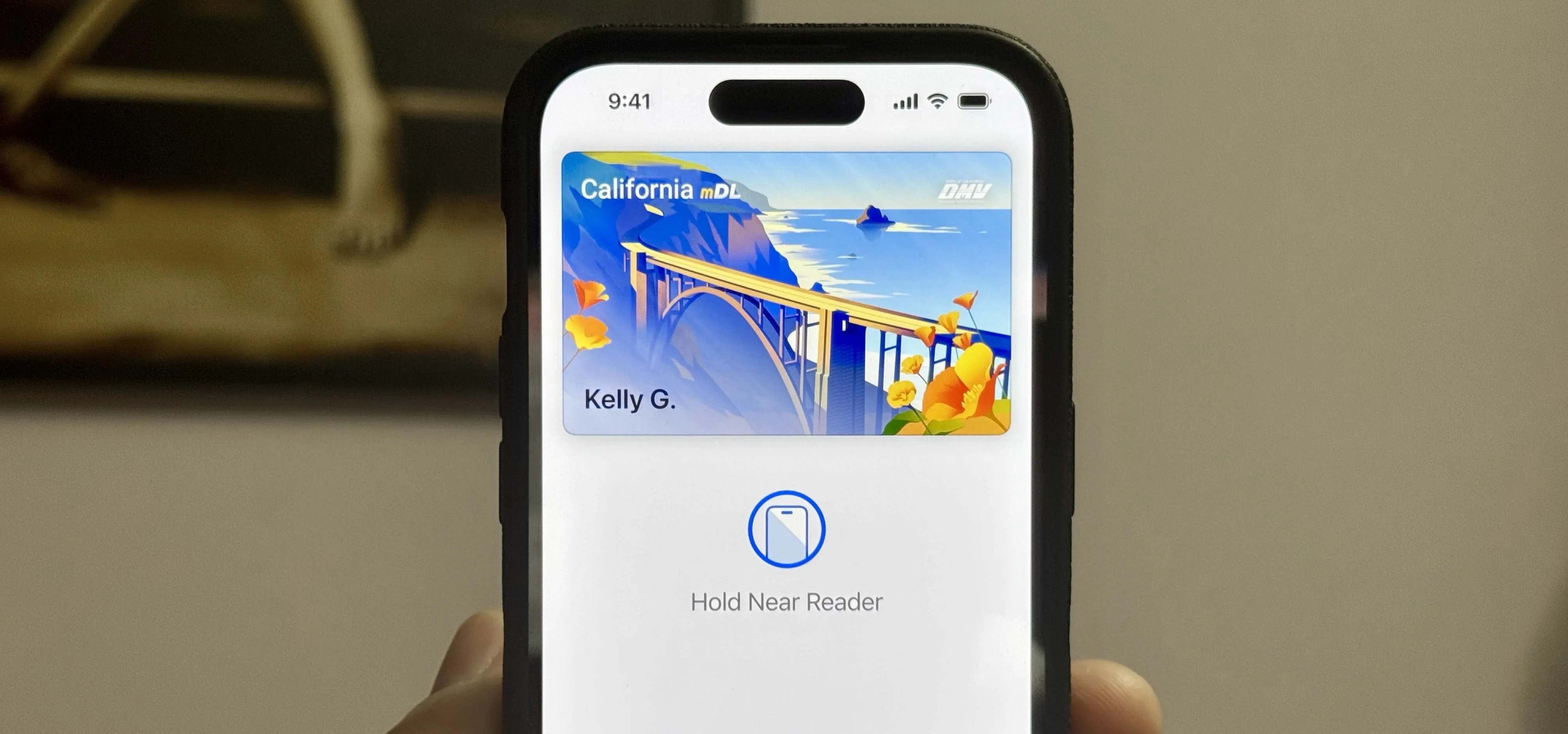
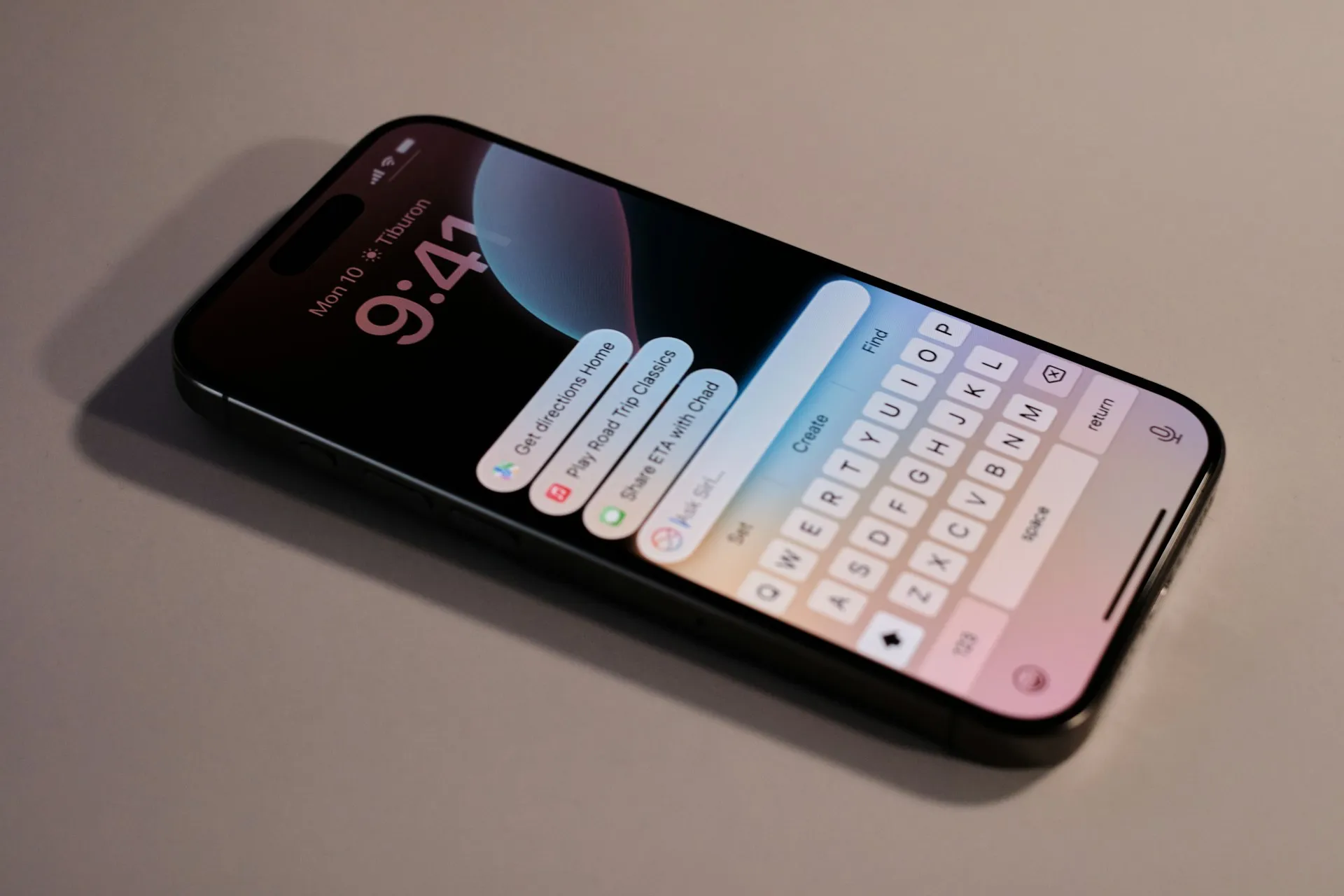
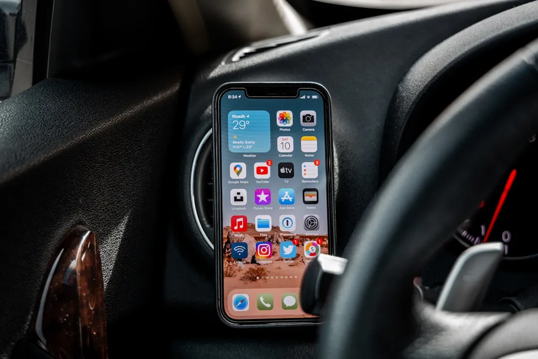
The iPhone X's "notch" is now possibly as notorious as Apple's decision to cut ties with the headphone jack. With that said, a cautious consensus can be made from first impressions of the X that the notch isn't all that bad. Still, one problem has shown up in reviews again and again — apps are not optimized to fit the notch.
It can be a big eyesore. Apps designed to fit a typical 16:9 iPhone screen aren't made to run on the iPhone X's unique display. That means you have apps attempting to display information behind the notch, or apps that abruptly cut off below the notch, leaving too much room at the top of the screen. Either way, it just looks terrible.
Now, to be fair, the iPhone X hasn't actually been released yet. so it's understandable that developers have not optimized their apps for its display — even though there is an iPhone X simulator in Xcode that developers can use without physical access to one of the devices. However, what's concerning is the history of app optimization on iPhones in the past.
When the iPhone 6 and 6 Plus were released, it took some developers a long time to optimize their apps for the larger displays. In fact, it took years for some to make the leap. What will the story be with the X? There's certainly more engineering behind optimizing for that notch than there was for the larger iPhone displays. That doesn't necessarily inspire much confidence.
All we can do is hope for the best.
- Follow Gadget Hacks on Facebook, Twitter, Google+, YouTube, and Instagram
- Follow WonderHowTo on Facebook, Twitter, Pinterest, and Google+
Cover image by The Verge/YouTube





Comments
Be the first, drop a comment!