Apple released iOS 11.3 beta on Jan. 24 and the public stable release on March 29, and it didn't take us long to find plenty of cool new stuff. Aside from new Animoji, Health Records, and some upcoming changes related to the recent battery fiasco, most of the new features are about polish. One such feature we've found should make iPhone X users a little happier.
When you're using the app switcher on the iPhone X in iOS 11.3, you'll probably notice this right off the bat: The time it takes for the multitasking interface to actually come up has been reduced. In other words, when you swipe up from the bottom, then pause to see your recent apps, that pause itself has been cut in half, roughly.

iOS 11.2.5 (left) vs. iOS 11.3 (right).
You can see it in the above before and after GIF, but it's a lot more noticeable in real life. To help demonstrate the difference, we started the next side-by-side gallery at the exact moment the foreground app stops shrinking (where you normally have to pause). Then we slowed things down to 1/4th speed to make it even more noticeable.
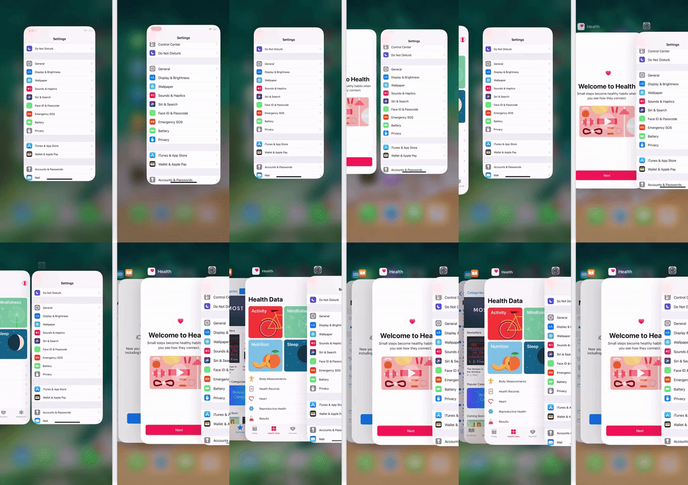
iOS 11.2.5 (left) vs. iOS 11.3 (right) at 0.25x speed.
As you can see, the time it takes for the other apps in the multitasking view to appear after performing the gesture has roughly been cut in half in 11.3. We're thinking Apple did this now that people are used to the swipe-up-to-go-home gesture on the iPhone X — chances are, you probably just flick to go home by now, so the longer delay for multitasking isn't needed anymore.
It's a small touch, but it definitely makes the multitasking UI feel a lot snappier. Indeed, the central theme of iOS 11.3 certainly seems to be polishing rough edges.
- Follow Gadget Hacks on Facebook, Twitter, YouTube, and Flipboard
- Follow WonderHowTo on Facebook, Twitter, Pinterest, and Flipboard
Cover image and screenshots by Dallas Thomas/Gadget Hacks








Comments
Be the first, drop a comment!