One of the least important but most noticeable changes in any iOS update is the look of home screen icons. In the new iOS 11, there aren't any drastic icon differences compared to iOS 10, but there's definitely a few design modifications for some of the main stock apps, such as Maps and the App Store.
Apple hasn't really strayed too far from their home screen icons look since they abandoned skeuomorphic versions starting in iOS 7 and began using the flat design. So it's no surprise there are just incremental updates to some of Apple's stock app icons in iOS 11 for iPad, iPhone, and iPod touch.
Below, you can see galleries of comparison screenshots for home screen app icons on an iPhone 7 Plus with identical settings in regards to the display.

iOS 10 app icons (left) vs. iOS 11 app icons (right).


iOS 10 app icons (left) vs. iOS 11 app icons (right).

- Calculator: Instead of buttons for addition, subtraction, multiplication, and equals, the icon now shows a full calculator on a gray backdrop. The black, gray, and orange colors are all still there.
- Contacts: The colored tabs on the right have been slimmed down and no longer have A, B, C, D on them anymore. This helped make way for a combined male/female icon in a circle, compared to just one big male outline.
- App Store: The pencil and brush images have been replaced with thick, smooth marker lines, and the circle has disappeared completely.
- Camera: Note a huge change on this one, but the camera icon's outline has been smoothed out a bit, and the lines above and below the lens have been removed.
- Maps: The old Maps icon featured the location of Apple's old campus, 1 Infinite Loop, while the new icon shows off a bit of the circular design of Apple's new campus, Apple Park, also right off the Interstate 280 in Cupertino, California.
- Notes: Three solid writing lines have been knocked down to two solid (and slightly thicker) lines, and a shadow appears under the yellow top now.
- Reminders: Five solid list lines have been knocked down to four solid (and slightly thicker) lines, and the four colored dots were reduced to just three, ditching purple, with thicker lines around the middle colored dots to make them more pronounced.
- iTunes Store: The beamed notes icon made sense when music was the primary focus of the iTunes Store, but movies and TV shows are such a big part of the system now that it only makes sense to get rid of the musical symbol that's already on the Music app icon. The new icon shows a white star on the same purple backdrop, perhaps to signify that all of the actors, filmmakers, musicians are all celebrities (à la stars on the Hollywood Walk of Fame).
- iCloud Drive/Files: iCloud Drive has been replaced with the newer Files app, which includes iCloud Drive within it. Therefore, the icon has been changed to a blue file folder instead of a blue cloud.

iOS 10 app icons (left) vs. iOS 11 app icons (right).


iOS 10 app icons (left) vs. iOS 11 app icons (right).

The rest of Apple's stock home screen icons have changed minimally or not at all. However, ass you can see in the dock comparisons above, the new iOS 11 dock omits app names. Now, if they would just give us the option to do that for every app on the home screen, we'd be set.
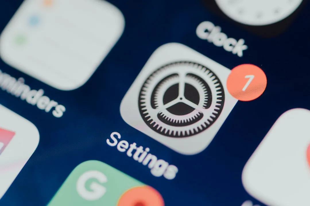
- Settings: The faded black in the cogs is now solid blank.
- Calendar: The day and number are bolder.
- Clock: The numbers are bolder.
- Compass: The compass degree ticks, letters, etc. are bolder.
- Stocks: The ticker lines squeezed in a bit, and the lines became bolder, especially the blue one.
- News: The newspaper icon grew slightly, and the gray "text" got thinner.
- iBooks: The book was split a tad bit farther apart due to a bolder orange line.
- FaceTime: There's bolder green outlines around the lens.
- Safari: The compass degree ticks are slightly thicker, and the needle moved 5 degrees clockwise.
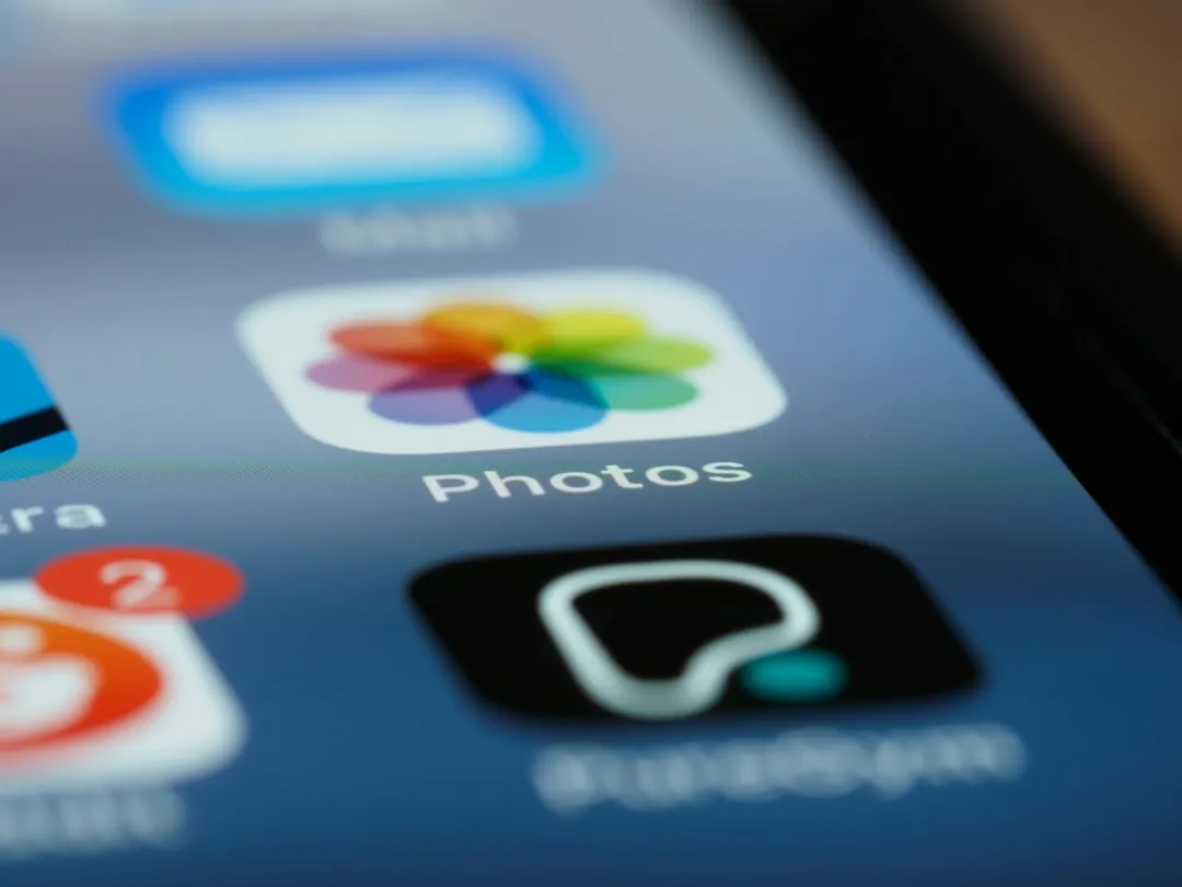
- Photos: The colors/shapes just looks slightly bolder.
- Weather: The sun icon grew slightly bigger while the cloud shrank a tiny bit.
- Wallet: No noticeable changes.
- Home: No noticeable changes.
- TV: No noticeable changes.
- Health: No noticeable changes.
- Podcasts: No noticeable changes.
- Watch: No noticeable changes.
- Tips: No noticeable changes.
- Find [My] Friends: No noticeable changes.
- Voice Memos: No noticeable changes.
- Find [My] iPhone: No noticeable changes.
- Mail: The letter icon is slightly larger with more circular corners.
- Messages: No noticeable changes.
- Music: No noticeable changes.
- Phone: No noticeable changes.
Most of Apple's non-stock apps available in the iOS App Store, such as iMovie, Pages, Numbers, Keynotes, iTunes U, GarageBand, and Clips did not receive any updated designs.
- Follow Gadget Hacks on Facebook, Twitter, Google+, YouTube, and Instagram
- Follow WonderHowTo on Facebook, Twitter, Pinterest, and Google+
Cover photo and screenshots by Justin Meyers/Gadget Hacks





Comments
Be the first, drop a comment!