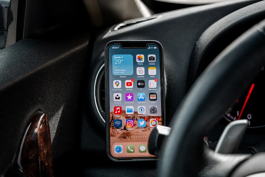
If you're not a fan of your iPhone's ability to adjust screen brightness by itself, you've probably turned off auto-brightness on multiple occasions in the past. All you would do is go to your "Display & Brightness" settings and toggle it off, but that's no longer the case in iOS 11 and iOS 12 — whether you have an iPhone X, XS, XS Max, XR or any older supported iPhone.
As you can see in the below screenshot on the right, in iOS 11 and 12, the auto-brightness option is no longer available in the "Display & Brightness" settings anymore. Performing a search in the Settings app for "Auto-Brightness" will get you to the new location of this preference, but not really, since you have to tap once afterward to find the setting (if you can even remember what the search page said).
- Don't Miss: 200+ Exciting New iOS 13 Features for iPhone
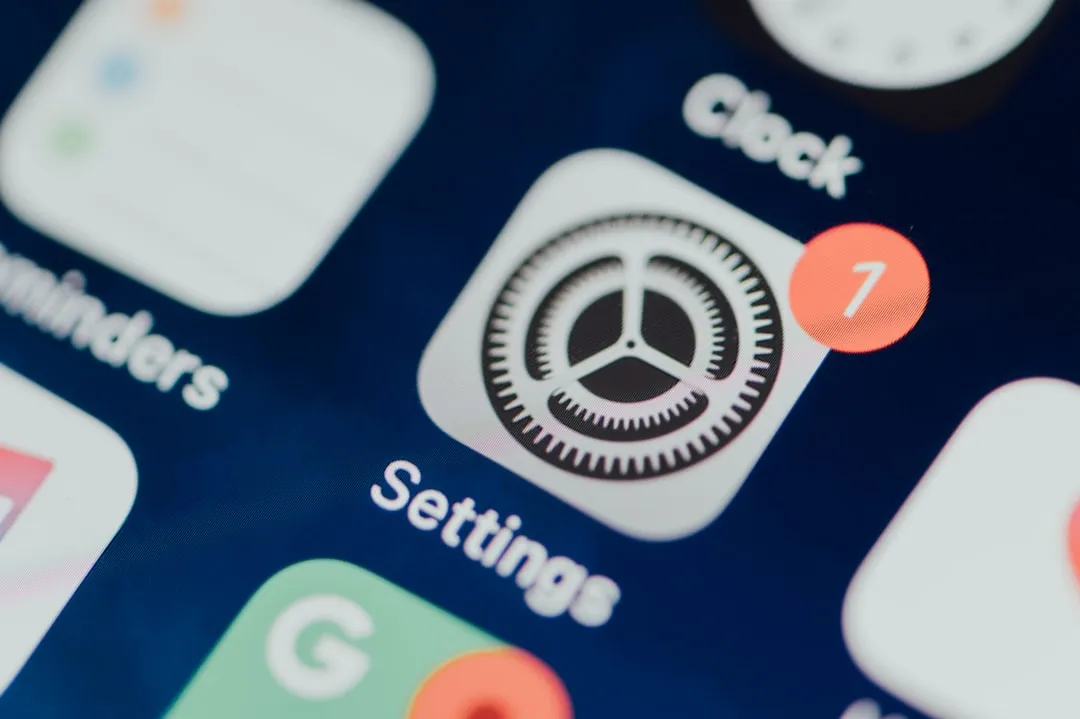
Apple's making us work for it. Now it's buried inside the Accessibility settings. To get there, select "General" in the Settings app, then "Accessibility." On the next page, tap on "Display Accommodations," and you'll see the toggle for "Auto-Brightness."
Why did Apple make it harder for users to disable auto-brightness in iOS 11 and iOS 12? Who knows. Maybe they were trying to reduce the number of people who complained about horrible battery life on their iPhone, which would explain the note in the settings caption that "Turning off auto-brightness may affect battery life." Still, I thought that was fairly obvious.
On OLED-equipped displays, it will also say "... and long-term display performance" in the caption since if you have the brightness on high for a long time when viewing a static image, it could produce a burn-in effect. So, avoid having it at maximum brightness for an extended period of time when the same view is on the screen.
Just updated your iPhone to iOS 18? You'll find a ton of hot new features for some of your most-used Apple apps. Dive in and see for yourself:
7 Comments
Thanks for that. I can't read my phone when it dims in the dark.
Since downloading IOS 11.03 two days ago, and with auto-brightness turned back on (until right now), my Iphone 7 is using battery at double the rate it was previously. I don't do a lot with my phone, and don't really know what it is doing to eat through the battery at that rate. Can I reverse it to the previous version of IOS that was on the phone?
Yet another stupid move by apple. If you have a whole option called display and brightness why wouldn't the option to turn off auto brightness be there instead of general/accessibility. I am finding this with a lot settings. Apple products are known for being easier and more intuitive to use than other phones. Based on my experience with this IOS version so far, I feel like it is going to be apple's version of vista when Microsoft put that piece of crap out.
Maybe iOS 12 will be Apple's version of Windows ME... yeah... that! I like auto brightness but I like the ability to tweak it back up a little if I need to. I'm going to see if I can add this to my swipe right or swipe up page.. maybe huh?
Well. You CAN add accessibility Shortcuts to Control Center, BUT you have to hit the BACK arrow then page up when it opens to get to display accommodations. Still a PITA but s little bit easier I think. Maybe there's a way to direct access, I dont know
It's actually much easier than this to disable auto-brightness. Simply open the control center and adjust the brightness to whatever level you want. Although this doesn't change the auto-brightness status in settings, it does effectively disable the feature.
Generally I prefer auto-brightness to save battery life, however, when using certain apps such as photo editing, I prefer the highest screen brightness to optimize the experience. Unfortunately, in order to re-enable auto-brightness I must go through the arduous steps detailed in your article to disable and then re-enable auto-brightness.
It would make more sense if the auto-brightness setting was included in the menu which you can access by 3D-touching the brightness bar in control center.
That's god t know about the other way with control center. With some people like myself, we don't want or need several ways to do the same thing. Adjustments should be under the same place in the menu even time, so there are less situations like this. I've always understood that some prefer something different, but personal preferences aren't even necessary when it comes to essentially the same level of simpleness as adjusting volume on a 1975 home stereo. The necessity of personal style and preference shouldn't over shadow the possibility of millions being confused, yet the arrogance of programmers continues to let that happen. New features should be added as options we can choose or not from the start, not something hidden and requiring an article by outside minds, not Apple, to figure out. I never needed much of computers in any form to live. I wasn't a big user of paper, I didn't need to manage endless accounts, and I didn't need to see new versions of how my photos are arranged. I do appreciate the scientific research I can access with the internet, and the opportunity to share my opinion as with this comment section. However, I wouldn't need to share it if it wasn't for the technology rammed down my throat in the first place.
I think they tried to reduce the fact that the battery gets drained easily... So hiding it and adding caution is the best way to go... Really poor design
Share Your Thoughts