Apple has released the third beta of its iOS 7.1 software to developers, just a few weeks after their second beta introduced us to button shapes, a new calendar list view toggle, a hidden Car Display control and several other tweaks and performance improvements.
Update: iOS 7.1 Released to the Public (3/10/14)
The final version of iOS 7.1 was released to everyone. To see what's new for all, check out our What You Need to Know About iOS 7.1 guide.
What's New in iOS 7.1 Beta 3
With this current build fresh out of the oven, I'm going to go through some of the new features and tweaks that are in this latest version of iOS 7.1.
New Round Buttons
Sticking to one shape, Apple has scrapped the rectangular call and end buttons for circular ones—matching the numbers and other options in the phone dialer.


If you hold down the power key at the top of the iPhone, you'll see that the confirmation icons when powering off your device are also rounded now.

Redesigned Keyboard
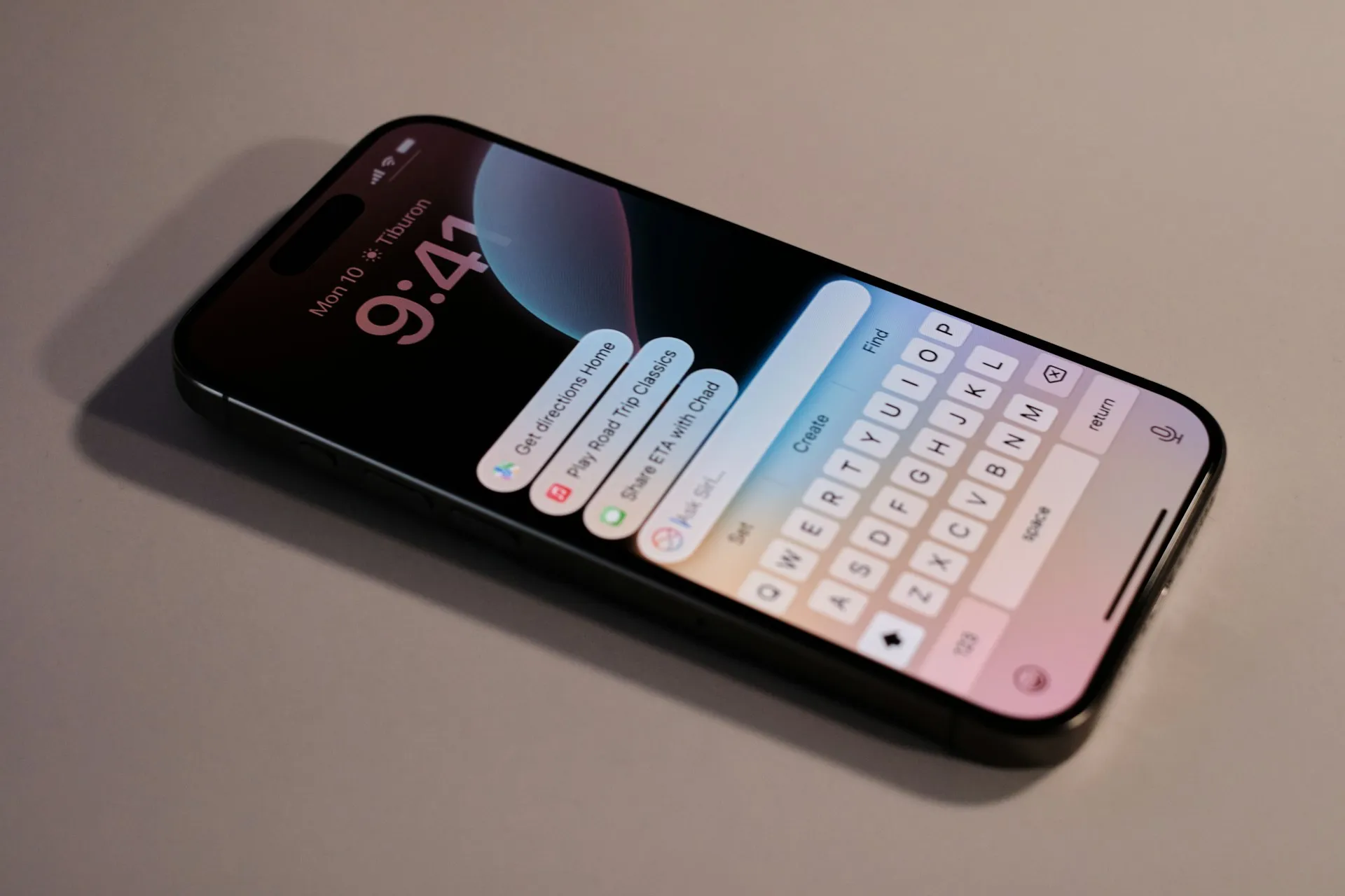
While the dark keyboard that was introduced in the first beta (and trashed in the second) is still missing, Apple has tweaked with the stock keyboard a bit—changing the design of both the shift and delete key.

Turn Motion Off Quicker
If you didn't enjoy the parallax feature (which causes your wallpaper to slightly shift with movement), you had to dig into the Accessibility settings in order to turn motion off, but it never really fixed the wallpaper zooming issue. Apple now recognizes this as a problem and added a toggle to reduce motion for the wallpaper specifically from your wallpaper preview.


Reduce Screen Brightness
From Settings -> General -> Accessibility you can now toggle a Reduce White Point option, which makes the screen less bright.

Duller Icons, Tweaked Address Bar & Richer Shuffle/Repeat Icons
In response to user's dislike of the sometimes too vibrant iOS 7, they have dulled down the colors of their Phone, FaceTime and Messages icons. A welcome improvement from the painful neon.

From Safari, a small but noticeable difference is that the wording in the address bar has been slightly tweaked, making it a bit longer.

Finally, in the Music application, the Shuffle and Repeat icons now become richer when selecting them, forming a colored in rectangle button.

Let us know what you think about Apple's improvements to iOS 7. Do you enjoy them? Dislike it? Have any suggestions for how they can make it better? Let us know!




Comments
Be the first, drop a comment!