Apple finally gave the Books app for iPhone the attention it deserves, making the experience even better for reading e-books and listening to audiobooks on the go. You can even do more with Books in custom shortcuts you develop.
We've had Apple's convenient book reader and bookstore since iOS 4 when it was called iBooks, and it got a pretty big visual redesign in iOS 7, audiobook support in iOS 8, and a new name in iOS 12. That makes the new iOS 16 software the most significant update to Apple Books in four years.
Most of the new features and changes for the Books app below also appear on iPadOS 16.1 for iPad, which was released on Oct. 24.
- Don't Miss: All 350+ New iOS 16 Features for Your iPhone
1. The Reading Interface Changed Slightly
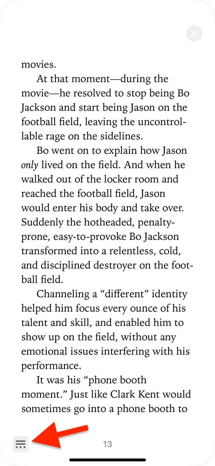
In iOS 15, you only see the book name, page number, and bookmark icon (if bookmarked) when reading a book. You still see all of those in iOS 16, but there's also a close (X) button to quickly exit the book, a reading menu button in the bottom right, and the bookmark icon now sits on top of the new reading menu button instead of being at the top by itself. Sometimes, you'll see return buttons to the previous page you were on.
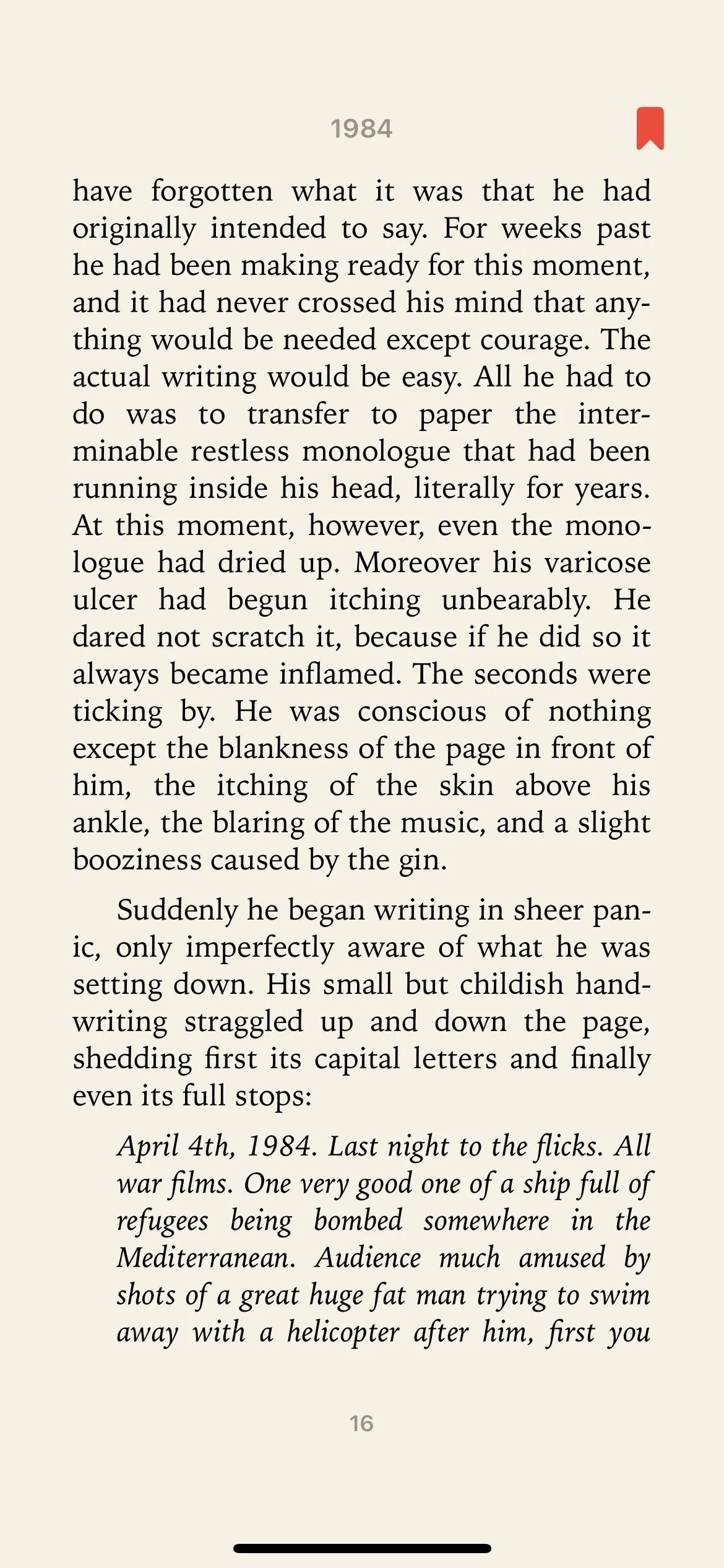
The reading interface in iOS 15 (left) vs. iOS 16 (right).
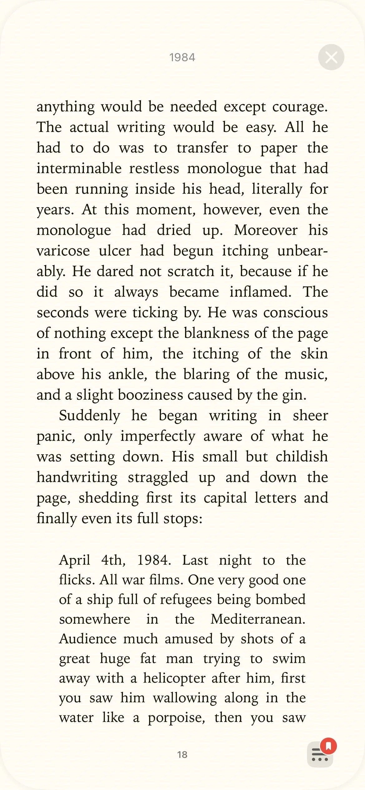

The reading interface in iOS 15 (left) vs. iOS 16 (right).

2. You Can Skip to Your Previously Viewed Page Quicker
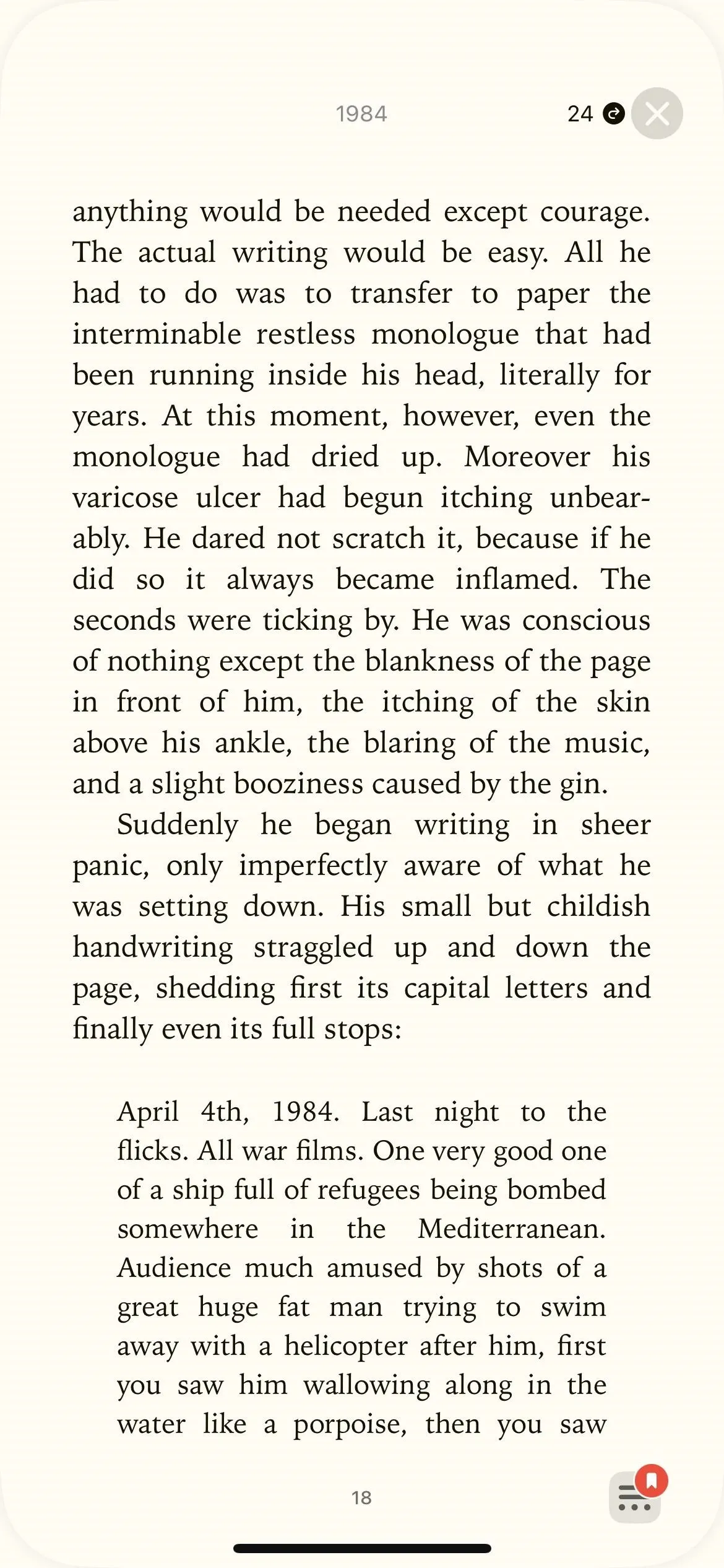
In the new reading layout, you will sometimes see tiny numbers with arrows in the top left and top right. If you jump ahead to preview what's to come or go back to refer to something, the new numbers will quickly get you back to the page you were reading.



3. You Can Exit the Book Faster
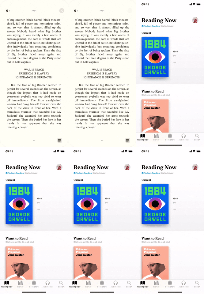
When in the middle of reading, you can now tap the close (X) button to exit the book. Alternatively, you can swipe the page down to exit. In iOS 15, the only way to exit the book was to tap the screen to open the reading options and hit the back (<) button.


4. Double-Tap a Page to Bookmark It
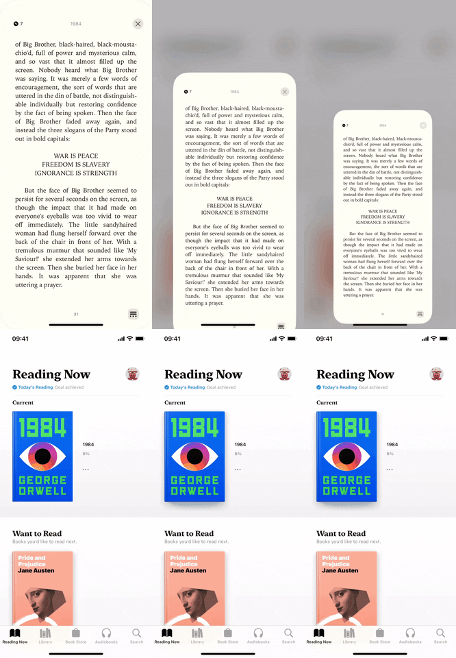
From the reading interface view on iOS 15, you would have to tap once on a page to open the reading menu, tap the bookmark icon to bookmark the page, and tap the page again to hide the reading menu. Apple streamlines this on iOS 16. Now, you just double-tap the page from the reading interface to bookmark the page and double-tap again to remove it.


5. The Reading Menu Is Now an Always-there Button
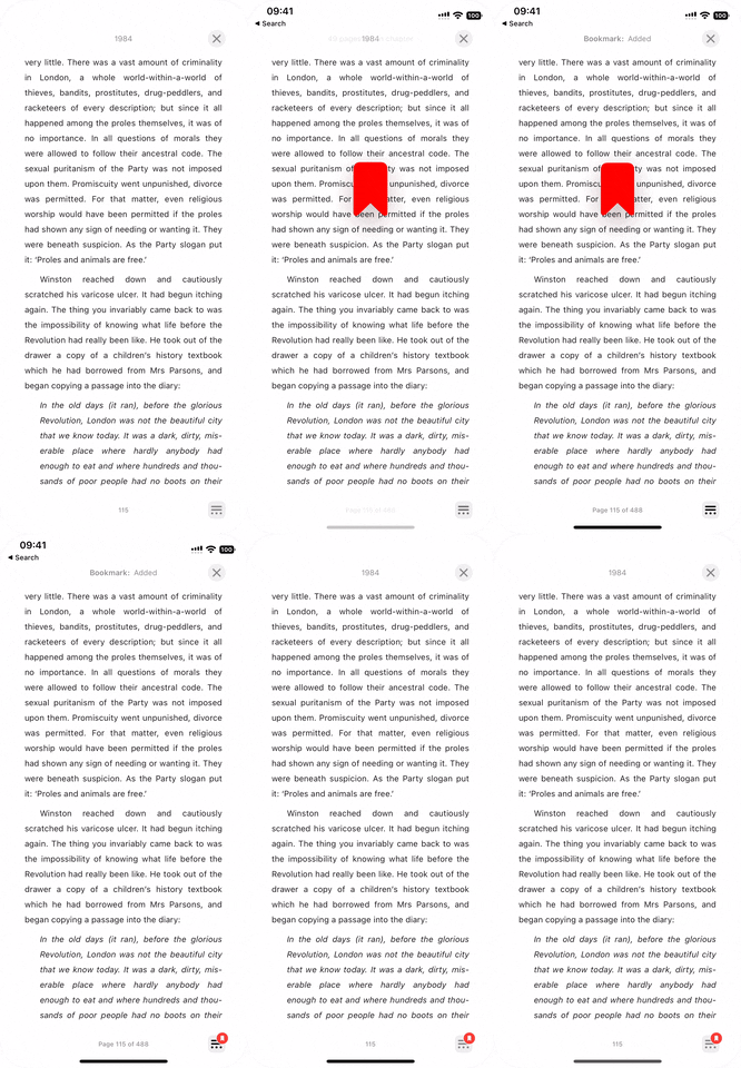
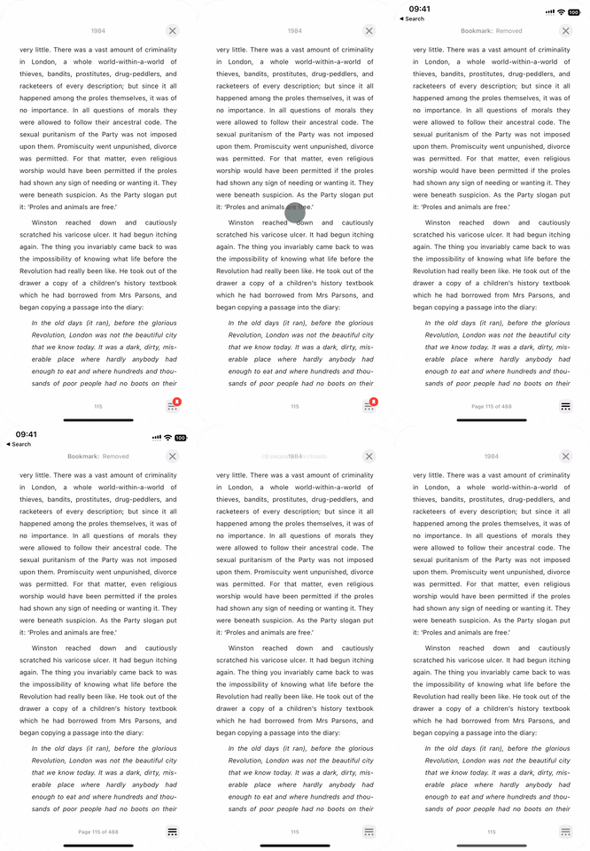
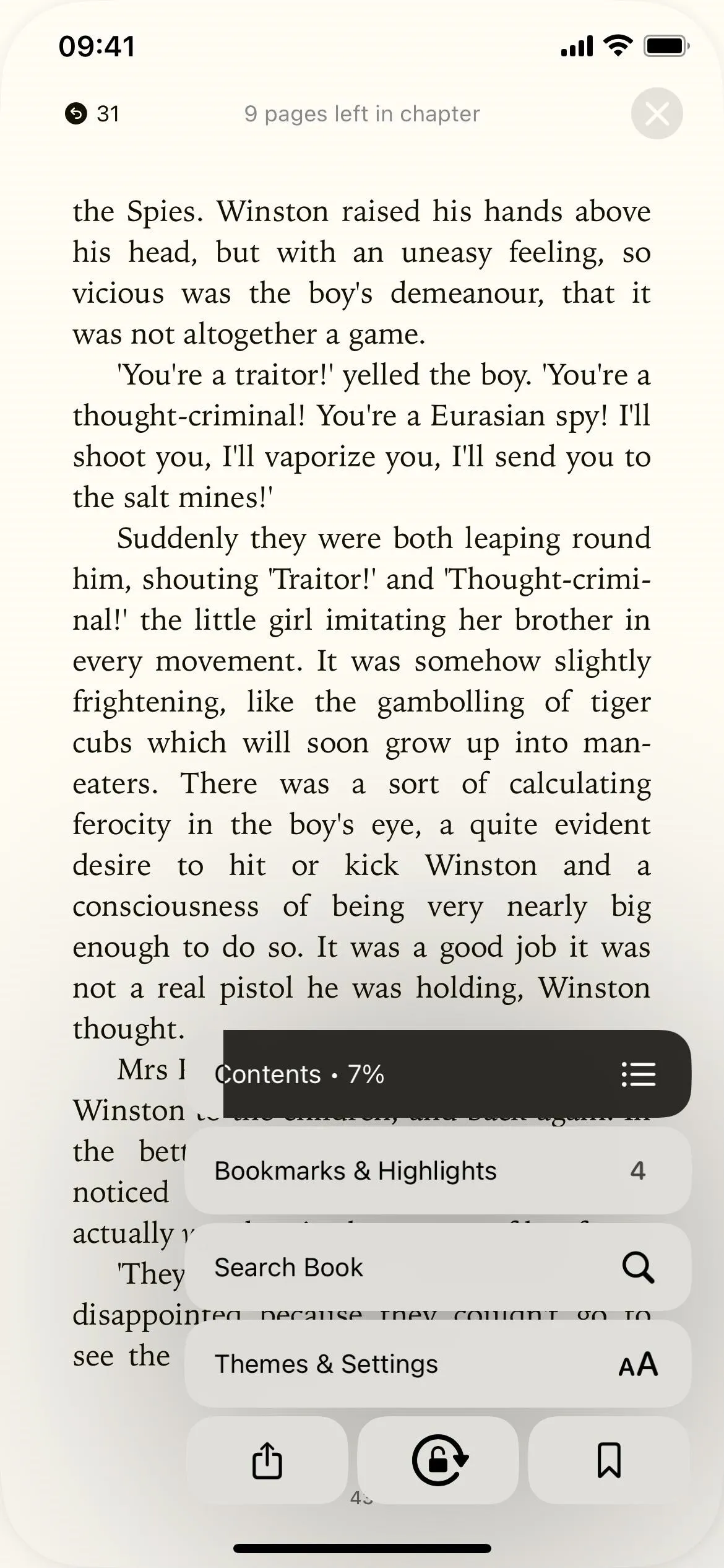
In the reading options interface on iOS 15, the top row of buttons to open the table of contents, bookmarks, and notes, change the appearance, search the book, and bookmark the page have all been moved to a single less-distracting menu icon that expands into a small list.
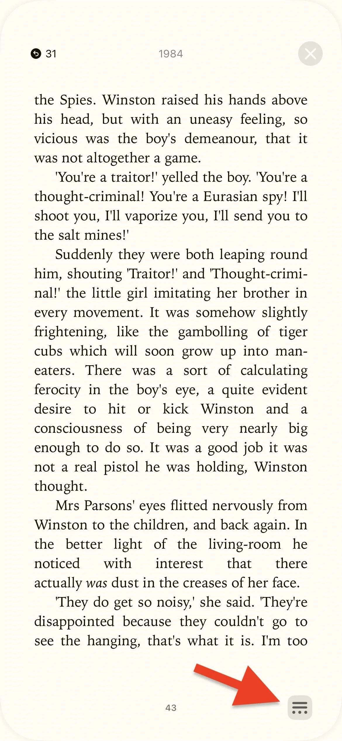
The new menu button, which looks like two parallel horizontal lines with an ellipsis (•••) below them, is tucked away in the bottom right of the page and can't be hidden. It's always there instead of hidden behind a tap, but it's very easy to ignore, so it shouldn't disturb your focus on reading. The bookmark icon appears over the menu button if a page is bookmarked.
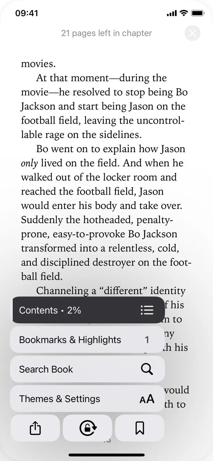
In addition to the buttons consolidated from the top of the page, the new menu also has buttons to share the book and lock the page orientation.


6. The Pages Left and Progress Status Works Differently
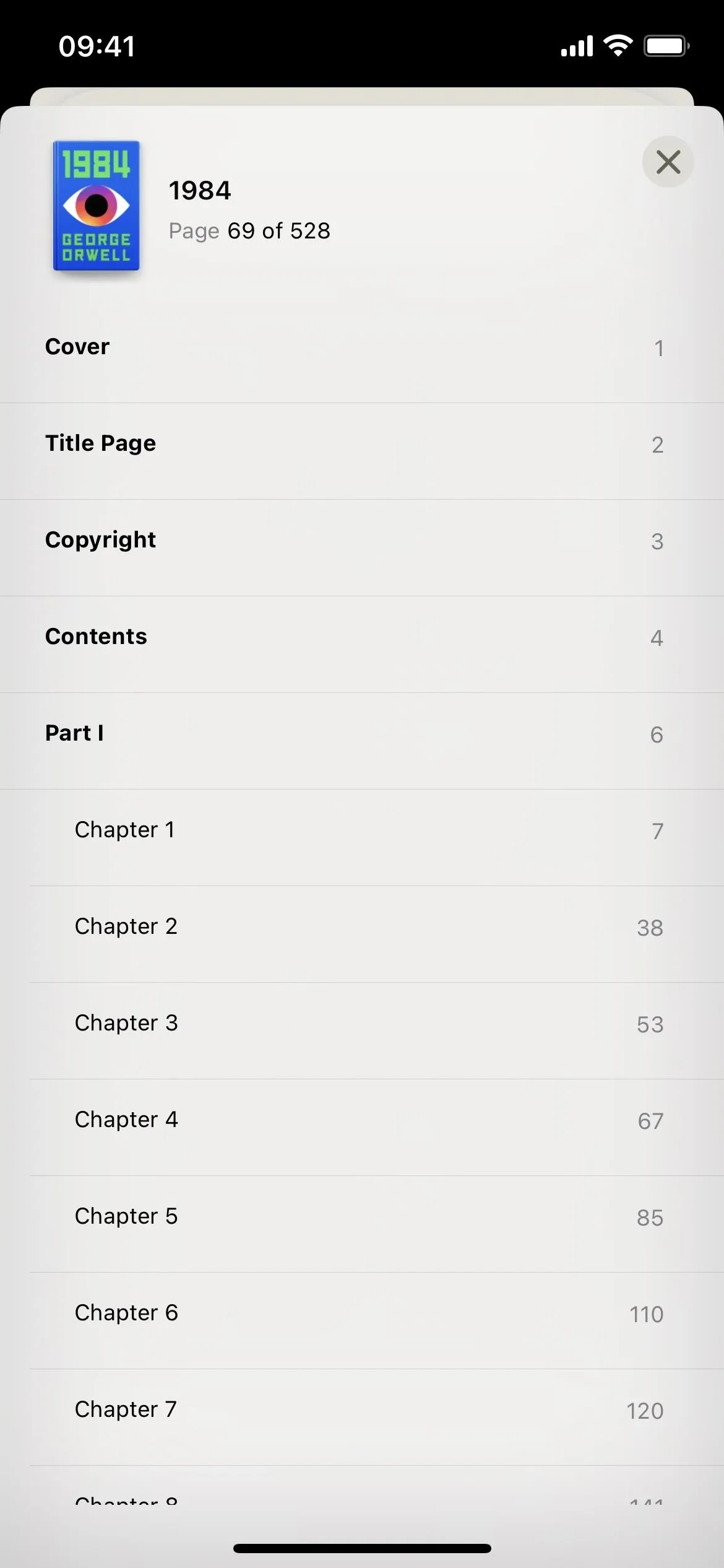
In the old design of the reading options interface, a progress bar appears at the bottom, telling you where you are in the book. It shows what page you're on, the total number of pages, how many pages you have until the end of the chapter, and the visual representation of your progress.
In iOS 16, the progress feature is in the new reading menu button. Open the reading menu, and you'll see a "Contents" button showing your progress in percentage. Tap that to open the table of contents and the total number of pages in the book.
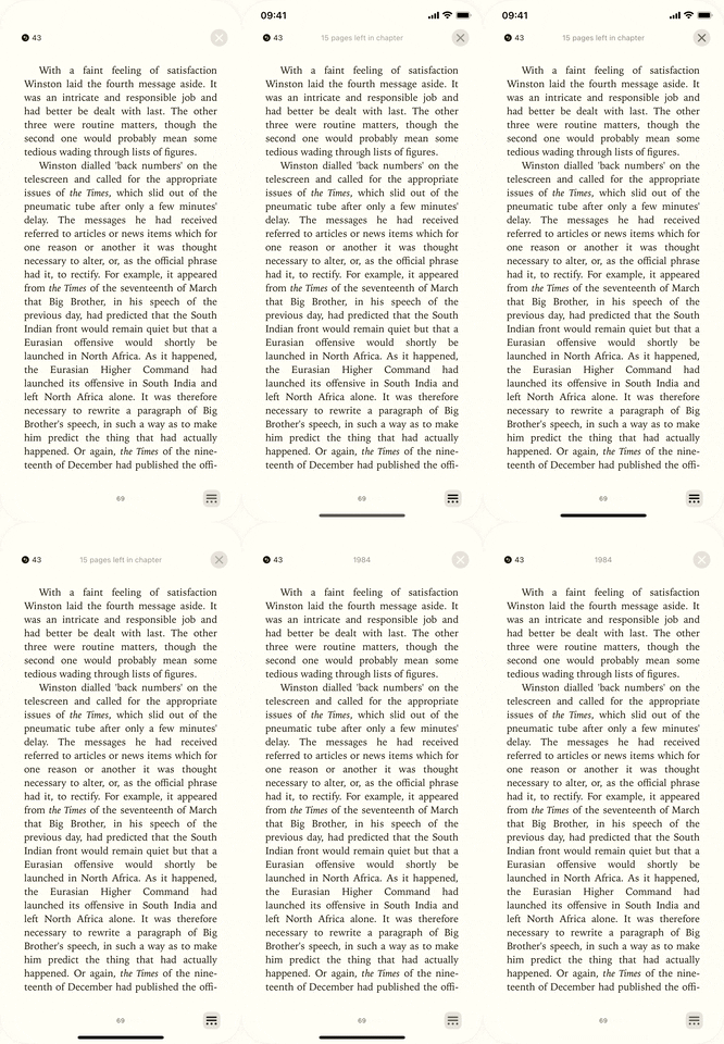
Also, with the new reading menu open, you'll find the number of pages left in the chapter at the top of the page where the book name usually is. With the reading menu closed, you can also temporarily reveal the number of pages left by tapping the current page number at the bottom.



7. Bookmarks and Highlights Has Its Own Button
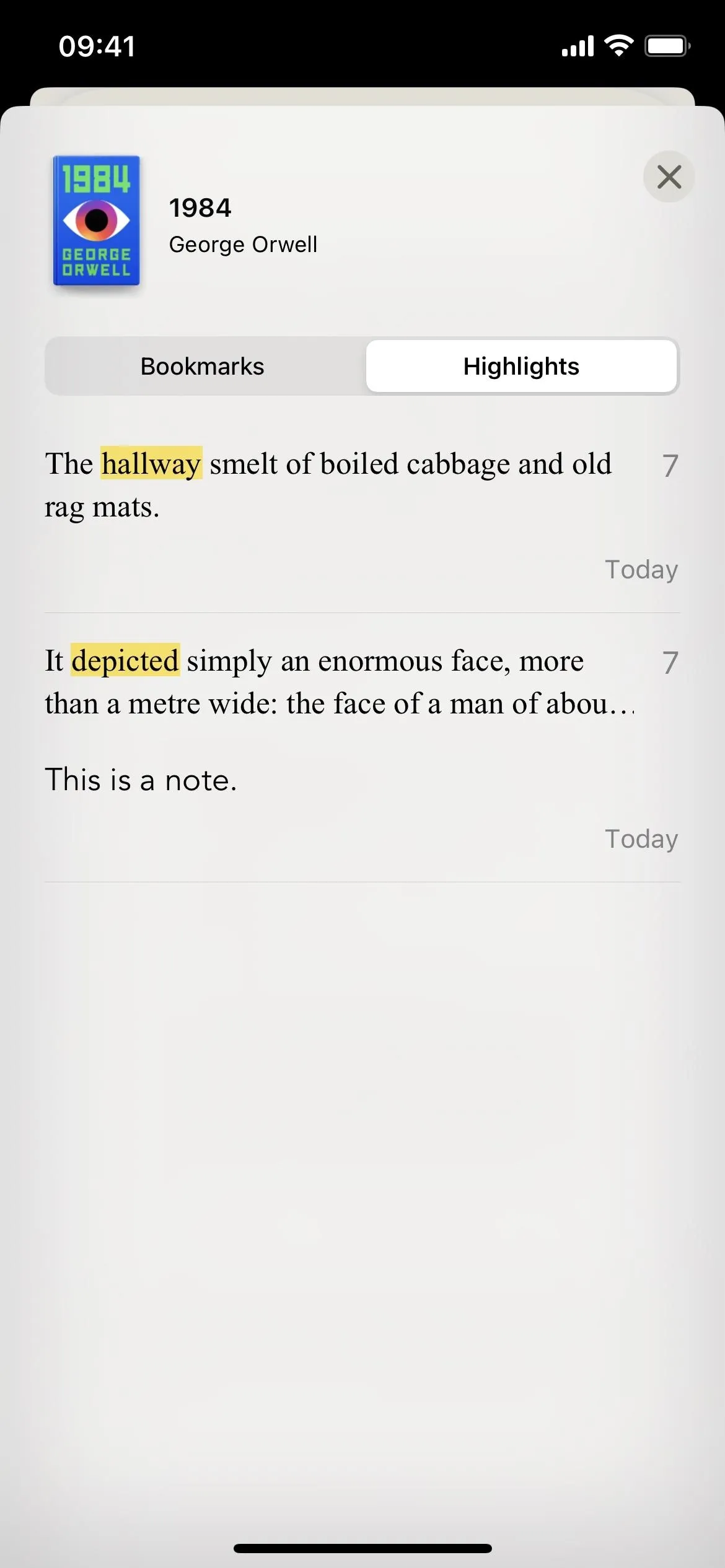
In iOS 15, you can find your bookmarks, highlights, and notes by tapping the table of contents button in the top left. There, you'd have tabs for contents, bookmarks, and notes.
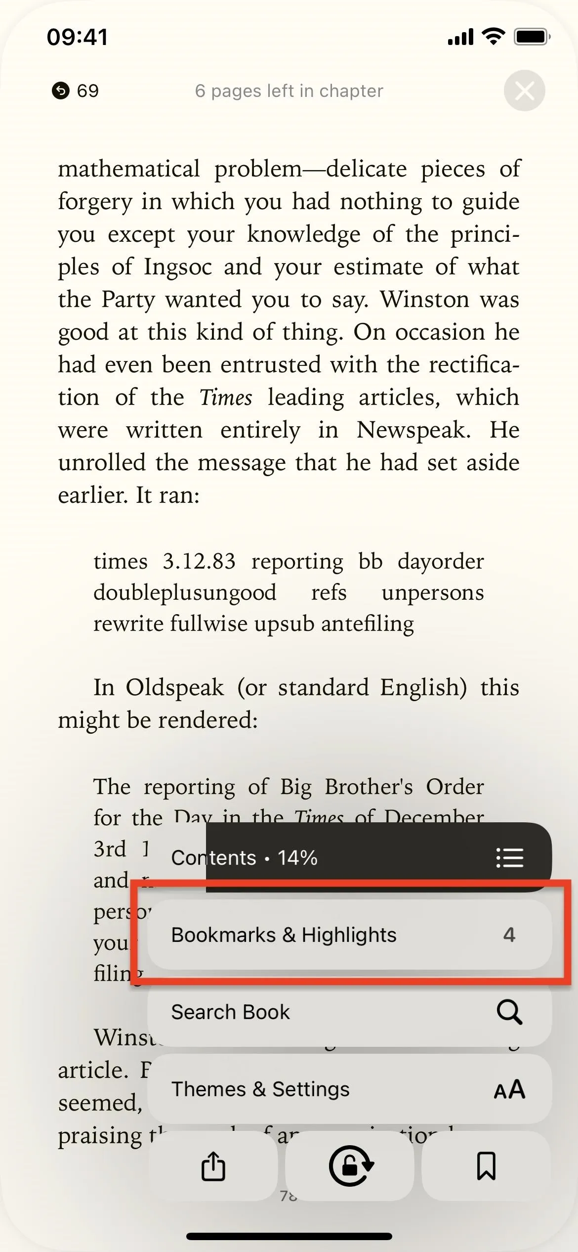
Now, the table of contents is in its own "Contents" button in the new reading menu, and there's a new "Bookmarks & Highlights" button just for those. It works the same, just without the table of contents and with the "Notes" tab renamed "Highlights."



8. There Are 3 New Page Themes
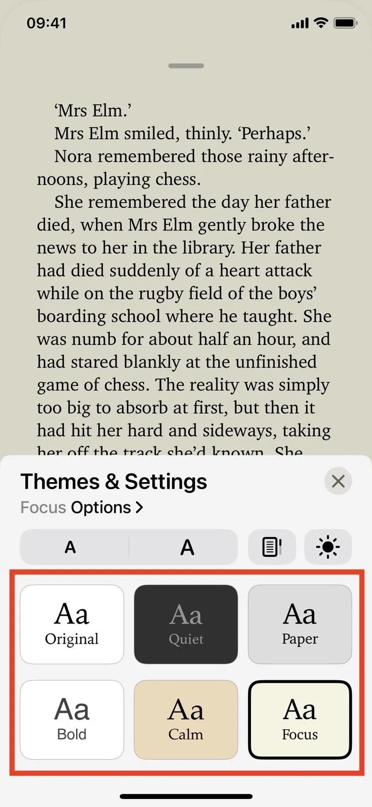
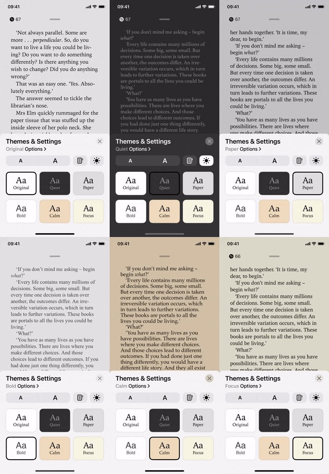
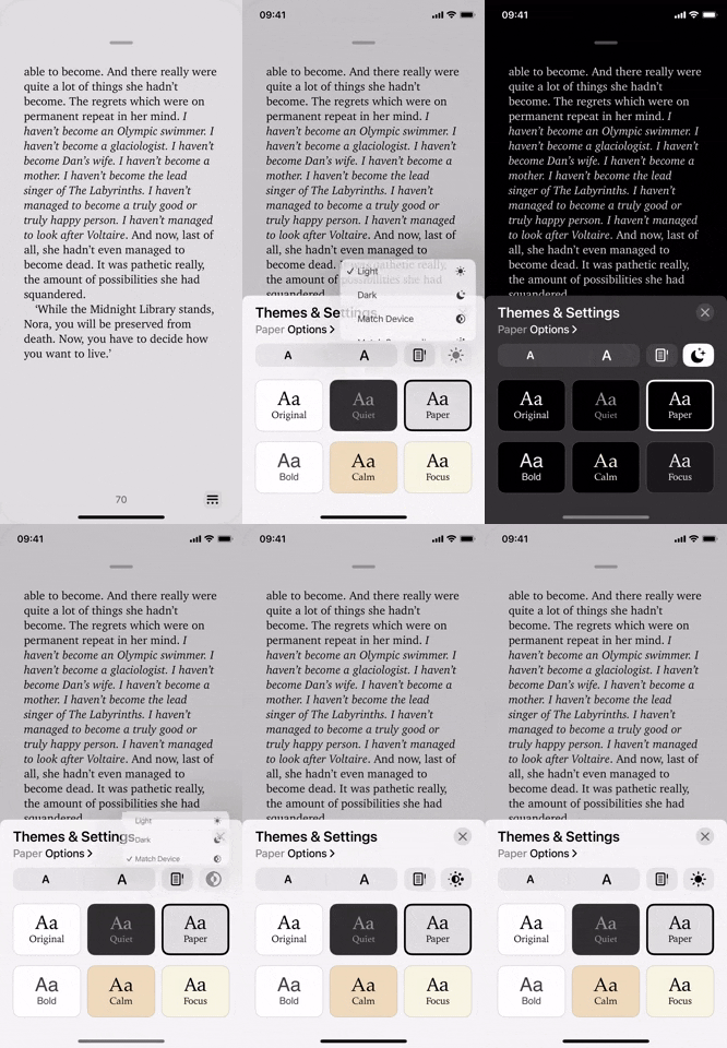
Within the "Themes & Settings" button in the new reading menu, you'll also find a few new and updated themes, and they even have names now. Choose between Original, Quiet, Paper, Bold, Calm, and Focus. Out of those, Paper, Bold, and Focus are new.


9. And More Dark Theme Options
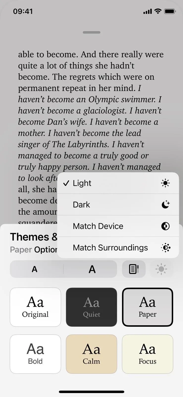
In iOS 15, there's a fourth theme for a dark look and a toggle for the "Auto-Night Theme" if you want it to switch automatically at night. In iOS 16, a new approach allows you to customize themes even more. Tap "Themes & Settings" in the new reading menu, then tap the brightness icon (which looks like a sun). From there, you have several options:
- Light is the default look and works on all six themes.
- Dark turns all six themes dark, so you can pick one based on the font you want and the contrast between the text and the background. Instead of just one night theme, you have six!
- Match Device automatically uses the light version of your chosen theme when your iPhone's system-wide dark mode is off and the dark version when it's on.
- Match Surroundings sets the theme to dark when you're in dark environments and light when you're not.


10. The Vertical Scrolling Option Is a Small Button Now
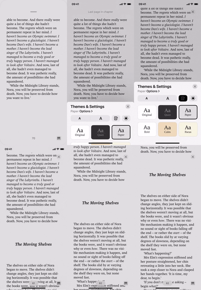
In iOS 15, the "Vertical Scrolling" switch is located under the appearance options (the AA button). In iOS 16, it's in the "Themes & Settings" options in the new reading menu button, but it's a small button now with a simple icon instead of a huge toggle switch with text.



11. There Are New Accessibility & Layout Options
The most significant addition to the new reading menu is the "Options" available for each theme in "Theme & Settings." This is where you'll now find the font selector.
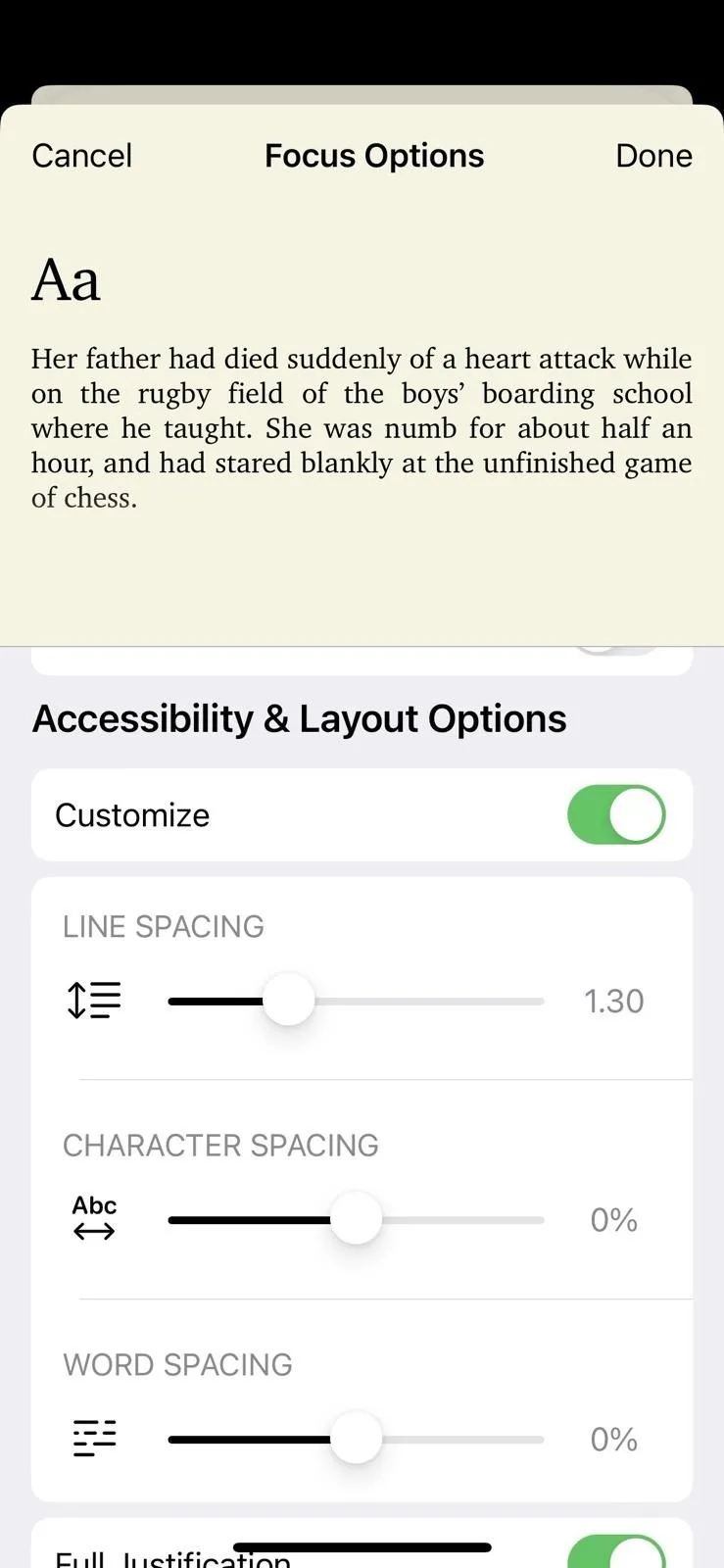
At the top of the "Options" preferences, you'll see a preview paragraph showing your changes. Under that is the font selector, followed by a new option to bold the text. Then, there's a "Customize" switch in a new Accessibility & Layout Options section.
When you turn on the "Customize" switch, you get access to the "Full Justification" switch that expands text to the right-side alignment when on and disables the right-side alignment when off. Before, this switch was in Settings –> Books. So it's more convenient to access now.
There are also new sliders to customize line, character, and word spacing. With "Full Justification" on, the word spacing will only change a little if you update it since it still has to stretch sentences to the right-side alignment. And there's also a new switch for "Allow Multiple Columns," as well as an option to reset the theme back to the default configuration.
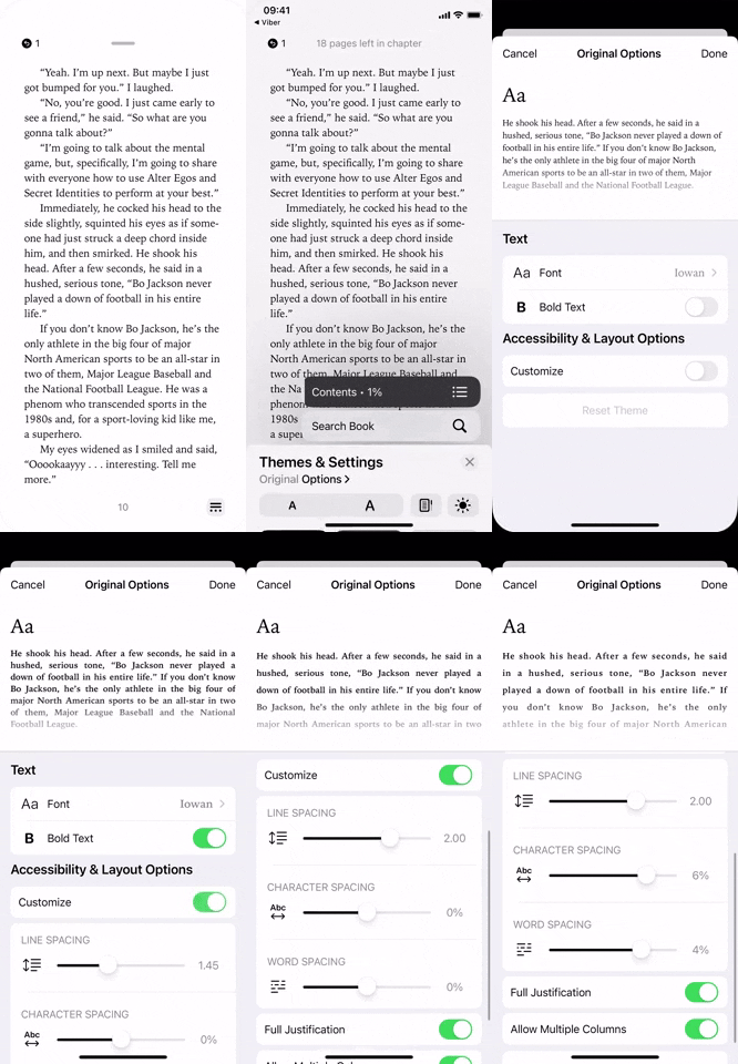


Unlike iOS 15's appearance menu, the options you change only apply to your current theme. And Books will remember your preferences, so you can set 'em and forget 'em.
12. You Can Move the Reading Menu to the Left
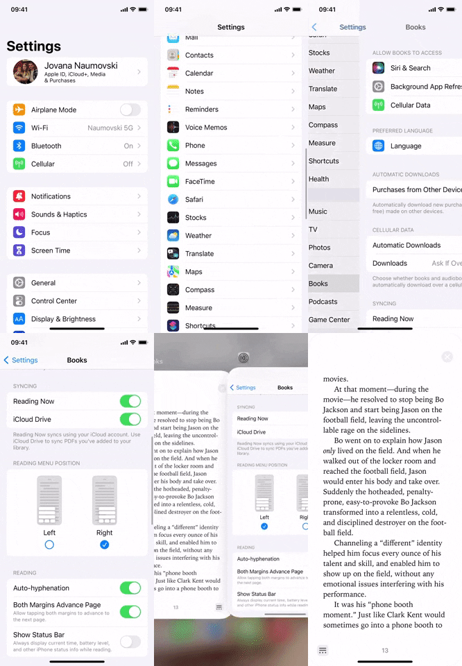
The whole time, I've been talking about the new reading menu being in the bottom right of the page, but if it makes more sense for you, you could move it to the bottom left instead. Visit "Books" in the Settings app and choose "Left" in the Reading Menu Position section.


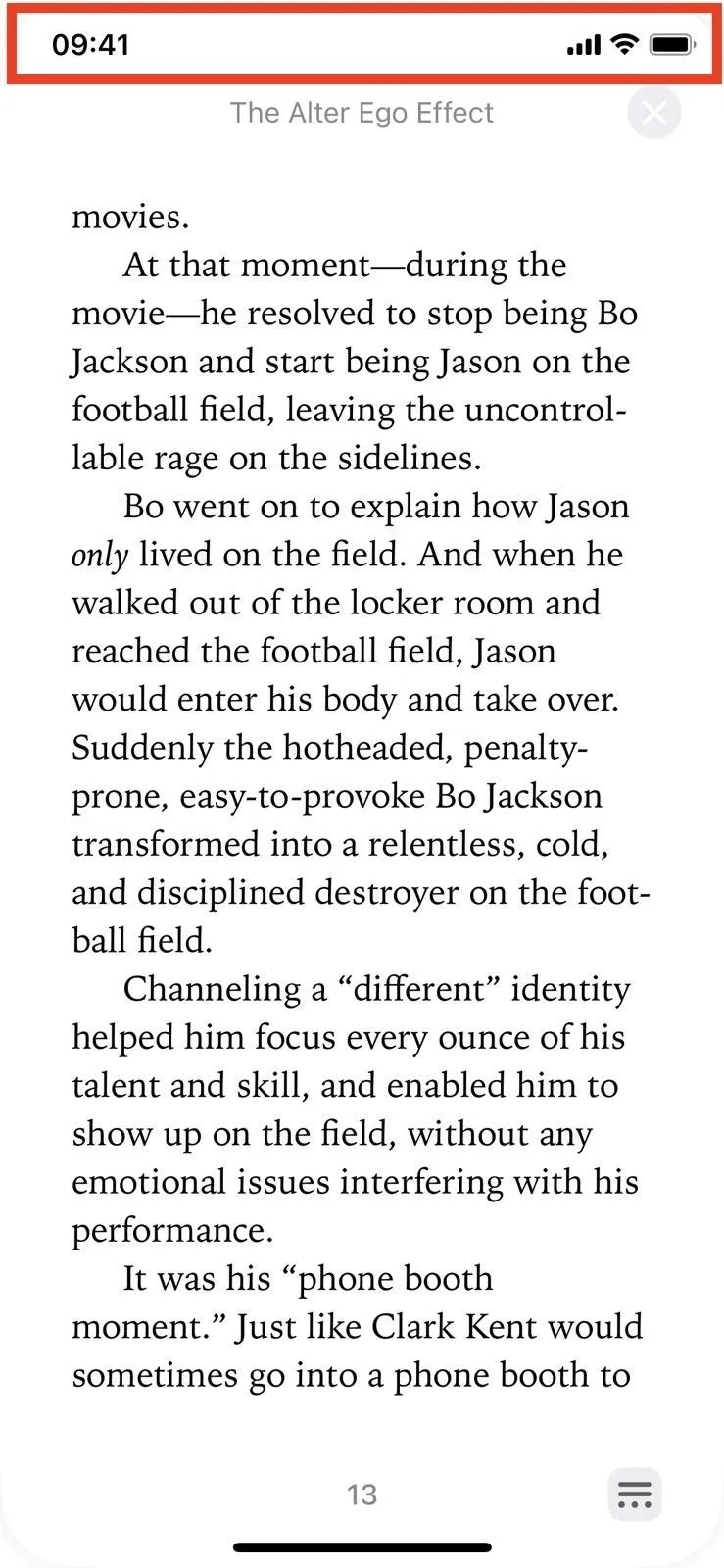
13. You Can Always Show Your Status Bar
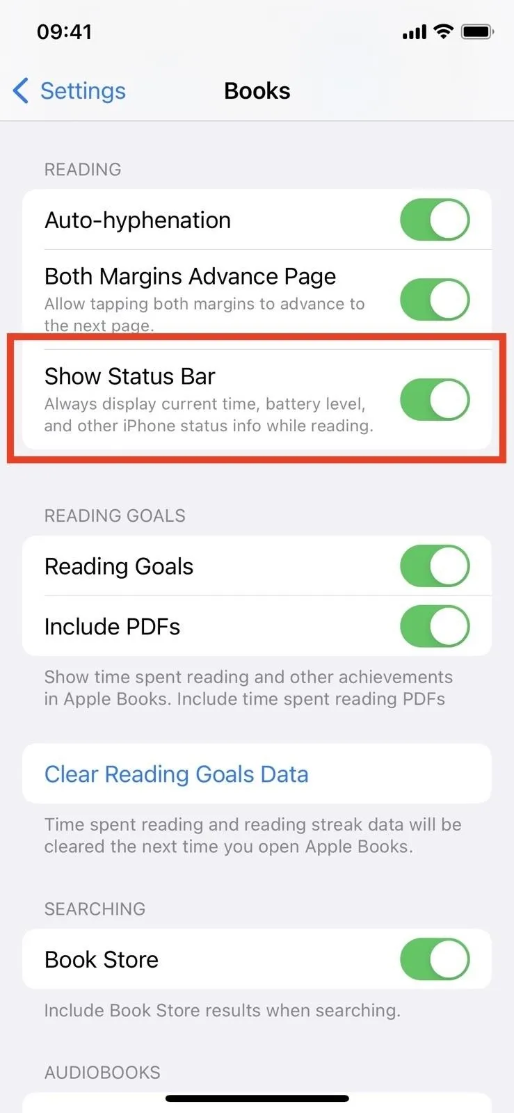
Also in Books' settings, you can now toggle on "Show Status" to always see the current time, battery status, and network status in your status bar. By default, Books hides your iPhone's status bar when you're reading, but it will show it when you open the new reading menu if you don't want it on all the time.


14. The Brightness Slider Was Ditched
When reading a book in iOS 15, the appearance settings in the reading options interface has a slider for brightness, which correlates directly with the brightness slider in Control Center. Apple ditched that in iOS 16 since you can change the brightness from Control Center when needed — there's no need for a separate slider in Books.
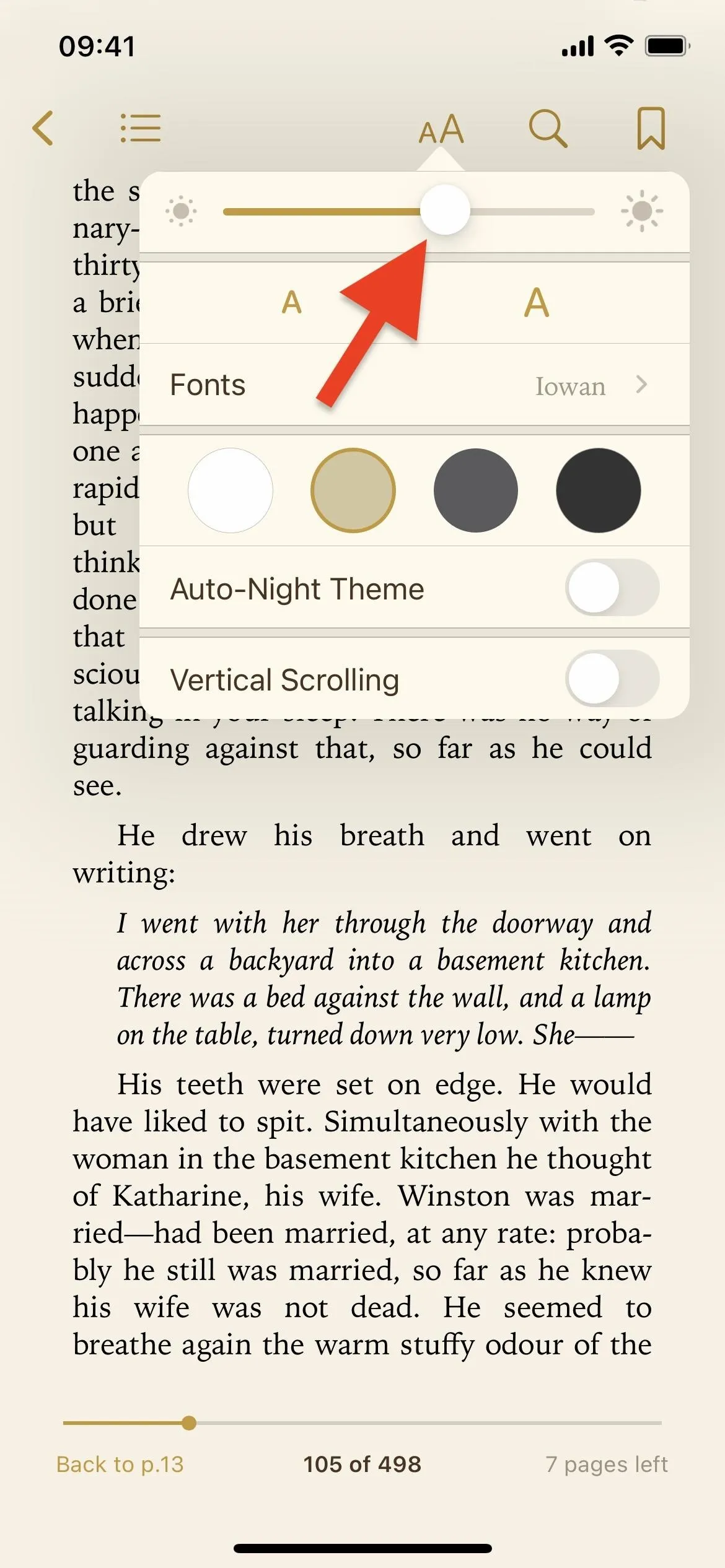
The brightness slider in iOS 15 (left) vs. no brightness control in iOS 16 (right).
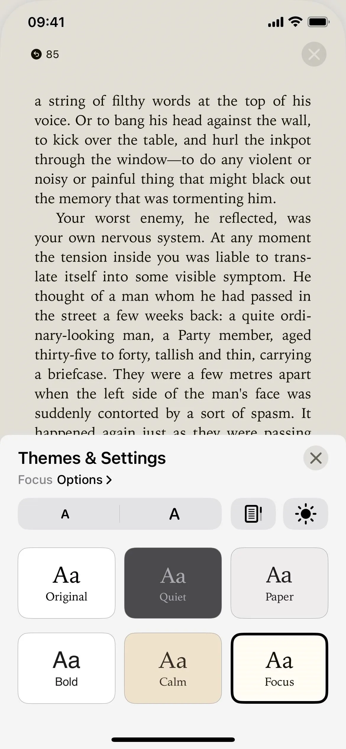

The brightness slider in iOS 15 (left) vs. no brightness control in iOS 16 (right).

15. There's No More Realistic Page Turning Animation
The skeuomorphic page-turning effect was among the most interesting things about the Apple Books app. In iOS 16, it's replaced with a simple-looking swipe animation, an effect that some users are very much against. Maybe one day, Apple will add a preference to choose between the new and the old way of turning pages.
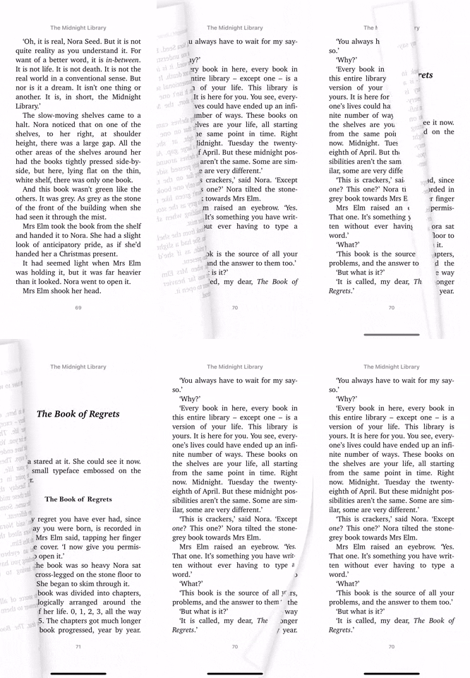
The page-turning effect in iOS 15 (left) vs. iOS 16 (right).
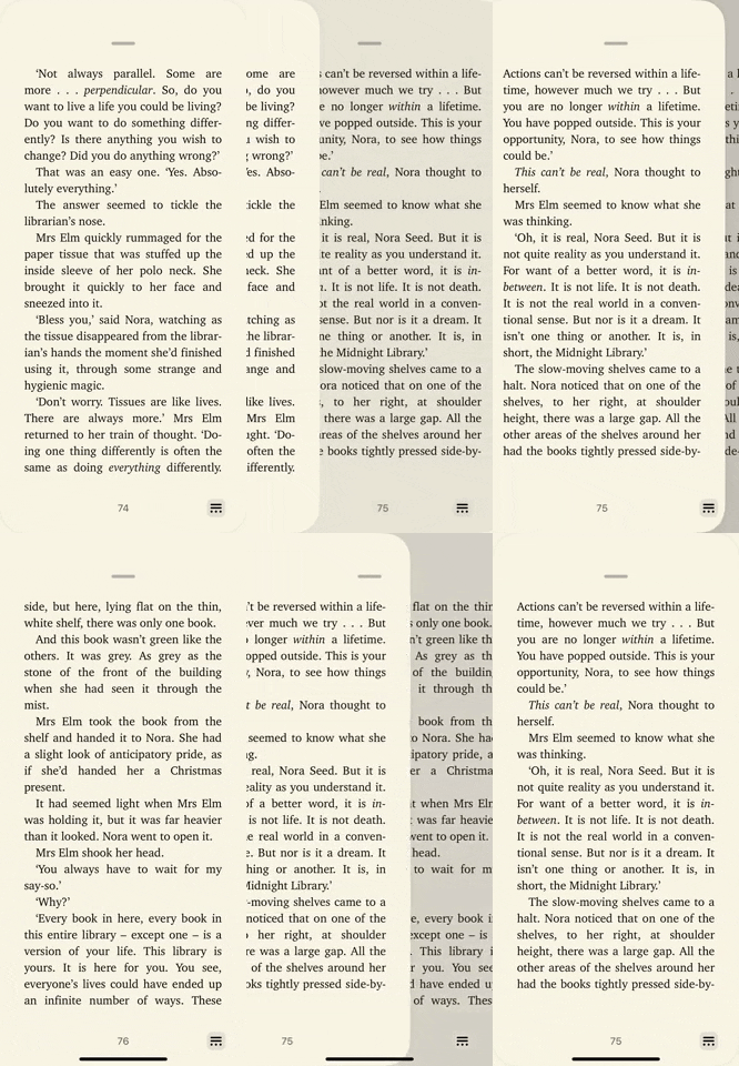

The page-turning effect in iOS 15 (left) vs. iOS 16 (right).

16. Use Quick Actions for Books Instead of the Share Sheet
When you tap the ellipsis (•••) icon for a book in the "Reading Now" or "Library" tab, for example, the share sheet comes up in iOS 15. In it, there are options to Copy, Share Book, Add to Want to Read, Add to Collection, Mark as Finished, Remove, View in Store, Rate and Review, Suggest More Like This, and Suggest Less Like This.
In iOS 16, it opens a quick actions menu instead of the share sheet, which is much faster. The only thing missing from the quick actions is the "Copy" option, which you can still find via "Share Book." Additionally, you can long-press the book to open the quick actions, whereas long-pressing in iOS 15 does nothing but let you reorganize books.
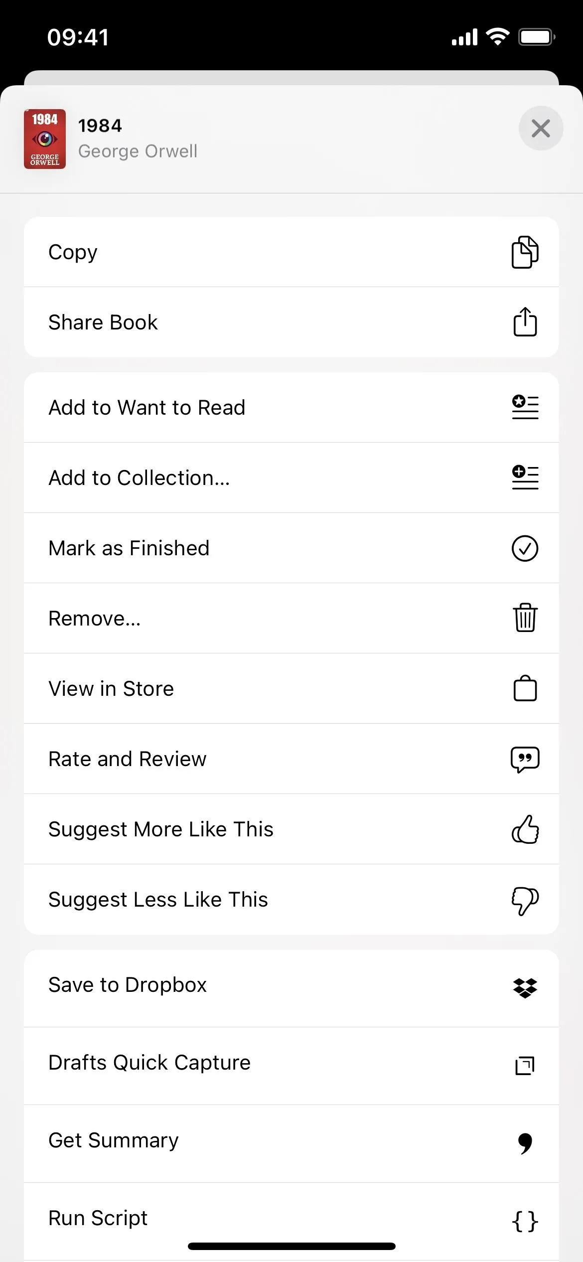
The book options in iOS 15 (left) vs. iOS 16 (right).
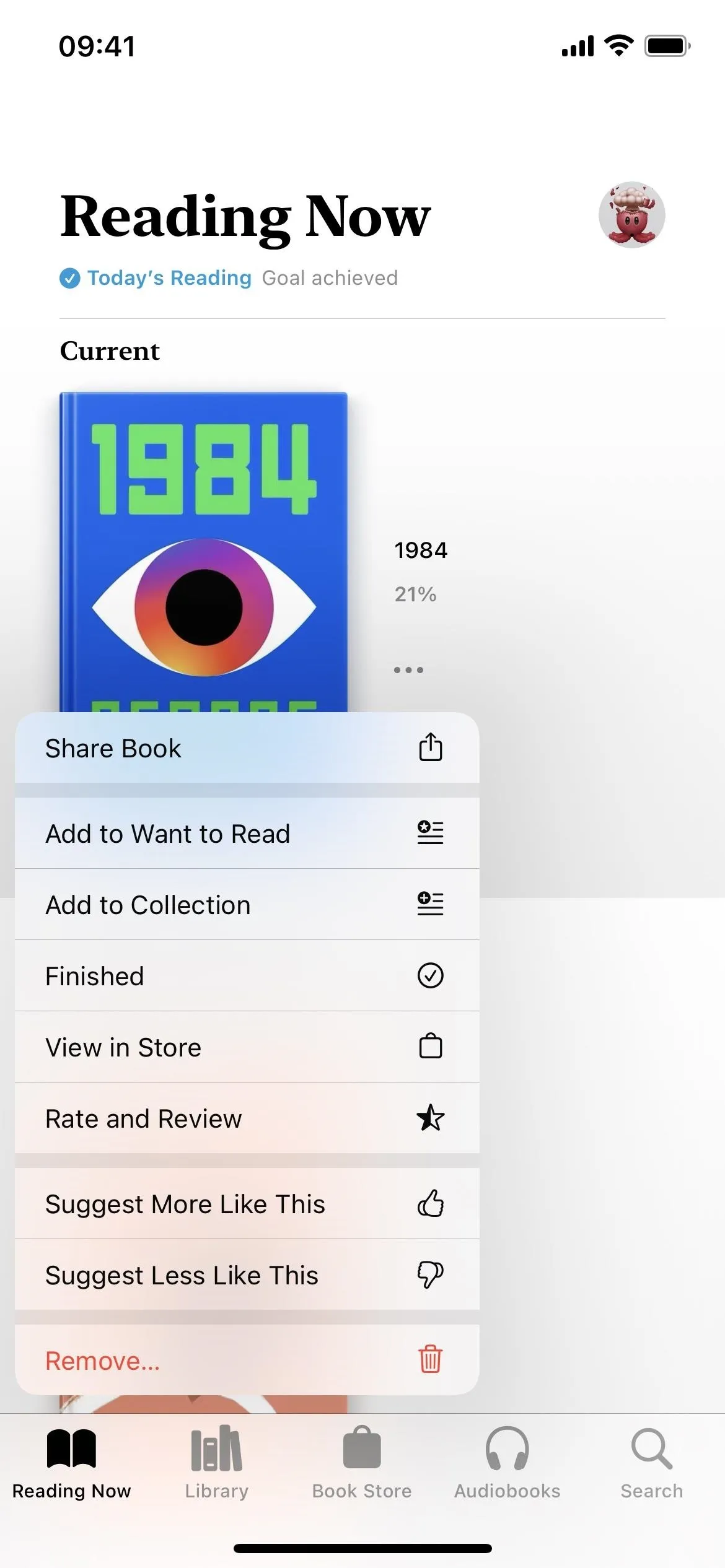

The book options in iOS 15 (left) vs. iOS 16 (right).

17. There's a Redesigned Full-Screen Audiobook Player
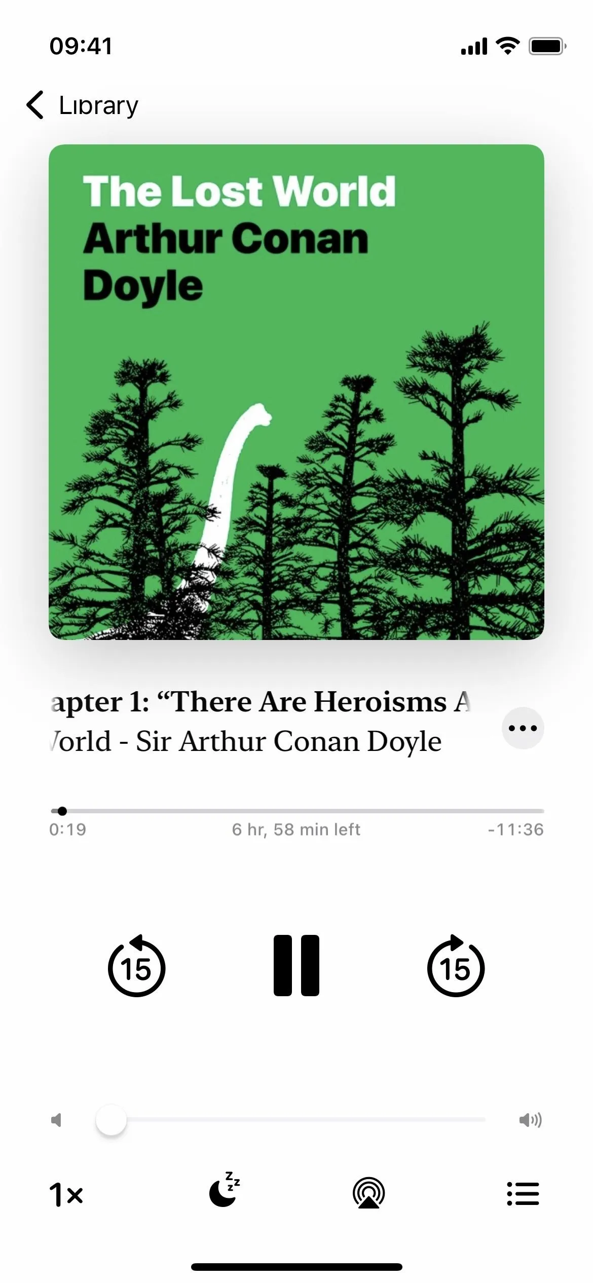
The audiobook player in the Books app now matches the interface's background colors with the audiobook's cover art colors. Also, instead of having to tap the back (<) button to exit the full-screen player, you swipe down.
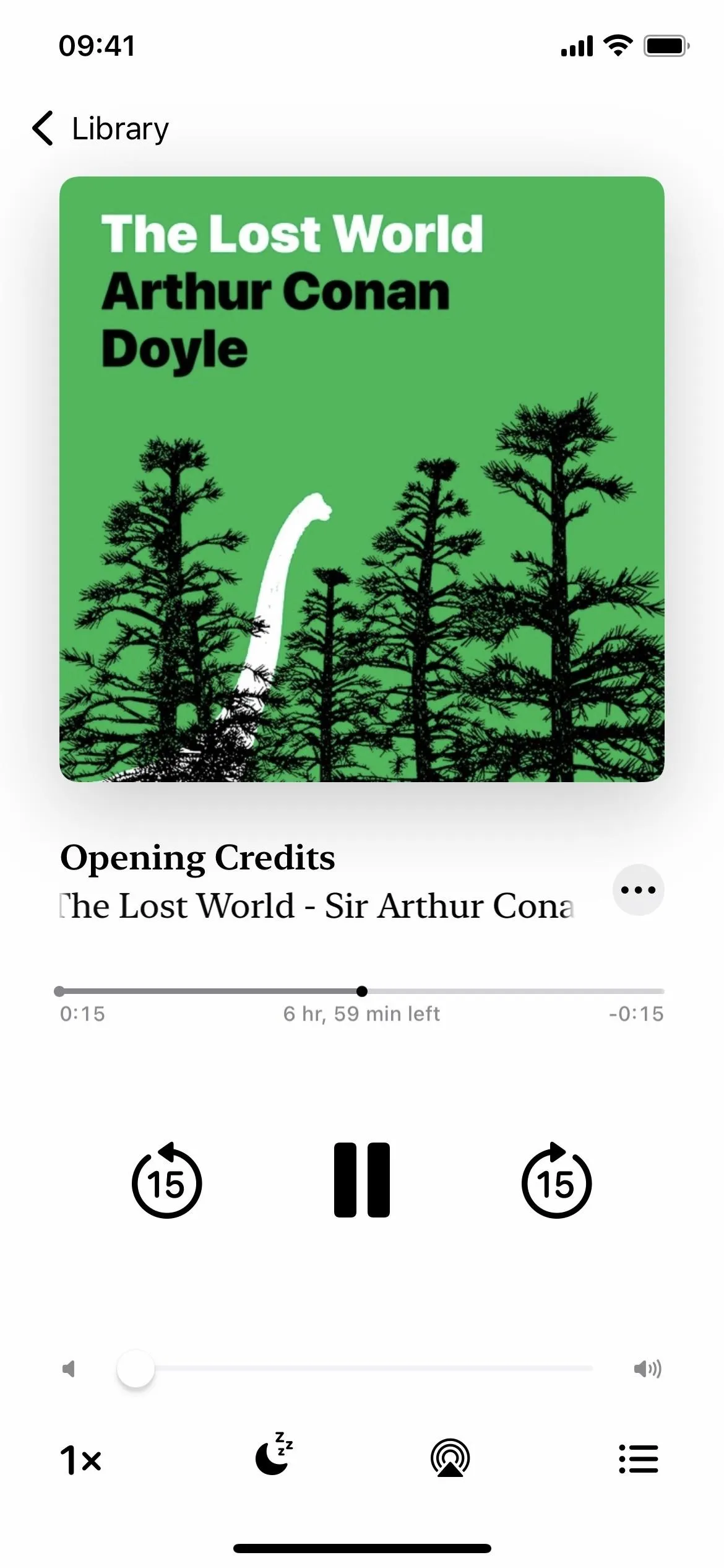

The audiobook player in iOS 15 (left) vs. iOS 16 (right).


The audiobook player in iOS 15 (left) vs. iOS 16 (right).
18. And a New Mini Audiobook Player
Like the Music app already had, Apple Books now has a mini player for audiobooks. While the Books app has a mini player for previews in iOS 15, it doesn't work for anything you own.
When you swipe down the full-screen player, it collapses to the bottom of the screen above the navigation tabs, and you can tap it to return to the full-screen view. You can even long-press the mini player to bring up quick actions such as Close Audio Player, Share Audiobook, and Finished.
The full-screen audiobook player in iOS 15 (left) vs. the mini player in iOS 16 (right).
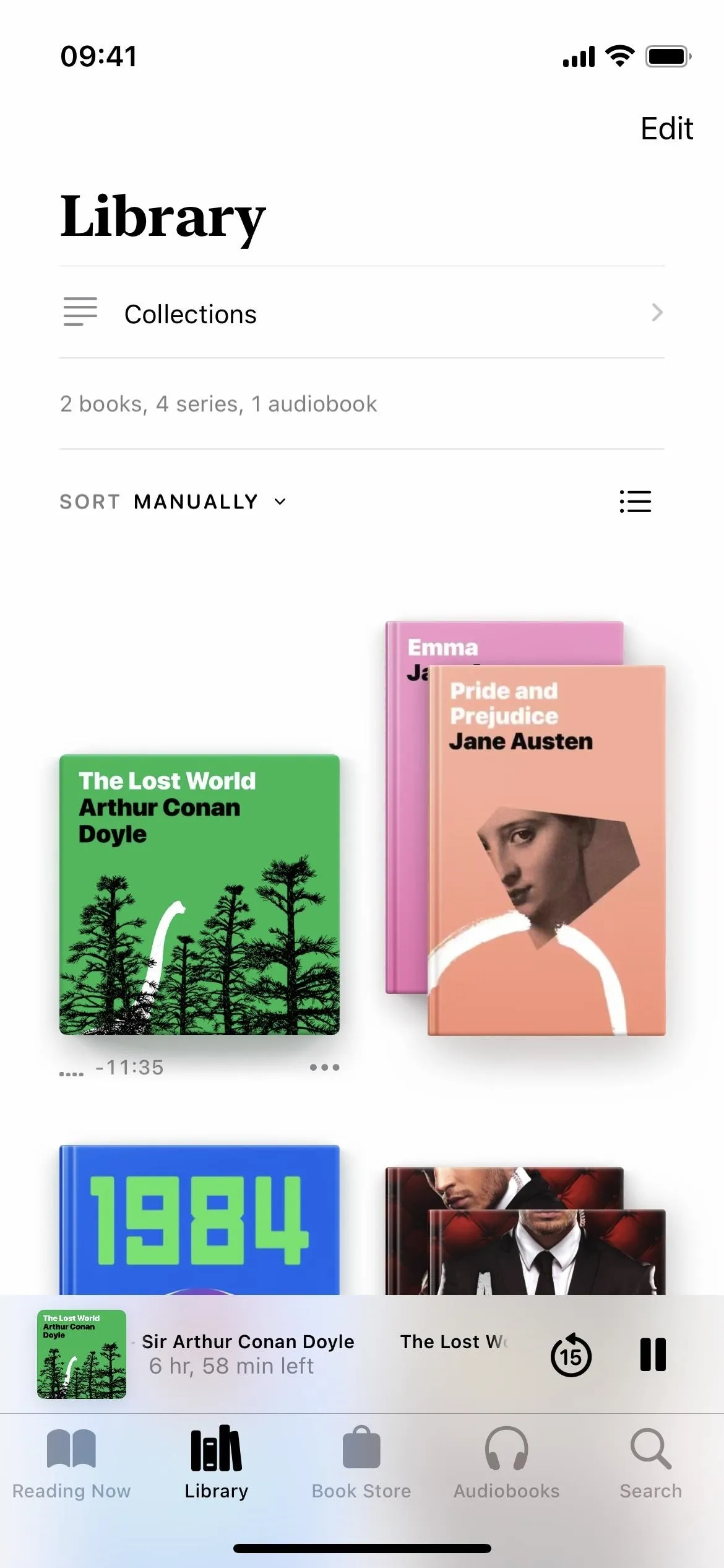

The full-screen audiobook player in iOS 15 (left) vs. the mini player in iOS 16 (right).

19. You Can Expand Audiobook Previews to the Full-Screen Player
Speaking of the preview player for audiobooks, in iOS 15, you can't expand the mini player to the full-screen player — you can only open the audiobook's listing in the store if it's not already visible. In iOS 16, the full-screen player appears every time you tap the mini player.
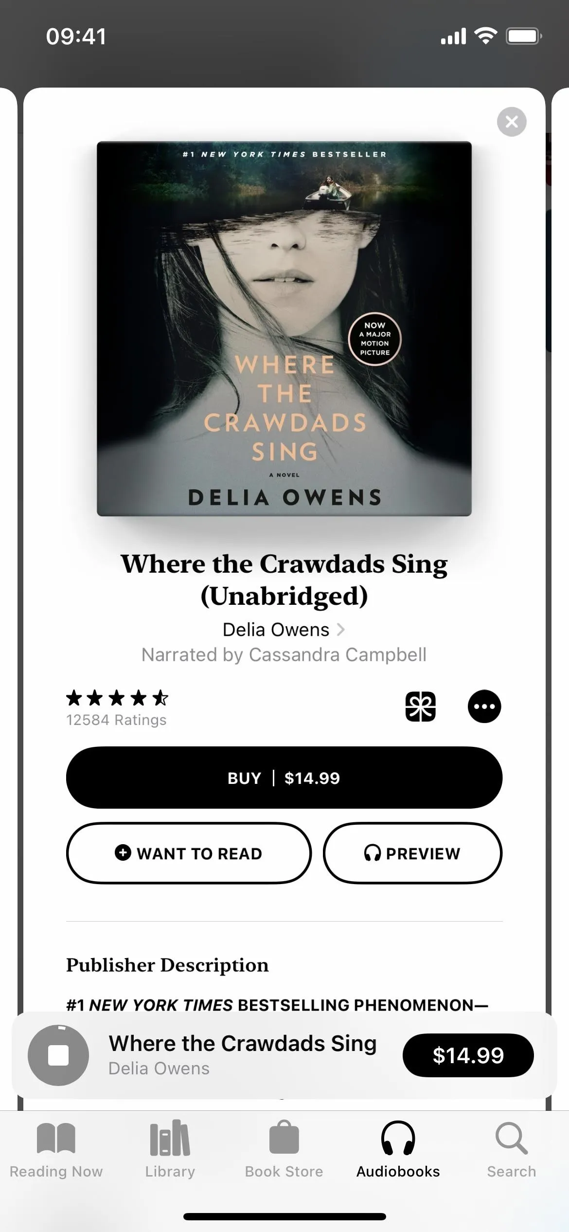
The only view you get for audiobook previews in iOS 15 (left) vs. the full-screen player in iOS 16 (right).
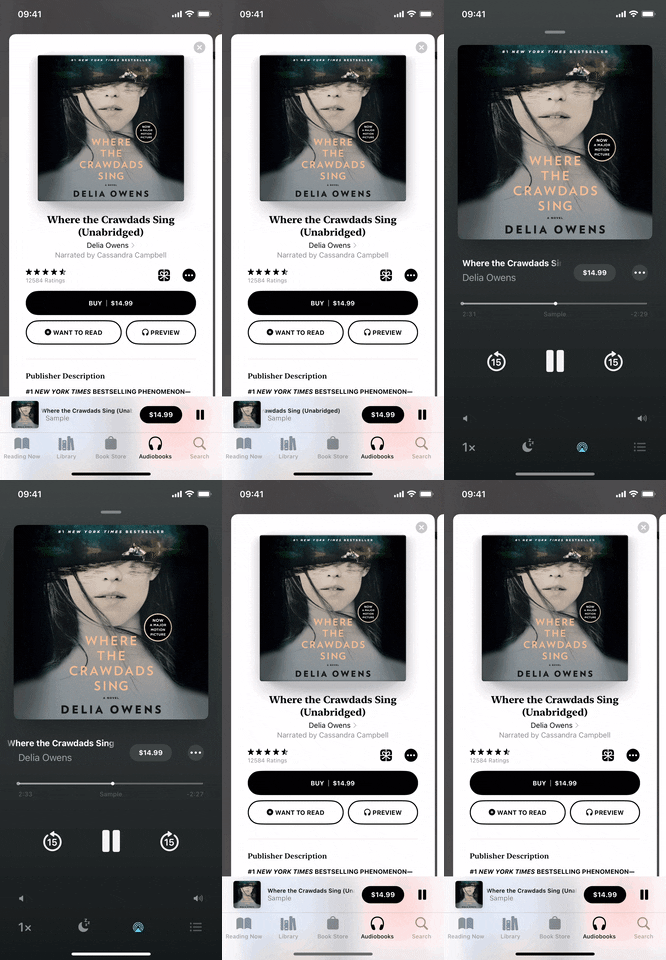

The only view you get for audiobook previews in iOS 15 (left) vs. the full-screen player in iOS 16 (right).

20. There's a Better Now Playing Window on the Lock Screen
Like when playing music, the Now Playing window on the lock screen in iOS 16 is about half the height it was before. The audiobook's cover art gets its own spot above the Now Playing window, and just like the full-screen player in the Books app, the background matches the art.
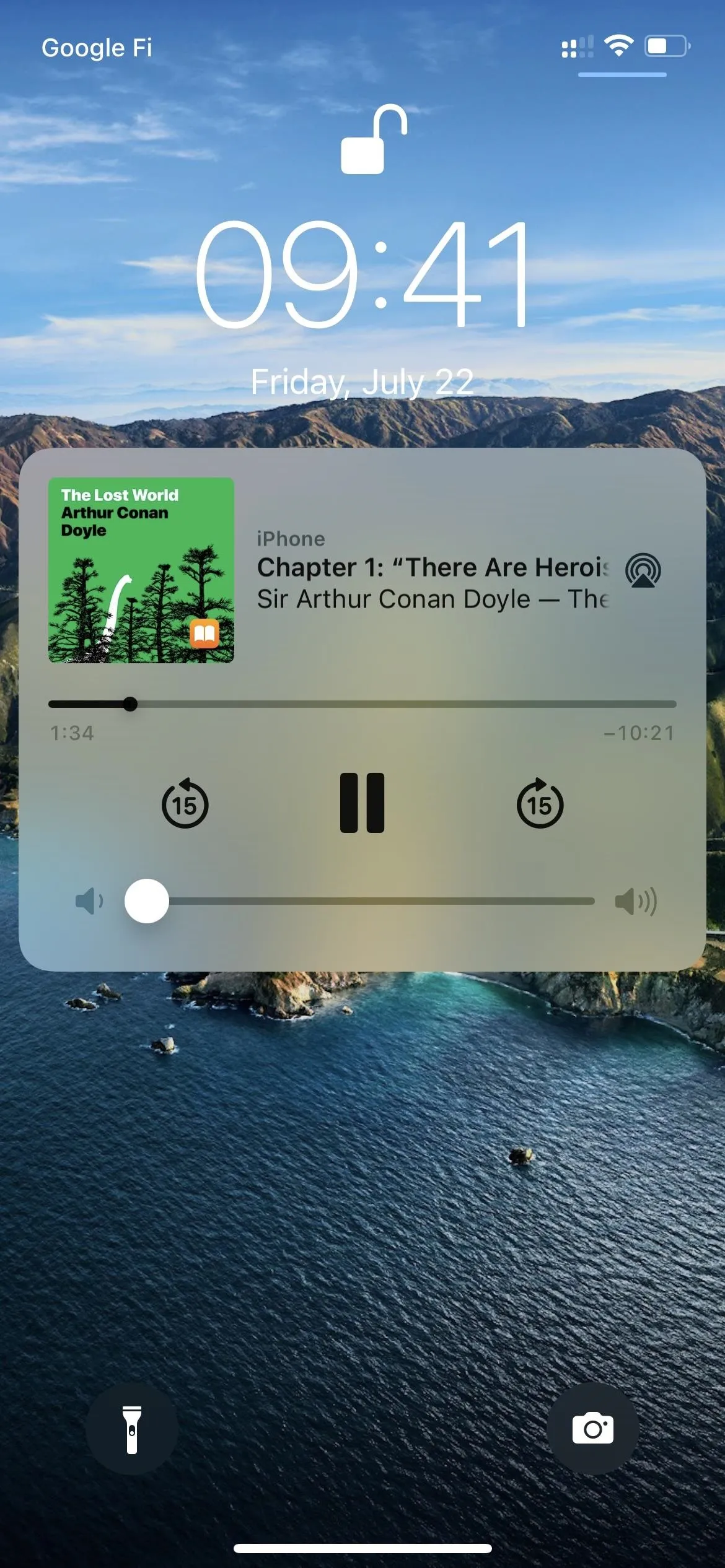
The lock screen player for audiobooks in iOS 15 (left) vs. iOS 16 (right).
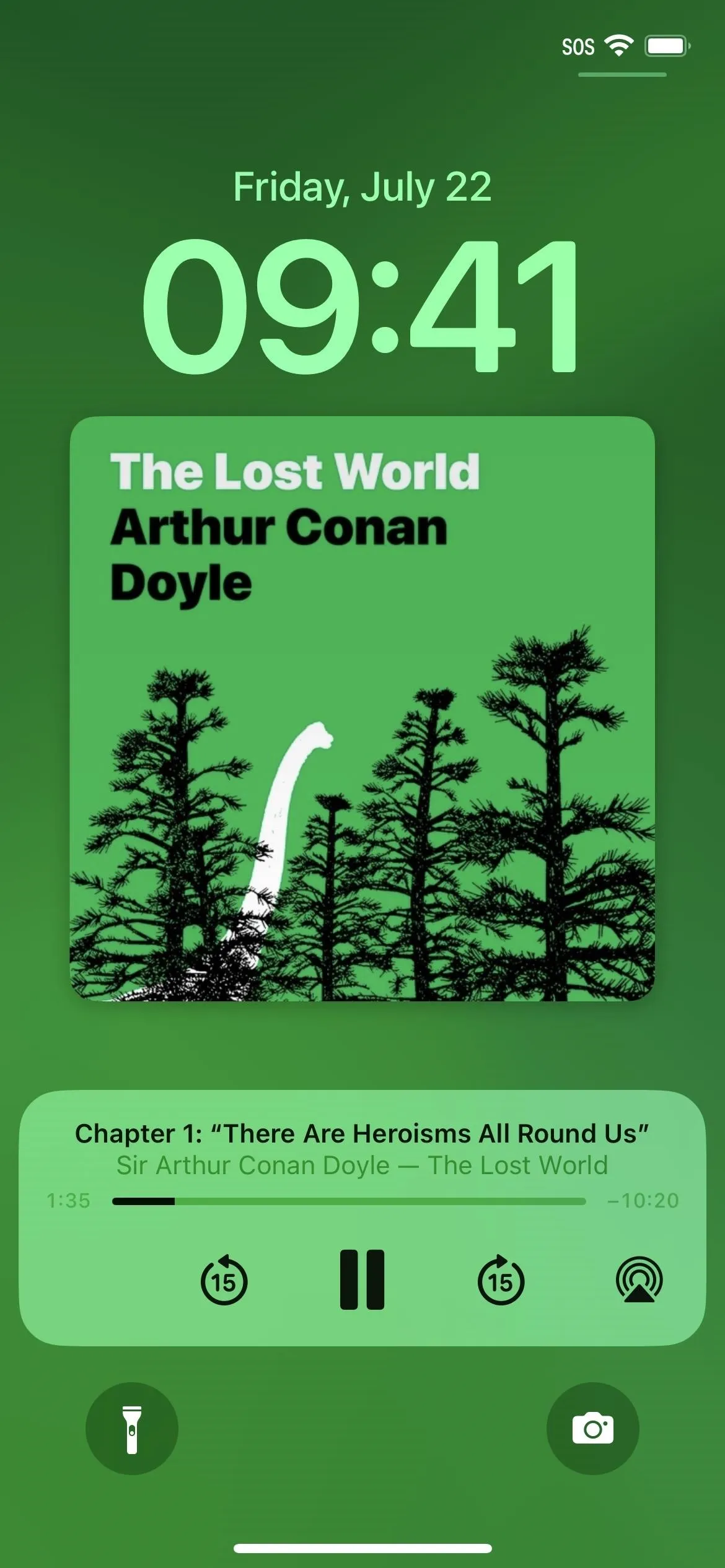

The lock screen player for audiobooks in iOS 15 (left) vs. iOS 16 (right).

But Can We Finally Customize the Size of Margins?
Unfortunately, the answer is no. Users have complained about big margins in the Books app for years, but Apple still didn't add an option to change the spacing on the left and right sides of the text.
Cover photo by Justin Meyers/Gadget Hacks; Screenshots and GIFs by Jovana Naumovski/Gadget Hacks




Comments
Be the first, drop a comment!